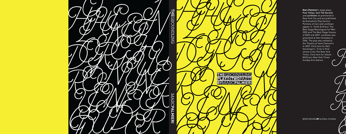
After reading the script of this play, I chose a design direction to best express the essence of The Groundling, a play by Marc Palmieri.
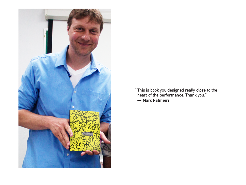
I was tremendously moved by this play and Palmieri’s quirky writing of the characters. It’s almost at first, you can’t take the couple so seriously since their relationship seems to consist of arguing. It seems like a waste of time for the husband to try so hard to remind his wife of how they came to be, but by the end of it, I was in tears. I was angry that they’d argued so much throughout the play and felt that it was important to emphasize that and the emotion behind all of the arguing. It was heart-wrenching to read their fighting by the end and how they’d lost their first child to cancer, and being unable to carry on their marriage from the pain. It was an incredible collaboration with the playwright himself and his own comment about my book, that it was “true to the heart of the play and the reality of their relationship.”
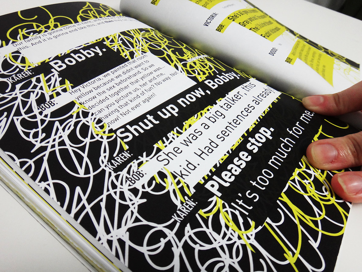
The play is about an arguing couple somewhere in Long Island, struggling to keep their marriage together. The husband tries to repair the relationship by hiring professional actors and writing a play about the couples’ courtship to win the favor of his wife, but as the play hits the climax, the audience soon realizes that the relationship is irreparable.
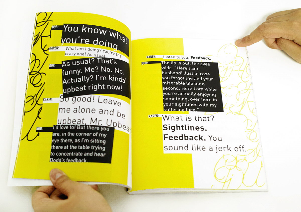
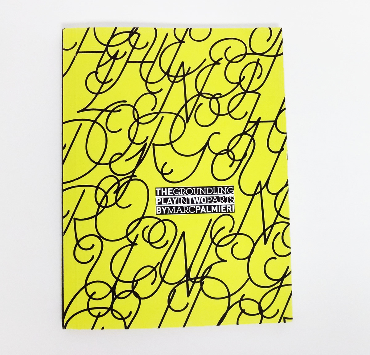
The book has high points and low points. I used big typography to express the loudness and emotion in the couples’ arguments along with a chaotic typographic illustration to make it a big mess. By the climax, clarity ensues but until then, there are moments of quiet and peace but those are short-lived.