Text by Liz Gorny / From It's Nice That
Jet Flamingo is a brand providing holiday accommodation and hospitality in the form of three villas in Bondi Beach, Australia, developing “places, events, bars and restaurants that people can enjoy”, Monga explains. The Florianópolis-based design studio has given the company an identity that dials up the enjoyment factor, aiming to bring a “happy, fun and cool experience for the future guests”, it explains.
The project is based specifically on the “‘golden times’ of flying”. Rather than looking heavily to specific historic references, Jet Flamingo is designed more to inspire the feeling of airline travel circa 1950s and 60s. The studio tells us more: “We got inspired by the aesthetics of it; the attention to detail and coolness of that time; the optimistic colourful graphics; the bold airline identities, tourism posters and everything in-between.” It adds: “We really wanted to bring back the happy memories of travelling and the laid-back coolness of it.”
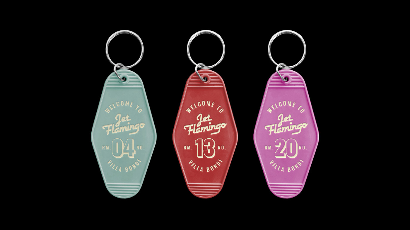
The identity extends playfully across a number of physical touchpoints too, including keychains, stationary and hotel miniature amenities. Monga also designed a variety of colourful stamps and stickers, inspired by the labels and tags that often can be found on travellers’ luggage.
The logotype pairs the retro, airline-inspired Airstream typeface with the accompanying text “Bondi villa”, set in the sans-serif gothic Oswald. This is to ensure the brand’s offering as a holiday accommodation company was reflected fully. Monga adds: “We wanted a bold, fun and friendly face for the headlines, so we went with Beiko for the headlines – that rather small I and J dot gives a nice ludic feel.”