

The problem:
BCP bank, the largest bank in Perú needed to produce graphic pieces for social media, website and other formats at a fast pace. They also needed that the pieces kept consistency with the brand while being innovative and attractive. They wanted to use the graphics for various publicity campaignes, so the idea behind the graphics is one of the most important aspects of them.
My role:
My role as Senior Visual Designer was to create the concepts for these graphics, as well as creating them using the Adobe suite.
Designing with purpose:
I decided to expand my role and became data centered. In order to achieve results I asked the growth hackers and people in charge of analytics to share that information with me so that I could analyze it and create concepts and graphics that made sense according to results, KPIs and insights. This opened the oportunity for me to manage the concepts and expand the visual design team by hiring one intern and a junior designer, so that I could create the concepts, analyze the data, do some research and benchamrk while the rest of the team worked on the graphic pieces, I would still be involved in that aspect but I could have more control over the concept. We introduced A/B testing for visual teams, we kept logs with the data for each campaign, highlighting the succesful ones ans the insights gathered from each campaign.
________________________
After data analysis
Comes the sketch

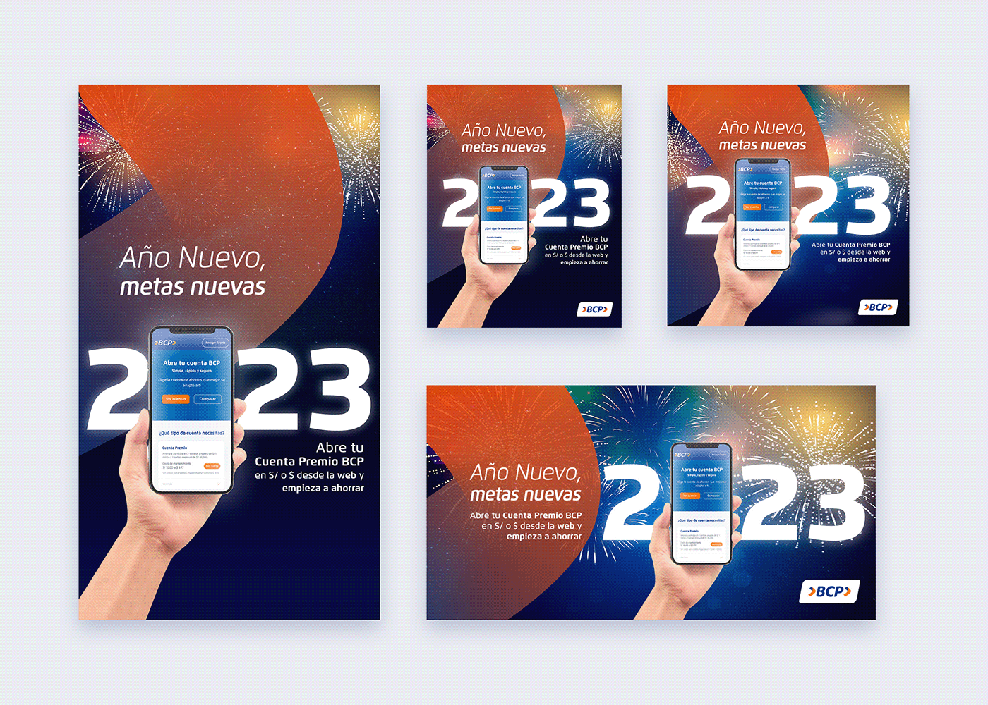
New years it's an easy one. Fireworks at night are one of the first things that come to mind, besides that we had to publicize the new webflow that would make it easyer for users to acquire the "Cuenta premio" a mid level type of bank account. These are the results of our efforts:
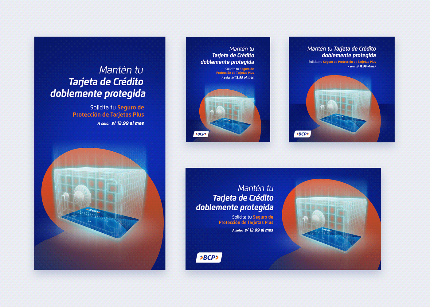
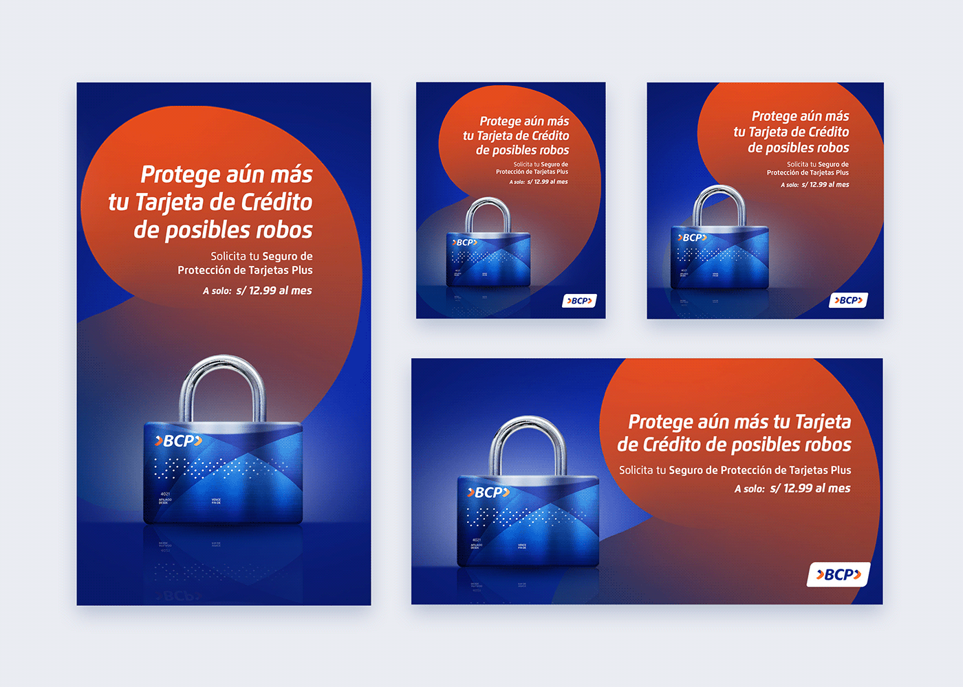
The bank wasn't being succesful in selling account insurances. They had been using pictures of happy people mixed with messages of fear, which wasn't working. We hypothesized that we should remove people from the visuals and add images that give the sensation of safety. We sketched forcefields in the shape of various items that are used to keep treasures safe, some of them had a fantasy element on them, like safeboxes, treasure chests, sci-fi bubbles, force-fields and others. Two of them stood out the most to us and the marketing team:

These were our final results:
Using UX data and new year's leverage:
Since we needed to boost sales in the insurance department, we suggested that an aditional pice should be made, an informative carrousel. We wanted that the users could enter the bank's website with the intention of getting an insurance already knowing what they would be paying for. This idea came to mind when checking the data for churn in the insurance user flow, there was a high churn rate in the seccion that had all the information of every type of insurance.
The new year's theme was known to be very well recieved, so I recomender using it for this purpose. This is the result:
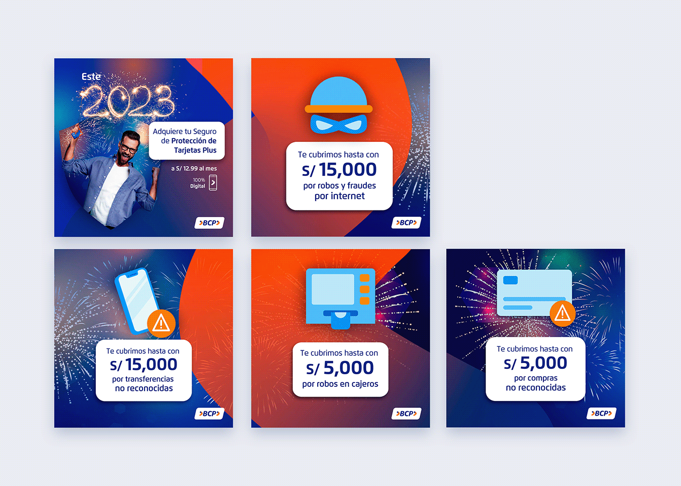
Thanks to the brainstorming session in which we generated many images that conveyed safety we could produce graphics like the following at a faster pace than usual:
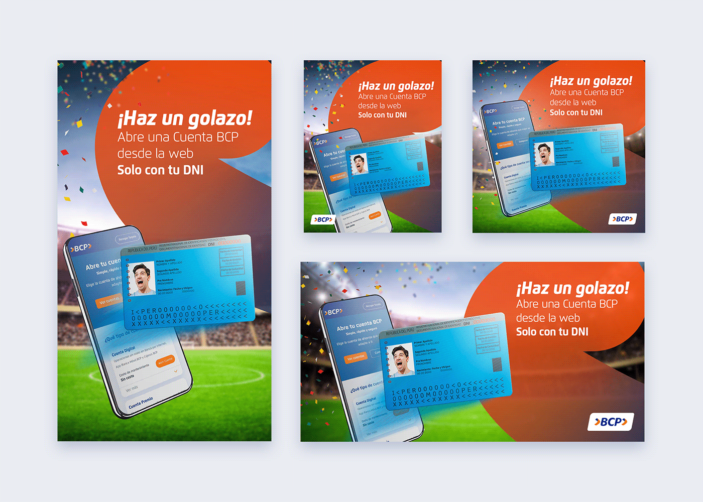
Soccer fans:
One key insight about our chosen target audience was their soccer fanatism. We chose a date near the FIFA World cup to try this pieces. The purpose of them was to publicize the webflow to acquire a card, to try getting the users not to go to the physical bank for that purpose and use the website instead.
In some cases I would point out elements that represented insights form previous experiences, so that my team knew not to take those out of the visuals.
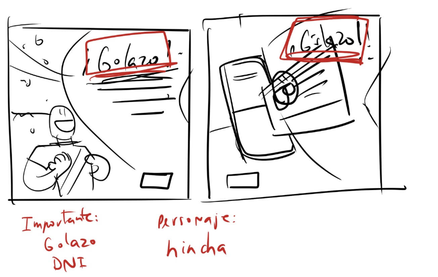
The word "Golazo" is a peruvian expression commonly screamed during soccer games, we needed it to have a high visual hierarchy. Having a protagonist with which the fans could identify themselves with was also important, according to my analysis, our target reacted favourably when they saw graphics with people in them if the context was a pleasurable or happy one.
After much sketching we decided to introduce the ID card based on data that supported our target audience either forgot their ID card when using the website to obtain a new credit card, or thought that they needed extra documents.
This was the result:
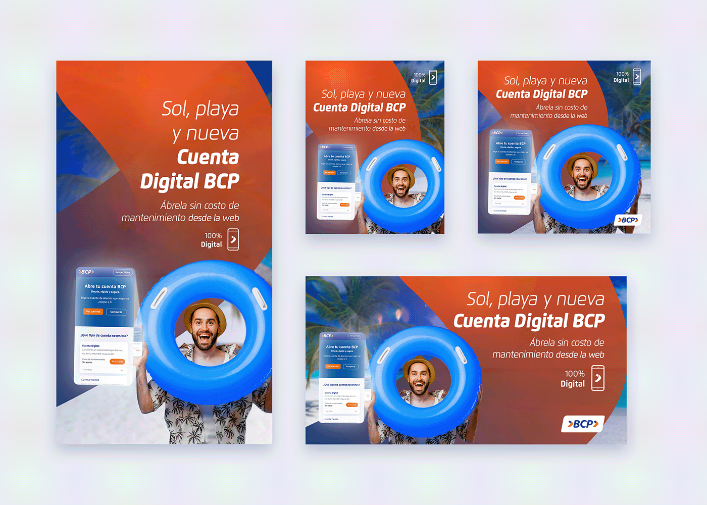
Cool for the summer
For the summer campaigns BCP had already had various succesful campaigns so we had the chance to innovate, be creative and more risky. We used some insights previously mentioned, such as the one that pointed out that users reacted in our favor when they saw visuals with people in pleassurable situations and decided to brainstorm ideas, many which we would save for the future.

We were using the screen being projected from the smartphone in other pieces, so we decided to use that in these pieces as well to relate the images as if they were part of the same story. We also used a text similar to reggeaton lyrics "Sol, playa y ...". This are the results:
Carrousels and iteration:
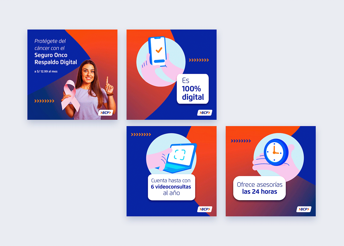
For the oncological insurance that the bank offers we just mimiqued the piece created for the credit card insurance due to lack of time, and because the carrousel had worked very well.
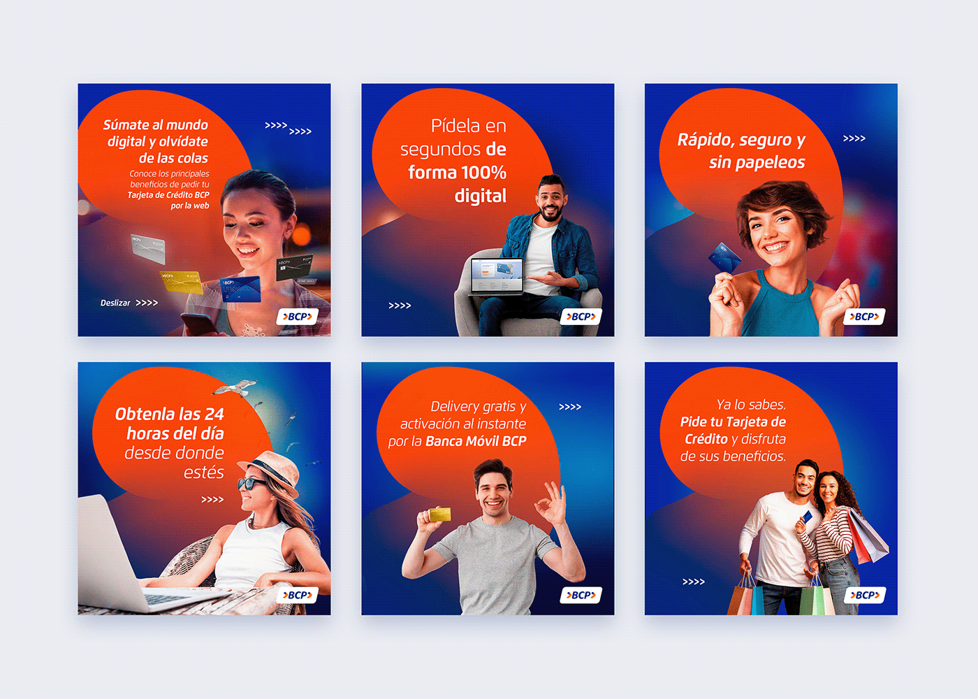
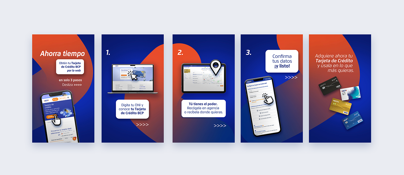
Because carrousels worked so well with informative pieces we created one to publicize the adquisition of credit and debit cards through the app and the website. We used data of who our users were to craft the characters in each slide.
We introduced some concepts that worked well before such as the screen projecting an image, the beach and shopping bags to some of the images.
This was the result:
Carrousels were working excellently, so we created them various formats and for various campaigns for new products and new webflows that needed to be introduced to the users.
Insights:
Thanks to an investigation made by the UX team we foudn out that our target was highly motivated to ask for loans for educational purposes and real state acquisition.
We created a series of graphic and audiovisual pieces touching on those subjects to publicize insurances.
These are some audovisual examples:
We used these same concepts with succesful results in various formats:
I would be happy to discuss more of this case in an interview.
Thank you!


