Map is not the territory
I started a big research on maps, where I found interesting maps uninteresting maps, common and less common maps.
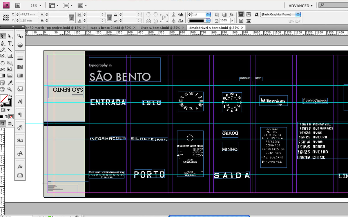
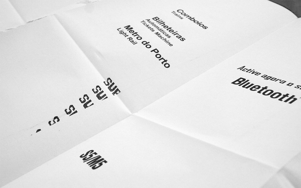
My field of work is the train station São Bento São Bento Station,is one of the most beautiful historic buildings of downtown (Porto). Ithas lots of details that characterize it, so i wanted to choosesomething that was specific only in this train station, for that I did:Step 1: go to the train station Step 2: shoot the station Step 3: document what I see at the station Step 4: make drawings of the station after this process I made a list of things that could map: – details ofiron and wire – all daily trains – predominant colors in the trainstation – old typography – doors – windows – chronology (historicaldates) first experiment with colour first experiment in typography
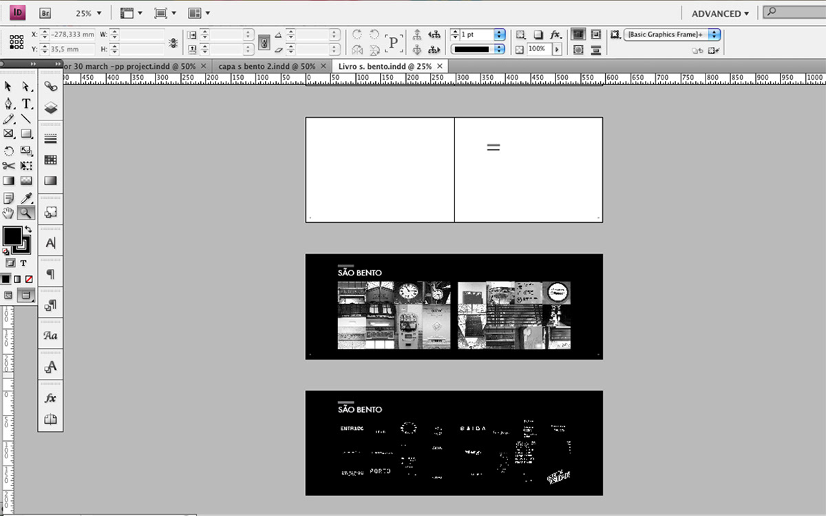
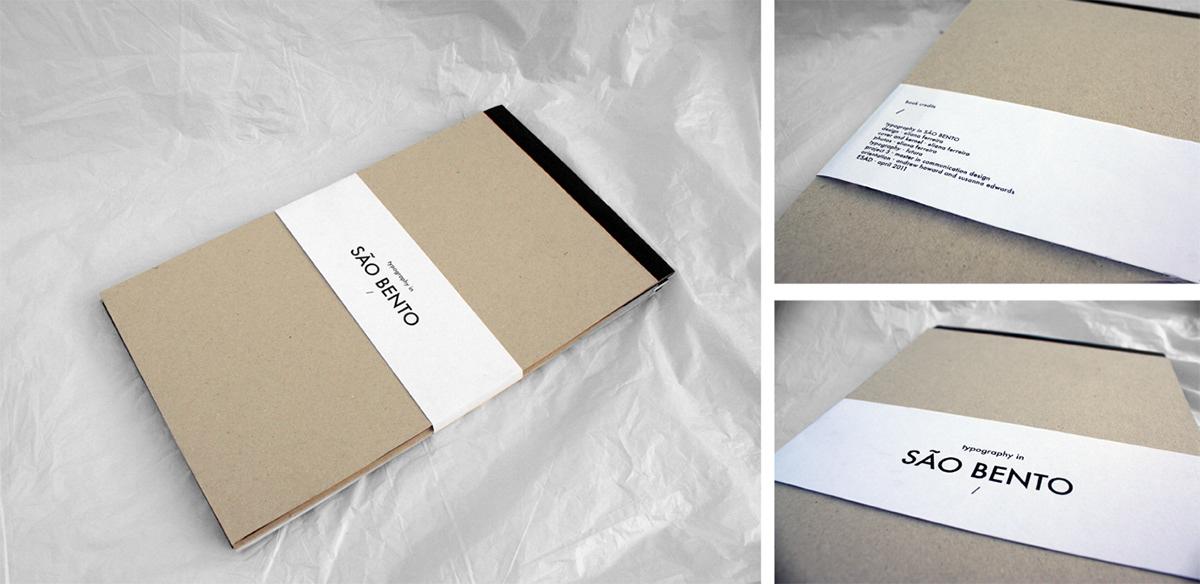
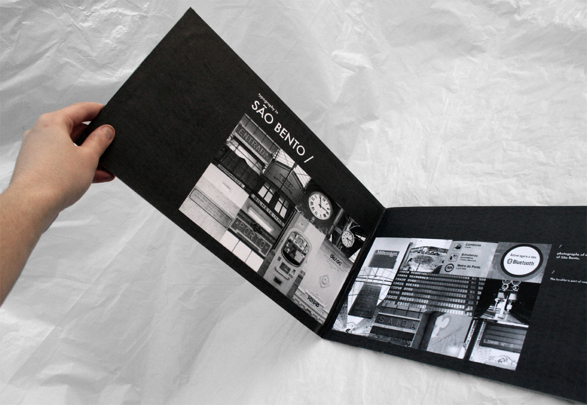
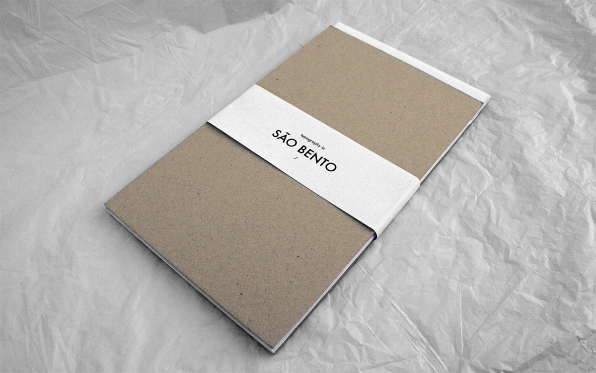
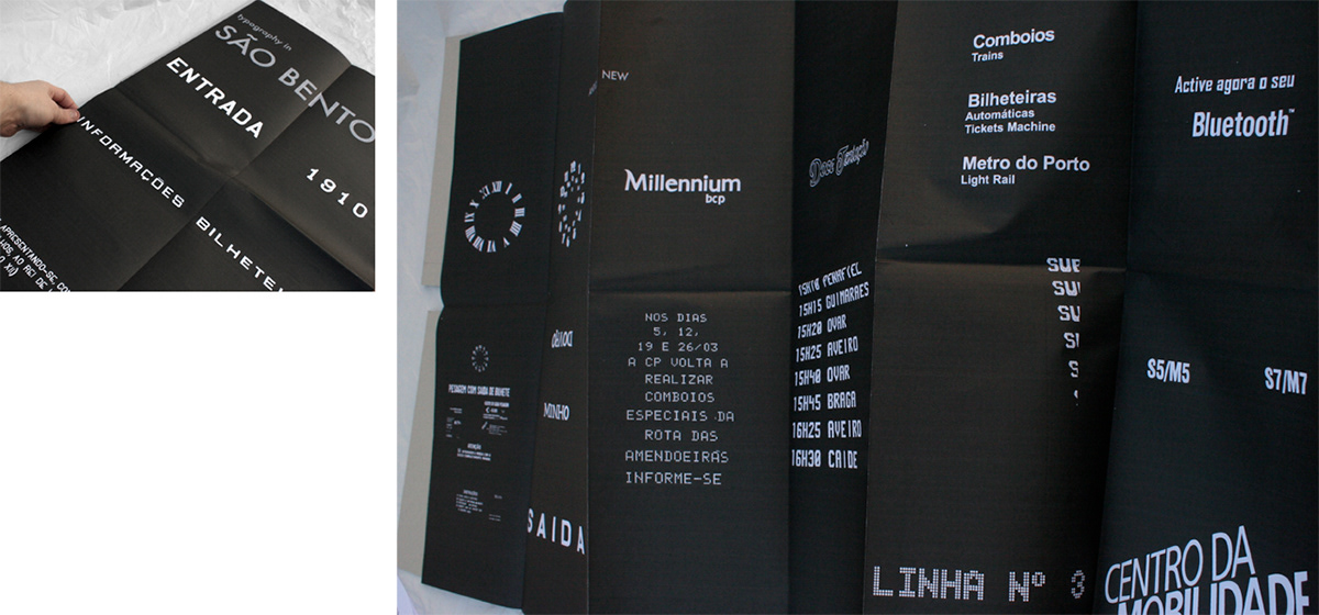
Step 5: choose theme to map: Typography: Dilemma # 1 – old vs. new?old or younger? Dilemma # 2 – split the typography features? (eg color,type, material, location) Step 6: what map and how map: all typography– create a map to find the typography in space Step 7: Graphics settings: All work in black and white Step 8: Start to vectorizer all typography Step 9: How to submit: first idea – Book i started to design a book but i wasn’t satisfied with the results, the last spread of the book had all Photo corresponding vectoredimages, and i liked that image, with all typographies together, so istarted a new shape for my submition, a map second idea – folded poster as i said before, liked the image oh all typographies together, ireally think that works much better than separate, so i started to makemy map, with my old/new typographies, of the railway station. the final result: i choose the card for the cover because of the stonein the architecture of the station of s. bento and i made two versionsof the map, the white and the black because i think that works betterin both ways. i made a guide/catalog, with the photographies of the station beforethe vectorization, to see the original and the real environments of thetypographies. the white version at the beginning of this project I wanted to do a more traditional map,but after choosing the typography to map I saw that I could not do so,so i opt for other kind of map. I like this theme, maps. I think it isa complex work, and I want to go back to make more maps in differentways, and better!