
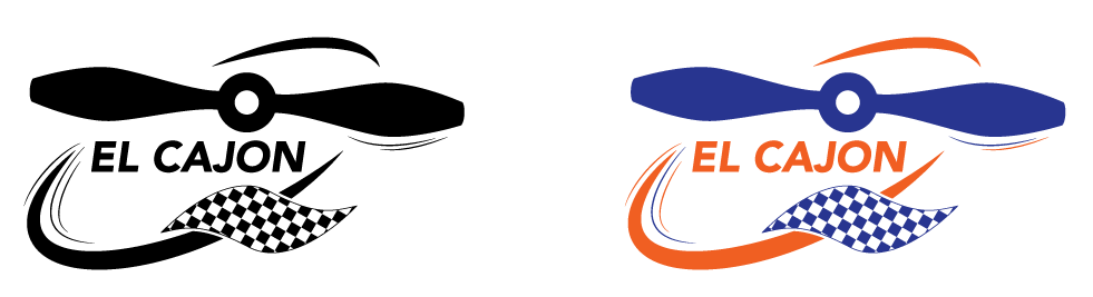


This project was aimed toward making El Cajon a more exciting place. The goal was to change the perception of the city from the run-down gang area that most people see it as, to the versatile inviting area that it is. Extensive research was conducted in order to achieve a better understanding of the area, its history, its population, and various activities. The logo portrays a very energetic and lively side of El Cajon that most people do not know. In the center is an old-style airplane propeller, which is a reference to the airport in El Cajon. Around the propeller is the historical racetrack that was a very popular attraction that the airport used to lease a part of its land for. To push the idea of the racetrack, I added the iconic checkered flag and the city name is set in a font reminiscent of the Nascar logo. Banners were also made as a part of this project, incorporating the words collaborate, cultivate, and spectate. These words reflect the atmosphere and history of El Cajon.


