

CLIENT
Christian and Marie are the founders of the Amano. Their target was to highlight the flaws in commercial olive oil production and provide health-conscious connoisseurs with a sustainable alternative to monotonous, mass-produced items from the grocery stores.
KEYWORDS
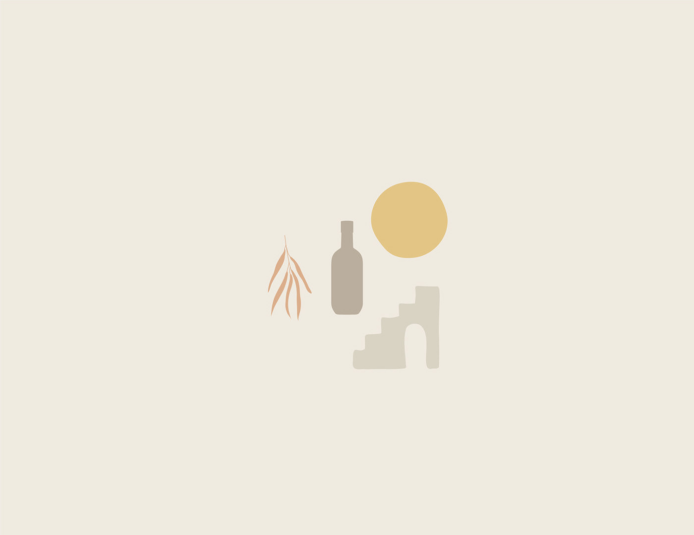
Natural / Exclusive / Minimalistic / Pastel / Bold
THE SOLUTION
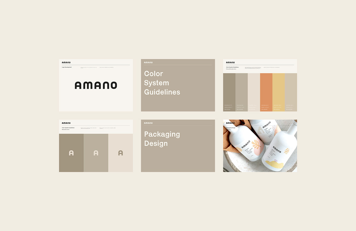
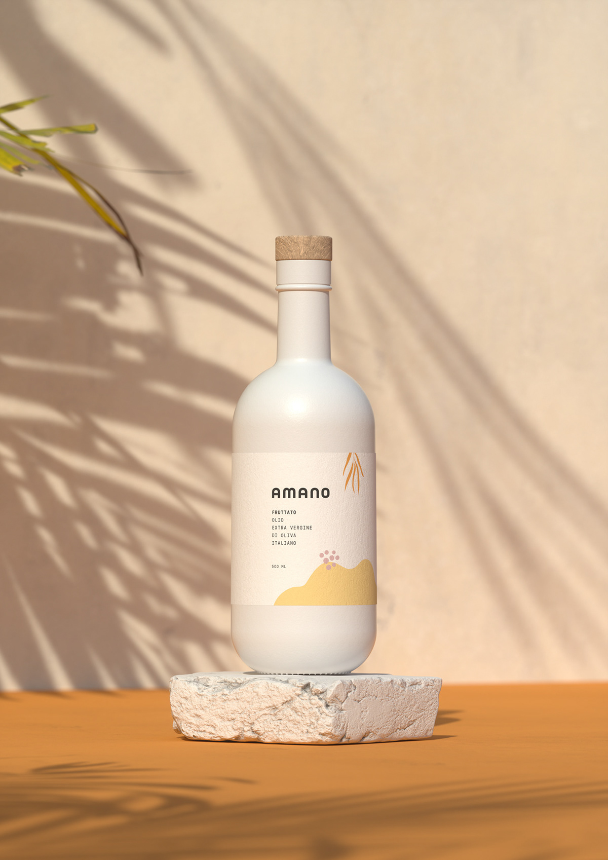
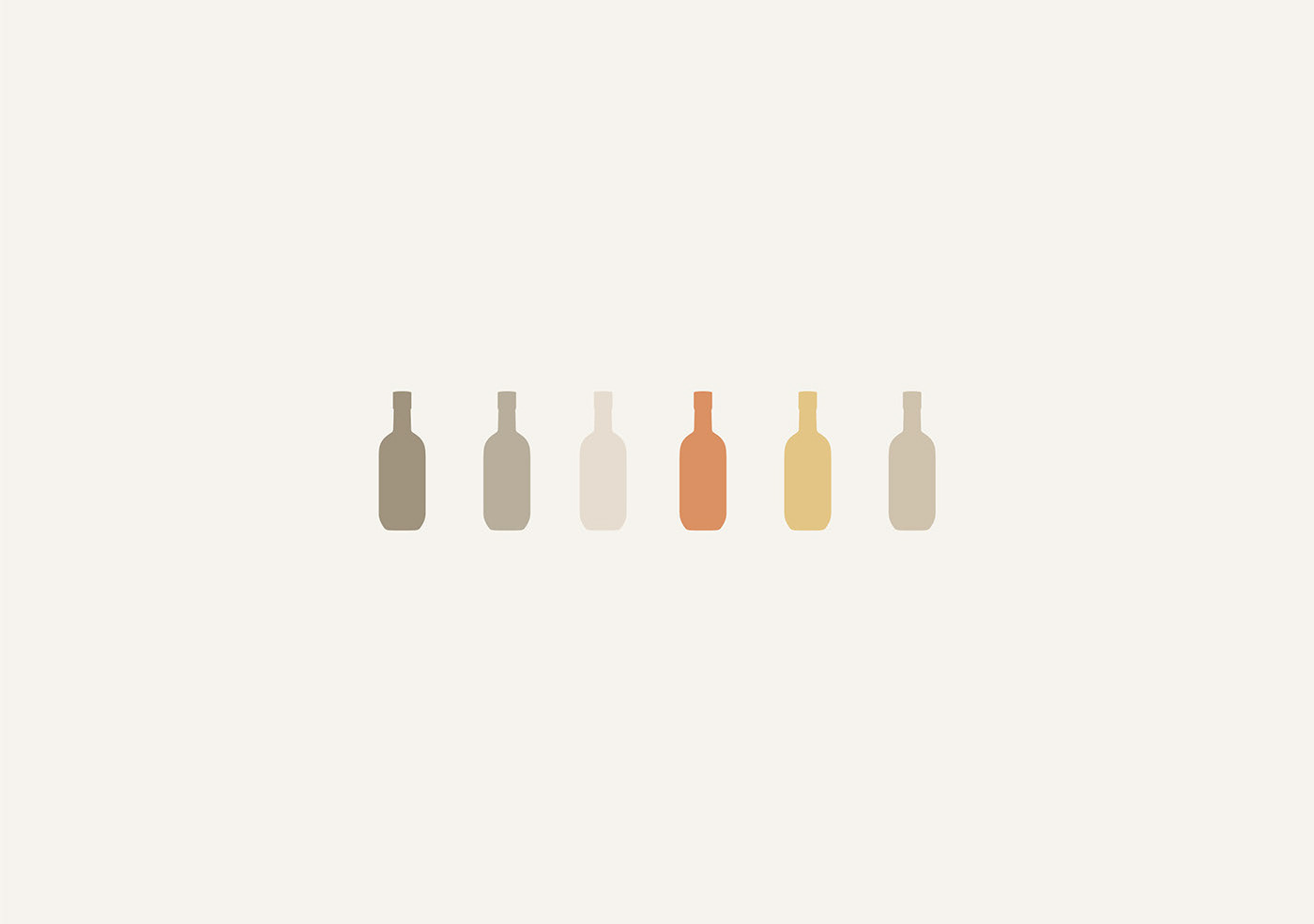
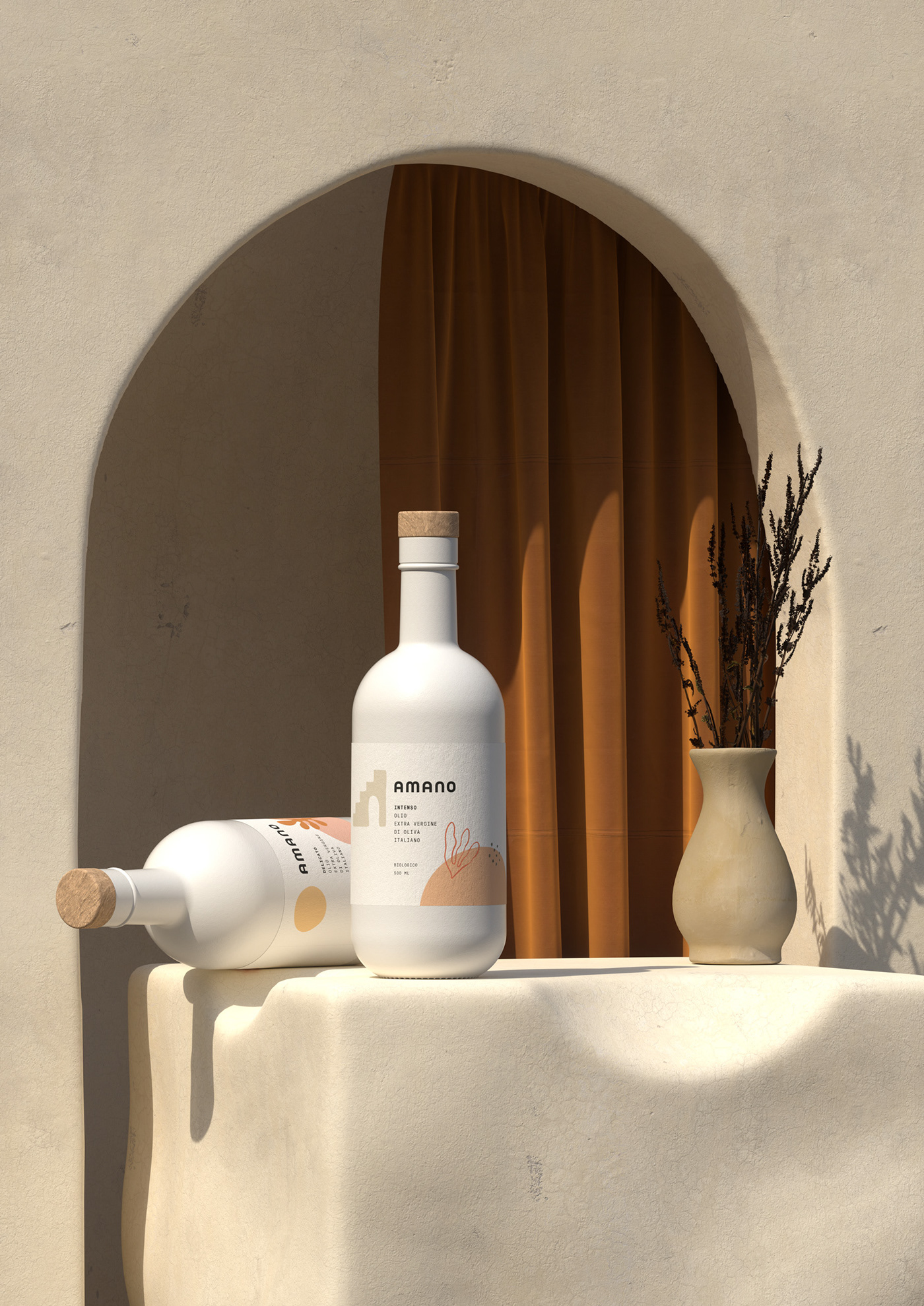
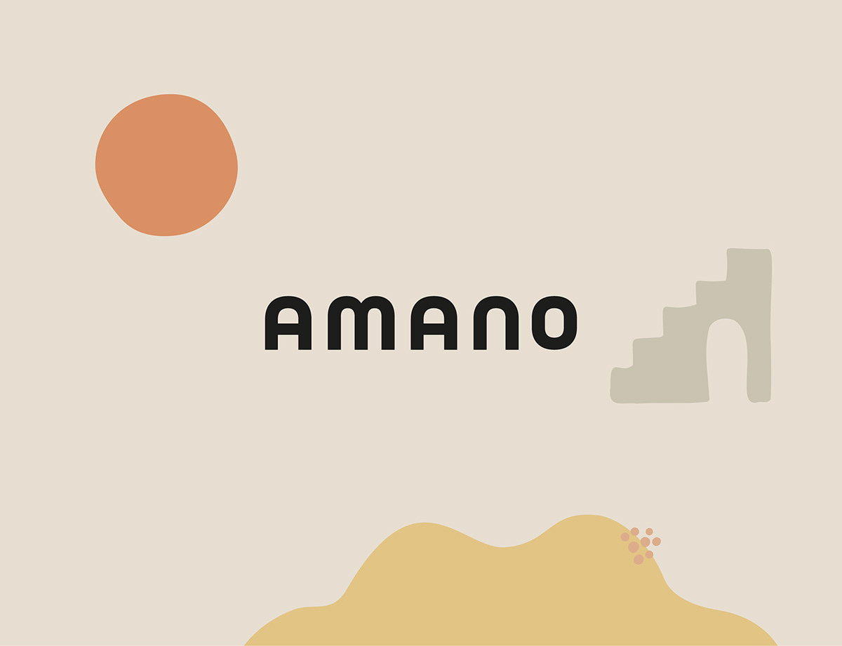
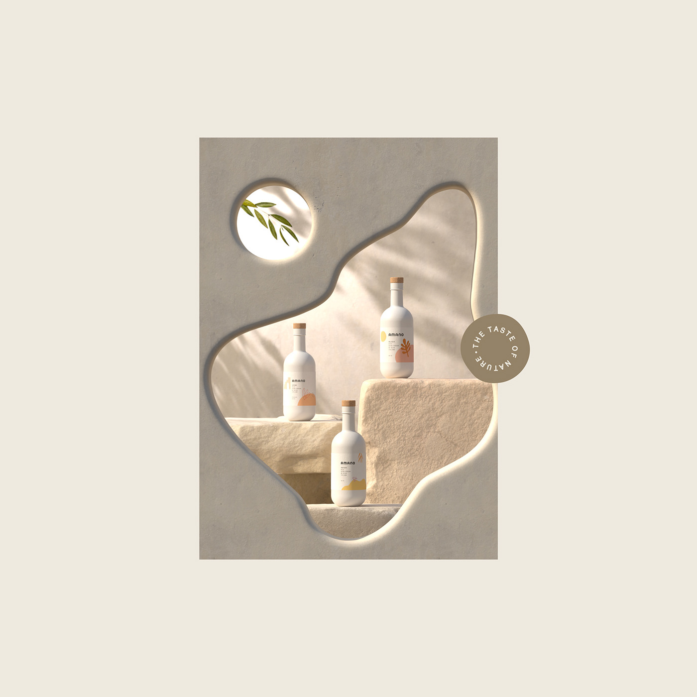
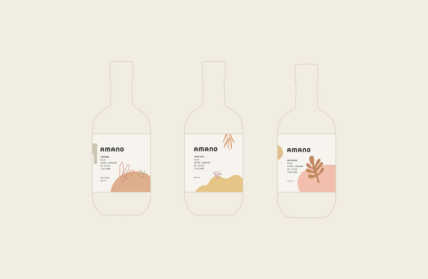
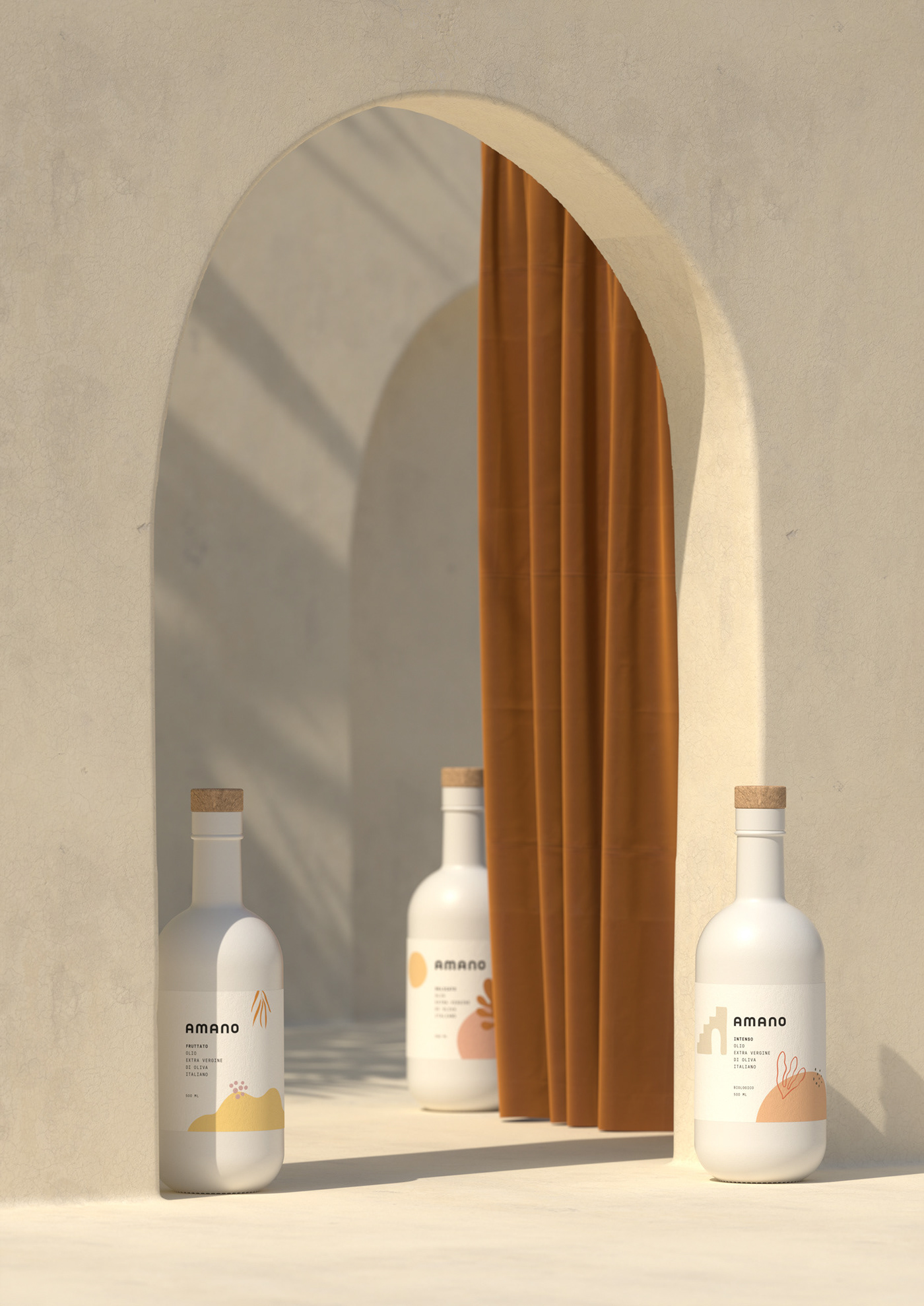
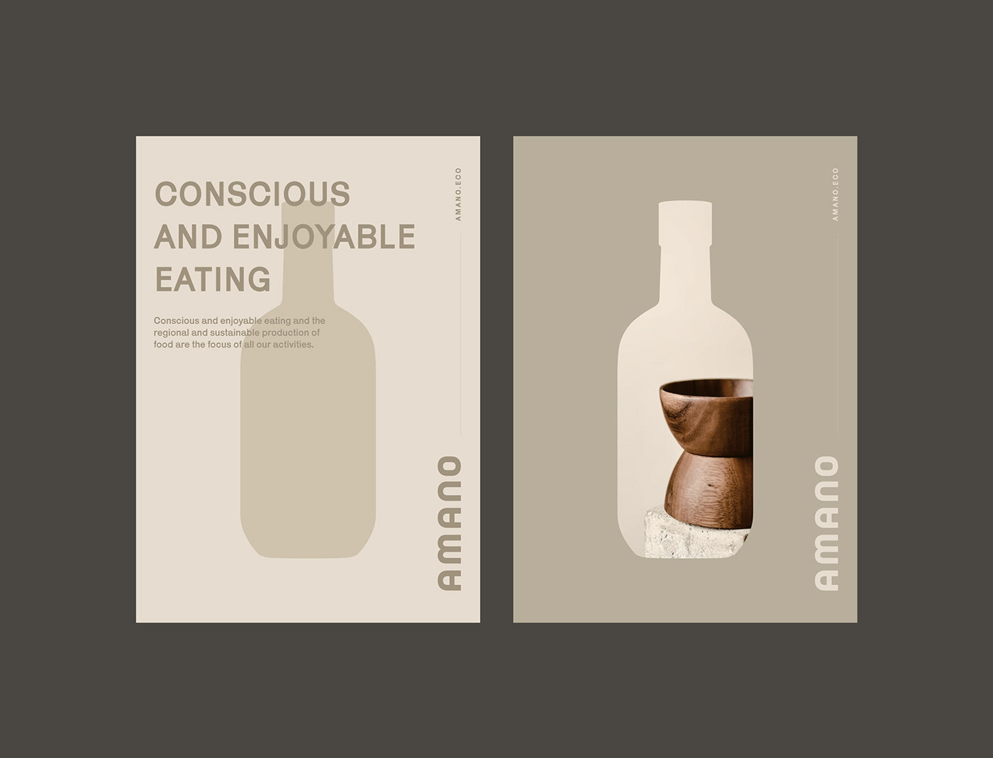
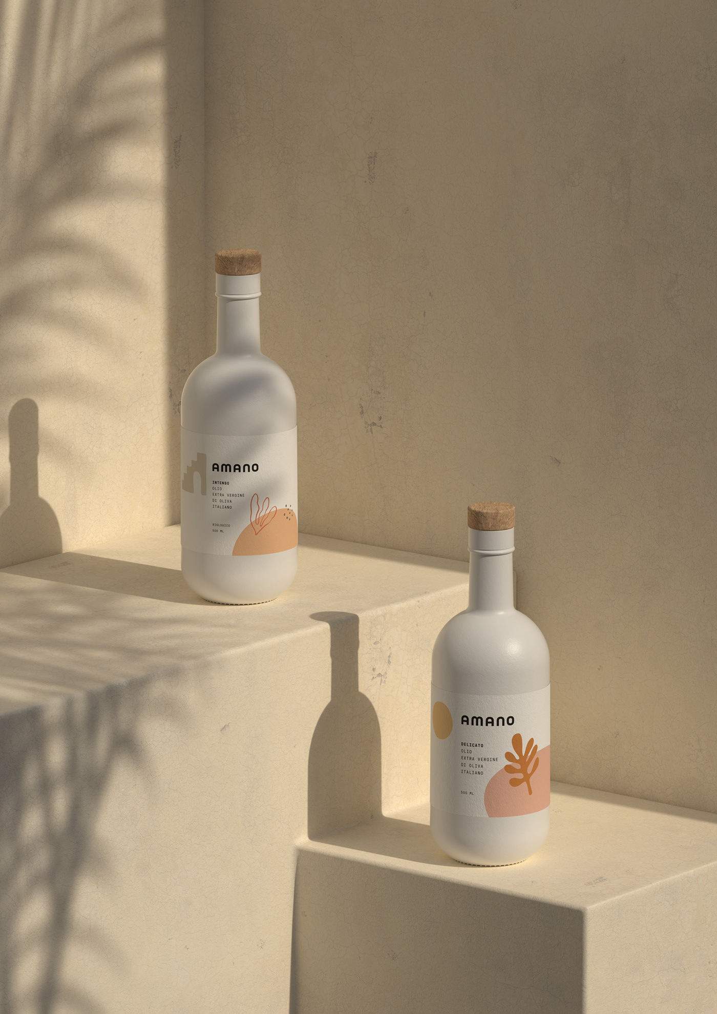
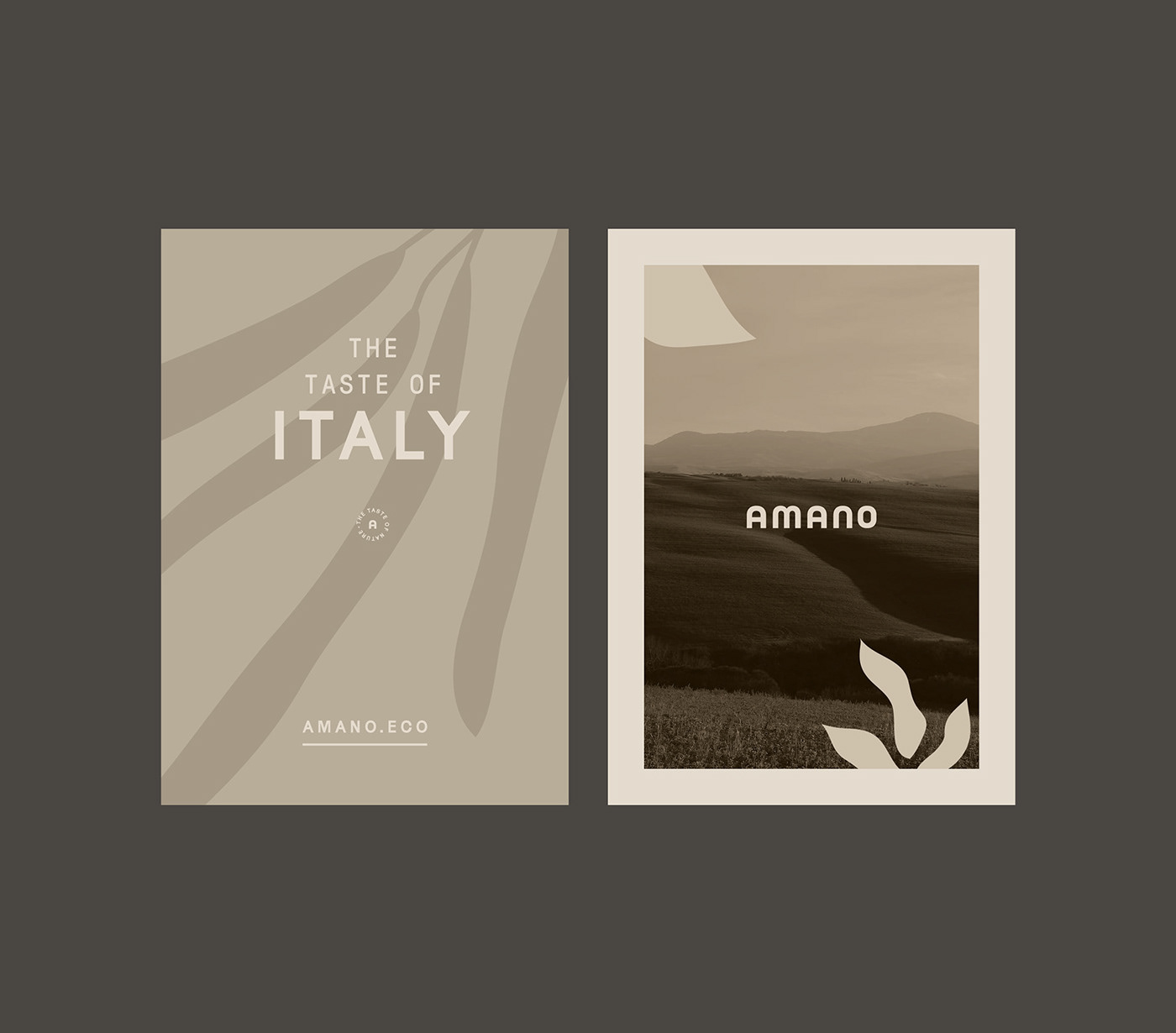
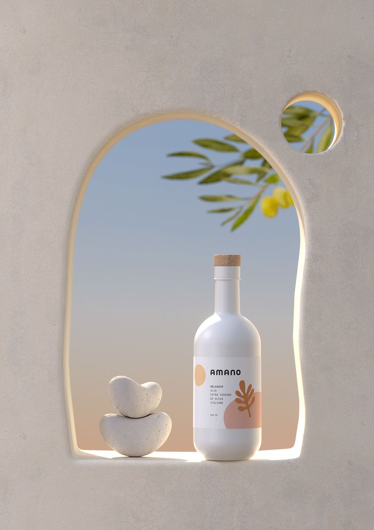
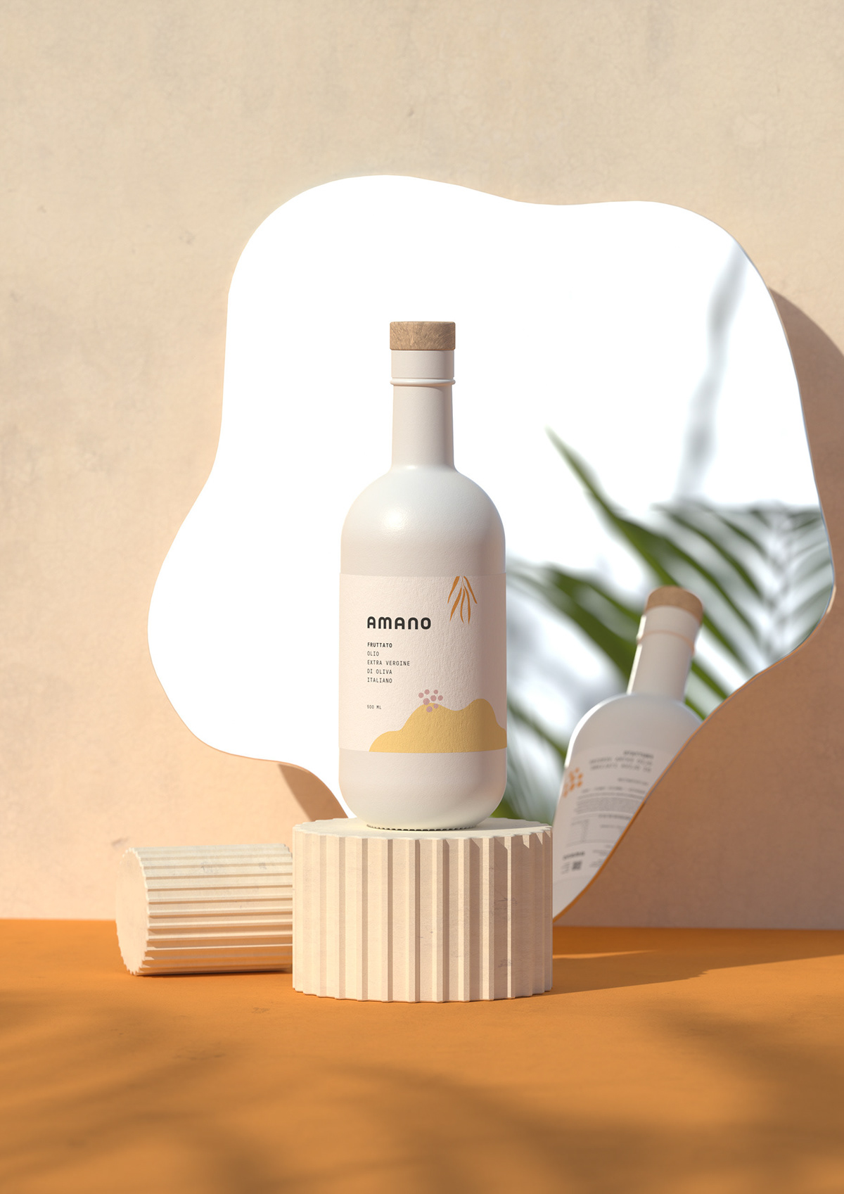
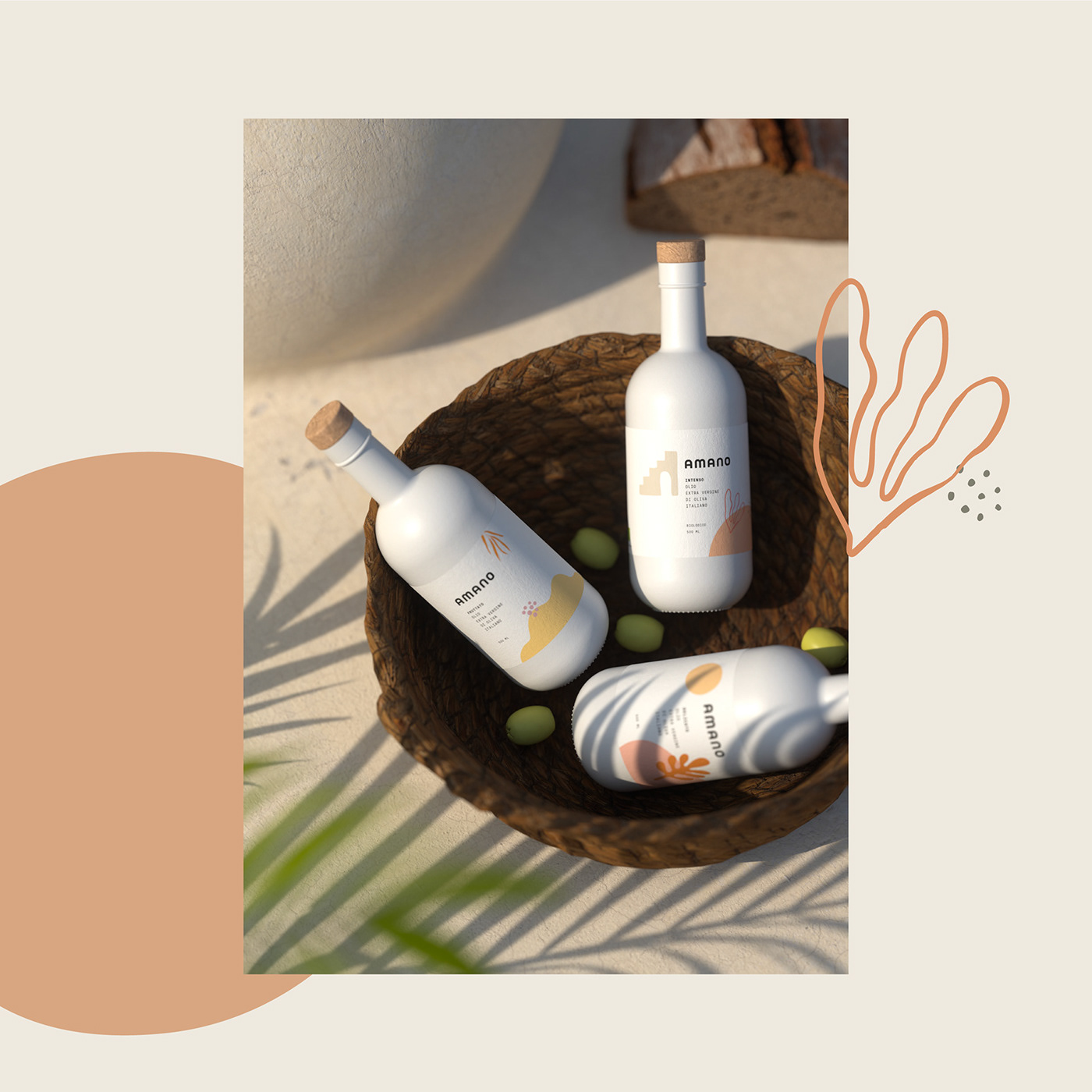
For the visual identity, we have created a bold and soft-edged logotype without an emblem. Our aim was to represent the care and love towards the nature of olive groves. For this reason, we selected pastel shades for the colour palette due to their softness and positive influence. The packaging was also kept simple, with different types of illustrated ingredient patterns on a white background label. White and transparent bottles and labels were chosen for their associations with clean intentions, purity, and efficiency.This way, packages look aesthetically sophisticated and have a chic energy. We have also created 3D stages and animations for the Amano product packaging.

Let's work together!
— Do you have a project? 📩 projects@markaworks.com
—
Visit our website to see all the project presentations.