

tarsty Brand Identity
Tarsty is a place where each person quench his/her various thirsts. It is a compound word of 'Tal; 脫' and 'thirsty', meaning 'quenching one’s thirst'. We aim to provide perfect environment for people visiting to have deeper conversation resolving each thirsts with a decent pairing of orange wine and small dining.


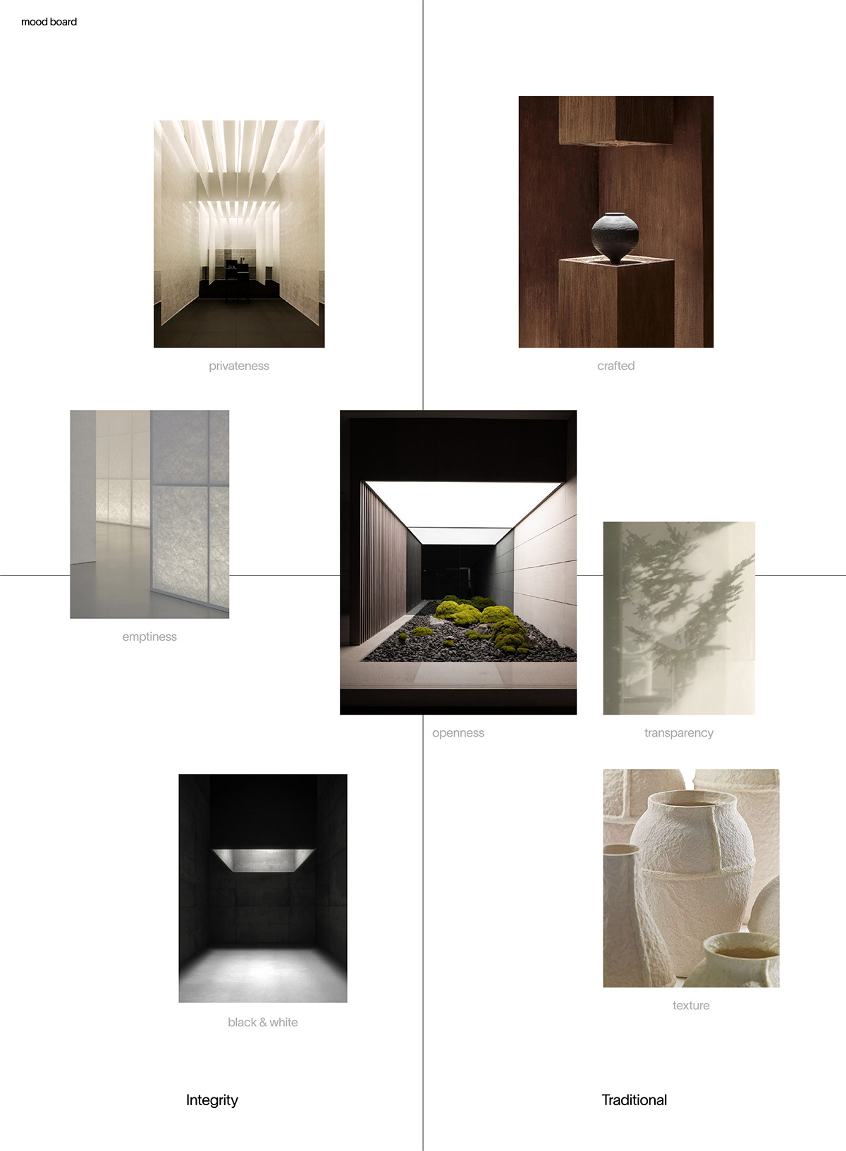
Tarsty's brand experience strategy is to help you explore your underlying thirsts, using void and transparency rather than fancy graphics at every interface you encounter. ‘Void and transparency’ as well as ‘black and white’ are as attractive and powerful as colors, and enable other things to become visible and reduce them to their essentials. In addition, we tried to subtly reveal the context of the Korean traditional architecture called "Hanok" and the context of providing natural wine that inherits the traditional method through texture and physical properties of every design we create.


Tarsty’s symbol and key visual represent traditional Hanok window fittings as motifs. The fittings, which exist only in the architectural style of Hanok, is an intriguing architectural element that controls people's relationships. Fittings become a wall to let us fully focus on conversation, and at the same time, it is also a connection to a new space. Likewise, everyone who visits 'tarsty' can find another self and face newness through conversation.


