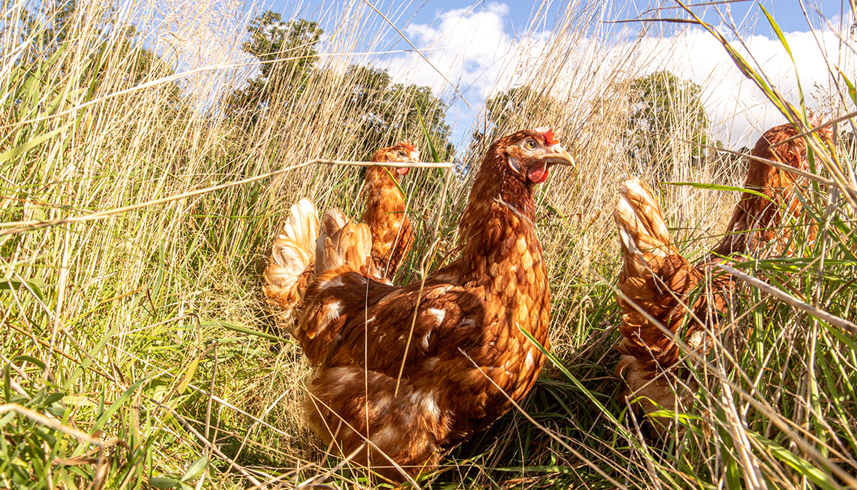
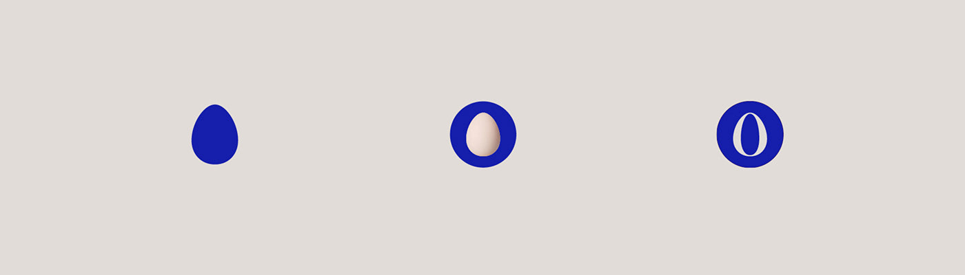
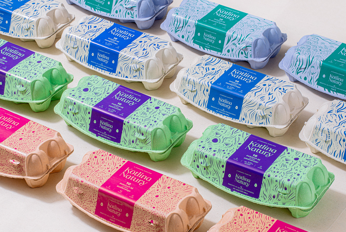
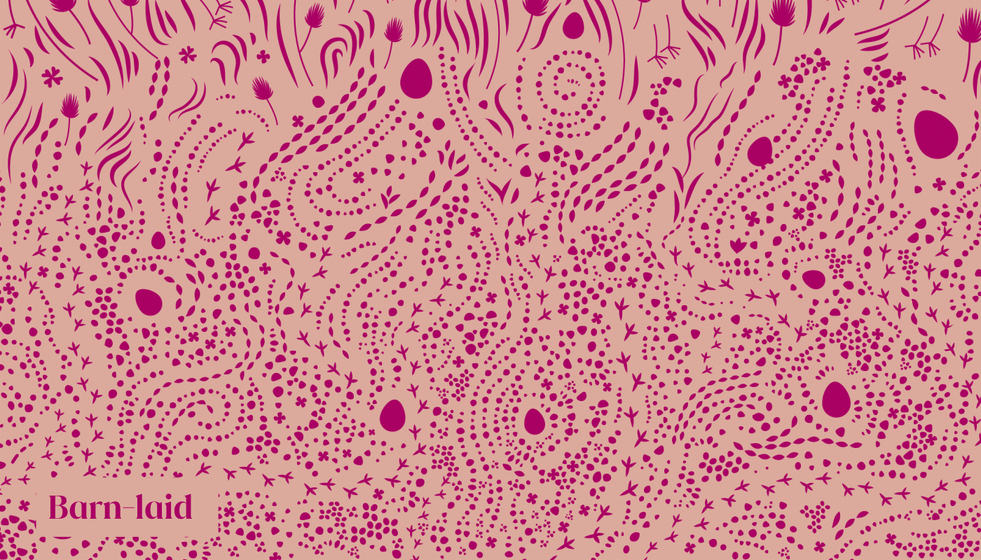
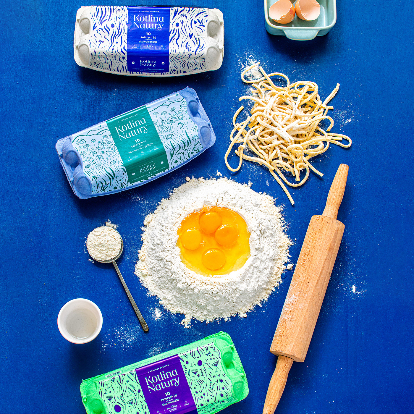
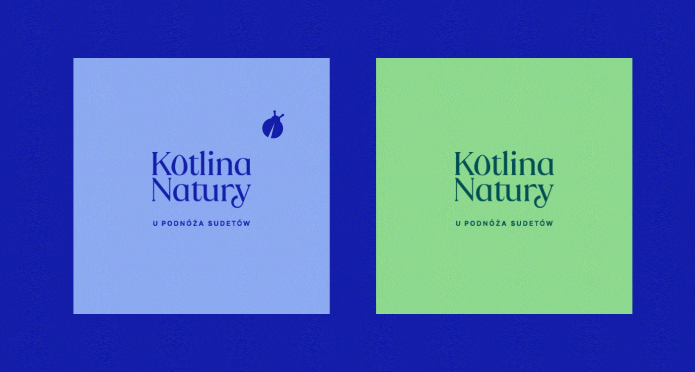
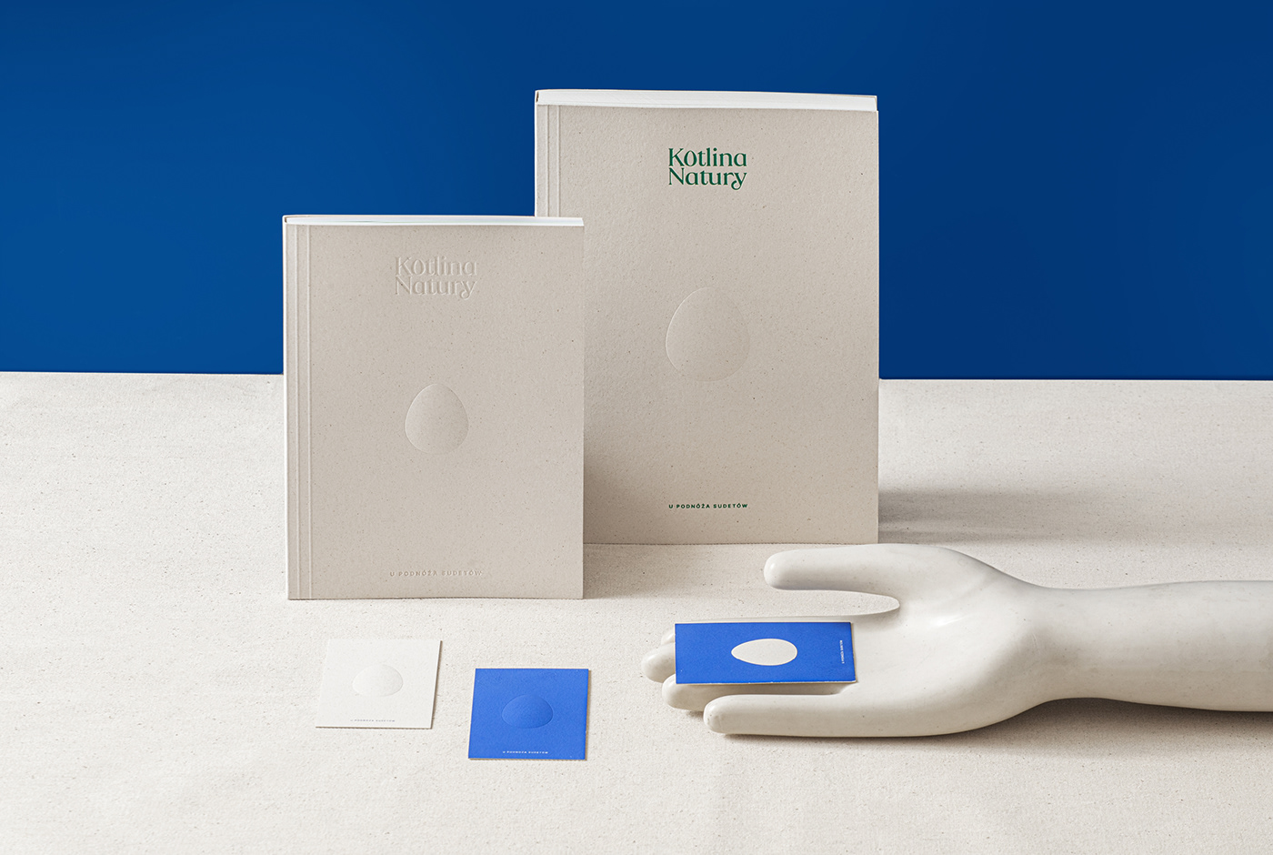
The brand identity invites the consumers to the Kotlina Natury home, to the meadow in the middle of the Sudetes mountains, showing the natural habitat of its heroines— the hens. The custom illustration of the meadow leads us through 4 levels of the valley—the level of grains and sand, the level of dense grass, the level of taller sprouts and their inhabitants, and finally, the level of tall stems, the tops of which reach the mountain landscapes. Each level of the illustration has been assigned to one of the 4 eggs categories. The illustration also features the protagonists: the hens and their traces, tails, beaks and full silhouettes and eggs—main logo symbol.
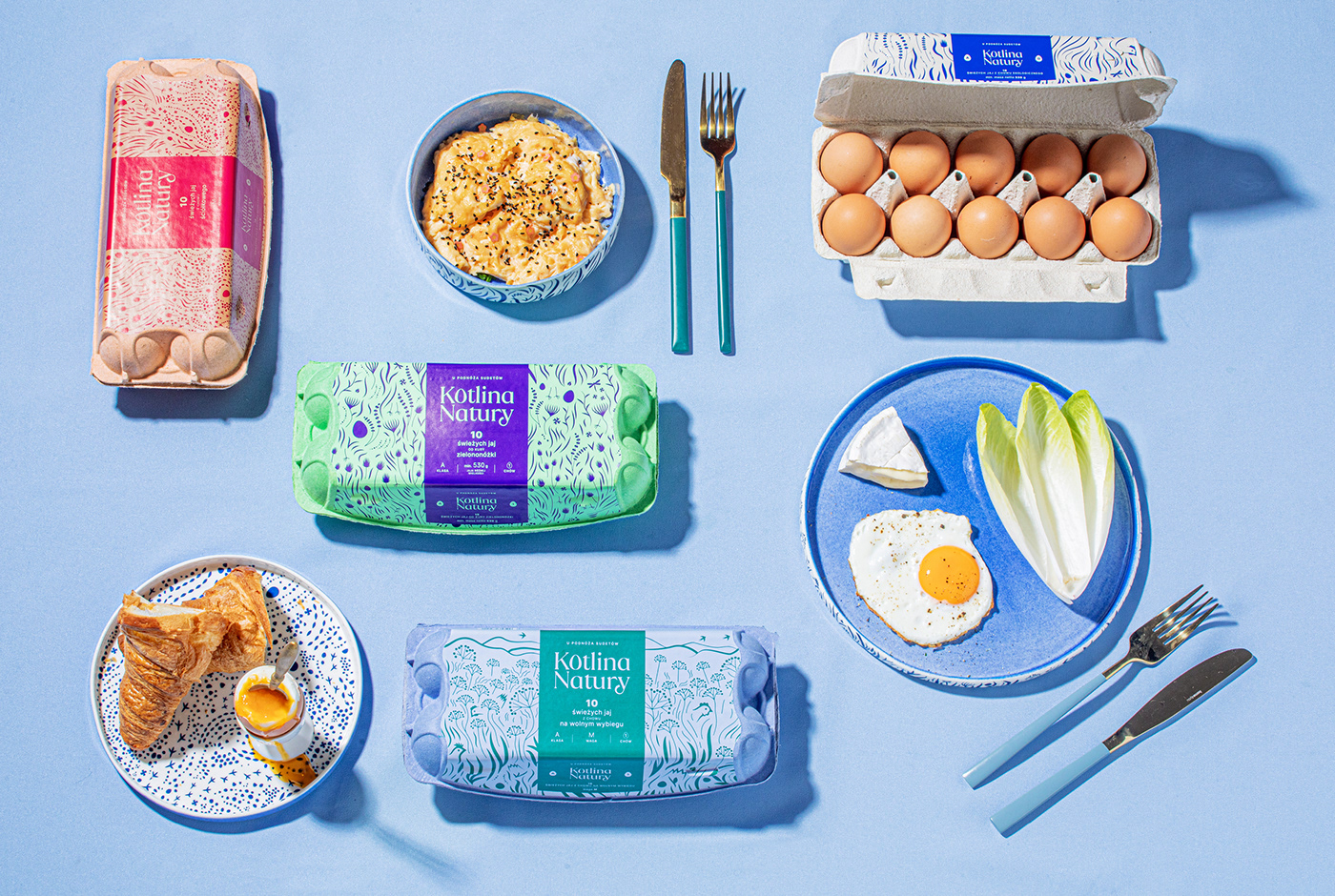
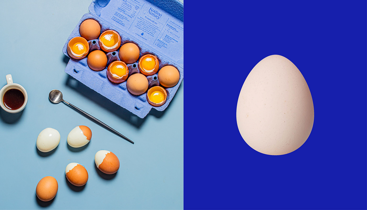
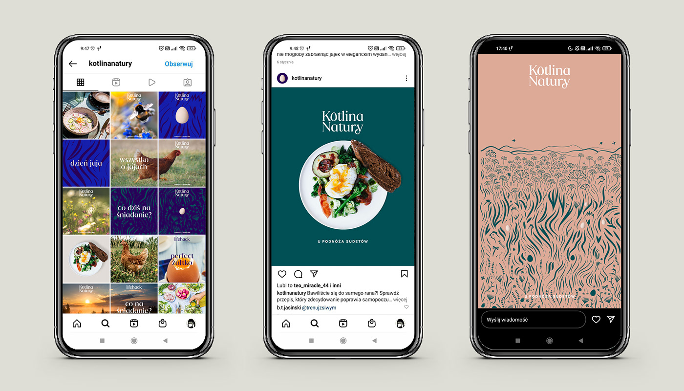
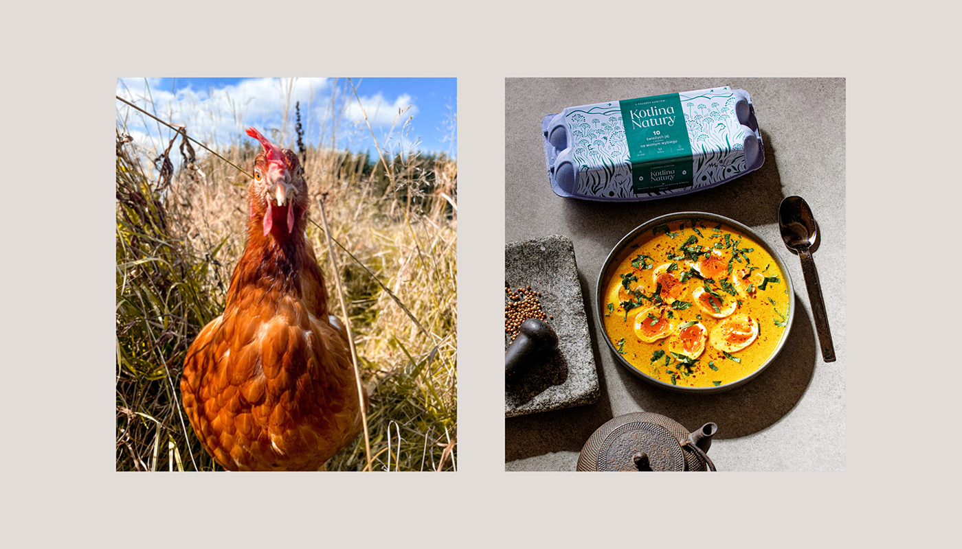
The illustration motives are background for the whole brand visual identity. We focused on a combination of a visually strong world of colors and vector illustration with blissful nature photographs and portraits of hens.The illustration serves as a creative background for various media—we use details, big pictures, and zoomed fragments, we move them.


Design & Art direction: Emilka Bojańczyk / Podpunkt
Illustrations: Emilka Bojańczyk, Zuza Charkiewicz / Podpunkt
Photos: Kotlina Natury / © Actiw Sp. z o.o.
Photos: Kotlina Natury / © Actiw Sp. z o.o.
Photographer: Krzysztof Kozanowski
Animations: Wojtek Waydel / Superskrypt, Zuza Charkiewicz / Podpunkt
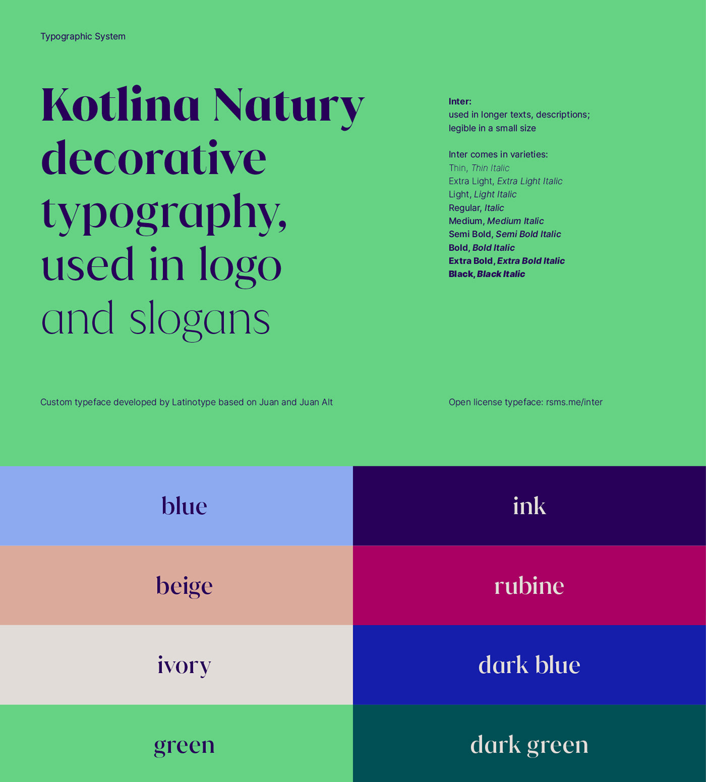
Semi Custom font & logo consultants: LatinoType
Animations: Wojtek Waydel / Superskrypt, Zuza Charkiewicz / Podpunkt
Semi Custom font & logo consultants: LatinoType
•
Visually strong and well made brands by
podpunkt.pl / superskrypt.pl