Plow Identity Design & Art Direction
Client - Plow
Concept, Design & Art Direction - Aashima Johri
Agency - Rasta & Ochre Revival
Concept, Design & Art Direction - Aashima Johri
Agency - Rasta & Ochre Revival


Wordmark
The font is a very powerful typeface. It resonates with the brand to exude a clean and strong personality.


Photography Mood & Art direction
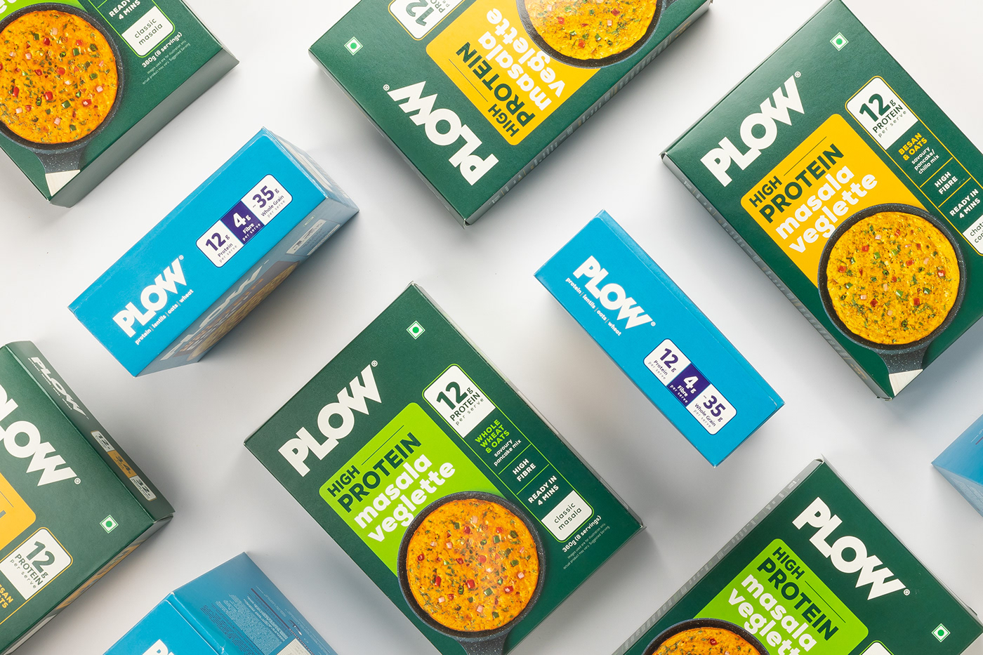
The goal was to bring Indian deliciousness to the forefront while assuring the audience that they will meet their protein requirements. Thus by playing around with the ingredients that Plow is comprised of, something the Desi audience is already familiar with. Poppy Yellow, Blue & Green was suggested in order to communicate the brand identity. Through these, a bridge between Plow and the desi inspirations behind it was created.


Film Art Direction
For the ad shoot, we let the founder and his inspiration towards creating Plow take centre stage. We addressed the problem statement directly - the lack of tasty, protein-rich breakfast options for vegetarians. The film stood as a reflection of the same idea.


