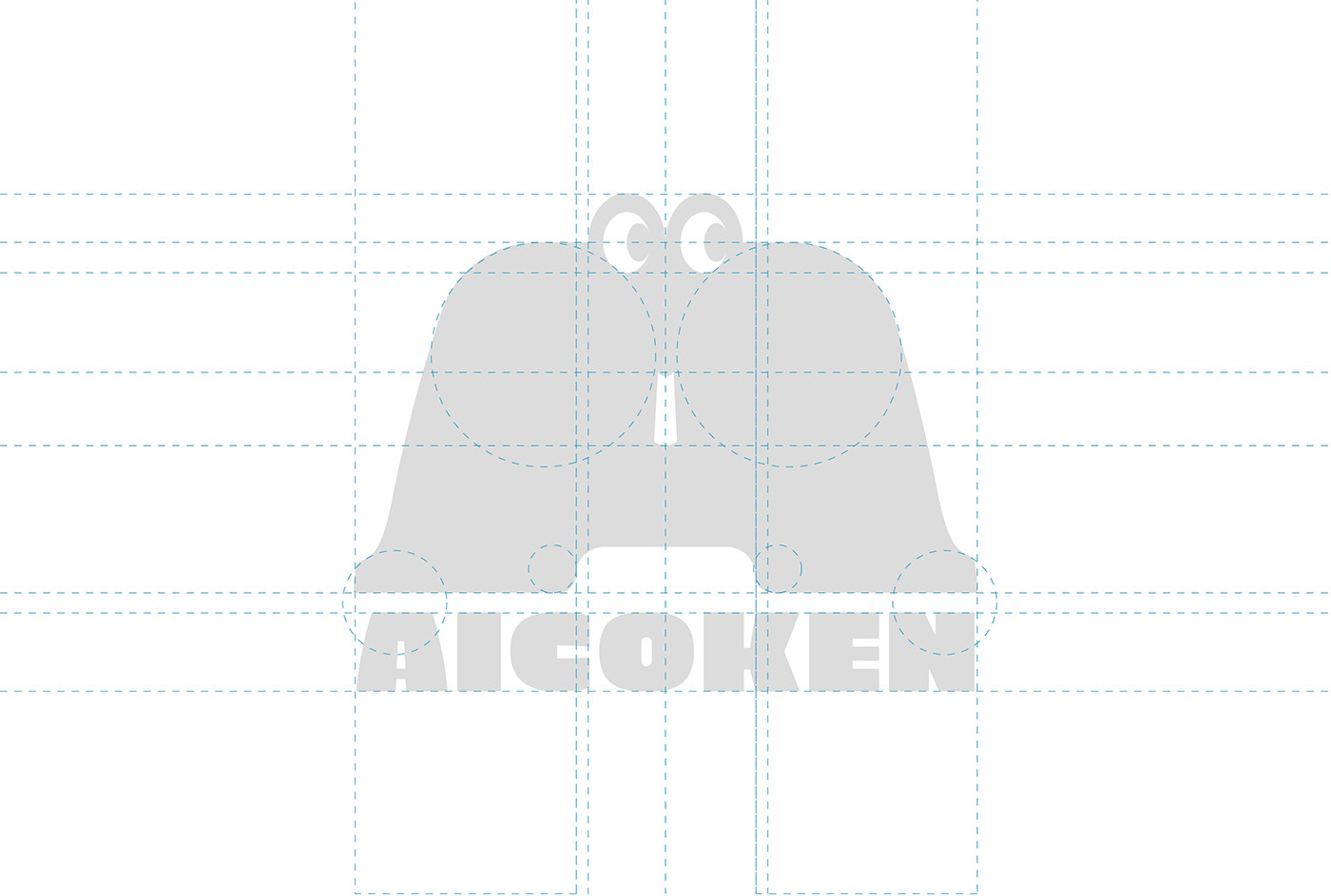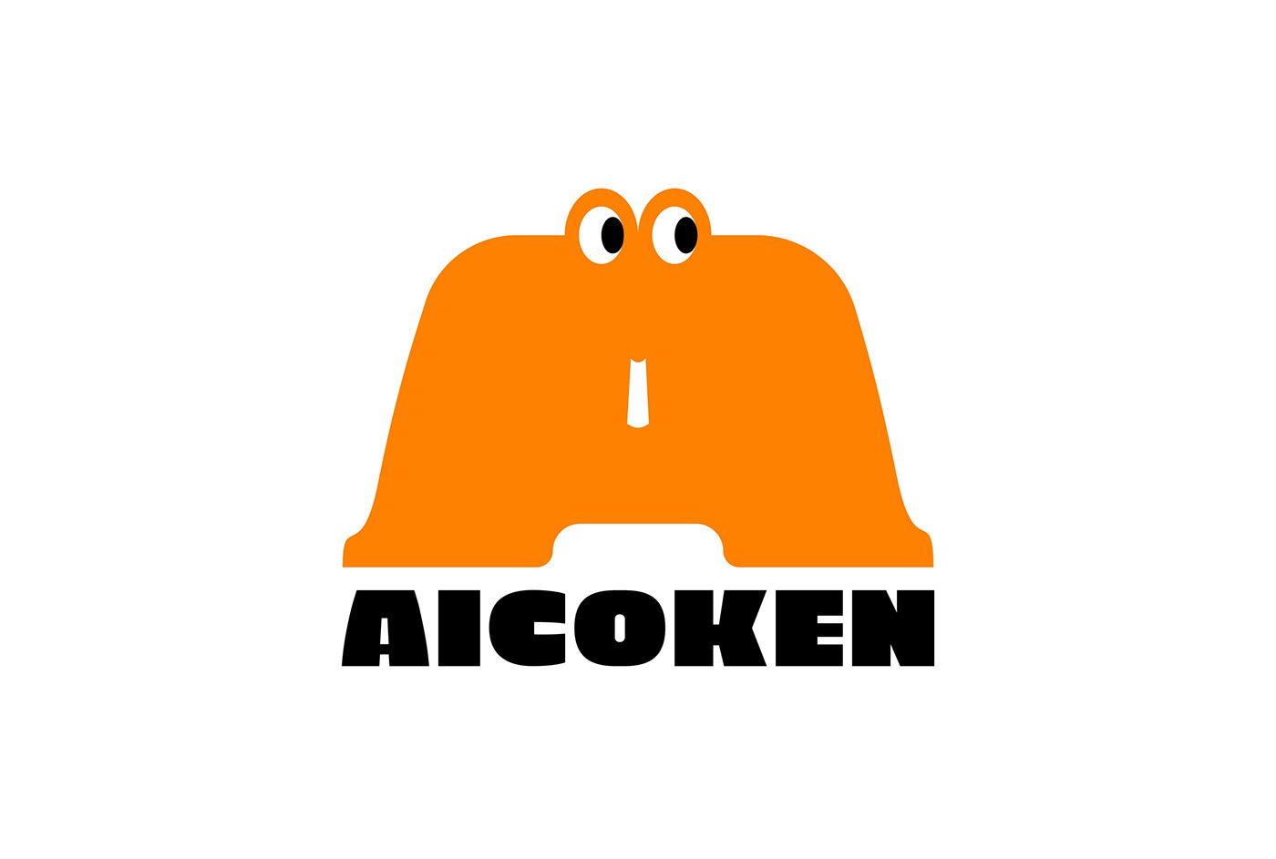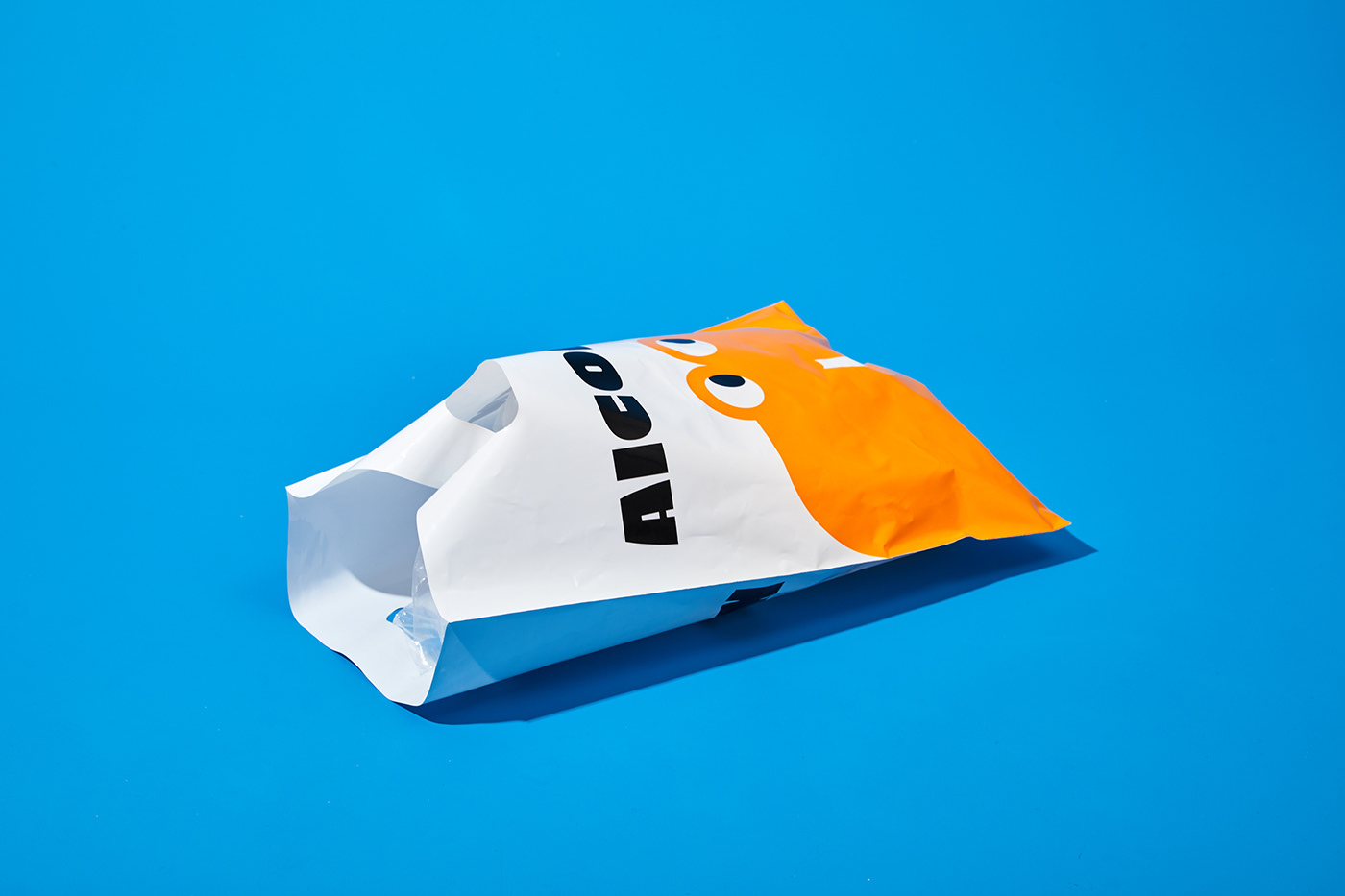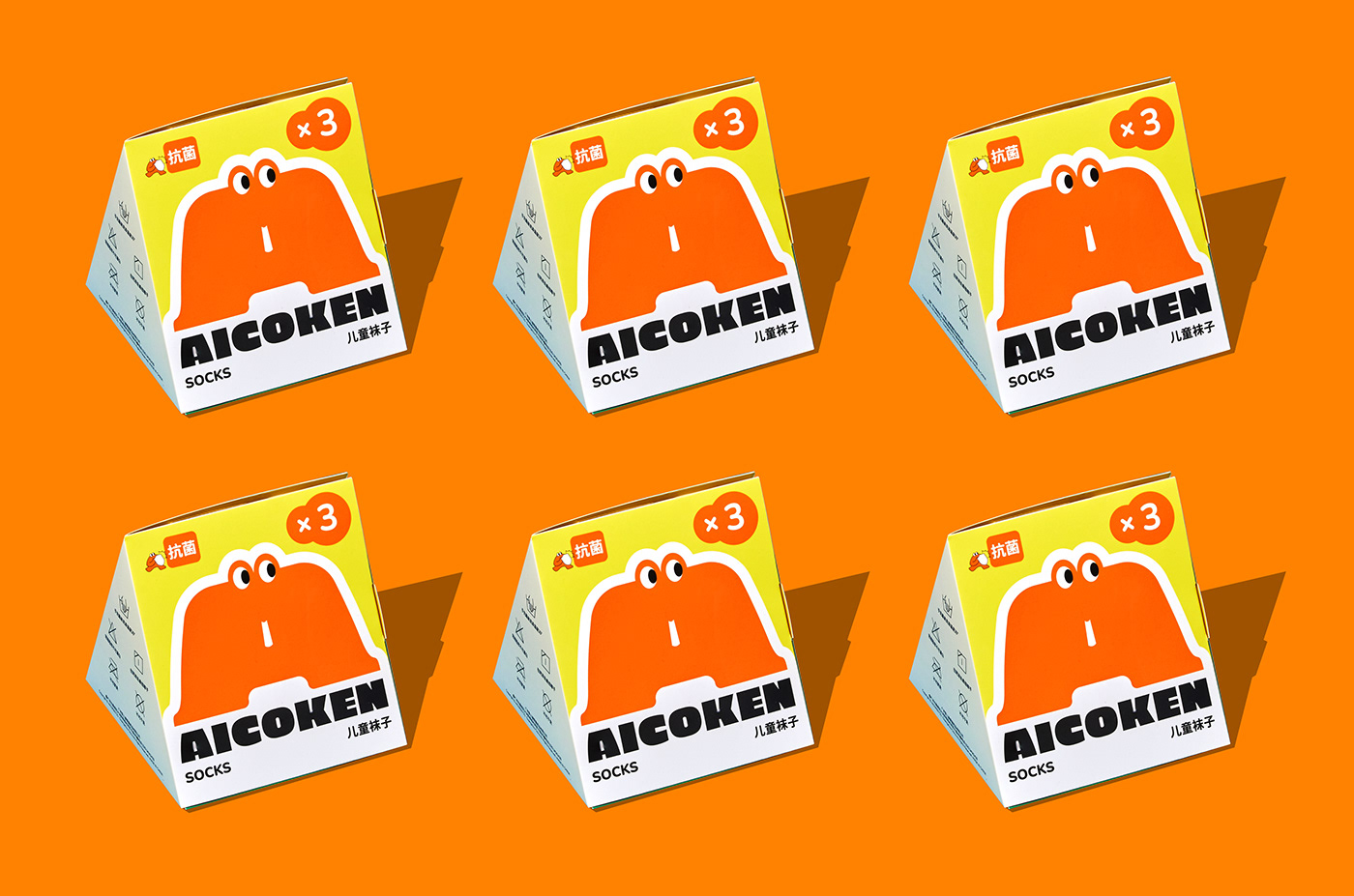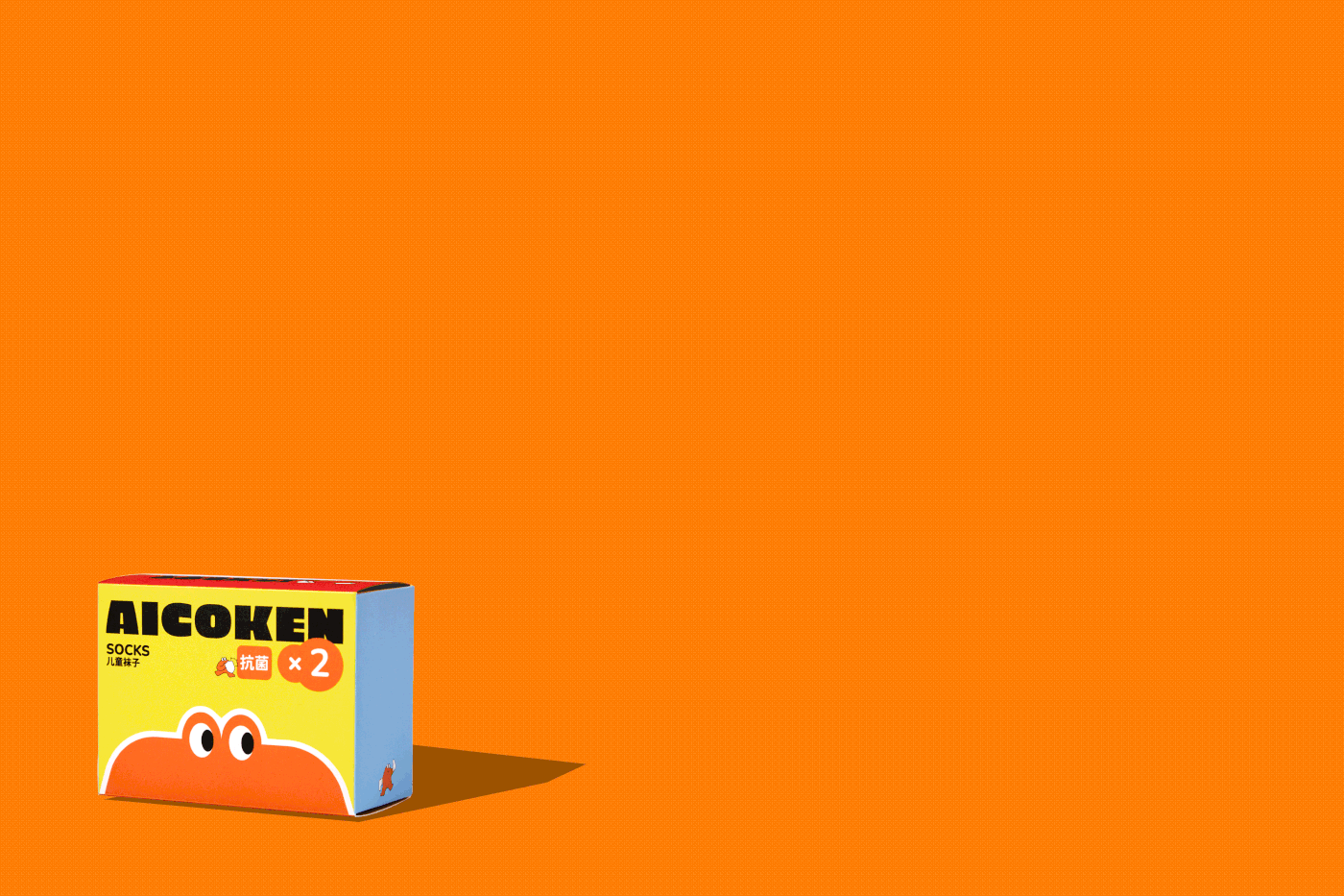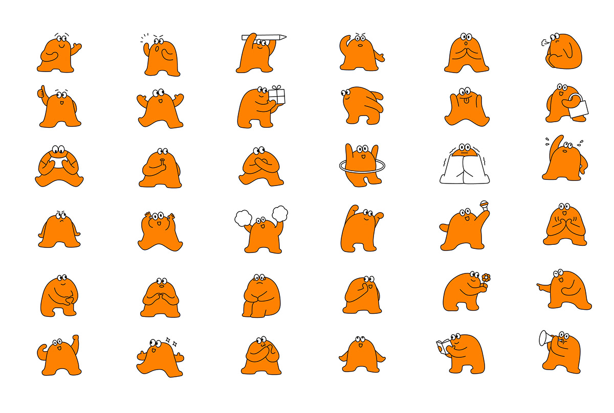

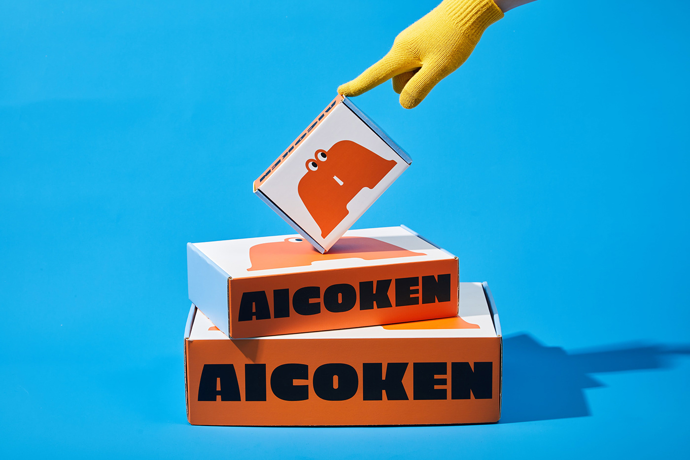
AICOKEN®️ Brand Identity Design
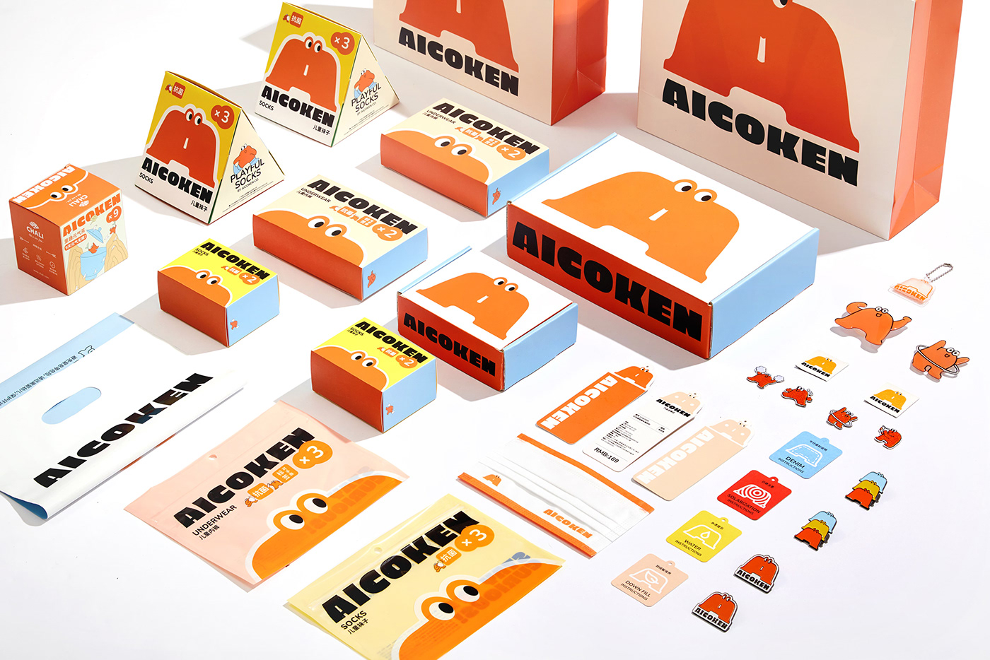
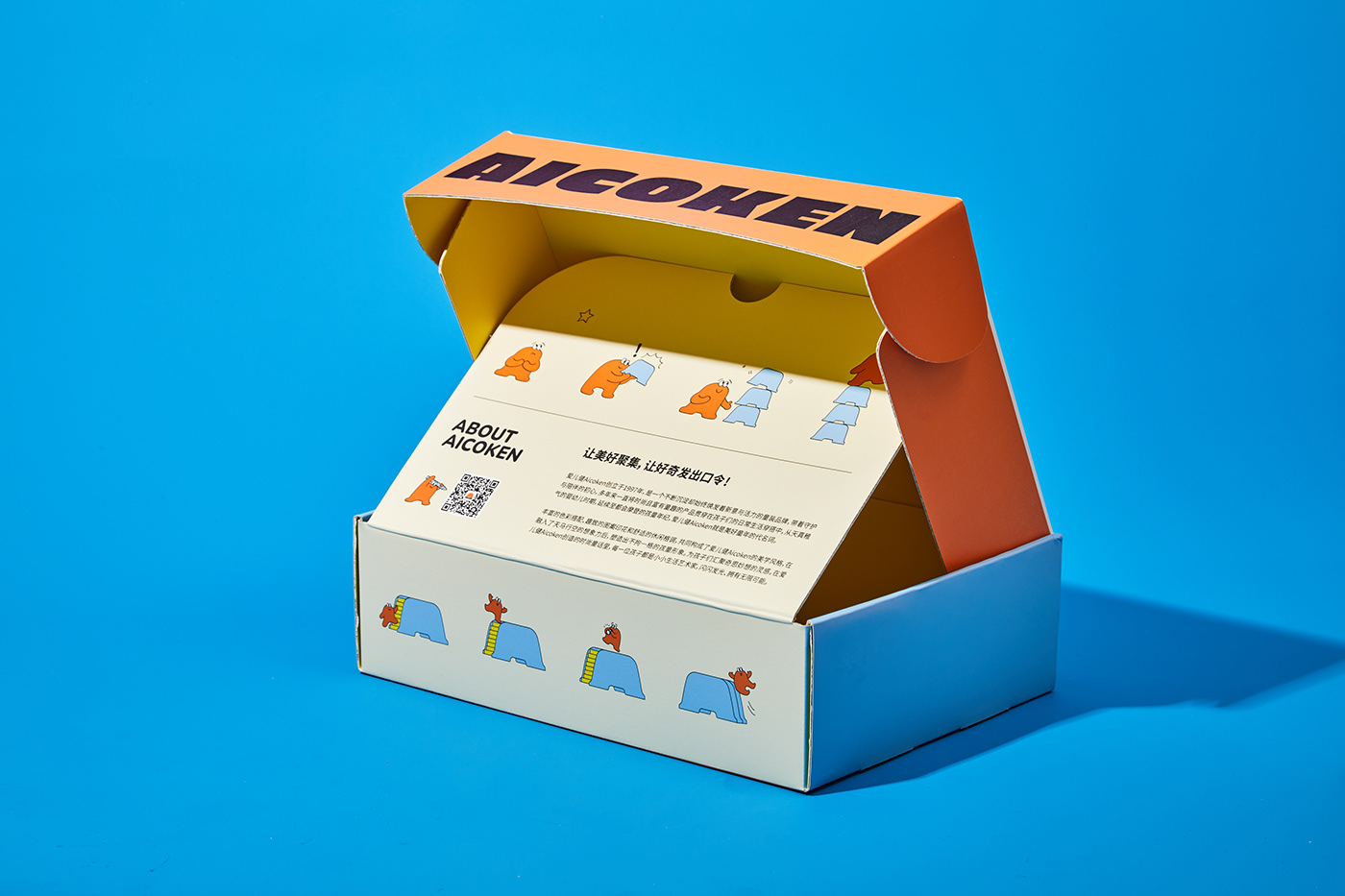
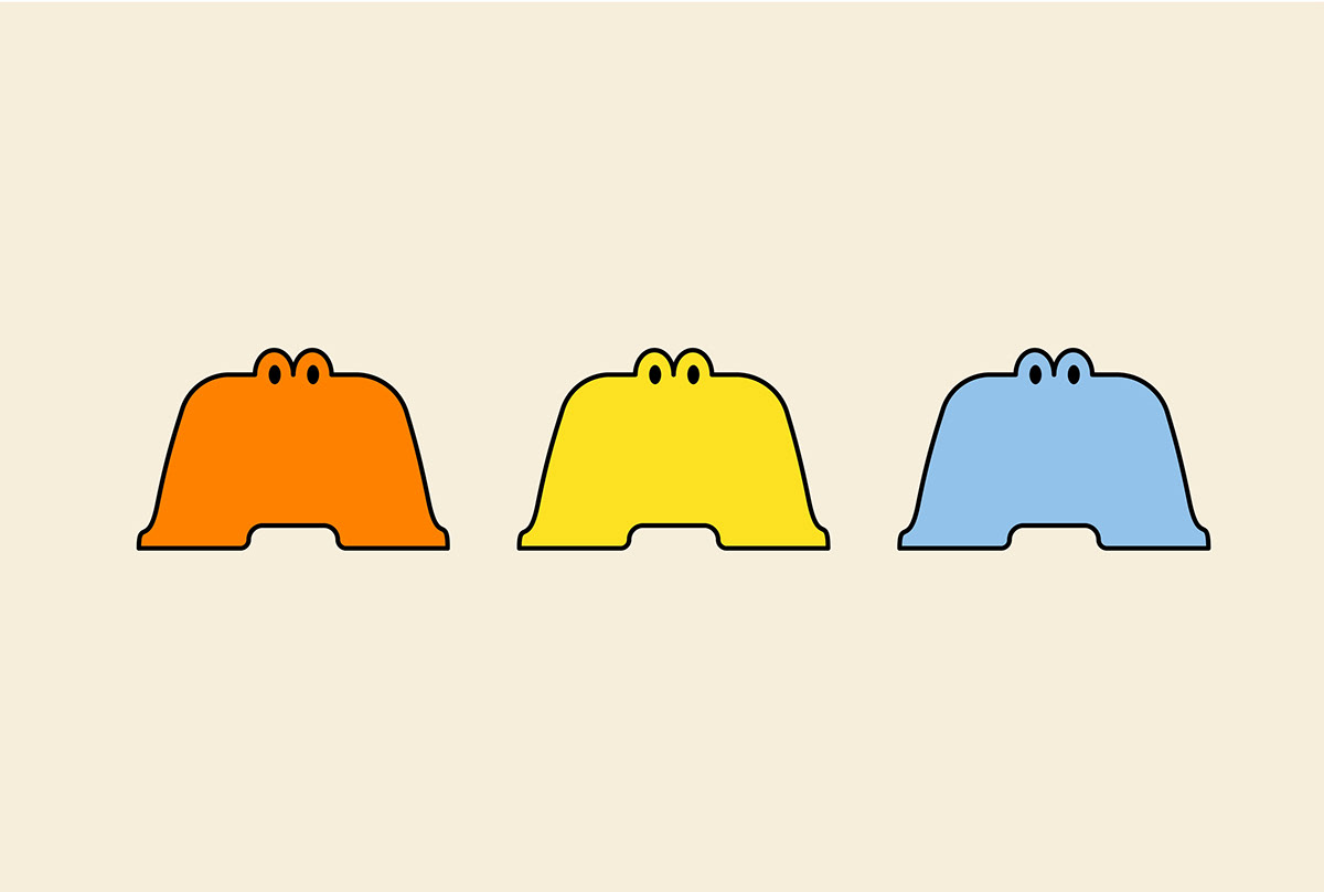
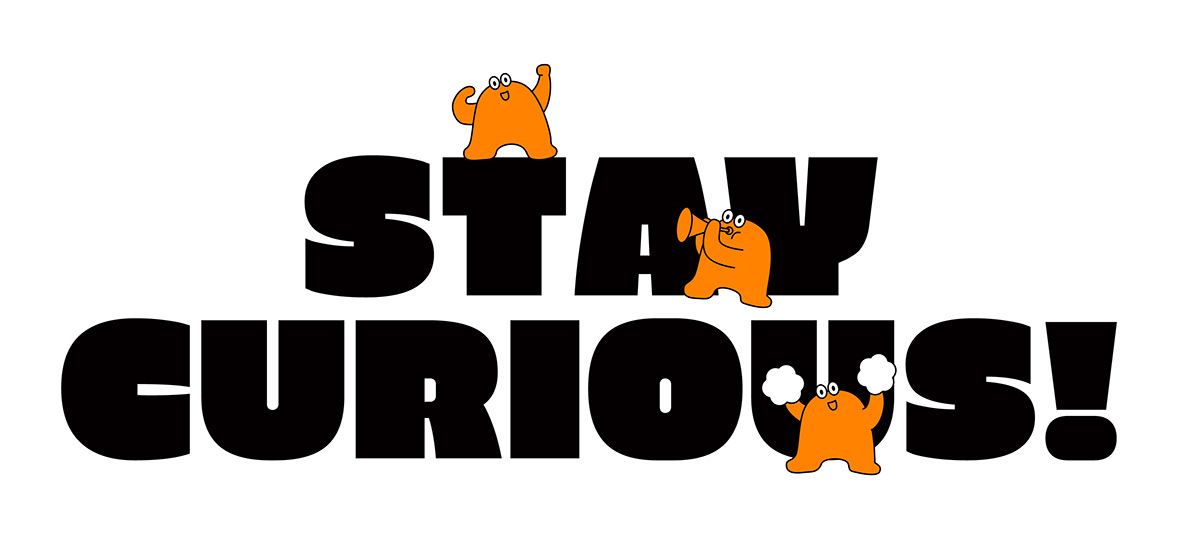
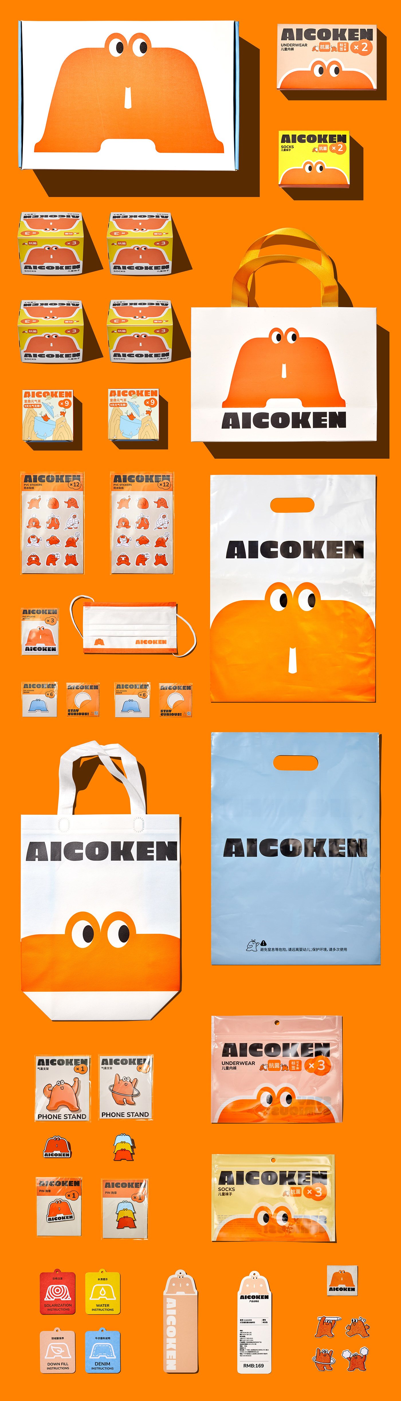
Started from the perspective of children, and with the childishness and innocence of a child, AICOKEN connects the distance between children and clothing by the fabric temperature. Inspired by "stay curious" and is based on the shape of a small bench, The brand design of AICOKEN symbolizes children standing on their tiptoes, growing and exploring with full of curiosity. We chose the A of AICOKEN as the prototype to create a cartoon image with a vibrant A silhouette. It looks friendly, bold, brave and energetic. We used it throughout the brand packaging, hoping to accompany children to experience the beauty of life together.
AICOKEN 爱儿健™ 以儿童的视角出发,带着孩童的稚气和天真,用布料的温度,连接着小朋友与服饰的距离。AICOKEN的品牌设计以“stay curious”为灵感,以小板凳的造型为基础,象征小朋友踮脚站立,成长探索,充满好奇心。我们选取AICOKEN的A为原型,创造出一个充满活力的A字轮廓的卡通形象。它看起来亲切,大胆,勇敢,充满活力。我们将它贯穿于品牌的包装里,希望可以陪伴小朋友一同体验生活中的美好。
Designed by ONNFF
Photo by DAZHI