Valesco rebrand
Valesco offers an array of consultancy services, helping Private Equity, Family Offices and Corporate M&A Functions increase their investment value by 10% on average through a targeted focus on Due Diligence and Post-Acquisition within Leadership, Team & Organization.
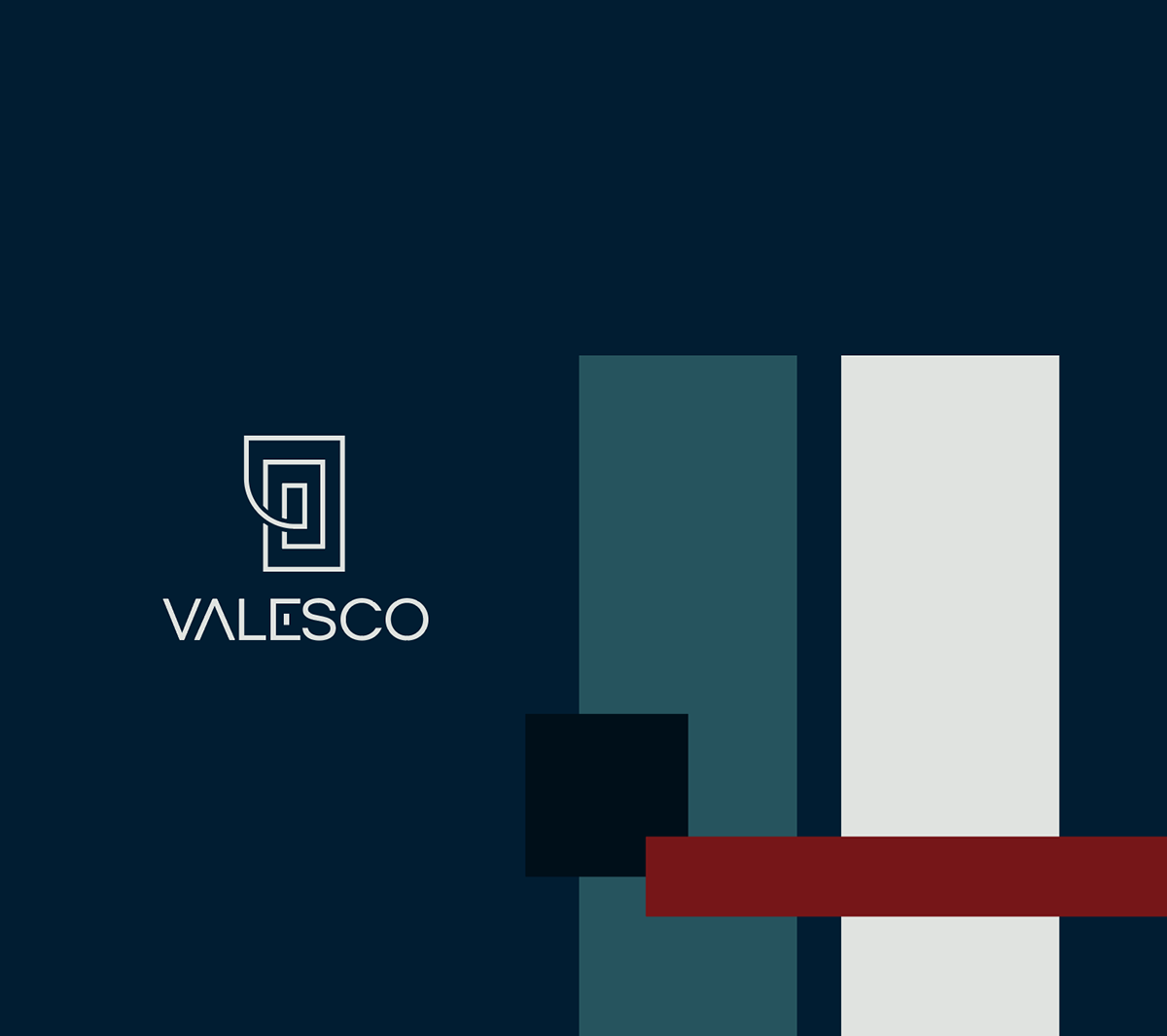
As Valesco outgrew their original branding, they came to me to update their look all-around to better align with the target audience's needs and expectations. We kept the red color in their previous branding as a hint to their roots, and paired it with deep, calm blue tones for a clean and professional yet approachable look.
The logo plays with combining classic shapes with a contemporary approach to type faces, giving the impression of a brand that's always been around while staying up-to-date. The combination of rounded and sharp corners seen in the logo is brought out into the design by giving the buttons one rounded corner each.