


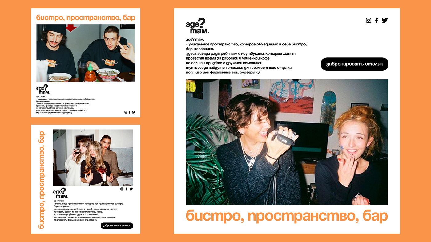
где? там.
- уникальное пространство, которое объединило в себе бистро, бар, коворкинг.
shmykova valerie and daria franco
данный проект является концептом. не имеет коммерческой основы.
this project is a concept. it has no commercial basis.
2023
Здесь всегда рады ребятам с ноутбуками, которые хотят провести время за работой и чашечкой кофе. Но если вы придёте с дружной компанией, тут всегда найдутся столики для совместного отдыха под пиво или фирменные вег. бургеры.
В философию заведения легло два главных принципа: комфорт и стиль. Именно это нужно было передать в айдентике.
В философию заведения легло два главных принципа: комфорт и стиль. Именно это нужно было передать в айдентике.
where? there.
- is a unique space that combines a bistro, a bar, and a co-working space.
Guys with laptops who want to spend time at work and a cup of coffee are always welcome here. But if you come here with a friendly company, you can always find a table for a joint rest with beer or special veg. burgers.
In the philosophy of the institution laid two main principles: comfort and style. That is what we needed to convey in our identity.
шмыкова валерия и дарья франко- is a unique space that combines a bistro, a bar, and a co-working space.
Guys with laptops who want to spend time at work and a cup of coffee are always welcome here. But if you come here with a friendly company, you can always find a table for a joint rest with beer or special veg. burgers.
In the philosophy of the institution laid two main principles: comfort and style. That is what we needed to convey in our identity.
shmykova valerie and daria franco
данный проект является концептом. не имеет коммерческой основы.
this project is a concept. it has no commercial basis.
2023


Были выбраны нейтральные цвета и акцентный ярко оранжевый, который передает атмосферу дружелюбности и открытости заведения. Визуальной метафорой айдентики была взята игра слов "где? там.", эта конструкция легко и пластично подстраивается под разные предложения. Было важно выбрать короткое, но запоминающееся название. Эта игра слов используется, как паттерн и может существовать в сокращенном виде до вопросительного знака и точки.
We chose neutral colors and accentuated with bright orange, which conveys the atmosphere of friendliness and openness of the place. Visual metaphor of identity was taken by a game of words "where? there.", this construction is easily and plastically adjusted to different sentences. It was important to choose a short but memorable name. This wordplay is used as a pattern and can exist in abbreviated form to a question mark and a dot.


Для того чтобы подчеркнуть характер заведения, помимо паттерна, графической основой айдентики было выбрано управление текстом. Мы выбрали мягкий гротеск, который хорошо встроился в айдентику и масштабируется на все носители. В качестве вариантов расширения стиля, представлены варианты с дополнительной графической составляющей - градиенты.
In order to emphasize the character of the institution, in addition to the pattern, text management was chosen as the graphic basis of the identity. We chose a soft grotesque that built well into the identity and scaled to all mediums. As options for extending the style, presented options with an additional graphic component - gradients.


showreel
↓
Thank you for watching ! ☆*: .。. o(≧▽≦)o .。.:*☆
valerie:
tg for communication
follow me on ig
and my tg channel
данный проект является концептом. не имеет коммерческой основы.
this project is a concept. it has no commercial basis.
2023
follow me on ig
and my tg channel
daria:
данный проект является концептом. не имеет коммерческой основы.
this project is a concept. it has no commercial basis.
2023


