


Brand Experience Design
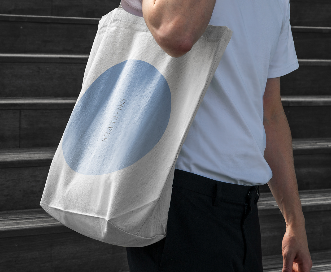
Onfleek's dictionary meaning is American slang, which means cool, perfect. The branding meaning was intended to have a wonderful and perfect experience on-fleek. The logo is wordmark type in text form, and it is designed with the intention of appealing the brand clearly by maximizing simplicity with minimal design.We designed the logo, main visual, color, typeface, and image with a sense of unity and on-fleek's unique identity.
Core visuals are the most powerful design elements that convey the brand's identity by contacting users. The main visual is the sound of communication with people from the space in the cafe. I was able to express it positively from the "pretty, wonderful" adjective meaning of Onfleek.

By referring to illustrations related to Japanese-style cafes that fit the atmosphere of Onfleek, we put a lot of emphasis on composition and style. After a lot of trial and error, I was able to make it simple and with a feeling

Issue and Goal
The project's core objectives are simple and intuitive. The menus are made to stand out without being buried. But I designed it to match in harmony. The brand includes the feeling of coffee, people who drink coffee together, time, and comfortable experience.
Concept
Onfleek was inspired by coffee crema, sky, and earth. It embodies a certain visual image that is static and calm. The warm color of coffee and dessert bread and the sky space are in harmony. It created a unique atmosphere of Onfleek in contrasting colors, the earth separated from the sky.
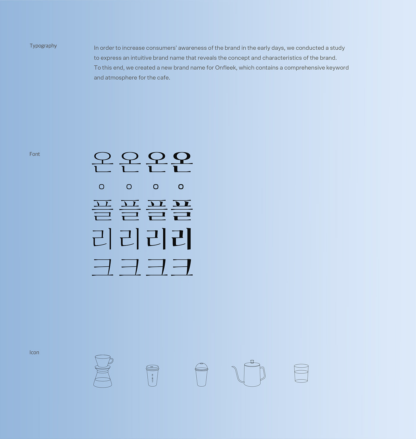
Typography
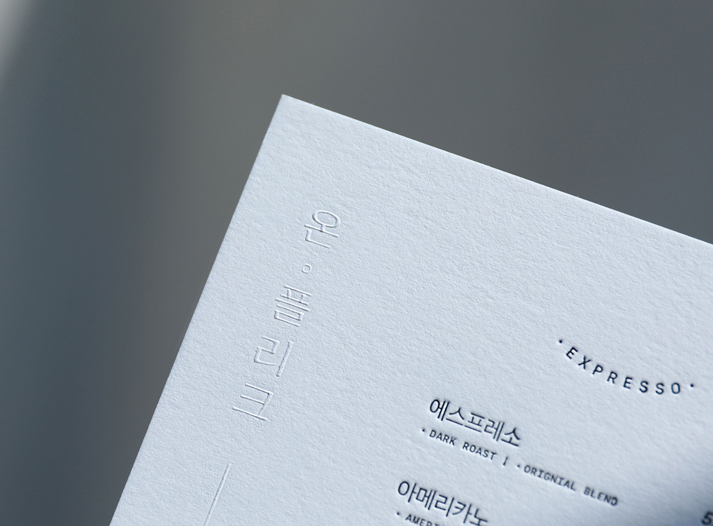
Onfleek’s Korean typeface uses 310 Masil which is a font that expresses elegance with less expression compared to the stroke. The characteristic is that it has an eight-step letter family and has a low stroke ratio of 10 to the thickest 80, which is basically a horizontal font, but can be used vertically.
And it effectively delivers the unique comfort of Onfleek and a special relaxing atmosphere. In addition, Engiish typeface uses Saol Display / Ogg which is the serif font was chosen so that the feeling of the font and the attractiveness of the brand experience could be seen in English fonts as much as possible without any sense of unity.


We wanted to complete this brand with a visual identity idea. Therefore, we designed it to give you a chance to drink coffee in a space with many interrelationships. Through Onfleek's coffee beans and coffee tampers, we were able to express the visual elements, and we were able to show that it was a professional brand.


-
Brand Experience Design
Onfleek's brand design evolves the atmosphere of normal life that can convey a simple and relaxed sense.We usually actively utilize visual concepts and records of time. It conveys a brand image and uses a neat typography system to see general life and understated monotone colors that operate continuously at all points of contact.
-
Direction
Creative Director Seongmin Lee
BX Designer Daseul Kim
BX Designer Minjin Choi
We inform you that it was produced by purchasing the copyright license for the font 210 Masil.
폰트 210마실에 대한 저작권 라이센스를 정식 구매하여 제작되었음을 알려 드립니다.
ⓒ2023 Direction Design Studio


