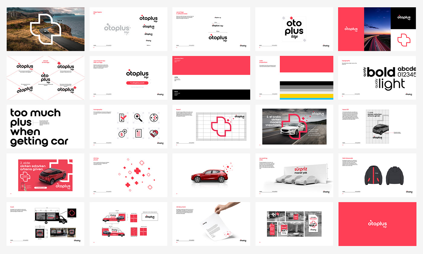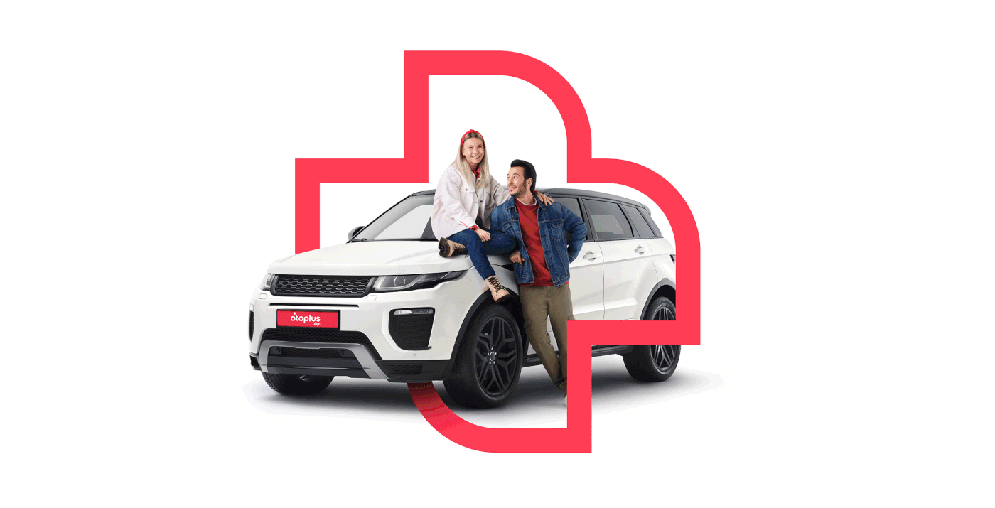

amblem
We designed the Plus emblem to look characteristic and show itself bold. In addition to living together with the logotype, we can also use it alone with strokes or filled with color.

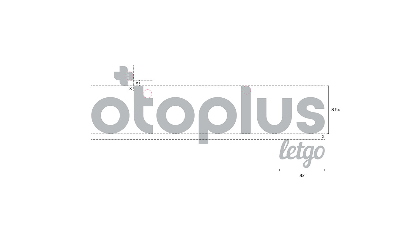
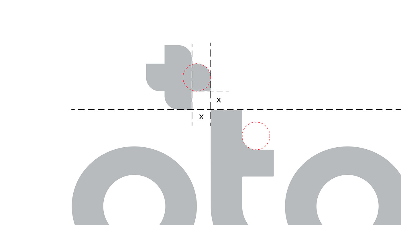
technical structure of the logo
We moved the X height, which started from the Plus emblem, to the overall logotype. We matched the radiuses on the Plus emblem with the radiuses on the logotype.
We kept it 5X wide, which corresponds to the width of the letter “S” on Letgo.
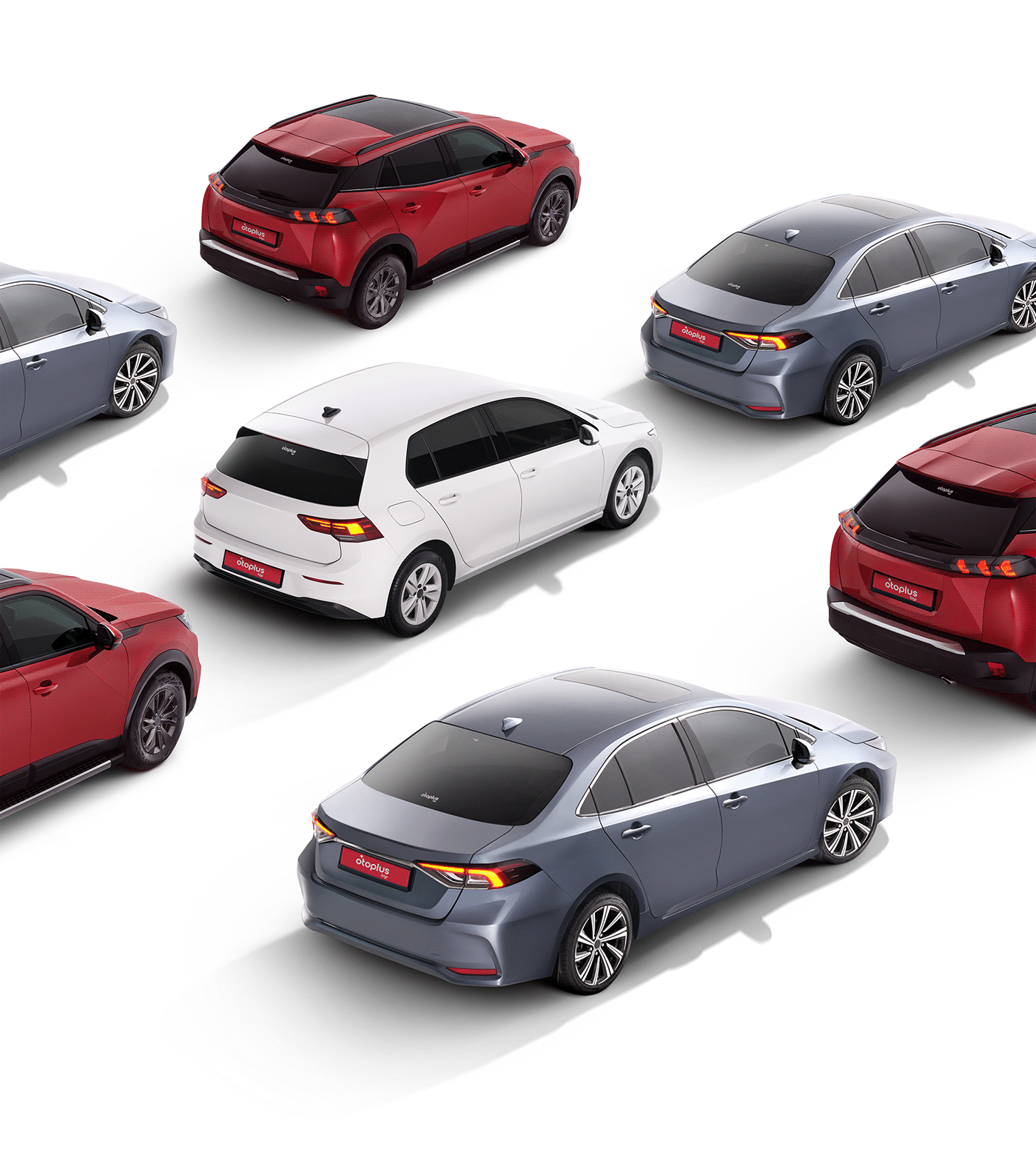


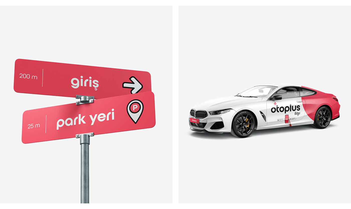
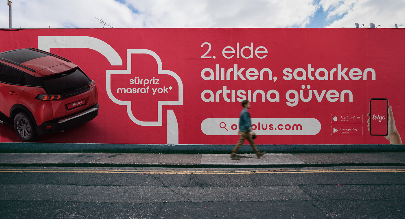
car parking area
We use typography in two colors, red and black on the white walls. In case that the wall is in red, we use typography and logo in white. Fonts should be big and bold. In areas where cars are parked in front of it, we position the texts above the cars.


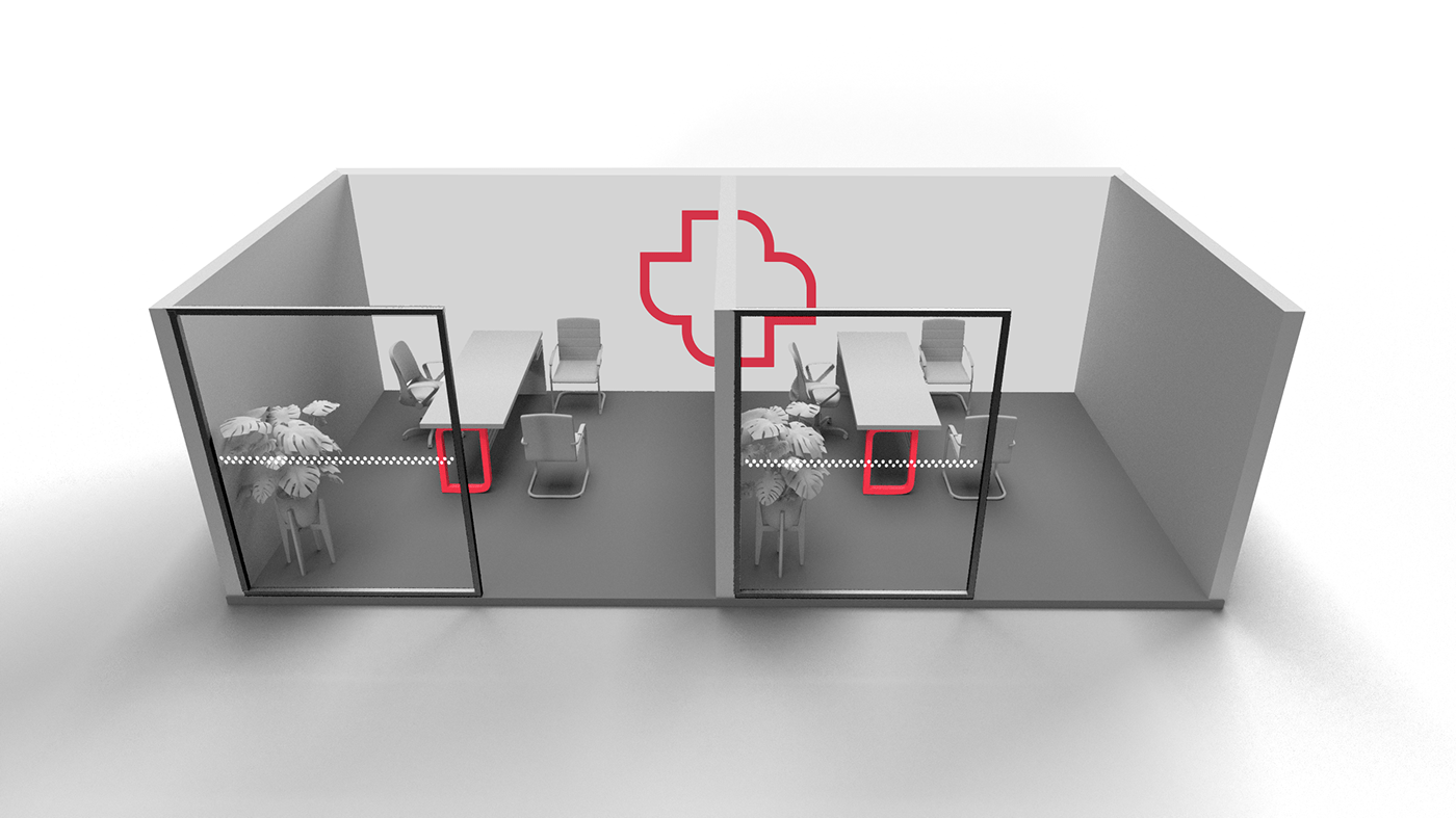
selling&buying center designs
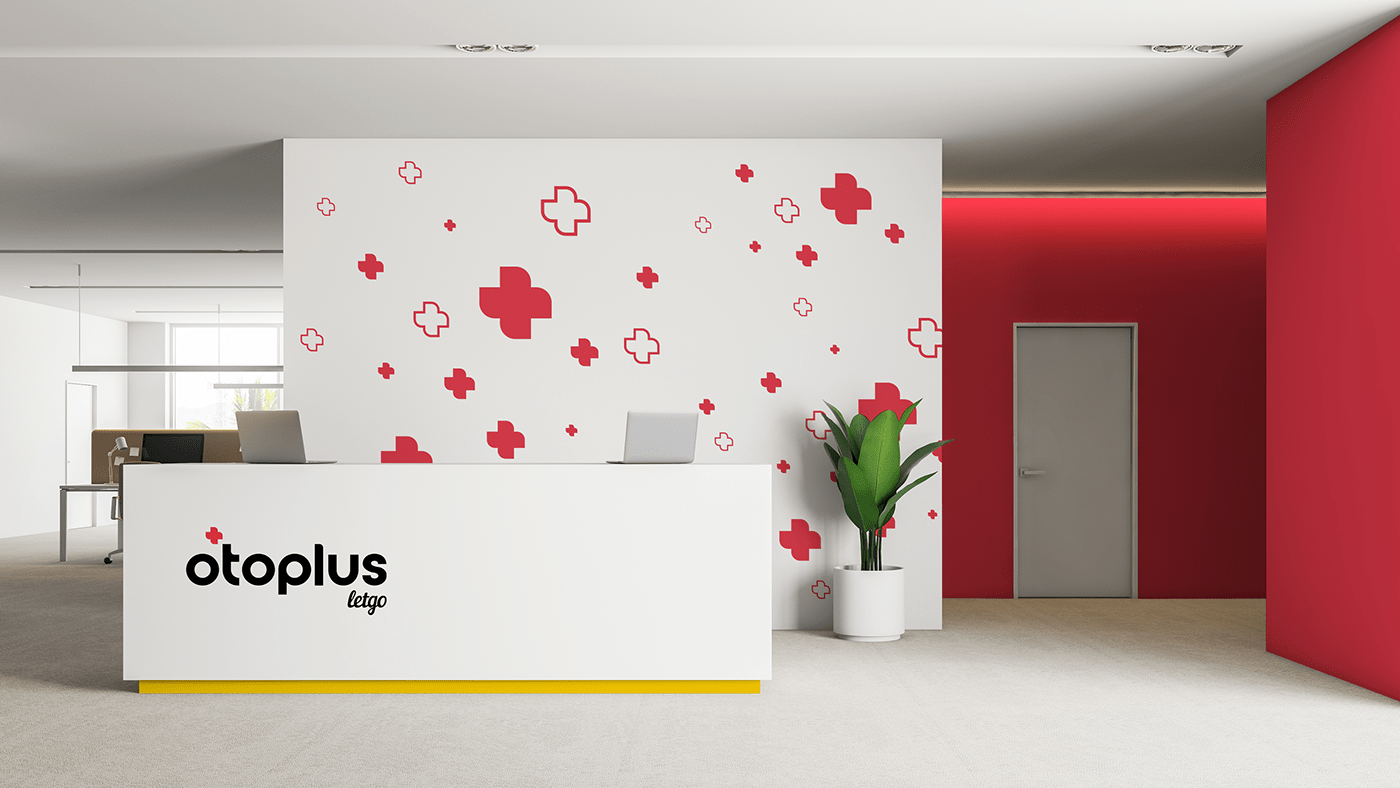
We design the wall across the entrance as white with a cut plus sign on it. The rest of the walls are gray. We place tall and green plants to decorate our rooms.

kioks
For 3D kiosk which we design to display in shopping malls, we apply our logo and slogan on the center. Kiosk also has plus-shaped seating areas for our visitors. We design our website call to action as a cut-out and place it in front of the stand.