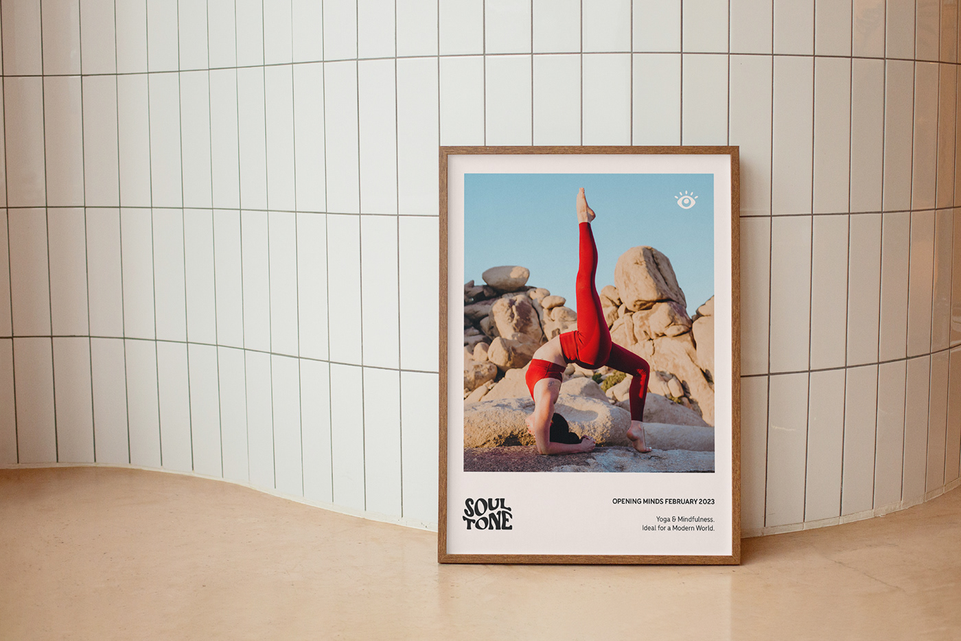
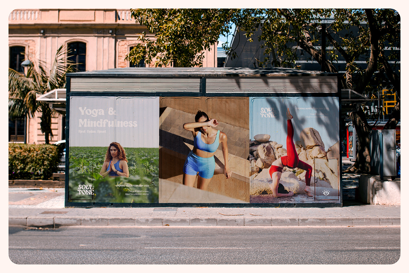
Soul Tone - Yoga & Mindfulness
Brief:
Soul Tone is a multifaceted wellness studio located in Brisbane, Australia. Using a modernised and scientific approach to Ayurvedic healing, the studio aims to improve body, mind and spirit through yoga, psychology and meditation. They require modern branding suitable for health professionals, though with a warm, playful feel.
Solution:
Rest. Relax. Reset. The secret to a happy life is a delicate balance of mental and physical wellbeing. Our teachers are with you every step of the way on a journey to a better you. Welcome to Soul Tone.
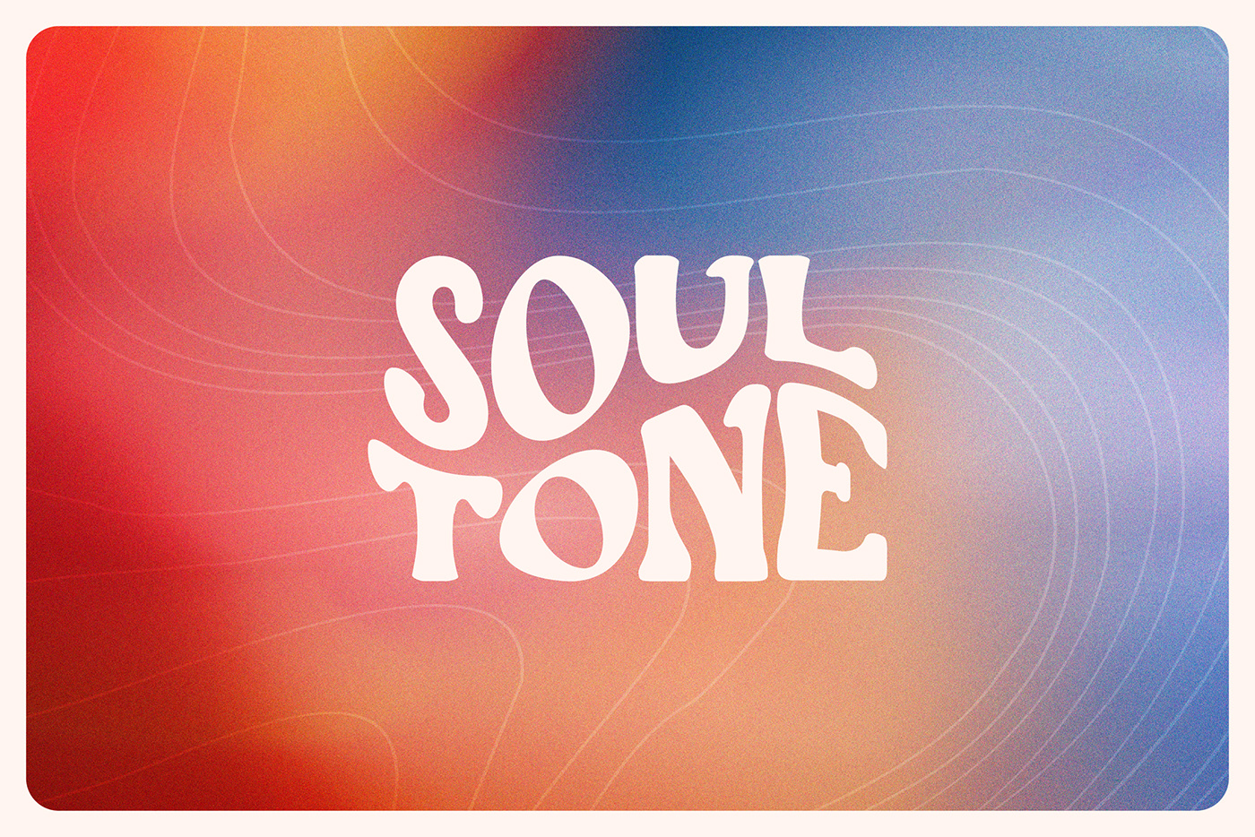
Soul Tone uses an interchangeable logo suite, reflective of dynamic yoga poses and a mental flow state. The modern black and off-white combo balances out the colourful gradients used elsewhere in the branding, while being more inviting and appealing than a clinical black and white. Hand-drawn linework patterns have also been created to reflect the waves of vibrational energy that give Soul Tone its name.
Soul Tone uses an interchangeable logo suite, reflective of dynamic yoga poses and a mental flow state. The modern black and off-white combo balances out the colourful gradients used elsewhere in the branding, while being more inviting and appealing than a clinical black and white. Hand-drawn linework patterns have also been created to reflect the waves of vibrational energy that give Soul Tone its name.
Logo Design / Brand Identity
Client Work - 2023


Typography:
Using a soft, rounded font pairing is important in establishing Soul Tone’s calm and relaxing mood. Beagris is used for titling and display purposes. With its 70’s influence and handmade feel, it adds a distinctly human element to the brand. The Menco suite provides a practical grounding to the font pairing, matching the rounded look while being more legible and usable as body copy.

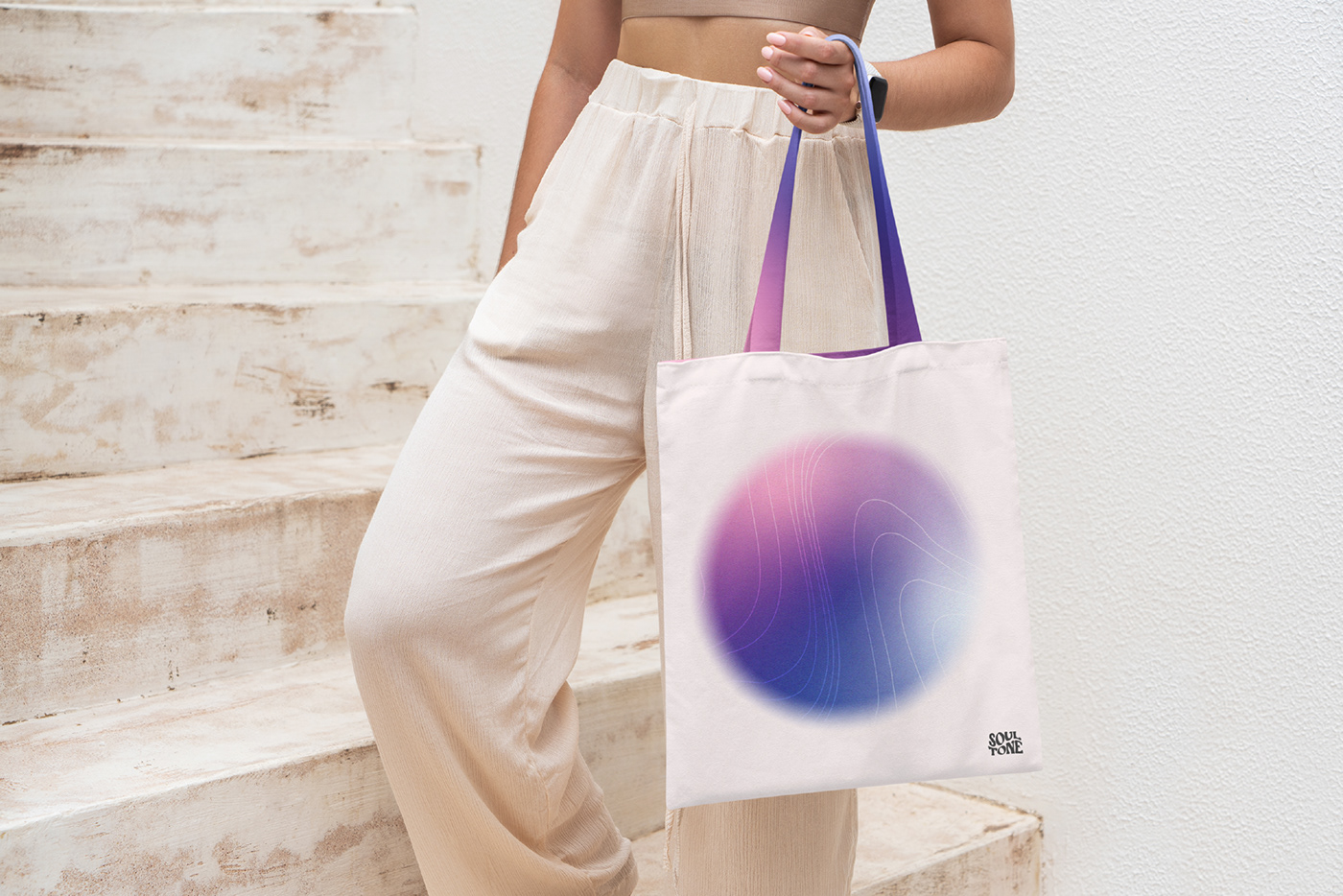
Gradients:
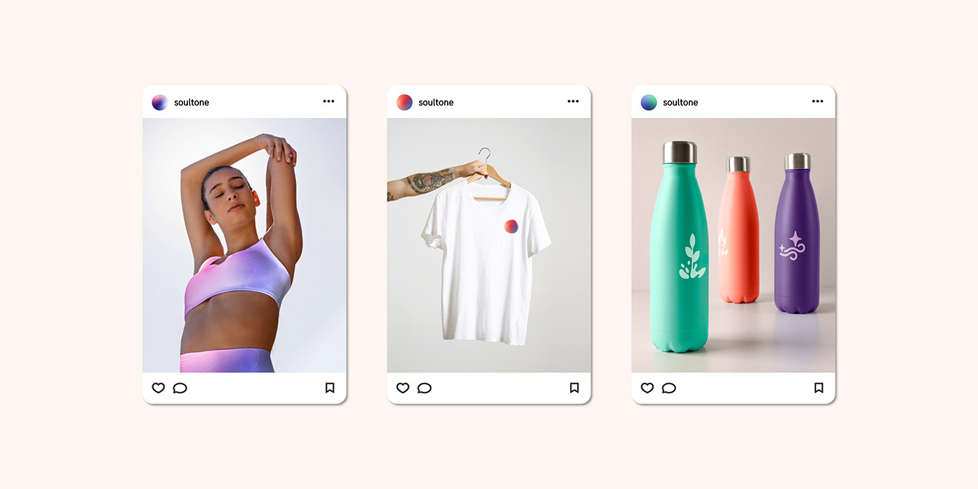
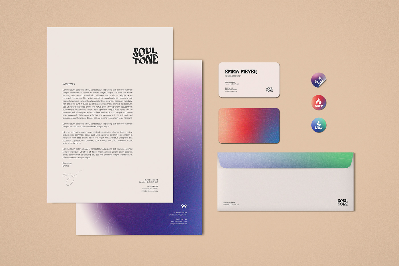
These are the hero gradients used throughout the Soul Tone branding. Similar levels of saturation and vibrancy across these gradients ensure they remain consistent, while the grainy texture and blurred edges soften them into the off-white background. This results in colourful graphics that build upon the simplicity of the basic brand, without being too dominant. The colours come from the elements of the Ayurvedic dosha that they represent.
The three doshas correspond with the three pillars of the Soul Tone business:
The three doshas correspond with the three pillars of the Soul Tone business:
Vata (Spirit, Meditation) -
Vata consists mostly of the two elements air and space (also known as ether) and is generally described as cool, light and flowing. Those with the Vata dosha are usually described as flexible, energetic, and highly creative, well known for thinking outside the box. Vata is represented with the colours purple and blue.
Pitta (Body, Yoga) -
Known for being associated with a tenacious personality, the Pitta dosha is based on fire and water. It’s commonly described as light, liquid, and mobile. People with Pitta are said to be self-determined, very athletic, and serve as strong leaders. Pitta is represented with the colours red and blue.
Kapha (Mind, Psychology) -
Kapha is based on earth and water. It can be described as steady, stable and soft. People with this dosha are described as strong, empathetic, and caring. They’re known for keeping things together and being a support system for others. Kapha is represented with the colours green and blue.


Icons:
Icons have been developed to represent elements and doshas used in Ayurvedic philosophy. These have been created to stylistically match the weight of the font pairings, and follow suit with rounded corners and a soft, handmade feel. They also use similar curves and shapes to the warps of the main logo, ensuring cohesiveness throughout the brand.


Soul tone - Yoga and mindfulness
Logo Design / Brand Identity
Client Work - 2023
Thanks!
All imagery licensed from Unsplash, Envato Elements and Freepik.
Created using Photoshop and Illustrator.