Bibaj Sport OBS
Amazing brands can sometimes be overlooked due to their lack of appearance.
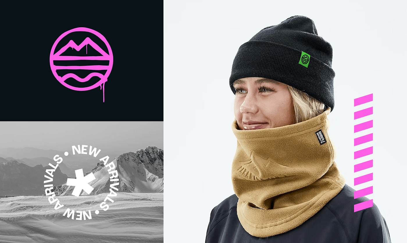
This was the case with Bibaj OBS, who came to us to design their new identity.
The concept behind this logo design was to embody the spirit of adventure and
the great outdoors, through a sophisticated and minimalist approach.
The color green was chosen to represent the connection with nature and to reflect
the company's commitment to providing outdoor enthusiasts with high-quality equipment.
The lines inside the logo represent different types of adventures. Beach and sea waves, street and roads and peak of a mountain.


Brand visuals
To build a coherent and consistent visual identity, we also worked on designing identity system and packaging design. This included the color palette, the layout and the imagery. The visual identity aligns with the brand's values, it communicates adventure and the great outdoors. The imagery used in the website and packaging is carefully selected to reflect the naturalness of the product and at the same time we used bold colors that reminded people of the natural outdoor shades.
Mobile app design
Another major update we offered Bibaj OBS was their brand new mobile app, fully fitted to support the user experience. This mobile app design emphasizes simplicity, making it easy for users to access the features they need quickly and efficiently.


Overall, the visual identity is designed to give an energizing effect to the viewers and to position the company as a leader in the outdoor and skiing industry.

Thank you.


