AKSA Energy
Brand Identity Development
_
[EN] AKSA, established in 1997, is one of the biggest energy providers and sellers in Turkey. The works below were a brand identity facelift proposal made to AKSA, they were not put into practice afterwards.
Brand Identity Development
_
[EN] AKSA, established in 1997, is one of the biggest energy providers and sellers in Turkey. The works below were a brand identity facelift proposal made to AKSA, they were not put into practice afterwards.
[TR] 1997 yılında kurulan AKSA Enerji, Türkiye'nin en önemli enerji şirketlerinden biridir. Aşağıdaki çalışmalar kurumsal kimliği yenileme önerisi olarak yapılmış bir sunum olup sonrasında uygulamaya koyulmamıştır.
Current identity

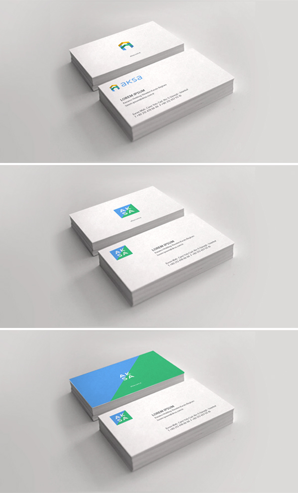
[EN] Two different identity systems were proposed – in both of them the three colors used represent earth, water and the Sun; the three elements that AKSA takes its power from.
The first option is much more of a drastic change for the brand where I removed the blue and green bars under the current logo and suggested we acquire a modern lowercase typeface, use pastel colors and add an "A" symbol next to the new logo.
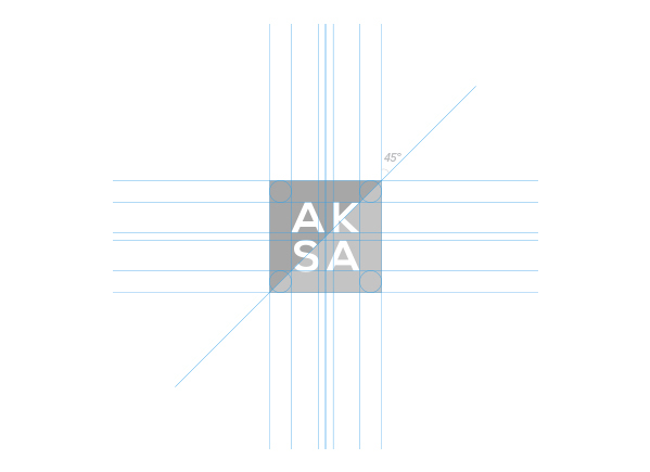
In the second option, I kept the blue-green colored base but divided the name into two rows to acquire a more compact logo divided it by a diagonal line.
In the second option, I kept the blue-green colored base but divided the name into two rows to acquire a more compact logo divided it by a diagonal line.
ALTERNATIVE 1


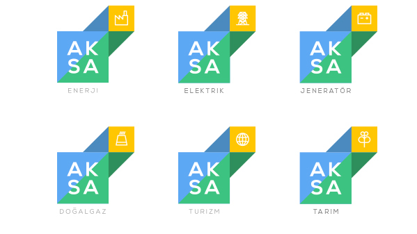
Sub-brand logo suggestions


ALTERNATIVE 2

Sub-brand logo suggestion

Sub-brand logo suggestion with icons
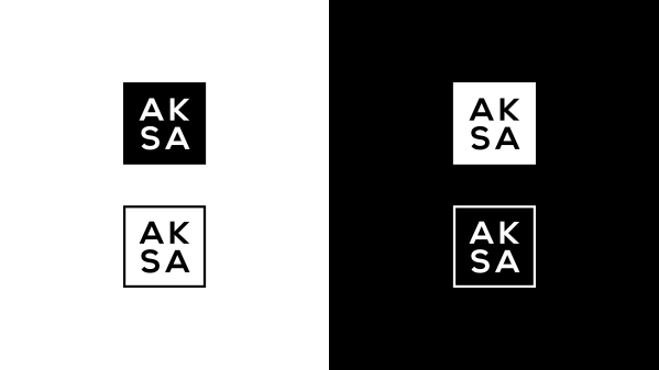
Monochrome usage
Suggested corporate typeface

Color scheme

Color sequence

Graphic elements : line cities powered by Aksa