
Another in a fairly regular series of map illustrations for Aer Lingus' inflight magazine. This was for a feature on the famous sights of Rome used in films, so I went with a little film reel to label the locations!

Initial rough for the map of Rome

A map of Las Vegas for Aer Lingus' inflight magazine. The feature talked about the hotels, shows and many quirky attractions the crazy Nevada town has to offer. I tried to give an idea of the craziness that is Vegas Baby!
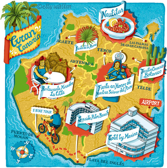
A map of Gran Canaria for Aer Lingus' inflight magazine. The article mentioned not only restaurants and hotels but fesitvals that visitors might want to see during their stay so I incorporated a couple of these. I used a nice bright Spanish colour scheme

Initial rough for the map of Gran Canaria

A map of California for Aer Lingus' inflight magazine. This feature discussed a road trip around California, visiting some of the historic locations where the pioneers first settled. I thought it would be fun to give it an 'Old West' theme to celebrate this historical take, using wooden signs with 'Wanted' poster style font :)

Initial rough for the map of California

This was a map of a cycle trail through Southern Ireland for Aer Lingus' inflight magazine. I wanted to give the map a nice fresh feel to capture the natural beauty of the region

Sketch for the cycle trail map

A map to accompany Simon Calder's writing in Waitrose Weekend, pointing out some of the great places to stay and sights to see on the Isle of Mull


Another map for Waitrose Weekend of Goring-on-Thames. I wanted to get across the feel of a sleepy, rural English village tucked in the hillside


Little map of Cardiff for Waitrose Weekend magazine showing some of the restaurants featured in their Good Food Guide piece

Sketch for the Cardiff Map

A map of a region of Tuscany for a business magazine. I wanted to capture the beauty of the Tuscan landcape and also the warmth and sunshine with the colours. I've featured various elements mentioned in the copy, a business weekend trip and the activities that can be done.

Inital sketch for the map of Tuscany

Map of LA for Waitrose Weekend, featuring some of the famous sights of LA as well as the restaurants and hotels Simon Calder mentioned in his piece

Sketch for LA map

Another in a fairly regular series of little maps for Waitrose Weekend magazine. Some of the good restaurants and sights of York

Initial rough for the map of York

A little map for Waitrose Weekend magazine, for a piece on the Italian town of Cagliari. I wanted to give it an Italian warmth with the dusty yellows and reds, hopefully you can almost feel that warm mediterranean breeze :)

Initial rough for the Cagliari map

I was so pleased to be asked to do this map of Croatia and the Dalmatian Coast by National Geographic Traveller. The Art Director wanted to get across the meditteranean feel with turquoise sea and the distinctive red-tiled roofs of that region

Sketch for the map of Croatia

A map of Malmo, Sweden for Waitrose Weekend. I used the Swedish flag colours and of course meatballs and the famous bridge from the TV series had to feature somewhere!

Rough for the map of Malmo

This was a map of an area of Barcelona for a UK business magazine, highlighting some venues from their article. The client also requested it have a 'green' and 'ecofriendly' feel with the colouring as the article also had this as a focus

Original sketch for the map of Barcelona

This was a fun map for Easyjet magazine, for a feature on the crazy Marathon Du Medoc in France, where competitors dress up in costumes and run a marathon with stops for wine, oysters and beef. That's how to do a marathon! It was quite a small space so I kept it simple with a little icon for each point in the copy and a bright colour scheme to convey the carnival atmosphere of the event

Initial sketch for the marathon map

An interesting map for Aer Lingus' inflight magazine, featuring an area of California now known as Silicon Valley, where tech companies like Google and Facebook have set up home!

A map of a coastal town in Spain called La Coruna for Waitrose Weekend magazine. I used the red and yellow from the Spanish flag to give it a fresh feel and flowing, script lettering seemed to also fit with the Meditteranean vibe :)

The sketch for the map of La Coruna

Map of Reykjavik for Waitrose Weekend. I used a cool colour scheme to convey the chilly Icelandic scene


Another small map for Waitrose Weekend, this time showing a region of the globe where you can travel to see the Northern Lights. I used the strong green/blue tones of the Lights as the key to this colour scheme

Rough for the map of the Northern Lights

Another of my little maps for Waitrose Weekend magazine. This one, of the elegant French city of Lille


A little map of Brighton - I took the famous Brighton Pier sign as my inspiration for the Brighton sign typeface and added some seaside bunting and a little deckchair to give it a seaside feel

Initial sketch for the Brighton map

A map of Lancaster and Morecambe for Waitrose Weekend magazine featuring venues from the article and also a seagull wearing some Eric Morecambe glasses (of course). Did you know Eric Morecambe was born John Eric Bartholomew and changed his second name to the name of his beloved home town? Neither did I, was thrilled when I read this and had to feature it here

Original sketch for map of Lancaster and Morecambe

A map of Whitstable for Waitrose Weekend. I went for a seaside/icecream colour scheme and put all the place name labels on little pieces of driftwood signage all to give it that beachy, coastal feel

Original sketch for the map of Whitstable

Map for business travel magazine of Birmingham city centre showing key landmarks new and old as well as some of the landmarks mentioned in the article. Birmingham is known as "The Venice of the Midlands" so I featured some of the canals and a little boat on there and made the title banner reminiscent of canal boat signage with the scrolls and colour scheme.

Initial rough for the map

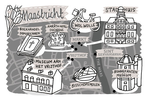
This was a map of Maastricht for Waitrose Weekend. I felt a map of a town in Holland really needed tulips :)
Rough for the map of Maastricht

This was a very tiny map of a region of Kent for Waitrose Weekend. I made the various icons fairly large so they could be seen once printed (this is much larger than actual size!). I wanted to get across the idea of "The Garden of Kent" with the lush greens and cherry reds.

Initial sketch for the Kent map

Map of Bath for Waitrose Weekend including the famous Bath Abbey and a detail of a Gorgon's Head from the Roman Baths. I used the warm creamy yellow of bath stone for all the buildings and put some little hills in the background to give a sense of its hilly location

Initial sketch for the map of Bath

A little spot map produced for Waitrose Weekend magazine for their regular "Weekending...with Simon Calder" slot. I've featured some of the locations mentioned in Simon's article along with a few 'famous' Hebden sights like the bridge and chimney

Initial sketch for the Hebden Bridge map

Another small spot map for Waitrose Weekend magazine showing a region of the Scottish Borders. I gave the background a tartan check and used white and blue in the colour scheme as well as a little thistle to get across the Scottish theme.

Inital rough for the map

Another in my series of small maps for Waitrose Weekend magazine on the Brecon Beacons region highlighting Crickhowell and the eateries and general sites of interest mentioned in the article. I wanted to give it a fresh, out-doorsy feel with the light green and use of contours and background hills. Can you feel that fresh borders air? :)

Initial rough for the map. After discussions with the Art Director, we decided it would be nice to have an apple instead of another building to represent the cider mill. I also added in a daffodil to give it that Welsh borders feel.

Another in the series of spot maps produced for Waitrose Weekend magazine. Here I've highlighted locations in Manchester

Inital sketch for the Manchester map

A map of Aberdeen and it's various interesting sights. I wanted this to have a subtly nautical theme and also included some solid-looking brick detail to the right to echo the granite stone famous in the area.

Sketch for the map of Aberdeen

