

VERSUS
// POSTER CONCEPT //
My latest artwork created using Photoshop and Illustrator assets.
I made a fun streetwear typographic poster with two cats that look like they're ready to brawl! I decided to keep it straightforward yet striking by using only a handful of carefully chosen words. But the real highlight of this poster are the humorous illustrations that nod to our feline companions.
Get a behind-the-scenes look at the creation of my artwork in this speed art video. This video showcases my process and the power of combining various tools and techniques to achieve this captivating result.
Don't forget to check out my Instagram and YouTube channel to stay updated on my latest design and to see other of my artworks !
Join me for a closer look at this fun typographic poster featuring two cats that look like they're ready to rumble! I wanted to keep the design simple yet impactful by using only a handful of carefully chosen words. But the real showstopper in this poster are the playful illustrations that nod to our feline friends. These two cats are full of personality and are sure to add a smile to your decor. So sit back and watch as I take you through the process of creating this poster from start to finish. Enjoy! #Typography #Poster #Design #Cats #Illustrations #Humor


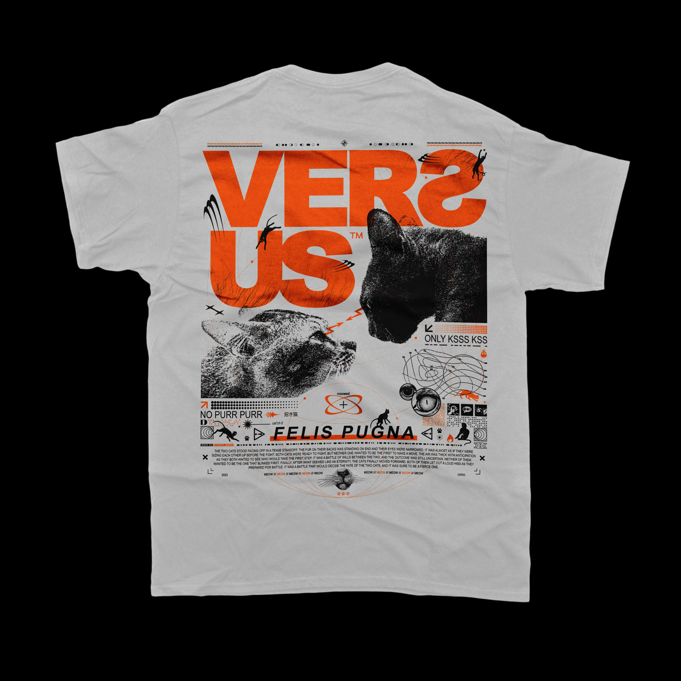
Versus - Felis Pugna, from the Latin "Cat Fight".
Inspired by Swiss graphic design and brutalism, I sought to create a modern, playful and humorous visual. While exploring the theme of cat fighting, I incorporated references to the world of the cat and its behavior, which is both playful, independent and a fierce predator.
Cat silhouettes in motion fill the design, hunting or playing with a star "*". The latter refers to the various insects and laser pointers often used to entertain our feline friends. In addition, the poster features circles in the background that represent the animal's senses, precision and analytical alertness. These circles are thin, multiple and start from the same point, like the whiskers of cats.
To represent the movement and fighting spirit of cats, I incorporated complex patterns of shapes. The focal point of the poster is the confrontation between two cats who are staring at each other, symbolized by two pointing arrows. To give a rough and textured look to the main image, I used the "Large Grain Texture" effect on Photoshop. This technique is easily done on Photoshop with the options available in the "Filter Gallery".
The theme of the cat's mischief is present in the degradations of the title "Versus", which looks like a corner of a sofa used by the latter. Then in the bottom of the poster is torn to symbolize the chaotic passage of the feline.
The various texts of the poster include onomatopoeias such as "NO PURR PURR" for the purr of the cat. But also, "ONLY KSSS KSSS" for the cat that crackles and "Meow" for the meow of the cat in English.


Want to wear it ?


If you like it let me know :
Smash that bad boy ! Love.
Smash that bad boy ! Love.


