( BRAND NARRATIVE ) ( BRAND IDENTITY ) ( PACKAGING DESIGN ) ( CREATIVE CAMPAIGN )
Yerbi
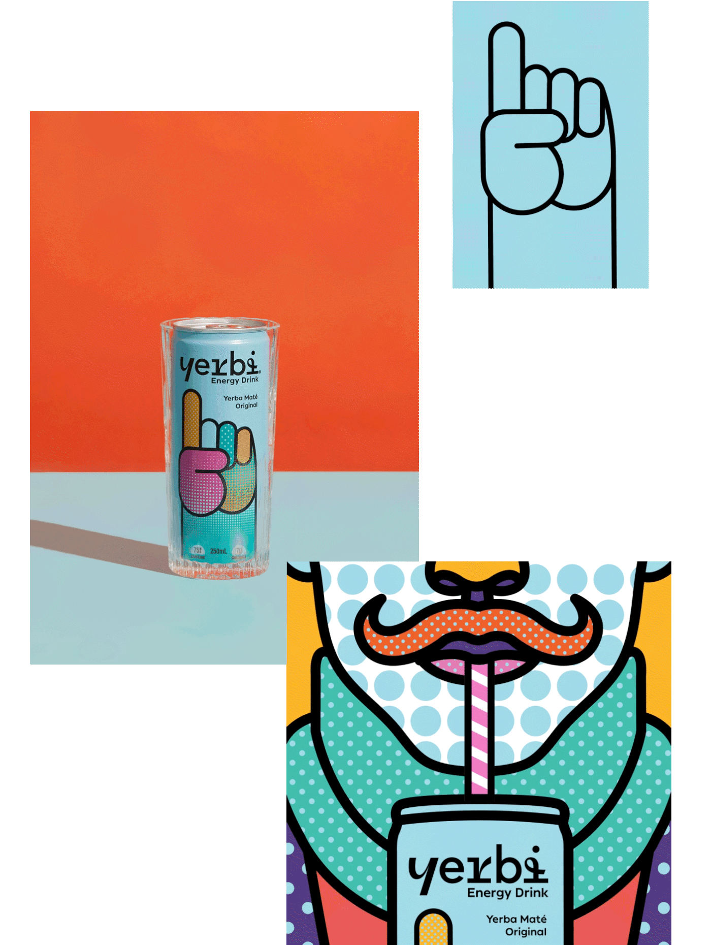
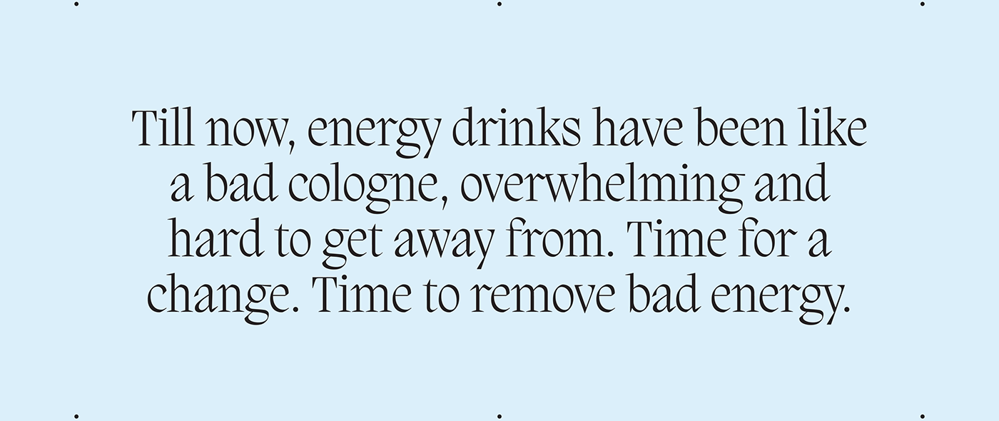
Increasingly regarded as ‘tasting bad’ or being ‘unhealthy’, the energy drink category had become one dimensional, lacking innovation and only targeting a younger male audience. Time for a change, enter yerba mate. Aiding concentration, mental acuity and tasting way better, the herbal tea yerba mate gives a sustained natural energy kick without the crash. Yerba mate takes centre stage for a new energy drink brand we were engaged by Bickfords's Group to create. We named it Yerbi.


(THE SOLUTION)
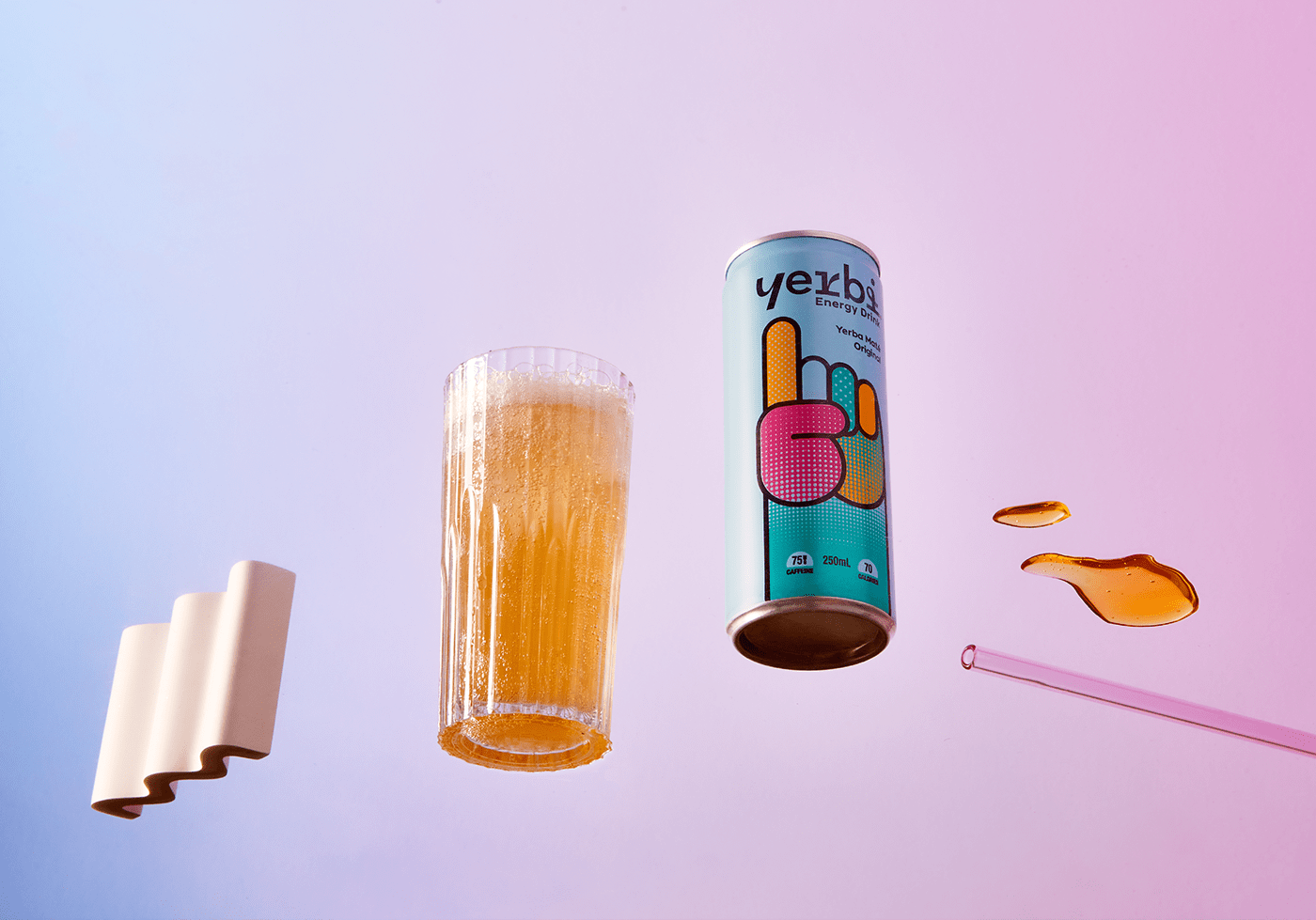
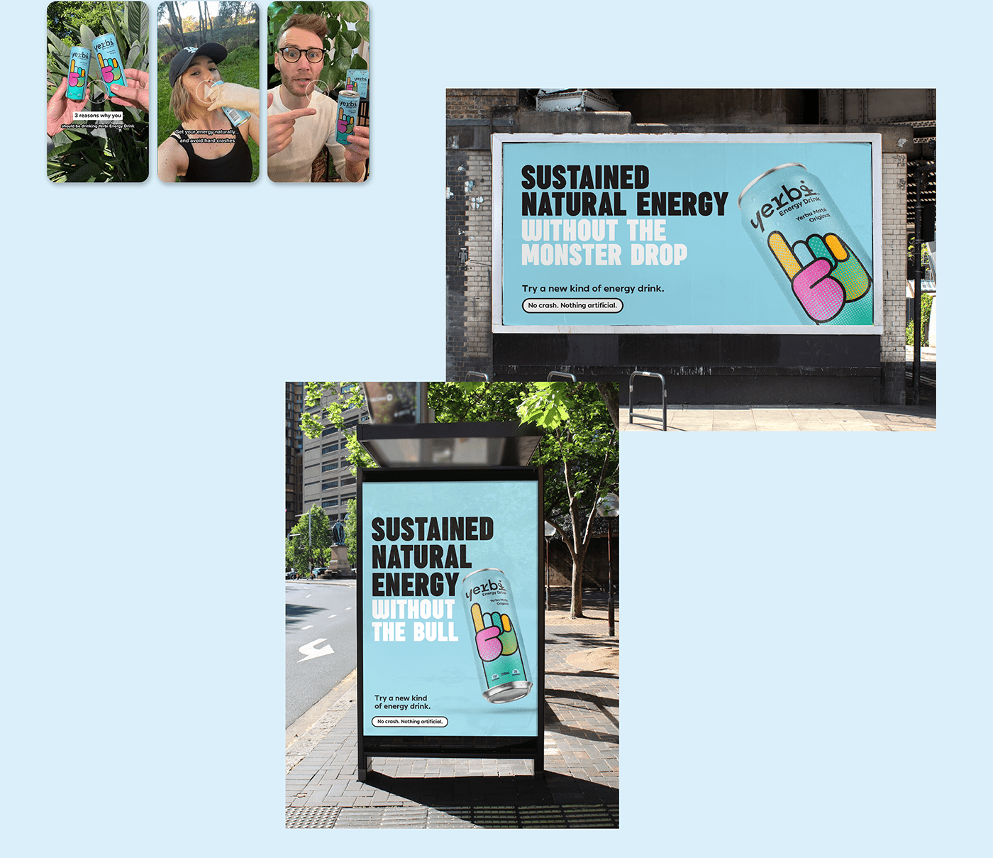
We created a lighter, brighter brand that communicates an energetic lift through our mascot hand pointing up, becoming our signature brand asset. Feeling positive, inclusive and offering a refreshing alternative to the usual potent neon greens and black cans - our design is the challenger to the latent hard core energy drinks we’re used to seeing. We devised a creative campaign to introduce Yerbi to the world. From our brand strategy and disruptive tone of voice, the campaign focuses on educating consumers about the benefits of Yerbi as a healthier alternative, whilst also injecting some tongue-in-cheek jabs at traditional energy drinks.