Концепт айдентики школы графического дизайна Unid
Unid Graphic Design School Identity Concept

rus:
Круг - самая уравновешенная фигура, символ гармонии и объединения.
Данная концепция символизирует опыт и знания которая дает школа.
Меньший круг – это начинающие ученики школы, которые либо новички, либо начинающие без какого-либо опыта
и груза знаний.
и груза знаний.
Второй круг, с высеченным меньшим. Больший круг символизирует опыт и знания кураторов школы, и студент
погружается во всё это движение, получает необходимые знания, поддержку и крутое сообщество дизайнеров,
которые будут с ним всегда.
погружается во всё это движение, получает необходимые знания, поддержку и крутое сообщество дизайнеров,
которые будут с ним всегда.
Последний круг – это уже готовый специалист, с большим количеством знаний, необходимых для старта в профессии.
eng:
The circle is the most balanced figure, a symbol of harmonyand associations.
This concept symbolizes the experience and knowledge that the school provides.
The smaller circle is the beginning students of the school, who are either beginners or beginners without any experience and a load of knowledge.
The second circle, with the smaller one carved. Big circle with symbolizes the experience and knowledge of the curators of the school, and the student dives into this whole movement, gets the necessary knowledge, support and a cool community of designers,who will always be with him.
The last circle is a ready-made specialist, with a large the amount of knowledge needed to start in the profession.


rus:
Логотип построен из простых форм, так же как и айдентика школы (айдентика будет представлена
в презентации чуть ниже).
Почему простые формы? Мозгу нравиться думать о простых вещах, получать что-то ожидаемое и следовать уже
знакомому. Поэтому и был выбран именно этот путь при создания логотипа.
знакомому. Поэтому и был выбран именно этот путь при создания логотипа.
Минимум деталей позволяет использовать логотип, а также другие элементы айдентики, где угодно, на различных
носителях, что, безусловно очень важно, ведь школа сможет эффективно внедрить свой визуальный стиль.
носителях, что, безусловно очень важно, ведь школа сможет эффективно внедрить свой визуальный стиль.
eng:
The logo is built from simple shapes, just like the school's identity (the identity will be presented in the presentation below).
Why simple shapes? The brain likes to think about simple things, get something expected and follow through
friend. That is why this path was chosen.when creating a logo.
friend. That is why this path was chosen.when creating a logo.
A minimum of details allows you to use the logo, as well as other elements of the identity, anywhere, on various
media, which is certainly very important, because the school will be able to effectively implement its visual style.
media, which is certainly very important, because the school will be able to effectively implement its visual style.


rus:
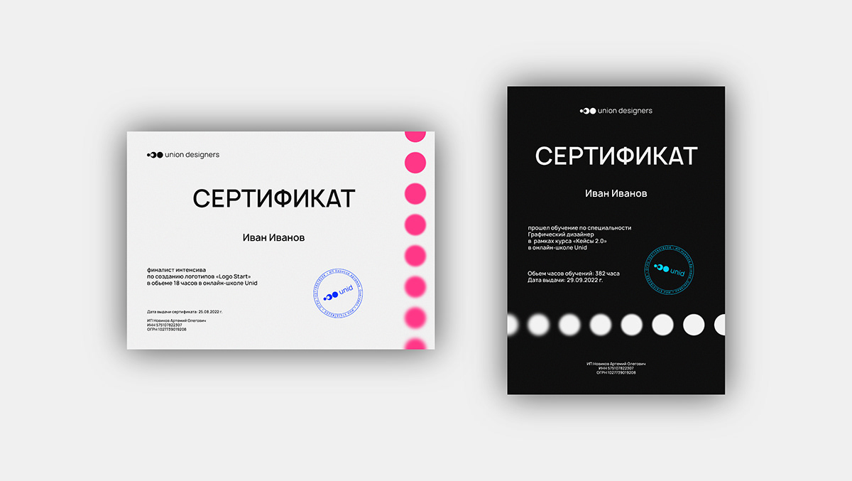
Сертификат.
eng:
Certificate.

rus:
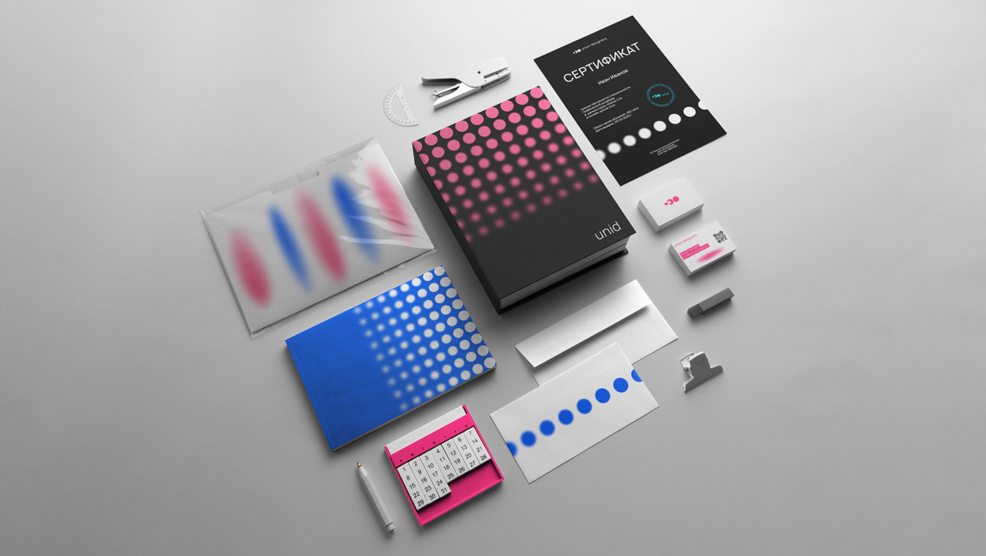
В графике школы используются круги в фирменных цветах с эффектом размытия, композиция составляется таким
образом, что бы получался эффект фокусировки. Возможно использовать овалы, задача которых, в некоторых случаях, разбавить круглую композицию. К ним применяется сетчатый градиент с эффектом текстуры – зерно.
образом, что бы получался эффект фокусировки. Возможно использовать овалы, задача которых, в некоторых случаях, разбавить круглую композицию. К ним применяется сетчатый градиент с эффектом текстуры – зерно.
Так же используется текст на плашках с фирменным цветом, для выделения важной текстовой информации.
eng:
School graphics use circles in corporate colorswith a blur effect, the composition is composed like this way
to get the effect of foxing. Perhaps use ovals, the task of which, in some cases, is to dilute the round composition.
It applies to them mesh gradient with texture effect - grain.
The text on plates with corporate color is also used to highlight important textual information.


rus:
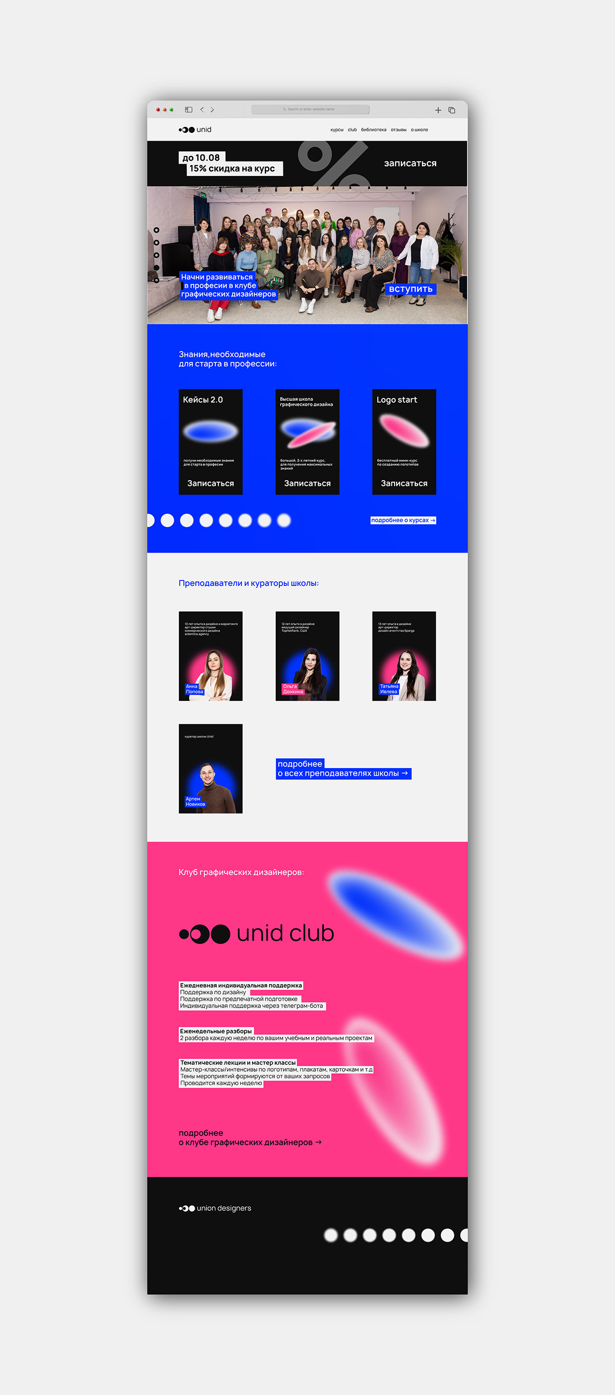
Концепт сайта школы.
eng:
School website concept.
rus:
Фирменный мерч.
eng:
Branded merch.