
How might we capture the past year in a single image?
After our 2021 greeting card, we decided to make annual visual overviews a yearly tradition. To free us from the creative pressures of past successes, we set out to find a completely different aesthetic.
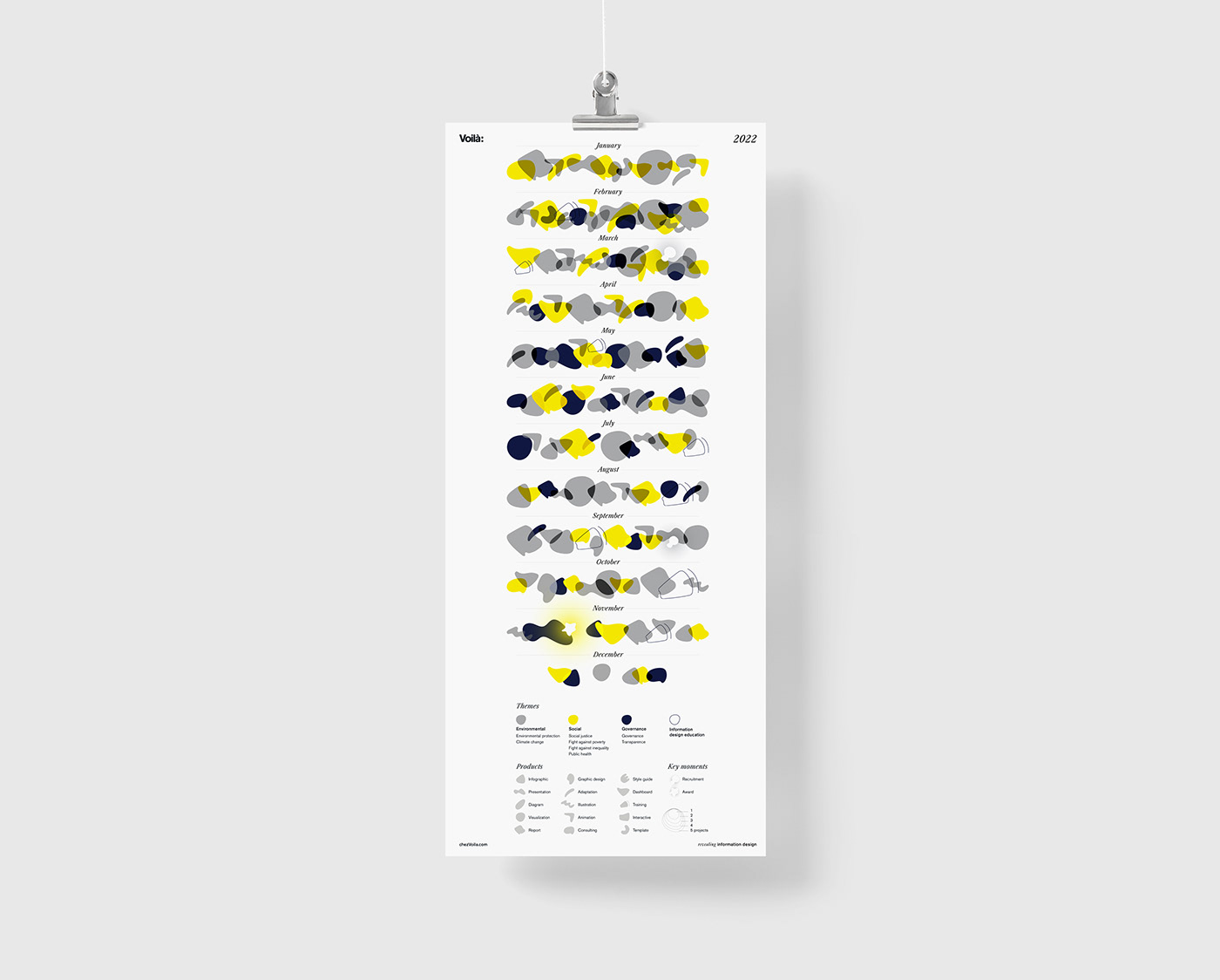
While last year's card focused on the trajectory of individual projects we accomplished, this year we turned the concept on its head and focused on creating "portraits" of each month.
Through these portraits, we wanted to highlight the themes of our work and the numerous types of projects we work on: from presentations to interactives, dashboards, reports, animated adaptations and more.

Rethinking the box
We started with the idea of a calendar, with each month contained within a rectangle.
After testing this concept with our real data, however, it became clear that we needed a different layout. There were too many types of products and themes in a single month to squeeze into one box! Instead, we laid out the shapes horizontally. Each row summarizes the month as a wave, representing a collection of the types of work that occupied our time.


Drafts of two layouts: one with months as squares and one as horizontal rows from top to bottom. We experimented with two types of layouts: one with months arranged in squares, like a calendar, and one with months arranged as horizontal rows, from the top of the page to the bottom. We liked both concepts, but like in many of our projects, it was the data that had the final say.
Expression through shape
We did many, many experiments on the types of shapes to use. In the end, we strove for a good balance between the two: something recognizable and distinct from one another, but also had that organic quality that worked well with this concept.


Our choice of shapes to represent the types of products involved extensive iterations. We started with hand-drawn sketches, prototyped some geometric shapes digitally, and then iterated again until we achieved an organic, but distinct quality. The two images side-by-side show how changing the form of the shapes can result in a completely different feel.
And, voilà! Here is the final result.
For a broader insight into our year, we invite you to read our 2022 retrospective, which shines a light into more of the behind-the-scenes here at Voilà:.
Happy 2023!

Image description: A visual representation of the year 2022 at Voilà featuring semi-transparent abstract shapes on a white background. Months January through December run from the top to bottom, with a row of overlapping shapes under the name of each month. The form of the shape represents the type of product the team worked on (infographic, presentation, etc.), and the colour of each shape represents the theme of the work (environmental, social, governance). The approximate size of each shape represents the number of projects in each theme and product type.
In the left and right-hand margins, abstract imprints indicate key moments of the year: recruitment in March and September, and an award won in November.


