Letterpress covers for Época São Paulo
The cover story "Feito para você" (Made for you) features 30 types of products and services that could only exist in such a diverse and vibrating city as São Paulo.
From the first sec I heard Camila Hessel, our executive editor, telling us the subject and the whole concept behind the so-called story "Made for you" I thought of ordering the cover to someone as if we (the magazine) were using one of the 30 services of the cover story. It would strengthen the concept of "Made for you", after all, we'd have actually order a cover, exclusively, under the team's supervision and made for us (and you, Mr and Ms Reader ;] ).
After several meetings, briefings and brainstorming, we decidede on the idea of making the cover, all sewn, from tthe logo of the magazine to the secondary headlines, aaaallll sewn up!
But on a beautiful sunny Saturday, I was at home, surfing on my computer and I read a twit from Catherine Dixon, a designer and a professor of Typography at Central Saint Martins in London. I took a summer course with her in 2007 and the only contact I had with her was between twits and replies. She had posted a video, recorded at Gráfica Fidalga, along with another designer and professor, Henrique Nardi, who has a super cool type-design project, Tipocracia. The video was superb! And I retwitted it straight way.
10 minutes later, eureka! Lets do the the cover with these guys from Fidalga! A great all-type cover, lambe-lambe alike, made with movable type and "home-made" printed!
As soon as the idea became stronger, I emailed Henrique, telling him the whole concept and idea, and called Samuca (Samuel Rodrigues, Época's São Paulo designer), Camila and Ricardo Alexandre (Editor-in-Chief), spreading the idea, getting aprovals and the green light to proceed.
On Monday production began: Henrique contact Claudio while I was looking for someone to produce the cliché of Época's São Paulo logo.
A week later, on a sunny Saturday just like the other one, Samuca, Oga (art director, videomaker and close-friend), Henrique, Claudio and myself, were all smiling, enjoying ourselves at Fidalga, playing with the types, choosing and arranging the letters, to what would be the cover and the opening spread (headline lettering) of the 12 pages story.
Because the language of lambe-lambe is so characteristic of São Paulo (although since 2009 there's a municipal law prohibiting lambes and posters), we decided to use the movable type as the graphic language of whole cover story, making the headlines and all the elements also with Claudio, in a lambe-lambe format.
So we spent 3 days at Fidalga. Day 1, composing the cover, D-2 printing the cover and D-3 printing the second poster (headlines and elements).
While the cover was due to Top Director's aproval, we thought of having it printed in four different versions, with four different background colors, strengthening the lambe-lambe concept. We printed 300 of this covers/posters/lambe-lambes and the idea was to spread them over the biggest news-stands in town.
We also did a video recording, producing a short 'making of' documentary, that never came out.
Shame the publishers and top directors did not aprove the idea.
At least we had a blast in that weekend :)
Art Direction by Rodolfo França
Printed by Cláudio, Carlinhos and Maurício at Gráfica Fidalga
Special thanks: Samuel Rodrigues, Oga Mendonça and Henrique Nardi (Tipocracia).
Printed by Cláudio, Carlinhos and Maurício at Gráfica Fidalga
Special thanks: Samuel Rodrigues, Oga Mendonça and Henrique Nardi (Tipocracia).


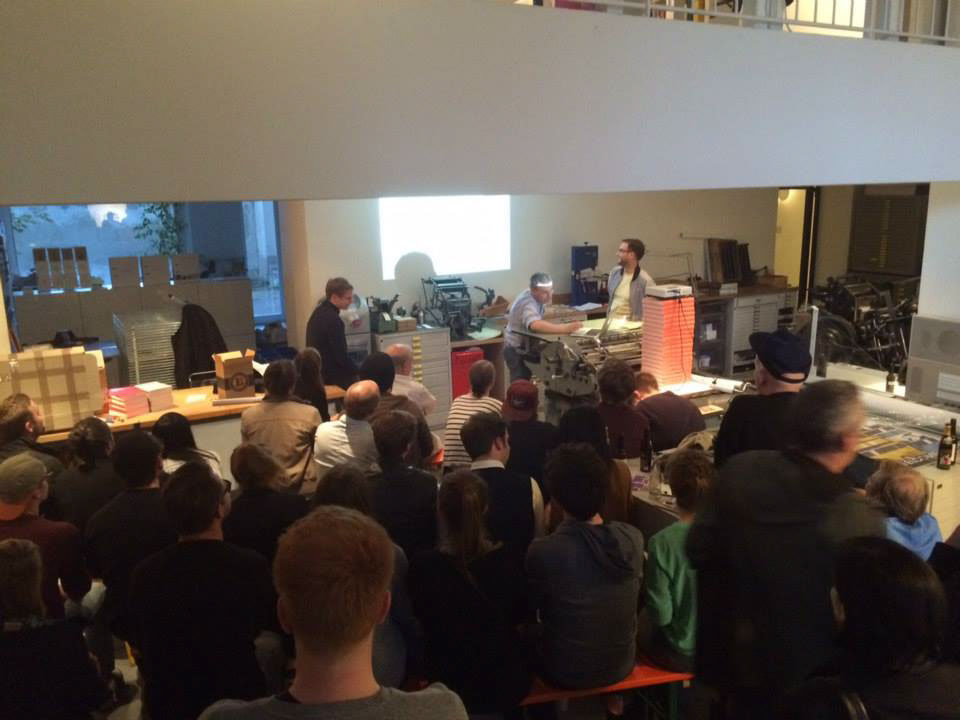
In June 2015 I was invited by german designers Daniel Wiesmann and Boris Brumnjak to talk a bit about the story behind this covers at their "Show & Tell", in Berlin. The event took place at Erik Spiekermann's letterpress workshop, Galerie p89a, and it was really nice to go back to the memories from such a nice project.
Pictures by Andreas Alexander Bohlender and Daniel Wiesmann