

Nutrify
Unusual design for an unusual service: how we created an identity for a vitamin delivery service
Client
Nutrify is a non-standard and very useful project: an online service for the monthly delivery of vitamins and dietary supplements. How it works? You answer a few questions, the service forms a personal list of vitamins for you, then you meet the courier and get +100 points to health every month. The project is new for our market, so it needs a cool design.
Problem
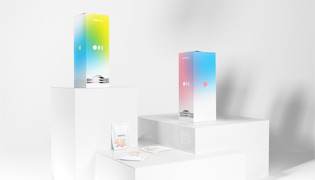
It is necessary to develop a design with a large palette of colors. This style will help to separate the tariff plans and product lines
Solution
We have created a minimalist sign, color coding for different directions and an unusual element that can be used for decoration
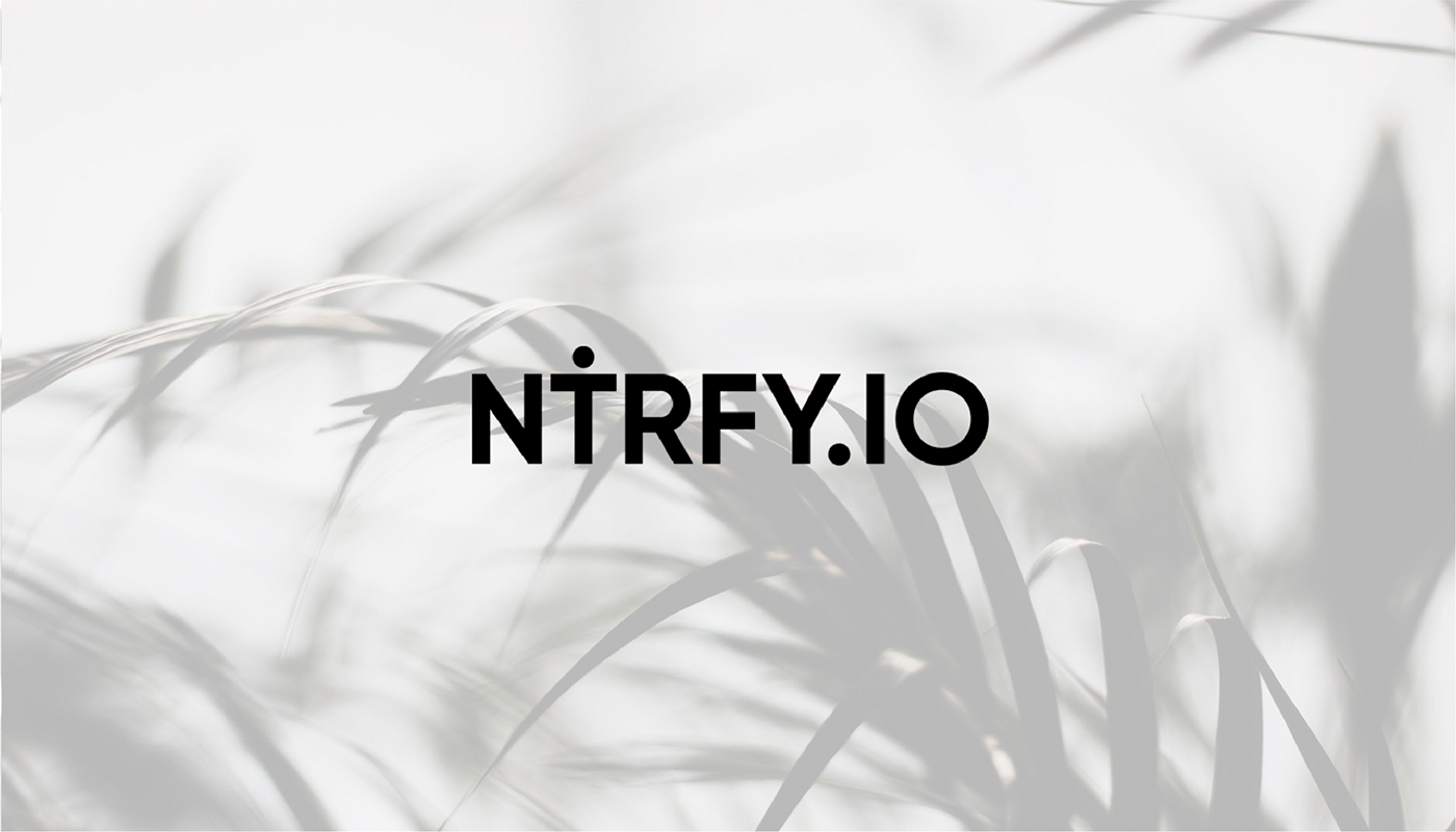
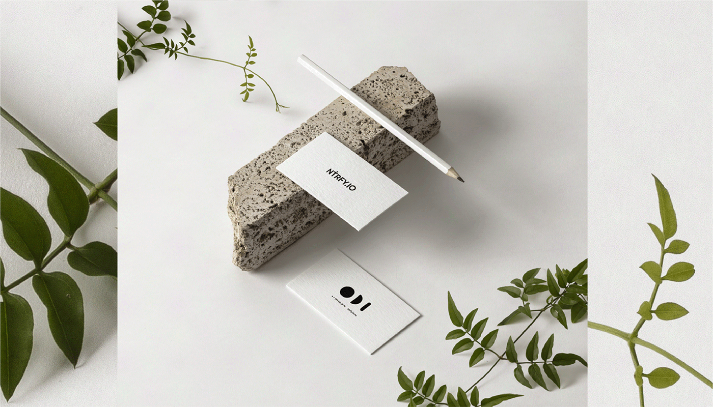
Nutrify sign
Font logo with elements that turn the letters into vigorous characters. The sign is simple, it does not argue with the bright elements of the rest of the design, and it is convenient to use it.
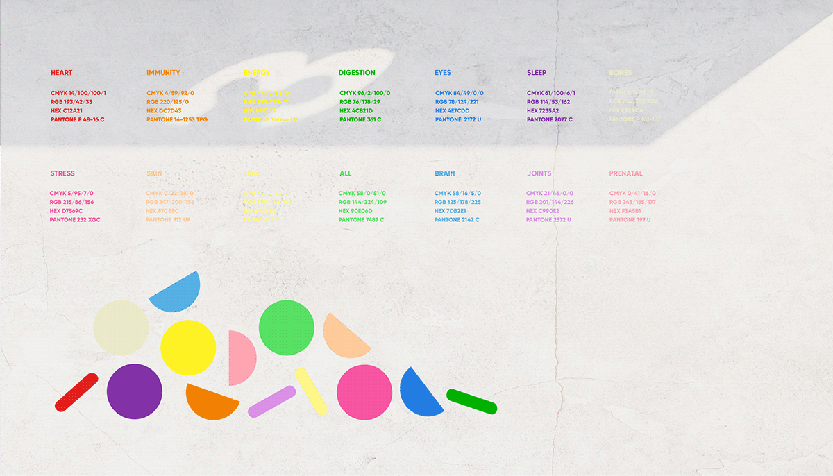
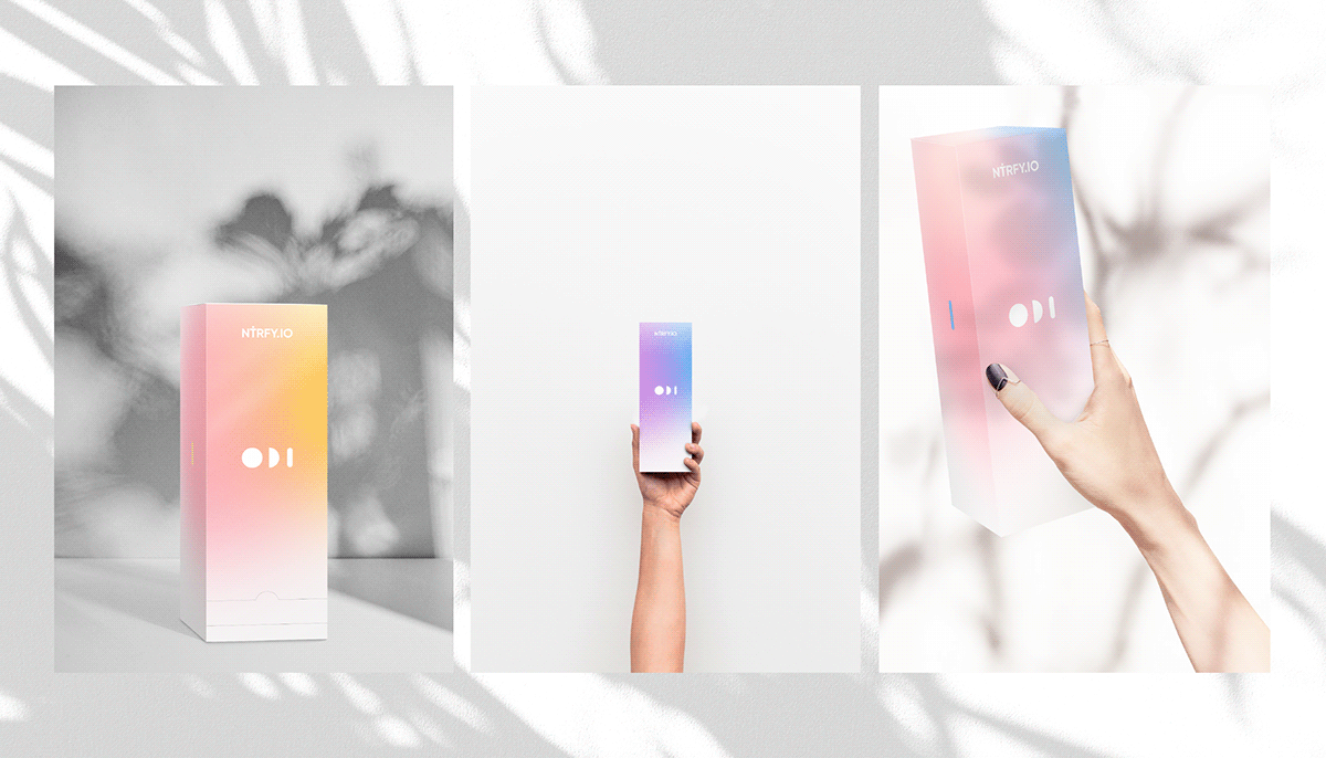
Nutrify color palette
The corporate palette of the project is the colors of the rainbow and a few additional shades. This decision suggests the natural origin of vitamins, and also helps to encode products.
The corporate palette of the project is the colors of the rainbow and a few additional shades. This decision suggests the natural origin of vitamins, and also helps to encode products.
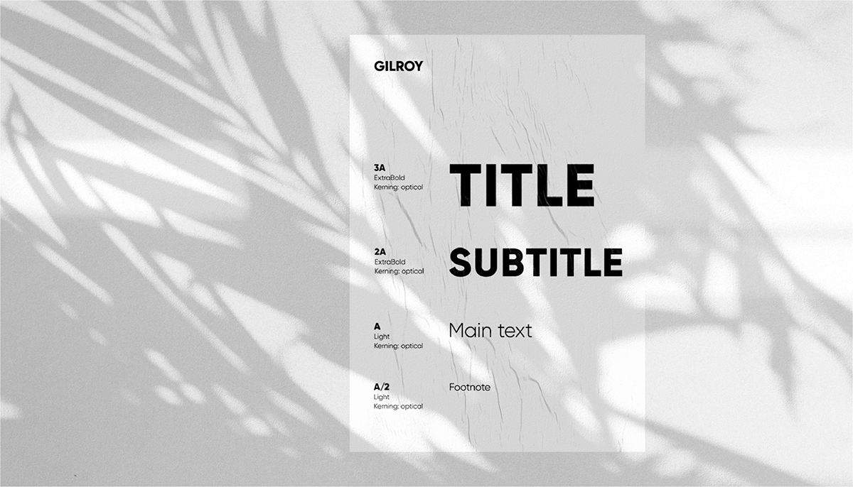
Typography
The font is simple, with rounded, soft forms - the letters resemble vitamins and complement the design:
The font is simple, with rounded, soft forms - the letters resemble vitamins and complement the design:
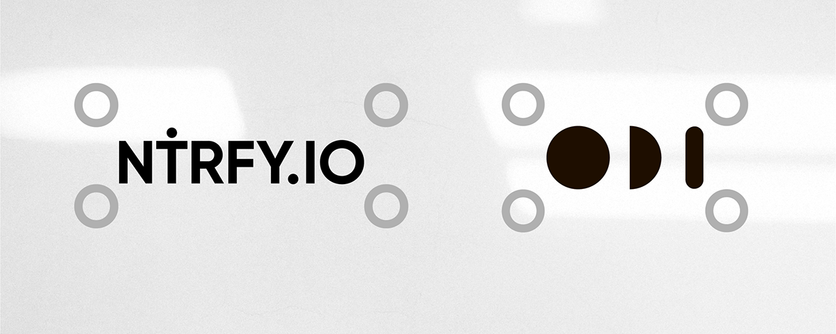
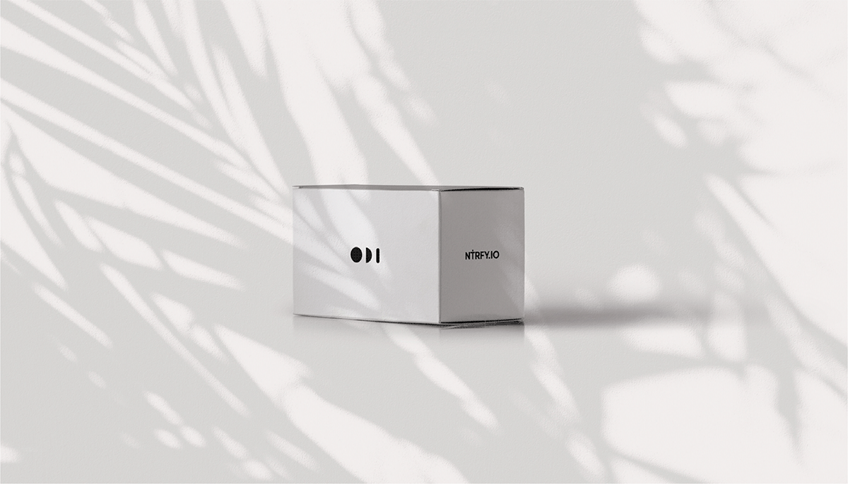
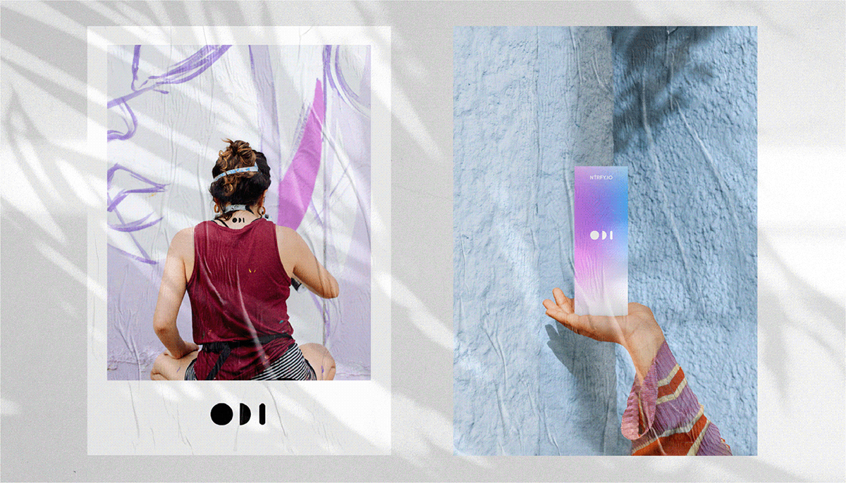
Additional element
A little more about nature and naturalness: the forms of vitamins and the phases of the moon are similar, so we stylized these images and came up with an additional element that can be applied to any objects. This makes the identity extraordinary and memorable.
A little more about nature and naturalness: the forms of vitamins and the phases of the moon are similar, so we stylized these images and came up with an additional element that can be applied to any objects. This makes the identity extraordinary and memorable.
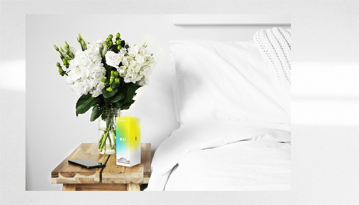
Nutrify carriers
Nutrify has a lot of white in design, free space and pleasant, natural colors. This creates a feeling of cleanliness, health and gives a reference to the medical field.
Nutrify has a lot of white in design, free space and pleasant, natural colors. This creates a feeling of cleanliness, health and gives a reference to the medical field.

Want a design just as cool?
Interested?
Tell us about your project


