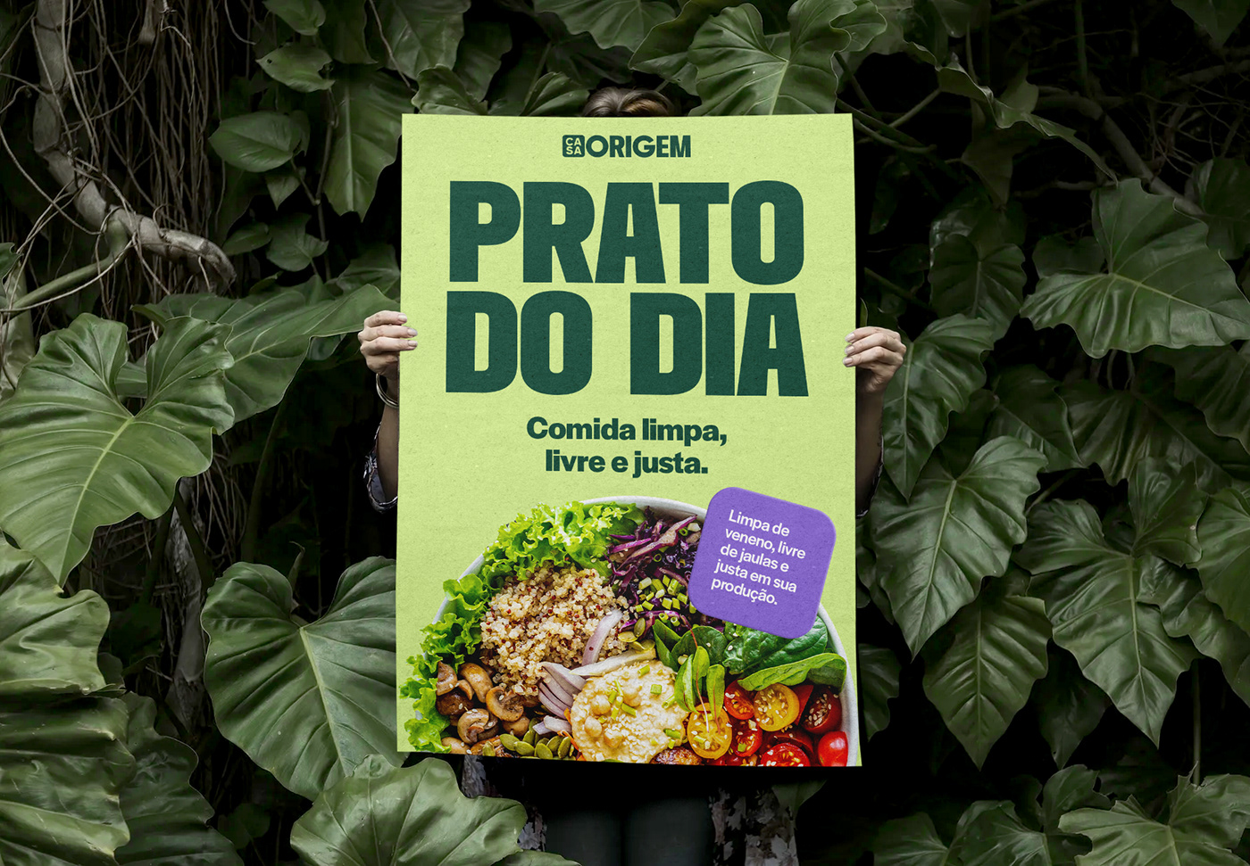
Where does our food come from? The name Casa Origem means “origin home” in portuguese and it’s the core principle of the organisation—to reckon and address the root cause of the situation. In this case, Casa Origem questions the way we treat our food, nature and the people behind them, and answers with action: valuing the people behind the food, from growing to preparing—specially women—supporting the local economy and generating wealth for all the farmers and workers involved.
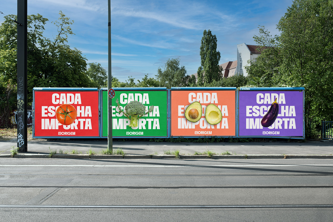
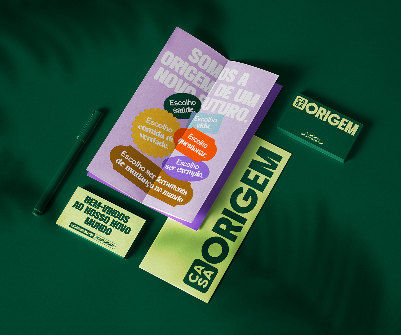
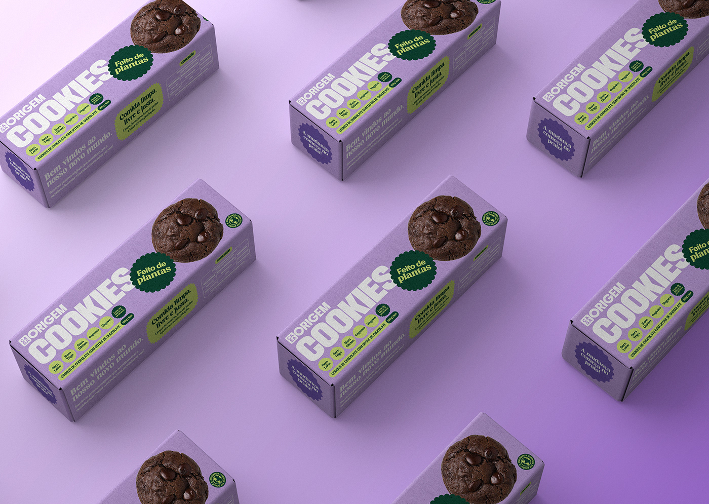
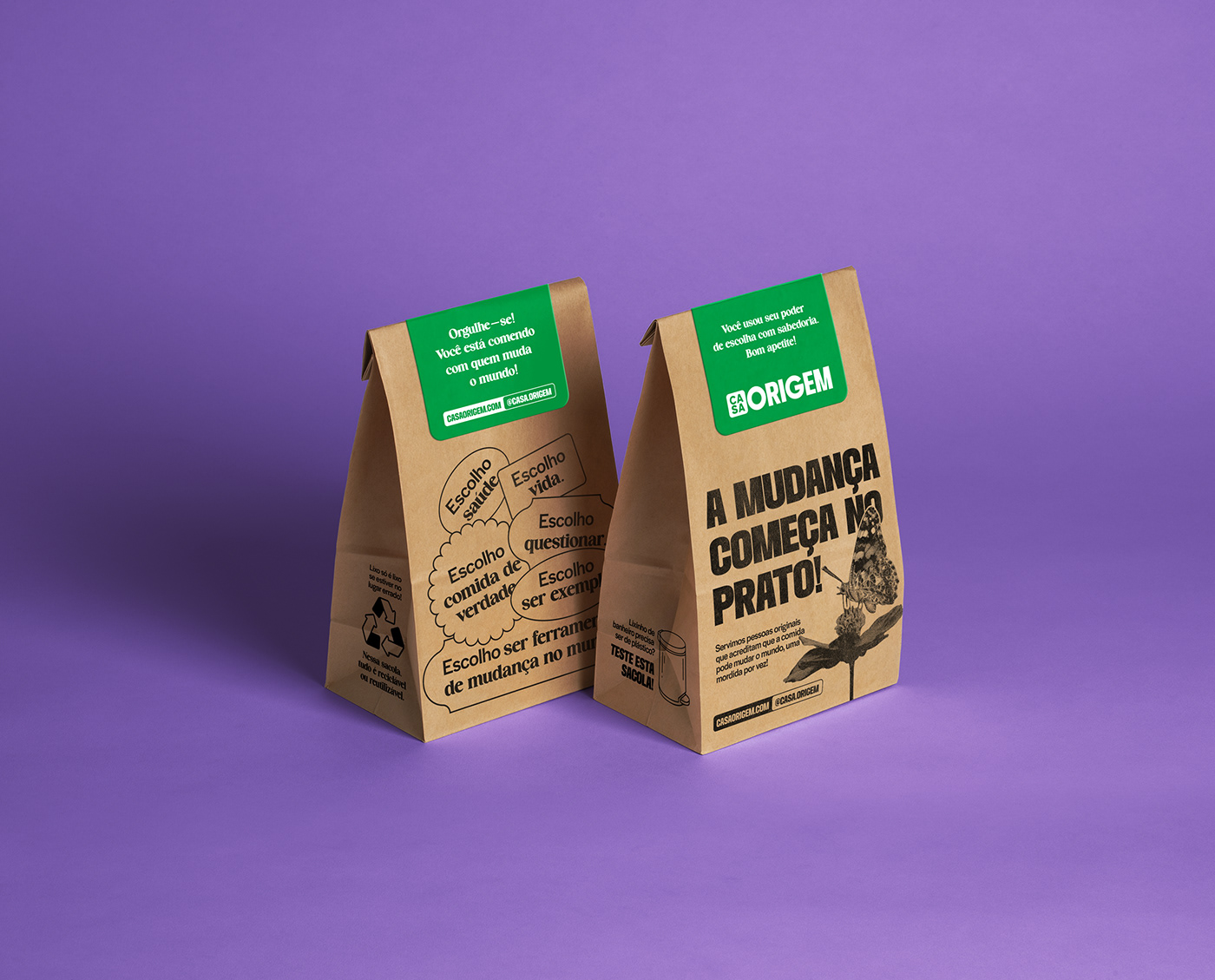
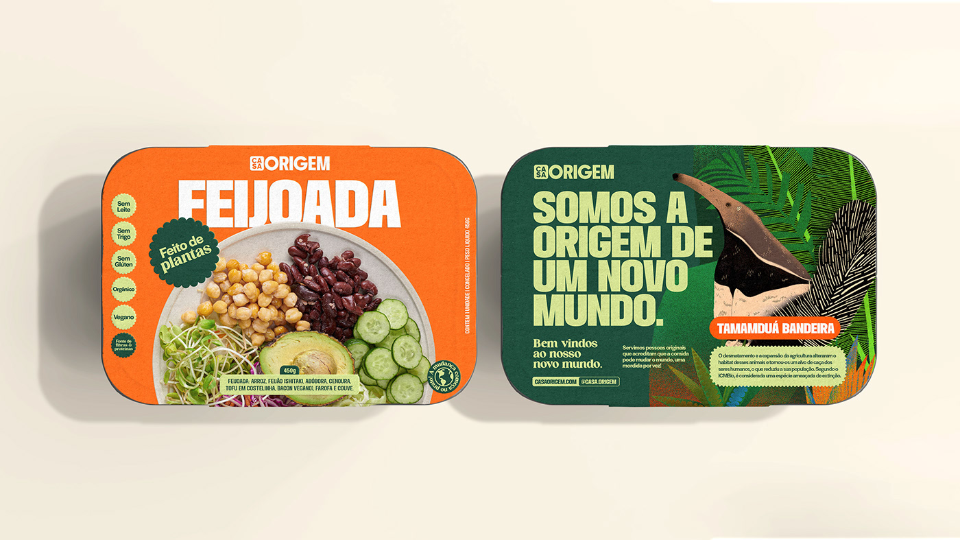
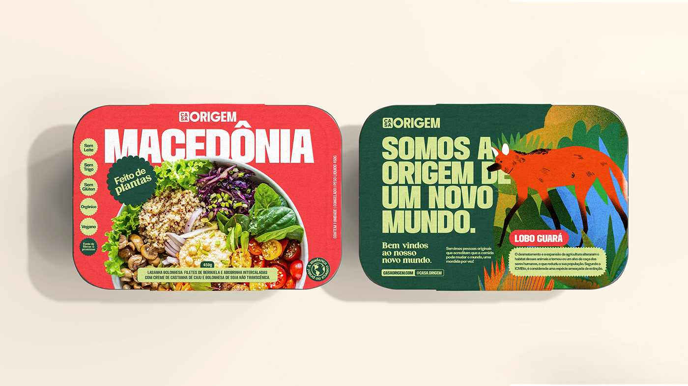
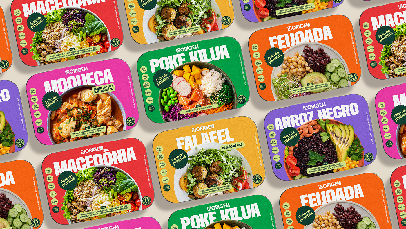
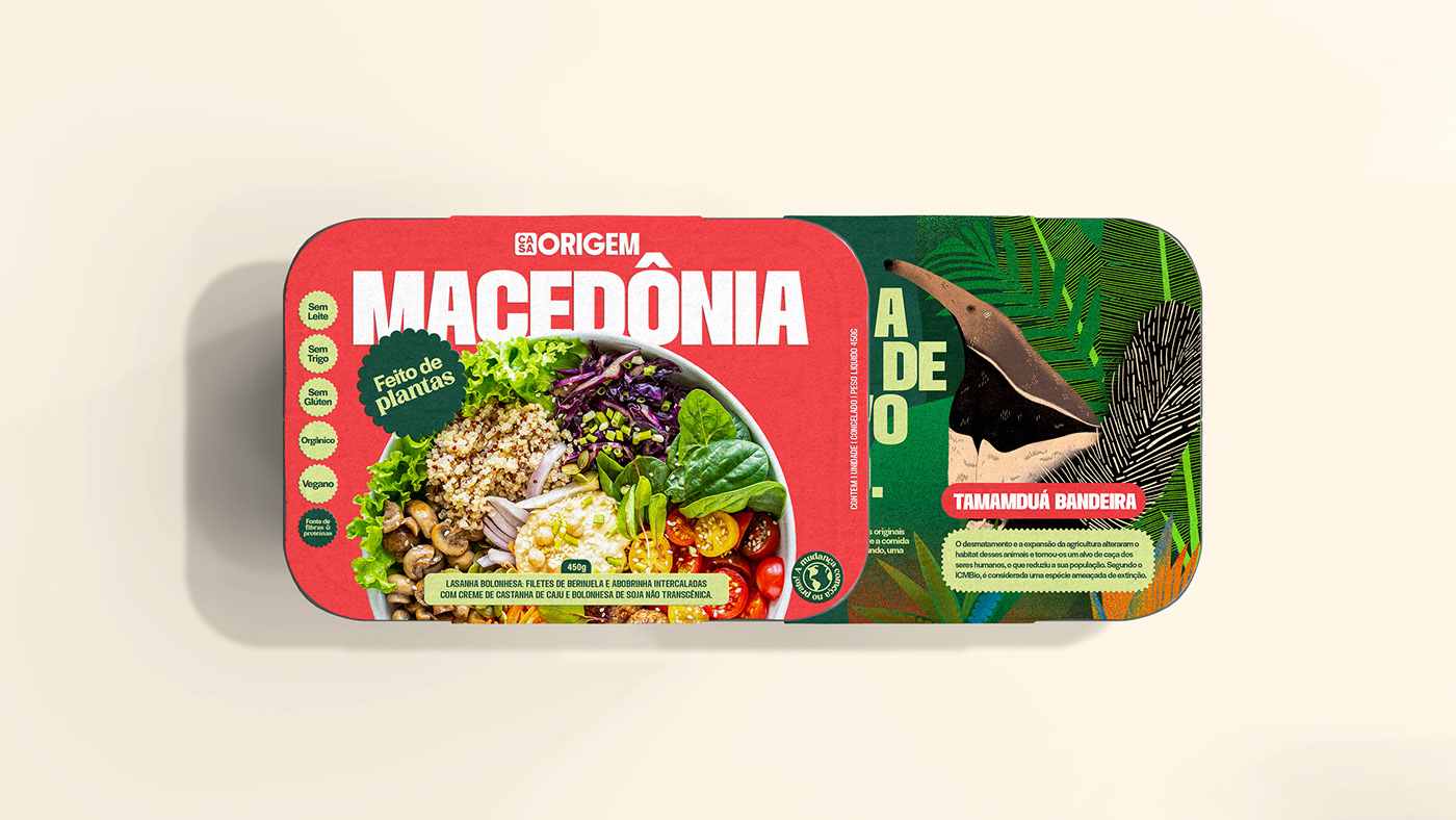
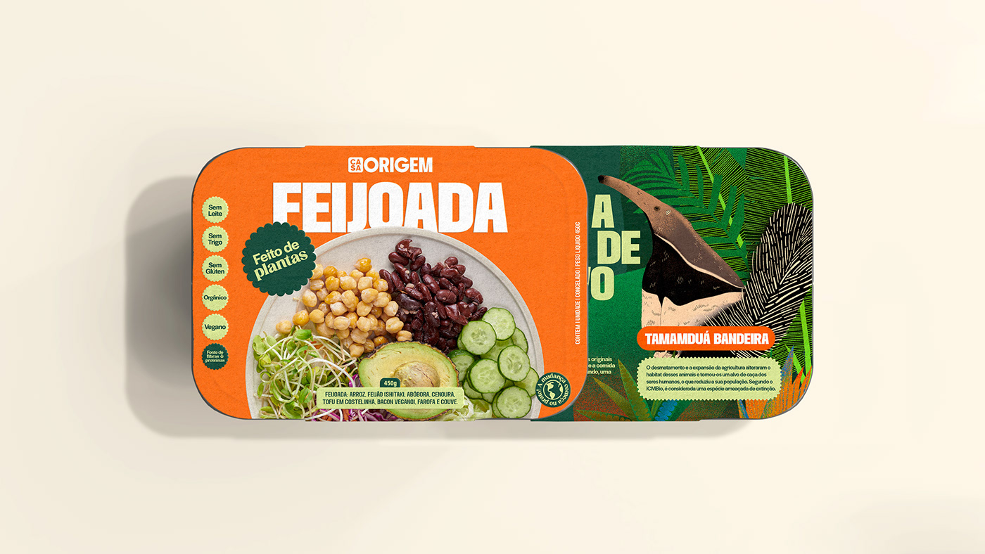
To represent the direct impact of this collective effort from farm-to-table, we created a colourful identity with a variety of illustrations and striking typography that visually captivates the consumer and reminds them that our food comes from this synergy with nature and all beings involved—the plants, the animals, including us humans, and the planet.
We developed a typographic system that conveys the plurality and the power that the food on our plate has in the everyday life. The bold and condensed Chandler typeface for the headings generates the impact; the grotesque Halyard initiates the conversation; and the serif HV Cocktail continues the dialogue with another tone. The logotype is based on the Chandler typeface to trasmit the impactful nature of Casa Origem and features a redesign of the O & G letters to a more geometrical form to convey the circle economy.
The colours were inspired by the food itself—colourful, multiple and tasty. This is translated throughout the whole identity, packaging, social media and illustrations.

