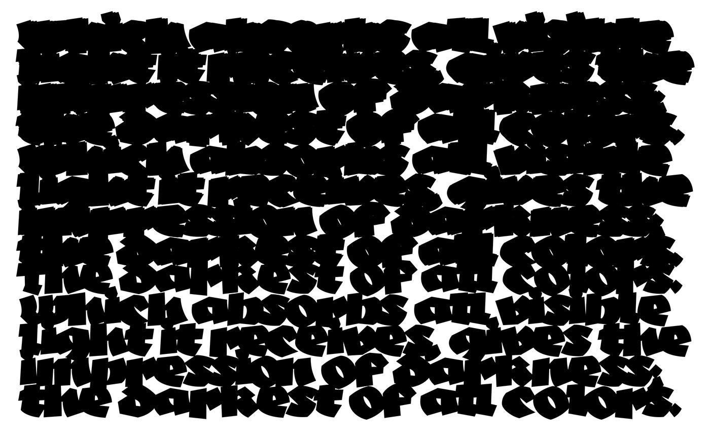
Negatif comes from an intention to simplify the gothic letter with a unique black style. The letters were first designed with some calligraphic research and then cut out in black paper. With the aim of obtaining raw, incisive, cutting forms. It consists in carving in the matter as sculpture.
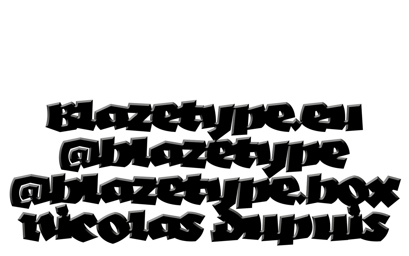
Typography by Nicolas Dupuis
Motion Design by Allan Gomila


The particular feature of Negatif is its spacing. Carried out from Glyphs app, the letters touch each other and have been reworked to create a solid and black block of text. The letters have been thought to be shown in big and large compositions. They are bold enough to add textural effects and to play with overlays. It's up to you to reveal your darkest side!