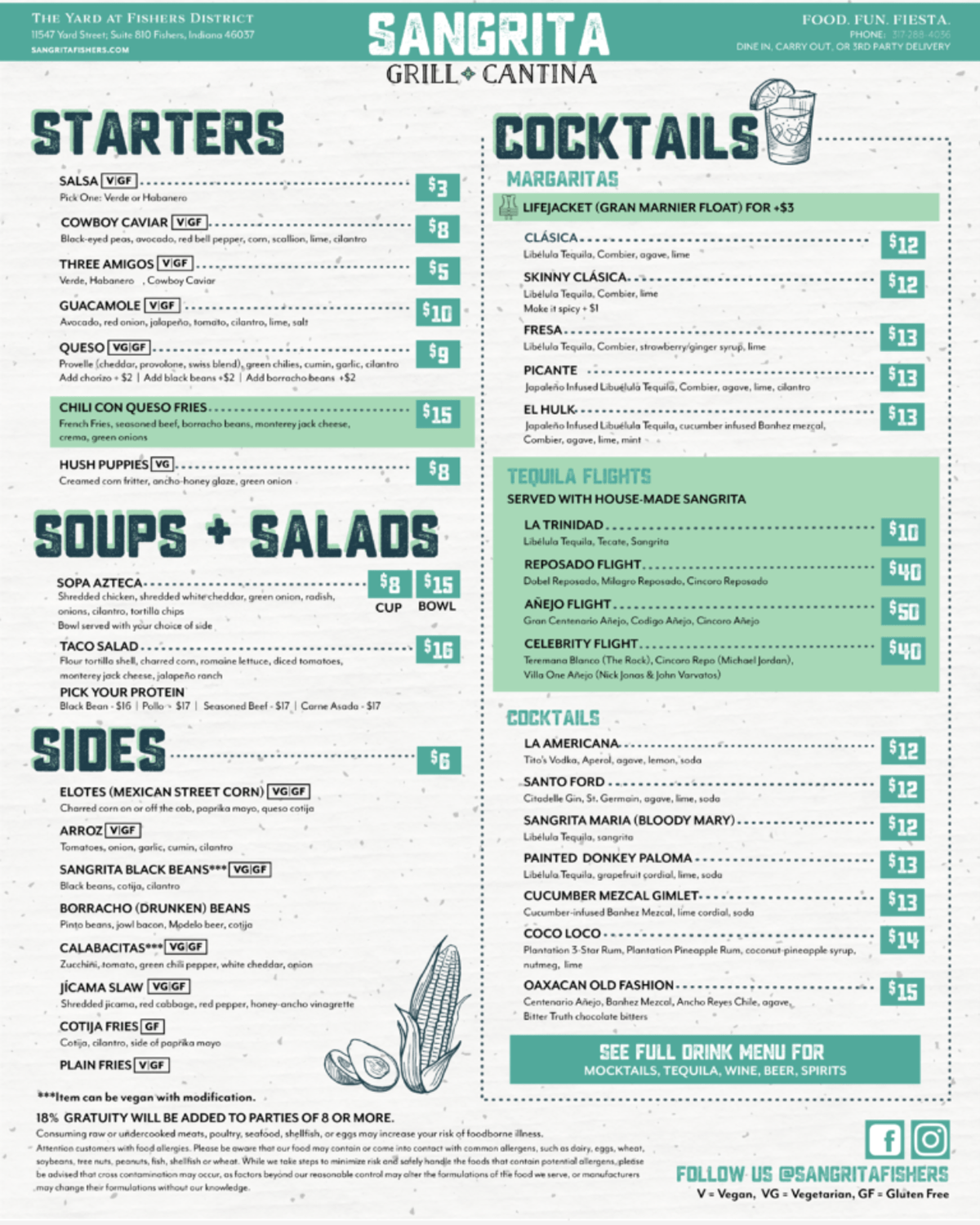
Before
After
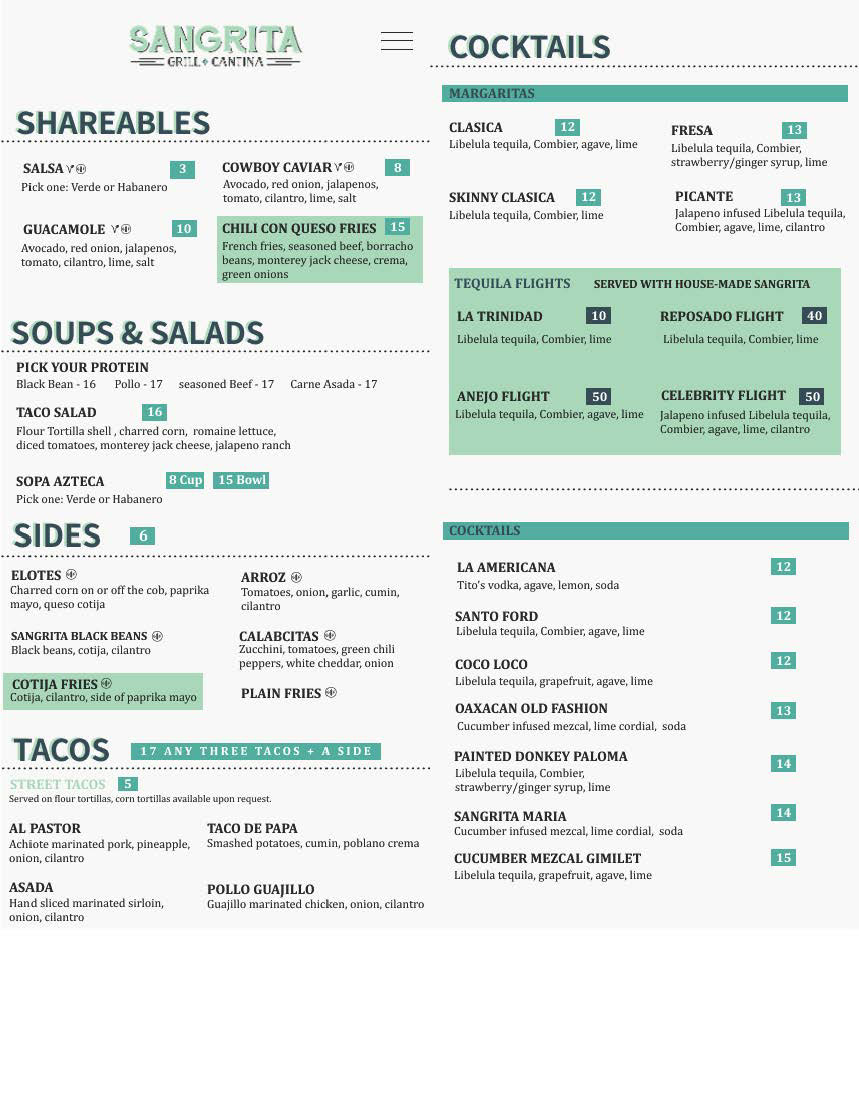
In the original menu, I thought it was too cluttered and hard to read. In my redesigned version, I took away almost all of the dotted lines that I thought were unnecessary and made the text slightly bigger so it could be easier to read. I also took away the dollar sign icon because I wanted to give the new version a simpler look. I switched the gluten and vegan icons as well because I thought the original ones were too large.
