


ARRIMO | Visual Identity
[PT]
Sobre
A empresa é fruto da amizade e parceria entre Beatriz, Eduardo e Lailson, conexão que ultrapassou fronteiras para que através do ramo imobiliário, pudessem proporcionar transformação e atendimento personalizado à seus clientes, visto que é uma grande deficiência do mercado.
Será uma imobiliária que atuará no segmento de compra e venda de imóveis, tendo sua filial inicial estabelecida em Timon – Maranhão, estendendo-se também para Teresina – Piauí. A empresa se planeja para que daqui há um breve período de tempo, possua mais filiais, transformando-se em referência no mercado imobiliário nos dois estados.
Tendo a diferenciação como pilar principal, os sócios queriam trazer aspectos regionais e imprimir sua própria identidade no ramo imobiliário – menos do mesmo e mais personalidade –, Logo, Beatriz nos procurou para desenvolvermos a identidade visual de sua empresa.
—
[EN]
About
About
The company is the result of the friendship and partnership between Beatriz, Eduardo and Lailson, a connection that crossed borders so that through the real estate sector, they could provide transformation and personalized service to their customers, since this is a major deficiency in the market.
It will be a real estate company that will operate in the property purchase and sale segment, having its initial branch established in Timon – Maranhão, also extending to Teresina – Piauí. The company plans to have more branches in a short period of time, becoming a reference in the real estate market in both states.
Having differentiation as the main pillar, the partners wanted to bring regional aspects and print their own identity in the real estate sector – less of the same and more personality –, so Beatriz came to us to develop the visual identity of her company.
—
Client: Beatriz Costa - Arrimo
Tasks: Visual Identity
Designer: Carolina Moreira, Brazil
Studio: Agência Sollara Brands
[PT]
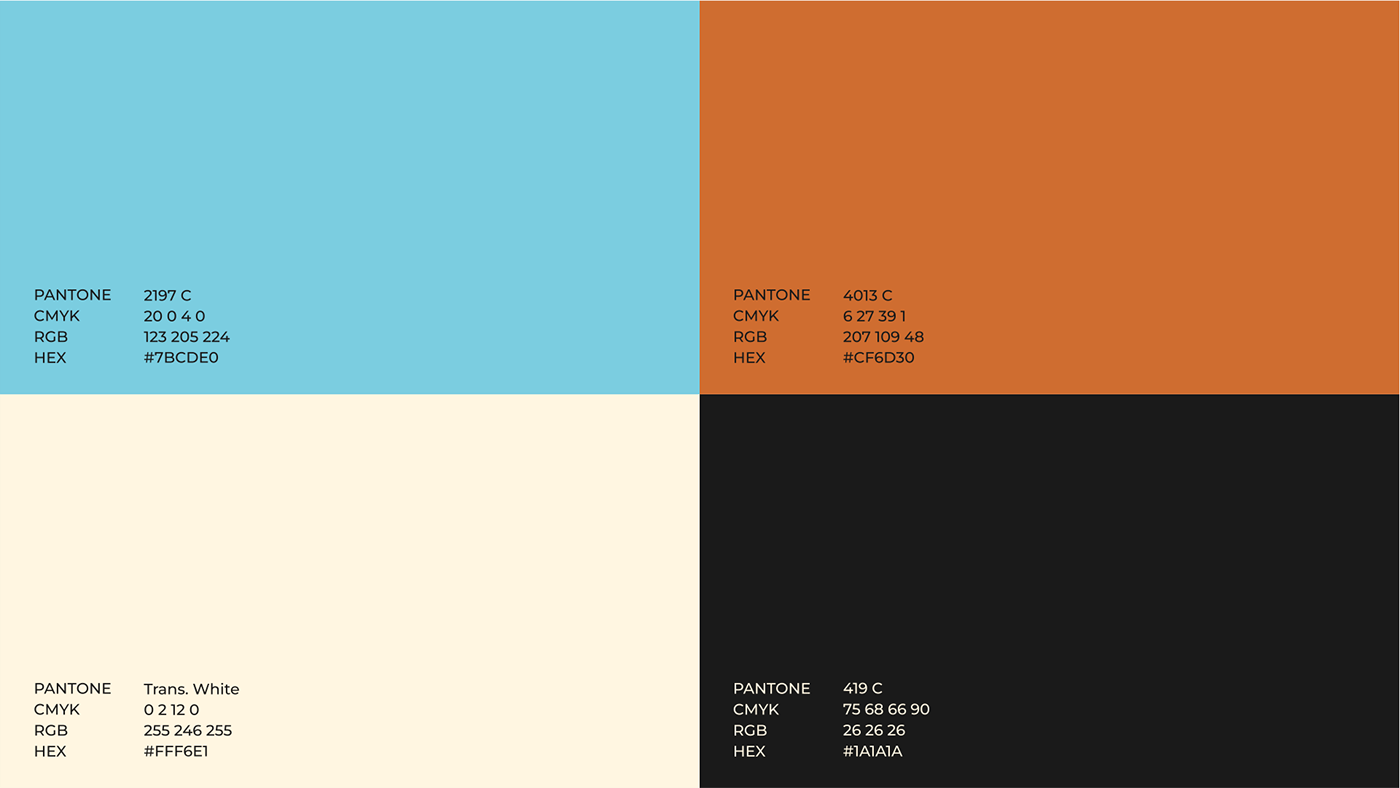
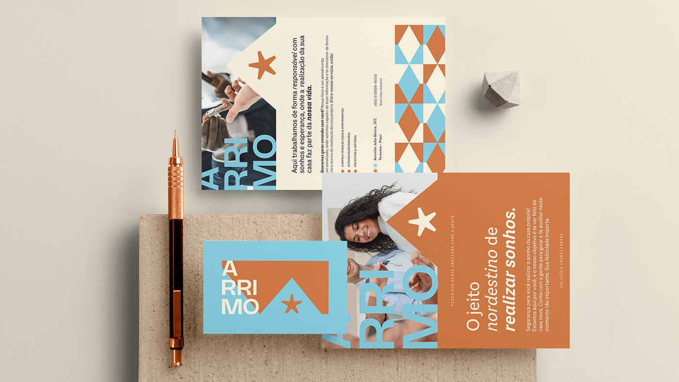
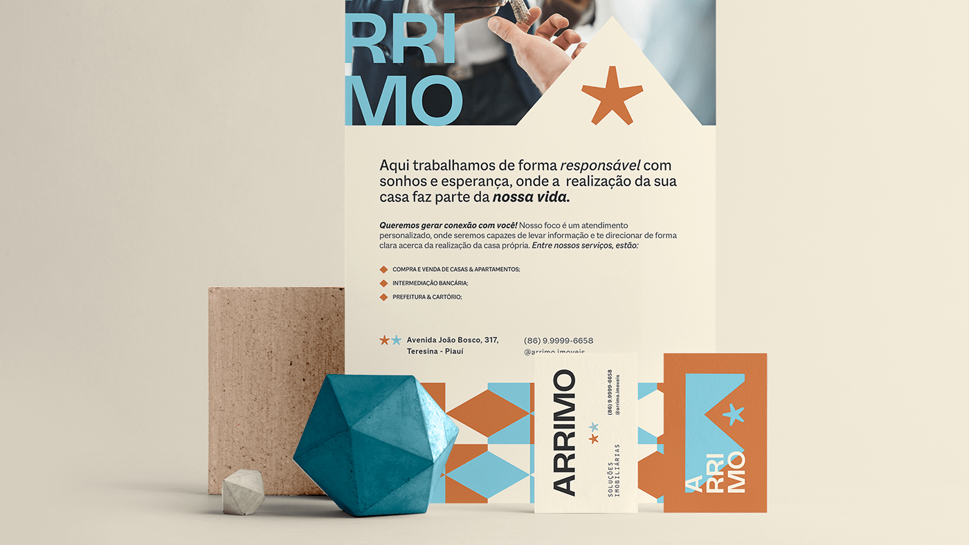
Cores
O azul foi sugerido pelos proprietários. Aqui, sua função é de representar o céu nordestino que sempre (na maior parte das vezes) está aberto. Além disso, o azul simboliza a tranquilidade, serenidade, harmonia e o infinito.
A cor marrom foi trazida para simbolizar a terra, o solo nordestino. De um ponto de vista psicológico, a cor marrom faz referência ao bem-estar, ao relaxamento e representa qualidade.
O bege é uma cor que transmite calma e serenidade. Está associado à elegância e ao clássico. Já a cor preta tem relação com a elegância, dignidade, luxo e sofisticação.
—
[EN]
Colors
Blue was suggested by the owners. Here, its function is to represent the northeastern sky that is always (most of the time) open. In addition, blue symbolizes tranquility, serenity, harmony and infinity.
The brown color was brought to symbolize the land, the northeastern soil. From a psychological point of view, the color brown refers to well-being, relaxation and represents quality.
Beige is a color that transmits calm and serenity. It is associated with elegance and the classic. The color black is related to elegance, dignity, luxury and sophistication.
[PT]
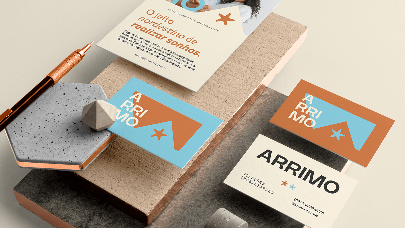
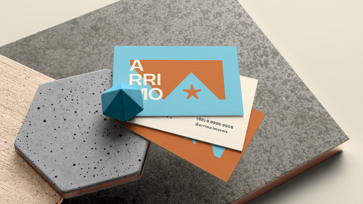
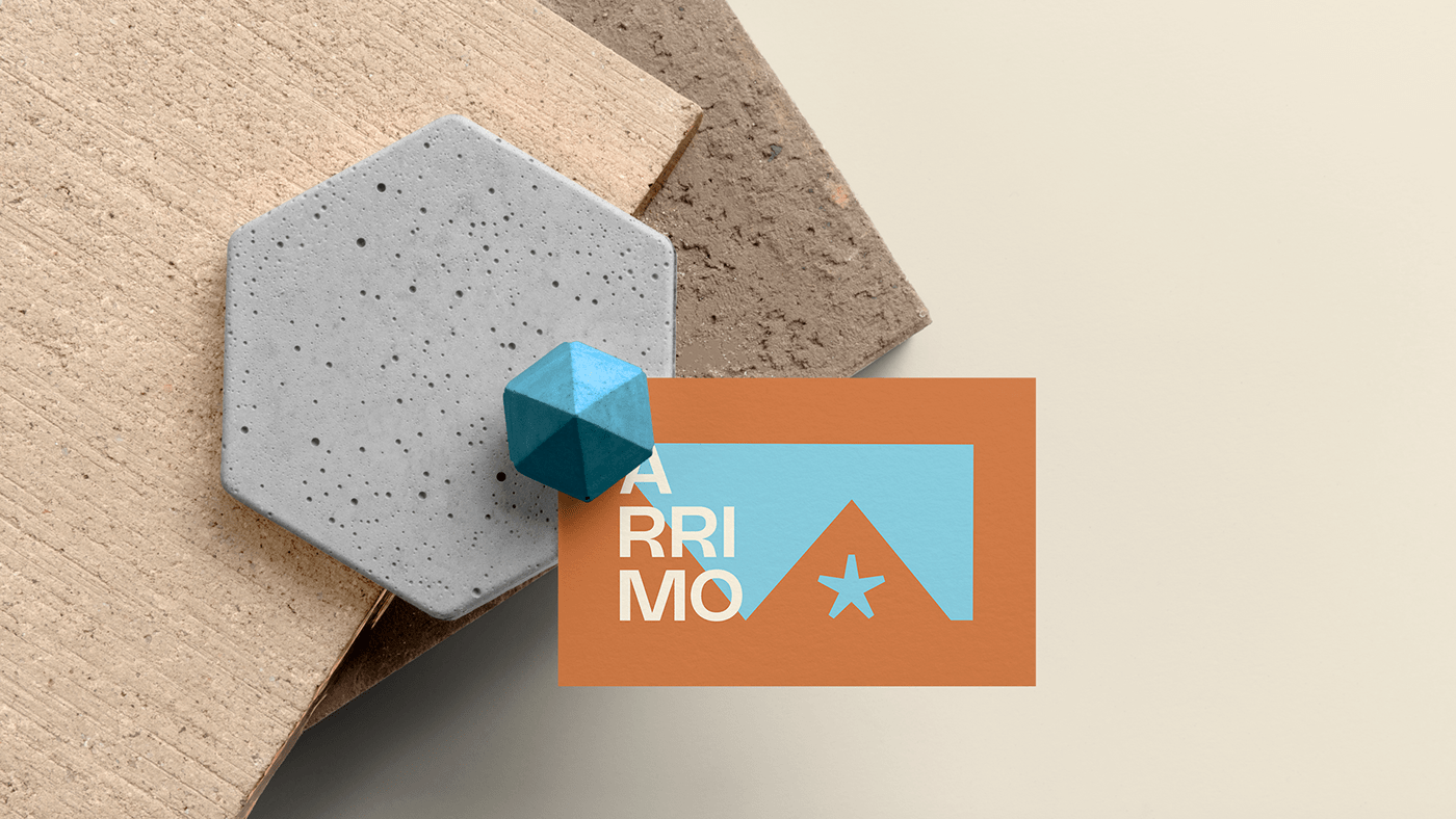
Símbolo
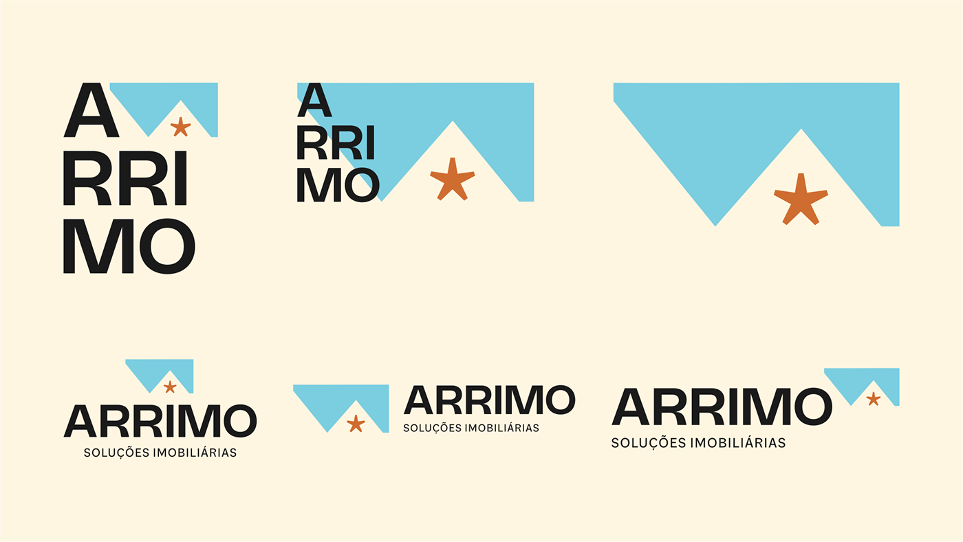
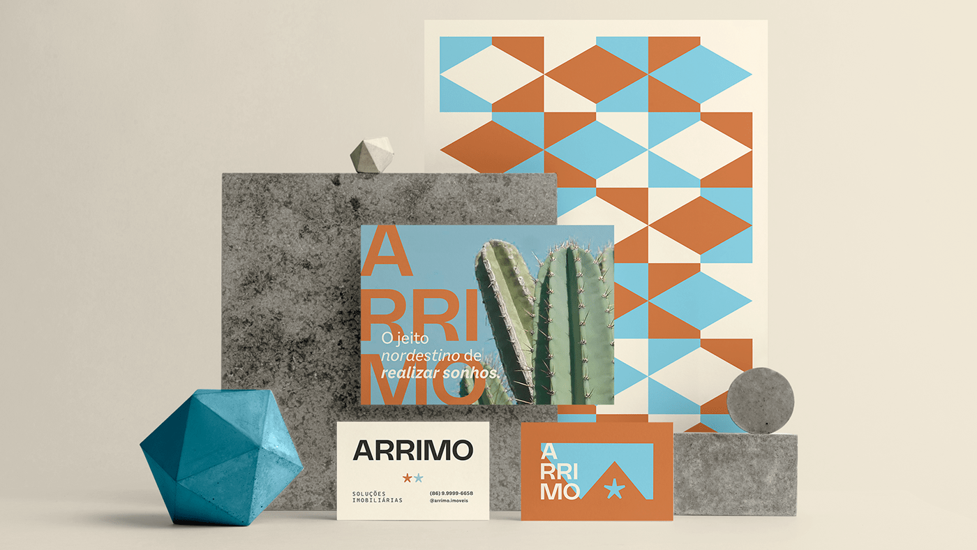
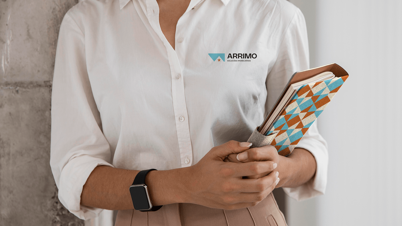
Assim como toda a identidade visual, o símbolo foi desenvolvido para trazer mais representatividade em aspectos regionais e diferenciação, tornando a marca única no mercado, trazendo uma identidade própria.
Especificamente, o símbolo foi criado a partir da figura de uma bandeira de festa, justamente para trazer o conceito de celebração ao se conseguir a casa própria, além disto, este símbolo (bandeira) é bem característico da região nordestina do país. À partir desta forma, pudemos desenvolver mais dois simbolismos: o de "arrimo", fazendo menção ao significado do nome da marca, onde temos a lateral esquerda inclinada, e o "telhado" de uma casa, trazendo a fácil associação ao tipo de negócio.
Não queríamos representar o telhado de uma casa através da janela em sua forma comum (quadrado), então, mais uma vez pensando em aspectos de regionalismo e representatividade, utilizamos uma estrela para tal. A estrela é um símbolo bem importante, afinal está presente nas duas bandeiras dos dois estados. Representa a união entre os sócios.
Em negativo, acabamos enxergando o símbolo de um triângulo. Ele representa crescimento, mudança e prosperidade. Além disso, o símbolo possui cantos pontiagudos/retos, e tais formas denotam aspectos de seriedade e liderança.
Neste símbolo, possuímos os seguintes simbolismos:
- Arrimo: Símbolo que faz referência ao nome da marca. Denota aspectos de segurança/suporte.
- Bandeira: Símbolo característico da região. Representa a celebração da conquista de um imóvel próprio.
- Casa (teto): Símbolo que associa a marca ao tipo de serviço oferecido. Fácil associação.
- Estrela: Símbolo presente nas bandeiras dos dois estados.
- Triangulo (Pirâmide): Símbolo que representa crescimento, mudança e prosperidade.
—
[EN]
Symbol
Like the entire visual identity, the symbol was developed to bring more representation in regional aspects and differentiation, making the brand unique in the market, bringing its own identity.
Specifically, the symbol was created from the figure of a party flag, precisely to bring the concept of celebration when you get your own home, in addition, this symbol (flag) is very characteristic of the northeastern region of the country. From this way, we were able to develop two more symbolisms: that of "support", referring to the meaning of the brand name, where we have the left side inclined, and the "roof" of a house, bringing the easy association to the type of business .
We didn't want to represent the roof of a house through the window in its common form (square), so, once again thinking about aspects of regionalism and representativeness, we used a star for this. The star is a very important symbol, after all it is present in the two flags of the two states. It represents the union between the partners.
In negative, we end up seeing the symbol of a triangle. It represents growth, change and prosperity. Furthermore, the symbol has pointed/straight corners, and such shapes denote aspects of seriousness and leadership.
In this symbol, we have the following symbolism:
- Arrimo: Symbol that refers to the brand name. Denotes security/support aspects.
- Flag: Characteristic symbol of the region. It represents the celebration of the conquest of one's own property.
- House (ceiling): Symbol that associates the brand with the type of service offered. Easy association.
- Star: Symbol present in the flags of the two states.
- Triangle (Pyramid): Symbol that represents growth, change and prosperity.


Obrigada por chegar até aqui! :)
Pronto para fazer da sua marca incrível?
Se você está interessado em desenvolver a sua marca conosco, nos solicite um orçamento. Te responderemos o mais breve possível.
Sollara Brands – 2023
Todos os Direitos Reservados.
www.sollarabrands.com | agenciasollara@gmail.com | +55 12 9 8264-3514
Developed by Carolina Moreira in Brazil.


