See Full Project at redkroft.com

Molecure
Using the language of empathy and science to build the biotech giant’s brand communication.
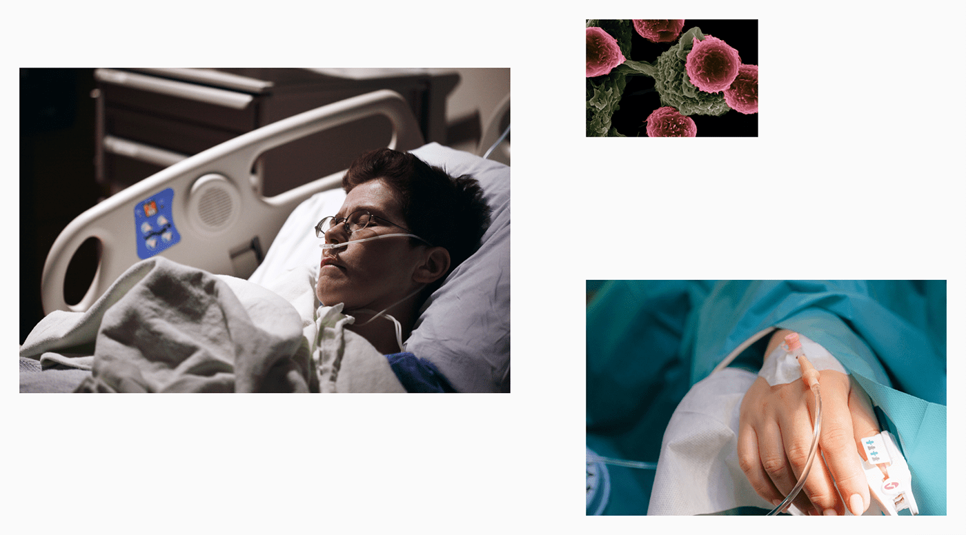
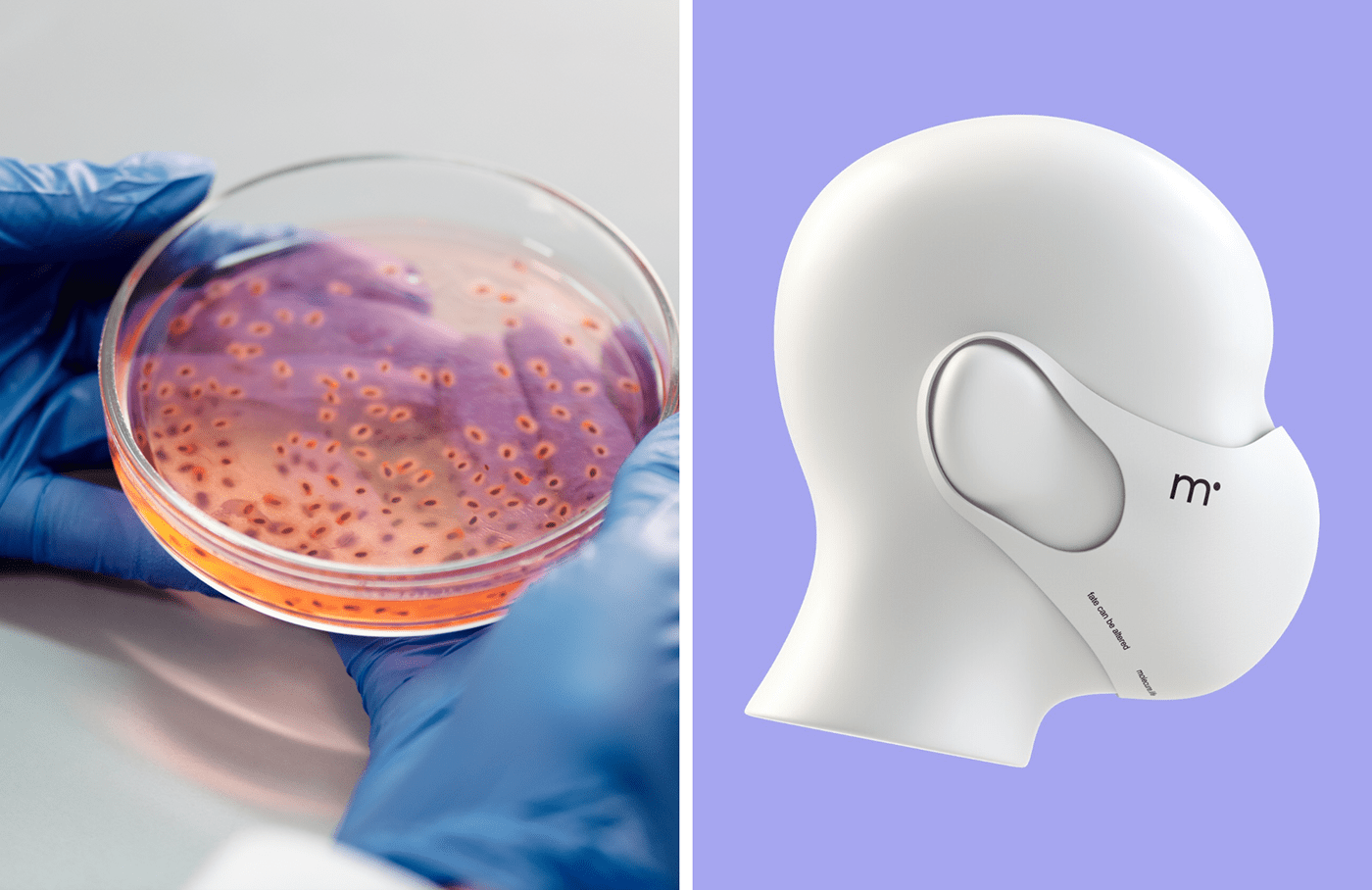
Molecure (previously OncoArendi Therapeutics) is one of the largest medical biotechnology companies in Poland. They specialise in researching molecule drugs for diseases that cause an average survival rate of 3-5 years after diagnosis. In other words, they seek cures for the incurable. Our task was to design a brand identity system that accurately represents the motivation and values of the Molecure team. We chose to base the communication on the language of empathy and science.

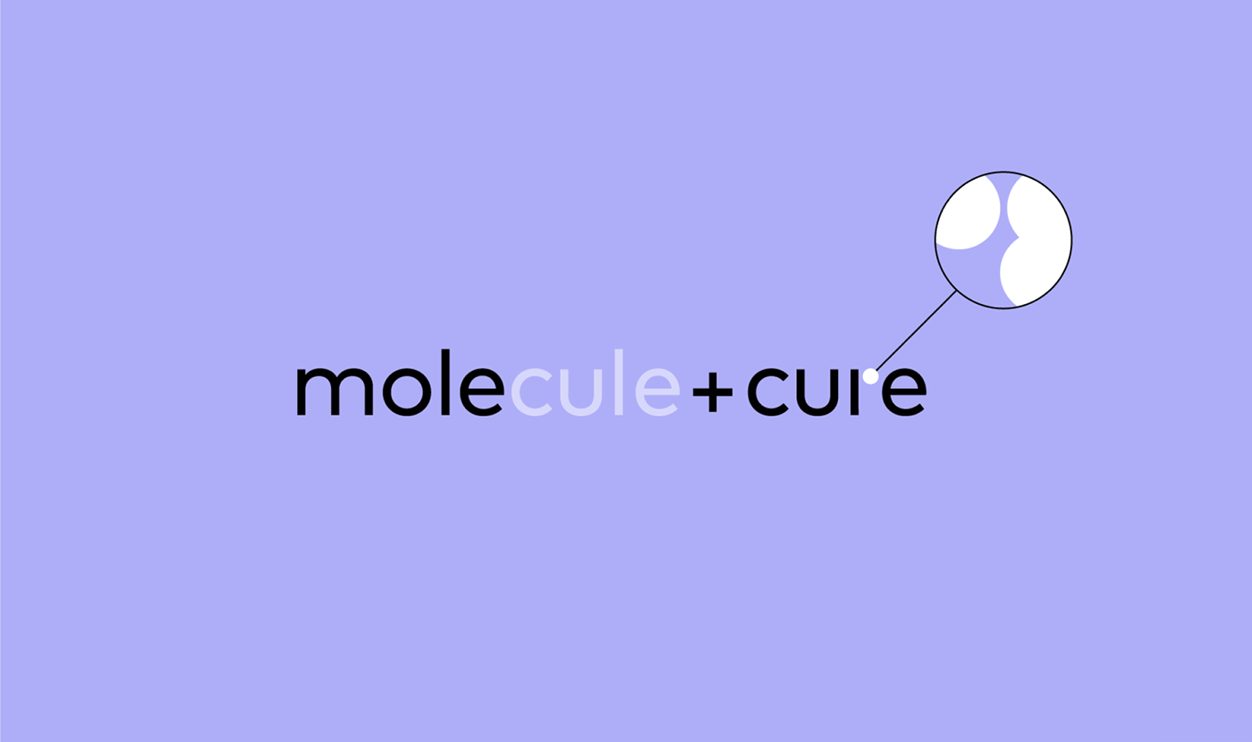
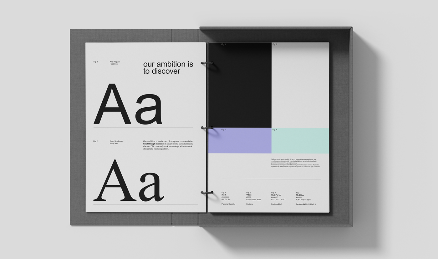
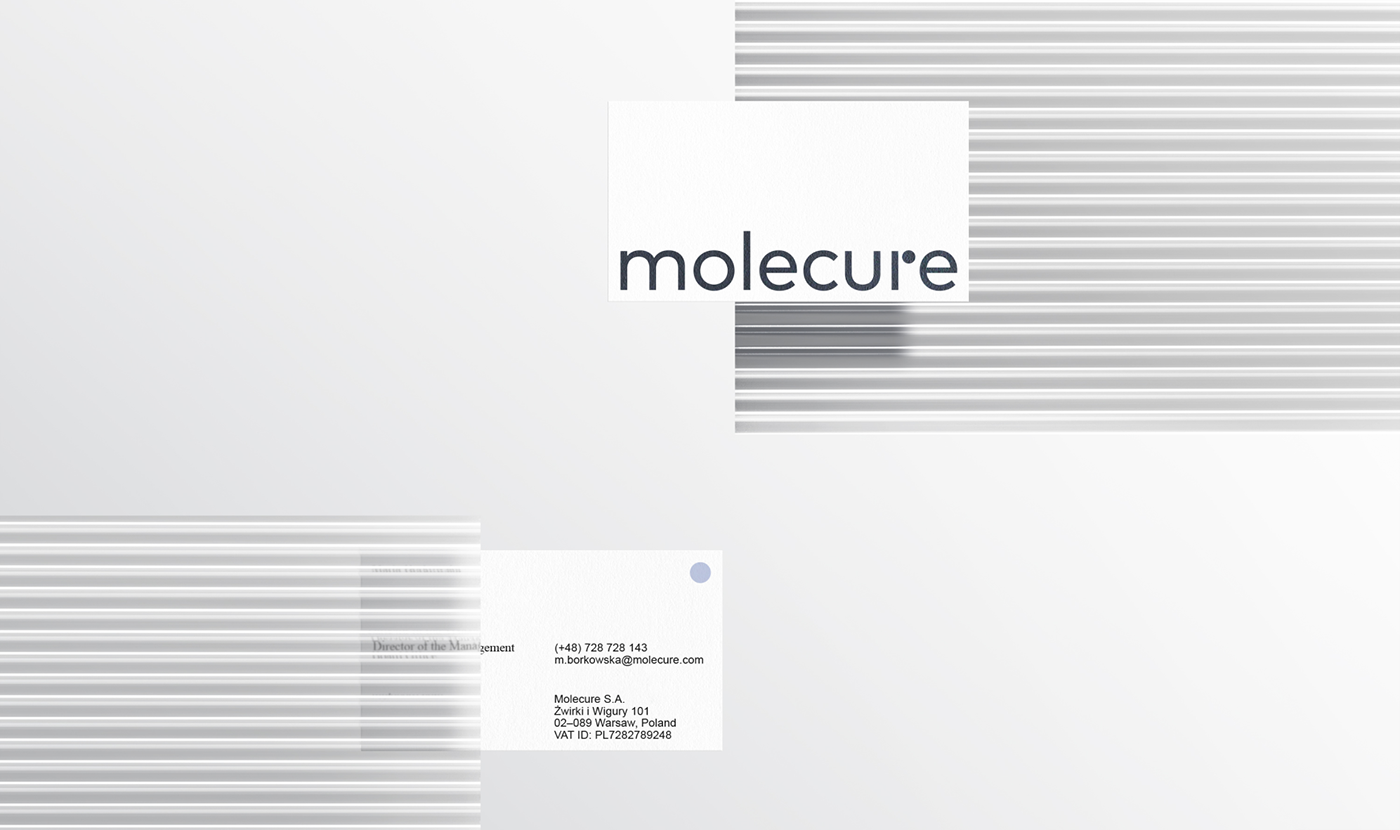
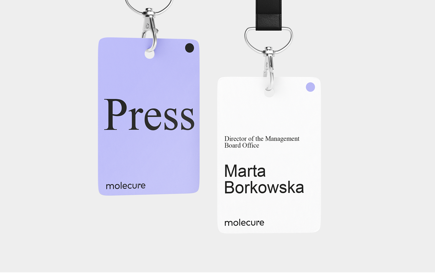
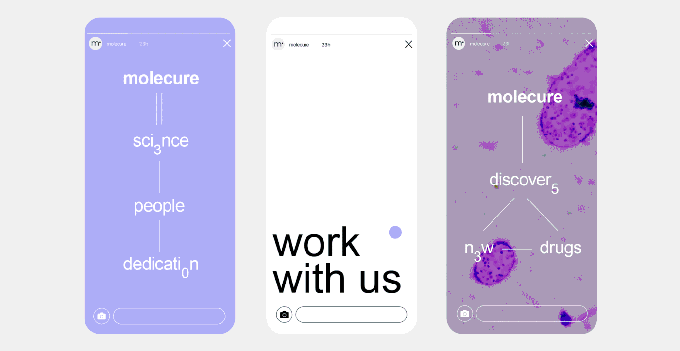
The geometry of the logotype symbolises the geometry of molecules.
The rounded letters and modified “r” refer to the world seen through a microscope - the biotech domain of the medical company.
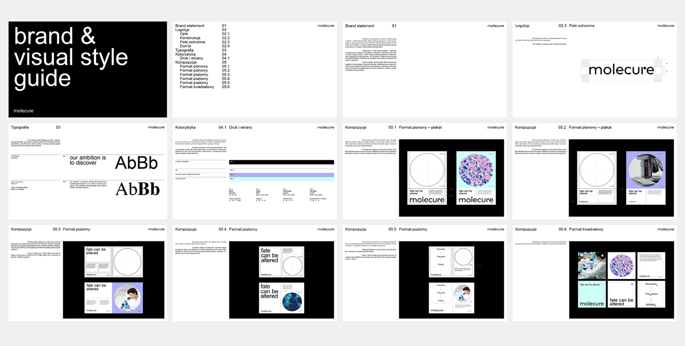
We chose Arial and Times New Roman as our basic typefaces, inspired by scientific papers’ standards.
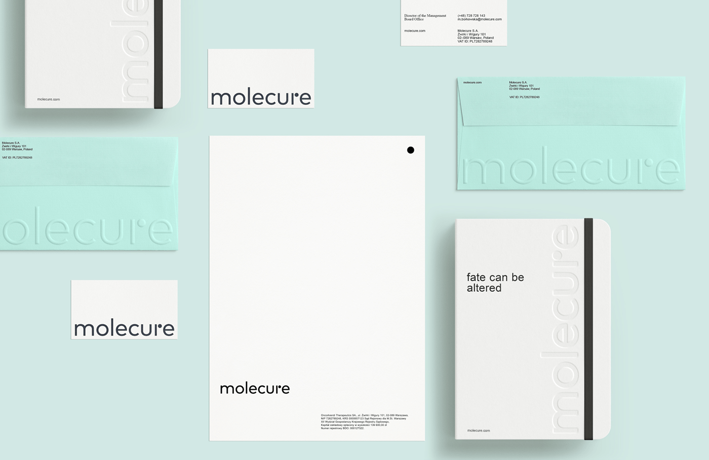


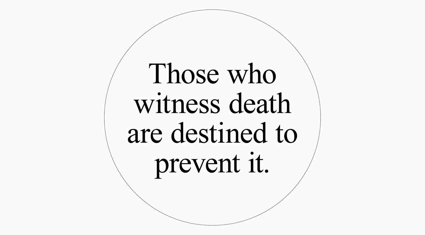
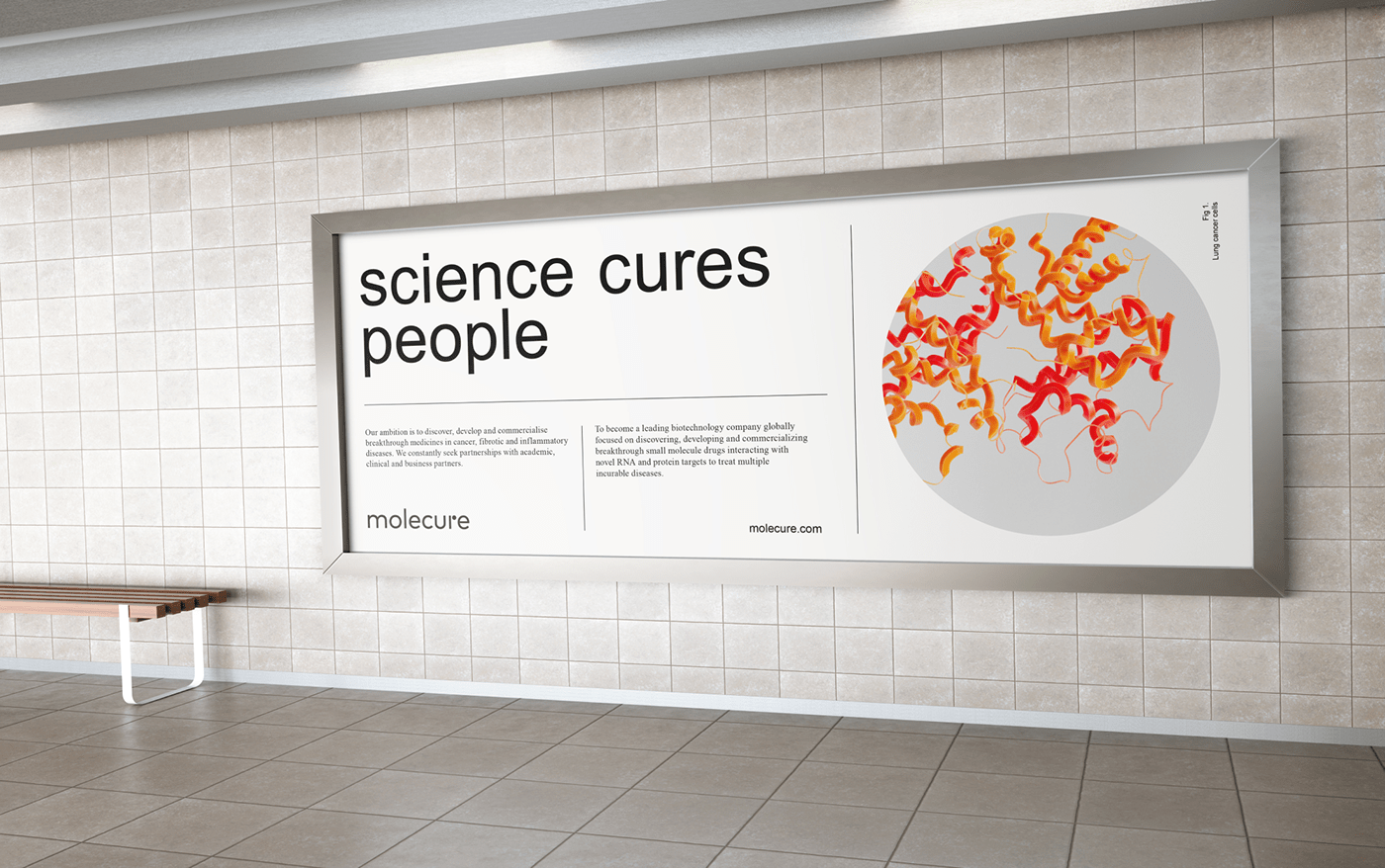
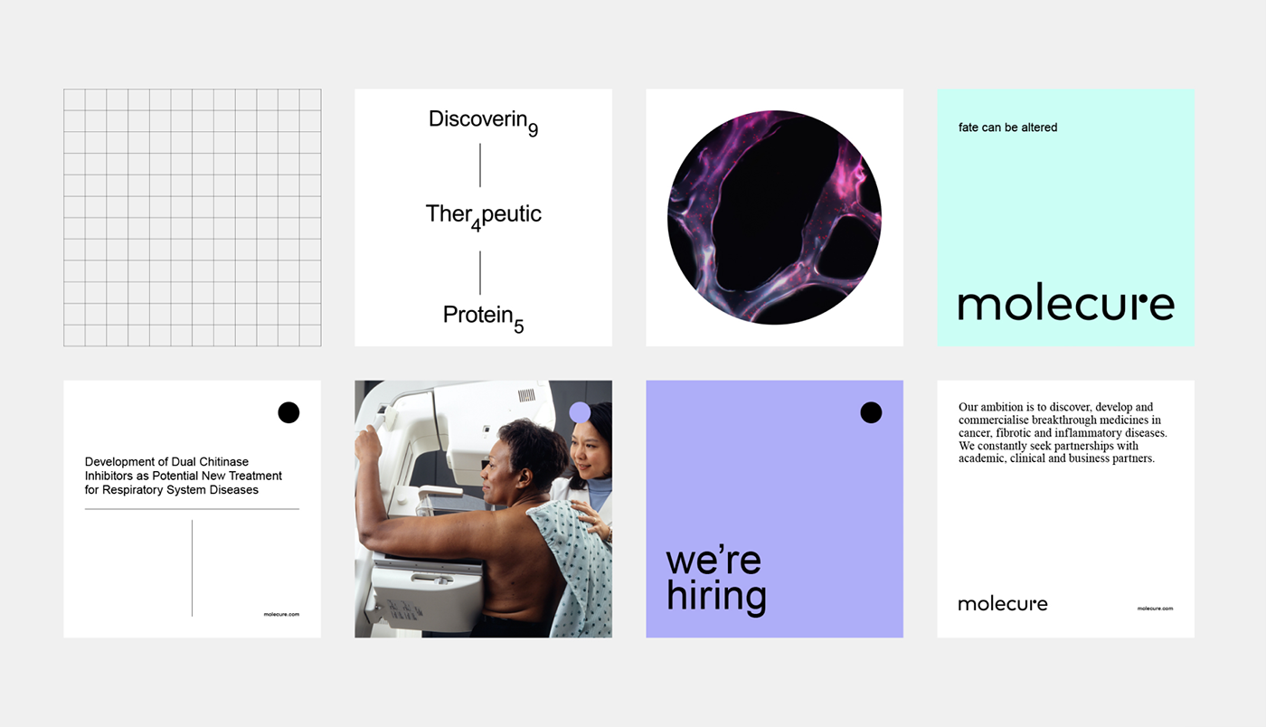
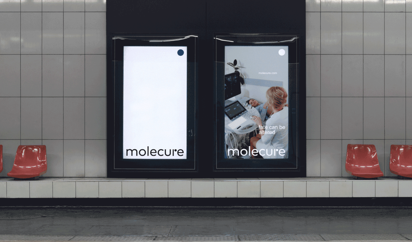
The tagline “Fate can be altered” is the essence of the Molecure team’s mission statement.
The slogan combines the seeming naivety with the determination needed when fighting for life in a hopeless situation - in the case of the company's team, it's finding cures for incurable diseases.


“Redkroft was able to bring out the most exciting things about our brand. What's better, we fell in love with our company even more”.
Sławomir Broniarek
Member of the Board, Molecure


