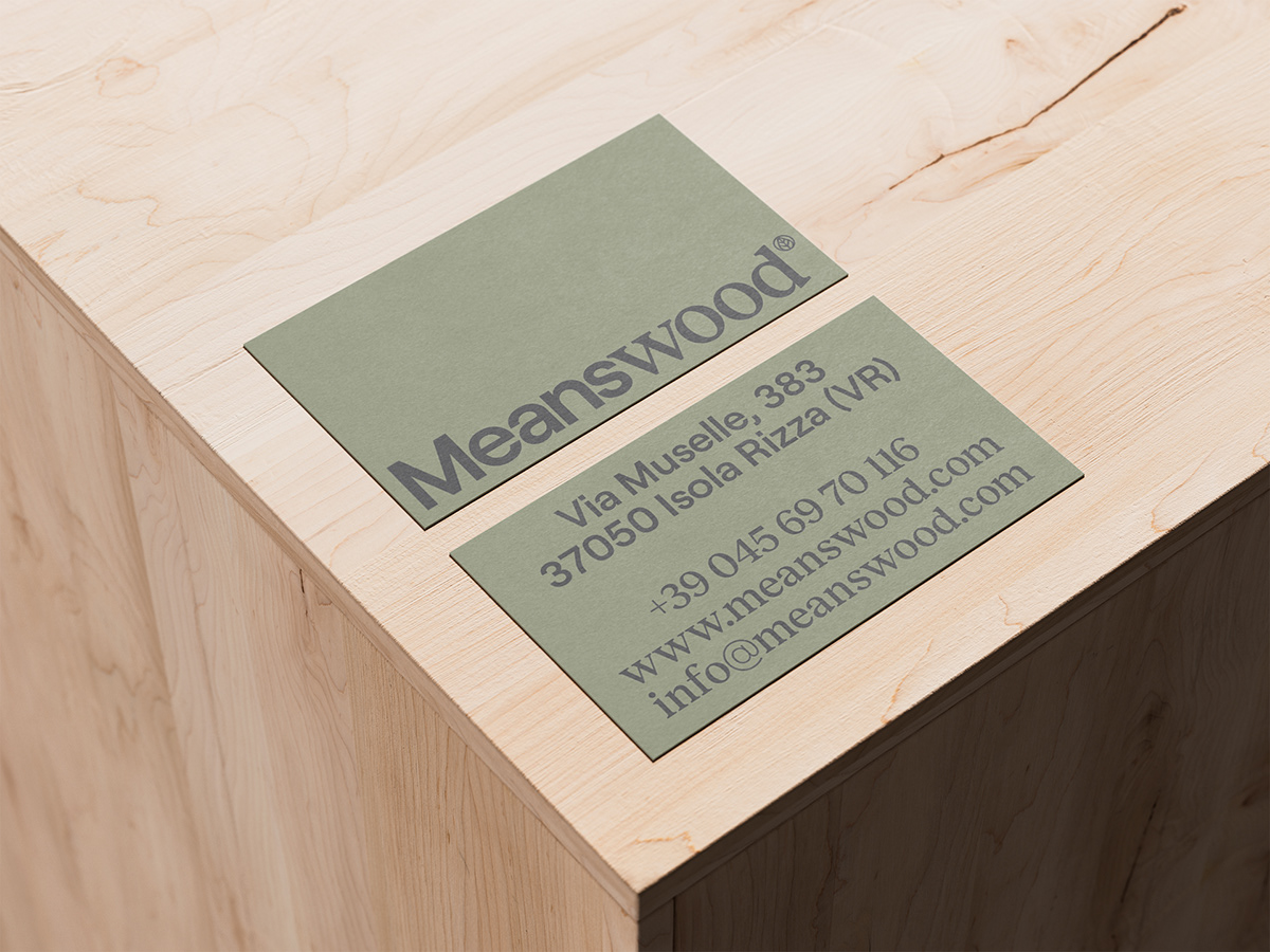
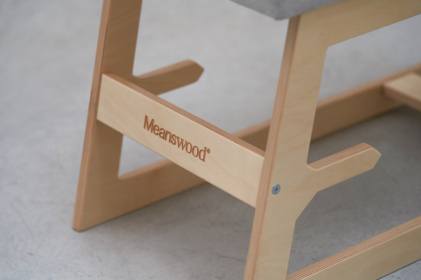
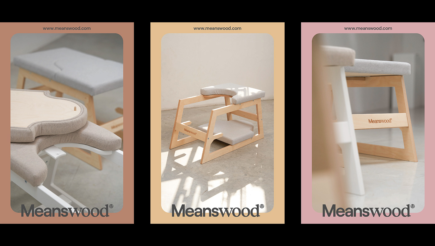
Il rebranding di Meanswood è stato un lavoro di rivoluzione stilistica volta alla valorizzazione del prodotto nella sua più naturale forma. Un’opera di restyling conservativa ed innovativa allo stesso tempo, per dare continuità alla precedente immagine con gentilezza. Il font bastoni trasmette l’anima moderna del prodotto, il carattere graziato enfatizza invece la tradizione legata all’uso di un materiale nobile come il legno e alla sua lavorazione ricca di storia e tradizione. Pulizia, semplicità e immediatezza sono il legame per lo sviluppo di una corporate al servizio del prodotto stesso. Perché quando si parla di una cosa semplice come il benessere, non si possono usare linguaggi complessi.
The rebranding of Meanswood was a work of stylistic revolution aimed at enhancing the product in its most natural form. A conservative and innovative restyling work at the same time, to give continuity to the previous image with kindness. The bastoni font conveys the modern soul of the product, while the serif character emphasizes the tradition linked to the use of a noble material such as wood and its manufacturing rich in history and tradition. Cleanliness, simplicity and immediacy are the link for the development of a corporate at the service of the product intself. Because when we talk about something as simple as well-being, we cannot use complex language.


For more updates visit mezzopienostudio.com
or follow us on Instagram