

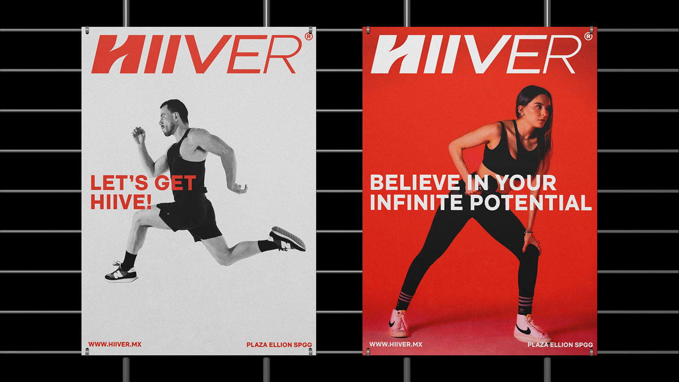
Hiiver®
Believe In Your Infinite Potential
Hiiver es una marca que nace en México y que busca romper paradigmas en la industria del fitness, creando atletas de alto rendimiento que tiene como base ideológica el trascender de forma física, mental y espiritual, a través de dos tipos de entrenamiento el Cycle y Bootcamp.
-
Hiiver is a brand founded in Mexico and seeks to break paradigms in the fitness industry, creating high-performance athletes, whose ideological basis is transcending physical, mental, and spiritual, through two types of training: Cycle and Bootcamp.


Naming (Hive + High Intensity)
Hive significa colmena en inglés. Es el lugar donde habitan las abejas y el espacio donde trabajan intensamente y en equipo. Por otro lado High Intensity hace referencia a una actividad y/o entrenamiento de alto rendimiento.
Hive significa colmena en inglés. Es el lugar donde habitan las abejas y el espacio donde trabajan intensamente y en equipo. Por otro lado High Intensity hace referencia a una actividad y/o entrenamiento de alto rendimiento.
El significado de ambas palabras describe la actividad, el nivel, la energía, los sentimientos y la fuerza que vive la comunidad de HIIVER.
-
Hive is the place where bees live and the space where they work intensely and as a team.
High Intensity refers to a high-performance activity and/or training.
The meaning of both words describes the activity, level, energy, feelings, and strength of the HIIVER community.

Para el logotipo exploramos diferentes opciones hasta llegar a una letra "H" que tiene la suficiente personalidad para funcionar por si sola como símbolo y al mismo tiempo se integra fluidamente con el nombre de la marca. Adicionalmente la tipografía del logotipo tiene una secuencia de pesos que simulan aceleración y dinamismo.
La marca mantiene un sistema visual minimalista, donde predominan el uso de la fotografía y tipografía para resaltar mensajes puntuales, además de contar con una onda expansiva que parte de la forma hexagonal de las celdas en los panales de abeja.
-
For the logo we explored different options until arriving at an letter "H" that has enough personality to function on its own as a symbol and at the same time integrates seamlessly with the brand name. Additionally, the typography of the logo has a sequence of visual weights that simulate acceleration and dynamism.
The brand maintains a minimalist visual system, where the use of photography and typography predominate to highlight specific messages, in addition to having an expansive wave that starts from the hexagonal shape of the cells in the honeycombs.


¡Gracias!
Visual Identity: Andrés Ávila
Naming, Strategy & Website: Elemental Branding
Photography: Mau Cagigas @Maucagigas
Photography: Mau Cagigas @Maucagigas
🡦
Do you want to learn how to design a logo?
Check my course on Domestika