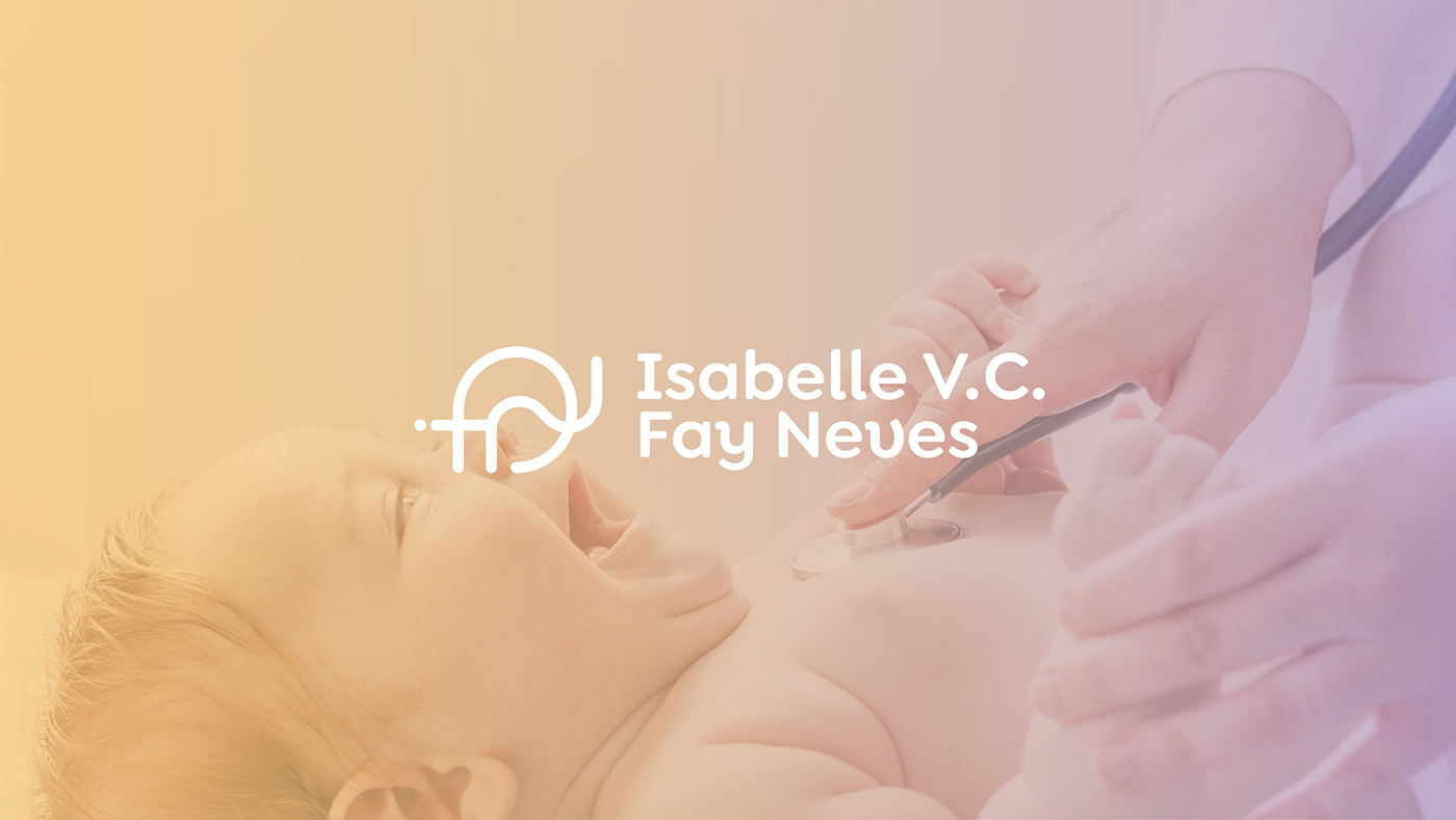
Isabelle Verônica Castro Fay Neves é uma médica do Rio de Janeiro, Brasil, atuante na área de Clínica Médica e Pediatria. O objetivo da identidade é transmitir confiança, profissionalismo e humanização.
Inicialmente a profissional irá atuar com a parte clínica geral e posteriormente focará em pediatria, portanto, um dos pilares da criação foi comunicar-se bem com ambas especialidades. Visamos mais a área de especialização, mas desenvolvemos algo que não restrinja o uso inicial.
Isabelle Verônica Castro Fay Neves is a physician from Rio de Janeiro, Brazil, working in Internal Medicine and Pediatrics. The goal of the identity is to transmit confidence, professionalism, and humanization.
Initially she will work in general practice and later on will focus on pediatrics, so one of the pillars of the creation was to communicate well with both specialties. We aimed more at the area of specialization, but developed something that does not restrict the initial use


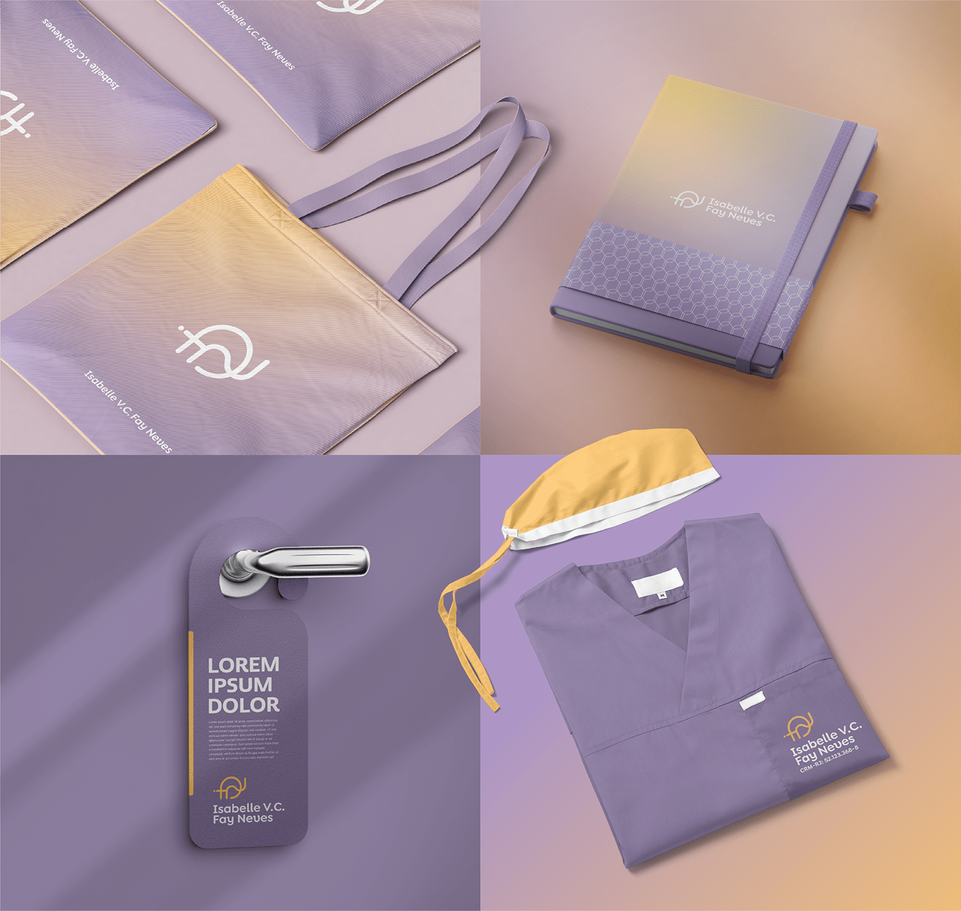
Usando as iniciais do nome desenvolvemos um símbolo abstrato, minimalista e moderno! O objetivo foi que o mesmo ficasse bom aplicado sozinho, sem a tipografia, para facilitar o uso em pontos de contato apontados pela cliente, como: ícones de redes sociais, adesivos e locais pequenos.
O símbolo foi um dos elementos mais importantes para deixar marca versátil. Ele não é limitante, pode ser usado em qualquer área da medicina, então atende bem o objetivo do projeto.
Using the initials of the name we developed an abstract, minimalist and modern symbol! The goal was that it would look good applied alone, without the typography, to facilitate the use in contact points pointed out by the client, such as: social network icons, stickers and small places.
The symbol was one of the most important elements to make her brand versatile. It is not limiting, it can be used in any area of medicine, so it meets the project's objective well.


mais atributos da criação
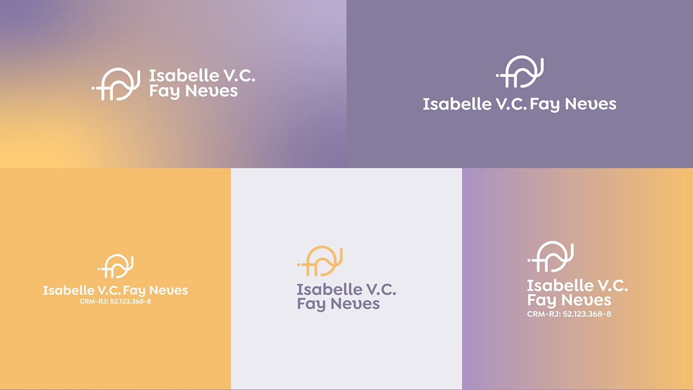
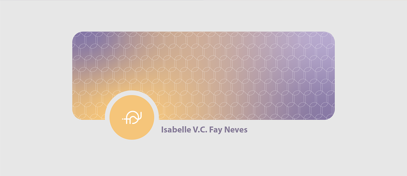
◦ A tipografia escolhida para o logotipo é minimalista e moderna. O acabamento arredondado deixa a marca mais próxima e amigável, conversando bem com a construção que fizemos.
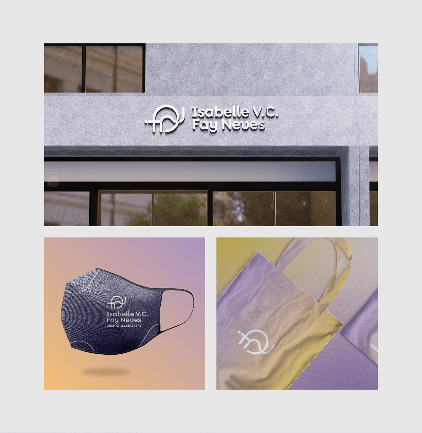
◦ Como sempre, prezamos pela boa aplicação, portanto, há variações de aplicação que preservam a identidade do logotipo indiferente do ponto de contato.
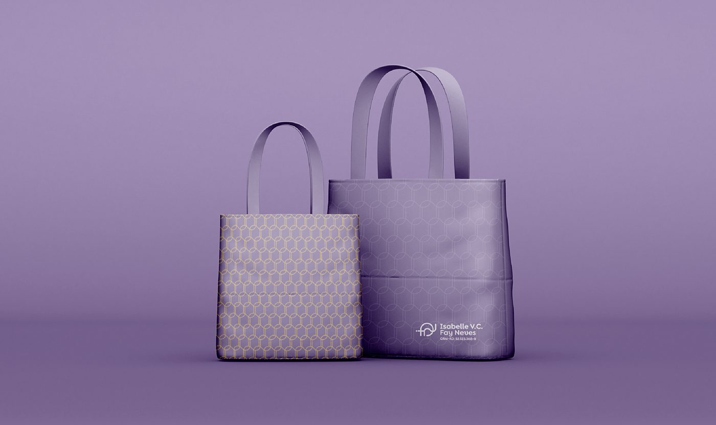
◦ Com base na fragmentação do símbolo trouxemos também alguns elementos e pattern para serem aplicados.
more attributes of the creation
◦ The typography chosen for the logo is minimalist and modern. The rounded finish makes the brand closer and friendlier, talking well with the construction we did.
◦ As always, we value good application, so there are application variations that preserve the identity of the logo regardless of the point of contact.
Based on the fragmentation of the symbol, we also brought some elements and patterns to be applied.