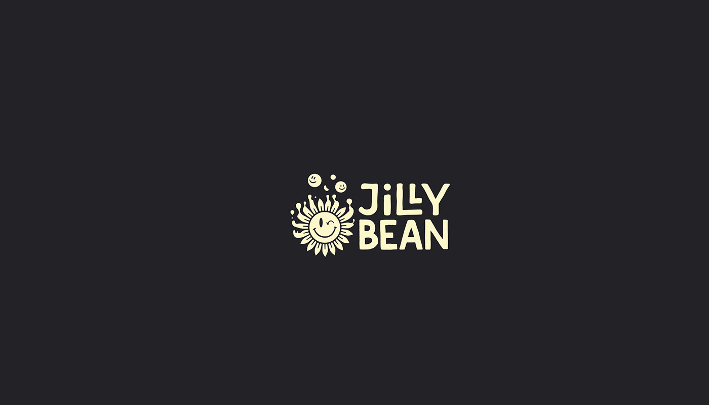
Jilly Bean is an indie nail polish brand that specializes in very unique glitter combinations. This project was a brand refresh with a logo that had good bones. Gabi Zuniga created the original word mark which was mostly kept the same because Jilly Bean had already established good brand recognition and is still young so building upon that was important. It also still felt like it represented the brand well and gave the refresh a great starting point.
Jillian, the founder of Jilly Bean, wanted a brand that felt elevated but inclusive. The primary goal was to make it feel very psychedelic without leaning too hard on stereotypical psychedelic designs and stand out among other indie polish brands. There's also a plan to create a kid's line of polishes so it needed to remain kid friendly.
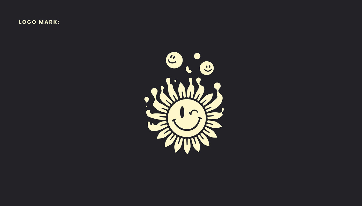
For this refresh we actually started with the illustrations first. Sometimes this fleshes out the visual identity so creating a logo is more like the final puzzle piece that has a clear outline. In this case, we needed to marry the new trippy, 80's, space inspired, illustration style with the original playful word mark so we needed an icon that holds both traits. I think floating between these spaces is where my work naturally wants to go anyway so it was a very fluid, frictionless process.
I took pieces from one of the illustrations and simplified it to become the goopy smiley sunflower mascot we have today!
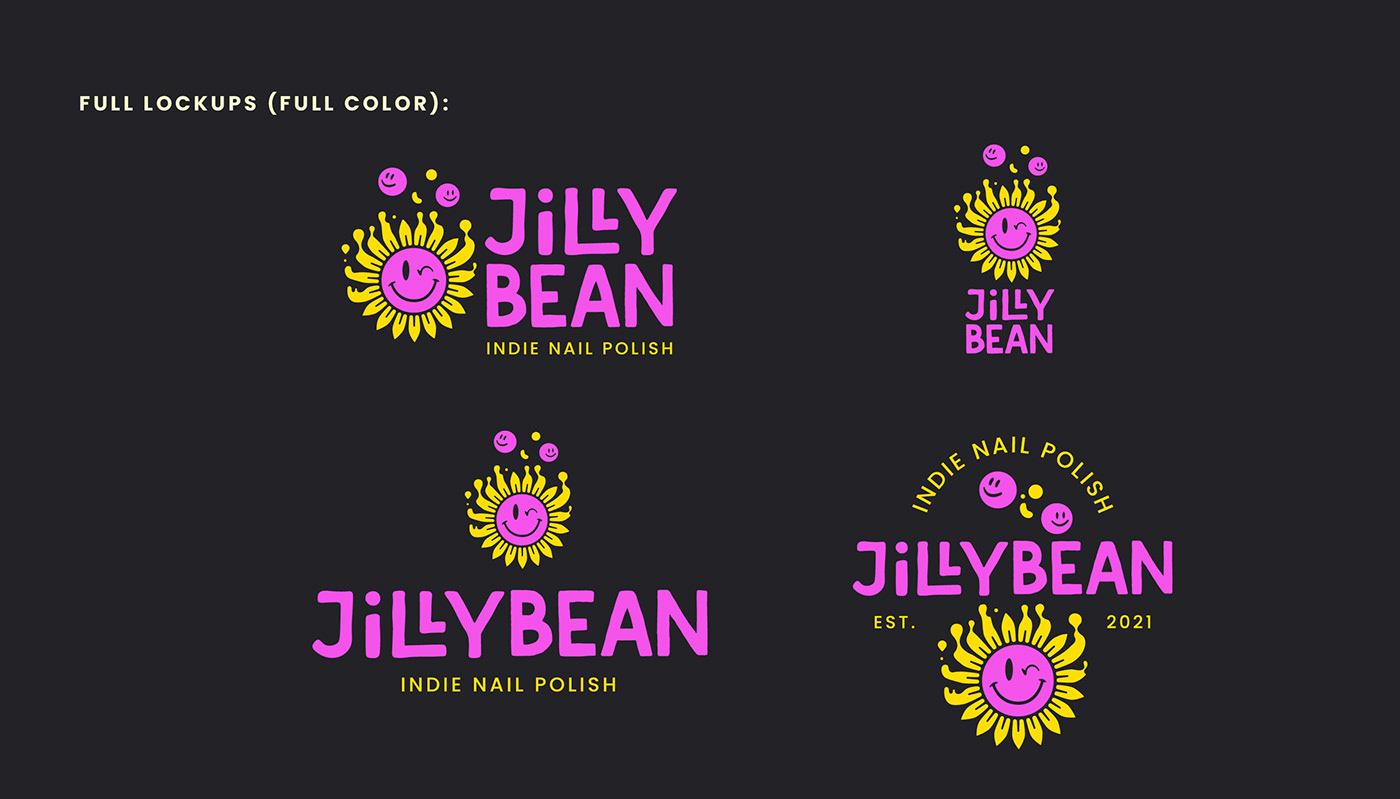
Here is the final brand identity for Jilly Bean. I think we created something that will stand out in the nail polish and beauty space but won't be a sore thumb. The delicate line between being unique and confusing is thin but I think if you nail it (no pun intended lol) just right, you come out with something truly special.