

Purified Simple Solutions
Proposed Brand Identity Design
Overview
Purified Simple Solutions is a company focused on emissions control technology. I wanted to give this logo a sleek, modern design. I also wanted to consider the different touchpoints where this identity will be needed. The founder of this company is a mutual friend and they are interested in using the updated design for their brand.


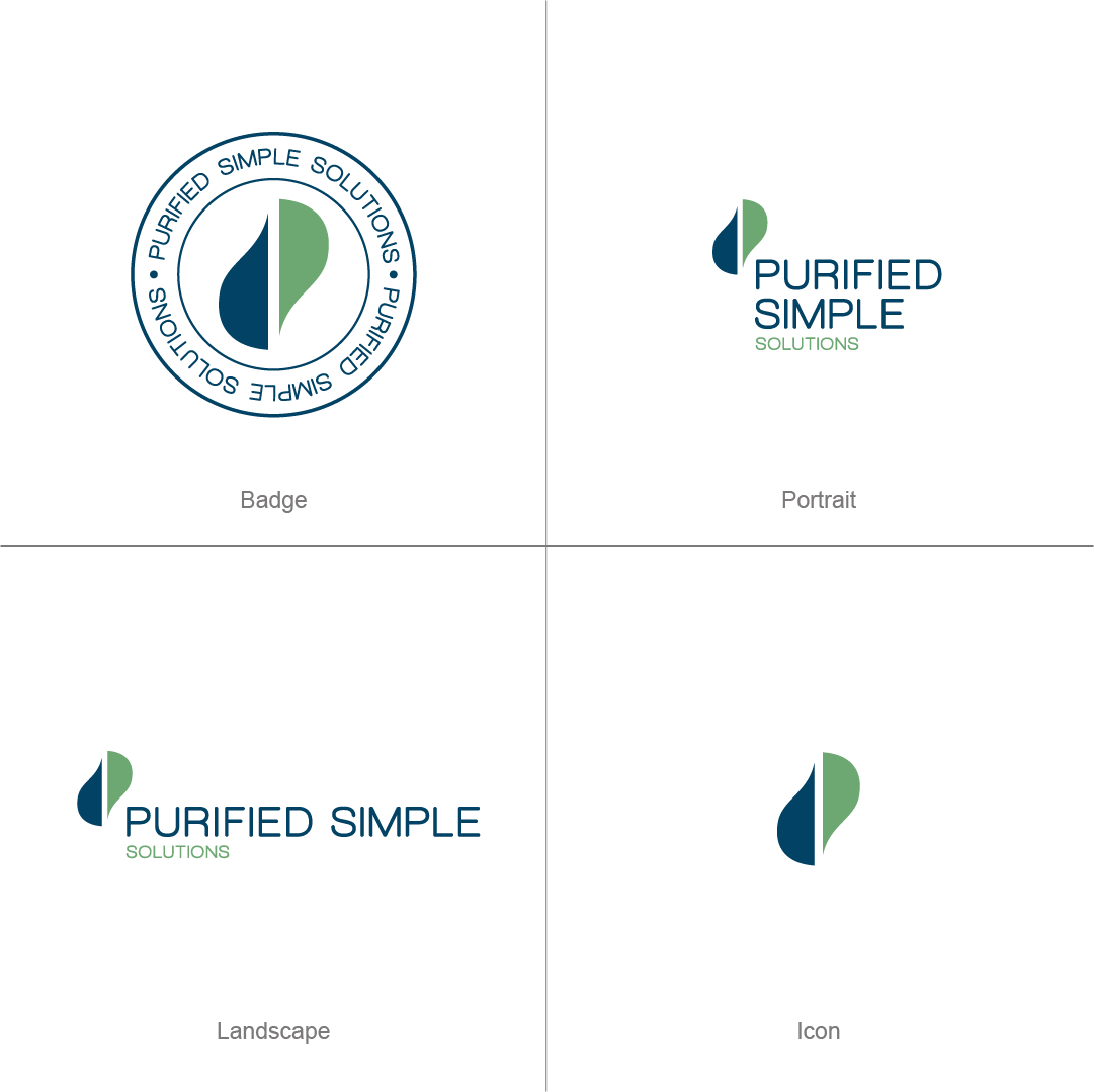
This company's technology is to help improve our environment, and the new logo's aim was to represent that idea in an abstract way using the icon. The blue represents a water droplet and the green represents a leaf. I also wanted this logo to be responsive and have an identity system that all works together.
Colors From Nature
I decided to keep the deep blue color from the original logo and I wanted to use a green that complemented the blue but could stand on its own when used. I also added a secondary accent color in sky blue to use as a background instead of stark white.

Fonts that Fit
I wanted a headline font with rounded edges to complement the curves in the logo icon. Walkway Rounded is the perfect fit. The font for the body copy is Noto Serif which has a more classic look to contrast the headline font.

Icon
I want this icon to be the symbol of the company. It can be used for the app, on merchandise, and turned into a pattern to be used on the back of business cards and in other unexpected places.


