

POSITIVE KIDS APP
Mockup image by Vectonauta on Freepik
BRAINSTORMING
The brief for this project is to design an app that calculates or uses numbers in some way. I began the brainstorming process by listing all the things I hated tracking or calculating and asked friends and family for their ideas as well. I then created a word map that started with basic categories, and then I branched out to discover more ideas.
I narrowed my ideas to the most viable options, such as a sunscreen reapplication calculator, an app to track water usage, an app to care for plants, a hay fever tracker, a children's reading log and companion app, and a positive self-talk app. I felt most passionate about a positive-self talk app for kids. I struggle with positive self-talk, and it's something my children struggle with, too. I was excited to create something that I'm enthusiastic about and that could make a positive change in the life of children.
I narrowed my ideas to the most viable options, such as a sunscreen reapplication calculator, an app to track water usage, an app to care for plants, a hay fever tracker, a children's reading log and companion app, and a positive self-talk app. I felt most passionate about a positive-self talk app for kids. I struggle with positive self-talk, and it's something my children struggle with, too. I was excited to create something that I'm enthusiastic about and that could make a positive change in the life of children.


Image 1 (left): mind map with my favorite ideas highlighted. Image 2 (right) brainstorming list that I compiled from notes on my phone and ideas recorded on the computer
RESEARCH FOR POSITIVE SELF-TALK APP
I began my research by reading up on what are effective ways to help children improve their positive self-talk. After reading several articles, I found that a child needs to recognize positive versus negative self-talk before they can change their thoughts. Practicing positive self-talk through recording thoughts is crucial to improvement, and daily practice is even more helpful. Children also improve their self-talk when they have positive role models who show them how to shift to positive thoughts. The articles mentioned the importance of focusing on effort more than results. I need to have a page that keeps track of progress to function as the calculating function of the app that focuses on effort. Once I had an idea of ways to help children with positive self-talk, I started researching examples of beneficial functions, layouts, designs, and colors for my app.
During my research, I looked for features and aspects that work well and items that need improving. I looked at a variety of apps with different uses and collected images that I thought would be most helpful for me. ThinkUp is an app designed to help improve moods and mental health by using words of affirmation. This app is designed for adults, but the layout is simple enough for kids. I also loved the idea of having a journal that can record voice or text on the same page. I thought about adding a quiz-type page where kids could practice changing a negative thought for a more positive one and saved some of the quiz/game-type examples. I researched journaling and therapy apps to get ideas for layout and helpful breadcrumbs. I love the apps with a calendar that allows you to view previous entries; it's a fun way to remember and collect entries. I also added some color and image inspirations for my app to my collection of inspiration.


TARGET USERS
The app is designed for children whose therapist offered the app as a tool to use as part of the child's therapy. The main audience for my app is children between the age of 6 and 14. I will be designing for an Android phone.
Persona 1: Matt is a 9-year-old boy who loves sports and school. He is friendly with everyone and makes friends easily. He tends to be a perfectionist who has high expectations of himself. He is learning how to be as kind to himself as he is to his friends.
Persona 2: Daniel is a more reserved 11-year-old who tends to keep to himself. He loves music and plays several instruments but hates to perform in public and is fearful of being viewed poorly by others. He's working with a therapist on boosting his confidence and improving his self-image.
Persona 3: Addy is a 7-year-old girl who loves art and playing outside. She is fun and outgoing but struggles with comparing herself to others. She is frustrated by feeling small and incapable at times. Her parents want to help her boost her confidence and improve her self-talk.


From left to right: Matt (left), Daniel (center), and Addy (right)
SCENARIOS
I created three scenarios to help me plan my sketches and ensure the app is user-friendly and meets its purpose.
Scenario 1:
You have been using the app for two months. Use the app to see how many days you have practiced positive self-talk this month versus last month.
Scenario 2:
You are trying to improve your self-talk as recommended by your therapist. Use the app to record a new positive thought journal entry.
Scenario 3:
Your therapist asked you to practice positive self-talk, but you are having a hard time thinking of a journal entry today. Use the app to play the positive versus negative game.
SKETCHES
Sketching helps me create new ideas and weed out the less helpful designs. It's an important part of my process, even if they are very rough sketches.


I struggled with creating a progress tracking page. I'm not sure how to best display the information for a child. A simple chart can communicate a lot, but I don't know if it appeals to a child so I drew a ton of tracking pages.
I like the idea of having a calendar that would show previous entries when you click on it. This may need to be on a separate page from the progress tracker.
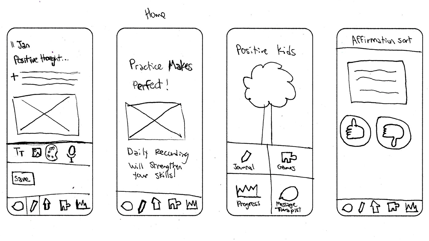
The home page should be simple. I think it will be a page with a quote or image and 4 links or icons.

The icons are key to successful navigation, but it's not the easiest thing to nail down.

I did these last 4 sketches after my first usability test. I recognized the need to simplify and clarify the journal entry process. My test subject was excited about the games and realized I needed a main page for them.
USABILITY TESTING
TEST 1:
I asked my 7-year-old daughter to her to record a positive self-talk journal entry which is scenario 2. She was able to select the journal page, but she was pretty confused about what to do to create an entry. There were too many options and she didn't know how to record or enter an entry. The only thing she was sure of was she should click save at the end. She was very curious about the icons on the bottom of the page and clicked the message icon. She looked at the message page and then immediately clicked the home button. Once she was on the home page she clicked games and clicked home again. The last few pages were rapid-fire, and I didn't catch as many pictures, but I learned a lot! I need to simplify the journal entry page. The home page was easy to understand. The navigation bar at the bottom was functional and helpful. The games need an organization page and are an appealing feature that I can expand on.


TEST 2:
I gave my 9-year-old scenario 2: "You have been using the app for two months. Use the app to see how many days you have practiced positive self-talk this month versus last month." She was confident about selecting the tracking button, but the tracking page was confusing, as you can see from her facial expressions below. She took a long time studying the page to figure out what was going on and then selected the month at the top. After a look at the graph, she asked me how she can go back two months. The tracking page had too much information and was unclear. She wanted to keep exploring and selected the pencil/journal icon. I gave her a different journal page (since the first page was so confusing for her sister), and she clicked the pencil and felt like she could put in an entry but she didn't know what the button on the right was for. After her test, I showed her my other sketches and asked her which tracking pages made the most sense to her. She preferred ones with a calendar and a simple line graph at the bottom. She also said she liked the simpler journal entry pages and thought it would be helpful to have prompts because it's hard to think of positive things to record on your own.


TEST 3:
I learned from my previous tests and selected pages that I thought were the clearest for the progress tracker and journal entry. An 11-year-old tested my app, and she easily navigated through the pages. She correctly selected all the right buttons and icons, which was nice after two confusing tests! She wanted to know if the graphs on the tracker page were buttons which helped me see their potential to act as buttons. I'm excited to get started on the computer wireframes!


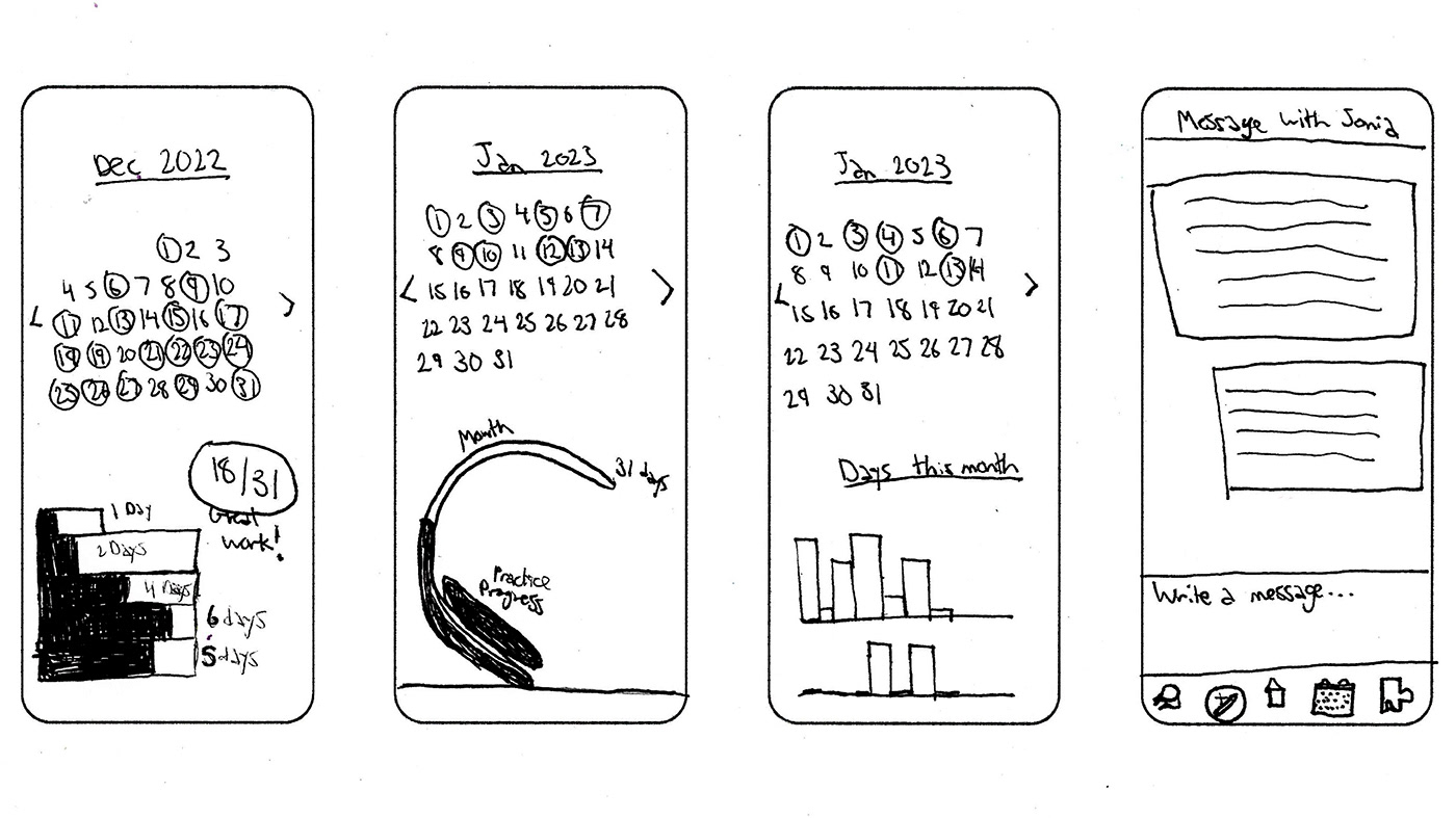
ROUGH DESIGNS
After conducting several user tests, I created wireframe designs for the second round of testing. I wanted to make it feel more game-oriented by adding an avatar feature, using a thick, rounded font, and incorporating the ability to earn badges. It was important to me to include breadcrumbs like the menu bar at the bottom with a highlighted icon for the current section. I would like to incorporate more fun elements after testing the basic layout. I'm still figuring details out, but here are the first drafts of my designs.


Wireframes from left to right: home page, tracking (scenario 1), journal entry (scenario 2), and the main game page (scenario 3)


I created a few extra wireframes. Left to right: messaging page, a page to create an avatar for the app games, the Positive vs Negative game, and a page to show the previous month's statistics.
USABILITY TESTING, ROUND 2
TEST 1:
My first test subject was a 12-year-old. She struggled a little with scenario 1 about tracking how many days you practiced this month versus last month. The buttons on the calendar at the top to scroll through months were too small, and I also had the arrows set up to go the wrong way which I didn't realize until after the 3rd user test. She was able to scroll through the information at the bottom of the page and read the information about streaks but didn't know how to change the month. The calendar page is not successful and needs to be altered. It was very easy for her to add a new journal entry, and she navigated through that quickly. She chose to do a written entry, pretended to type, and saved it just fine. Scenario 2 was successful! Scenario 3 was the easiest of the three. She played several pages of the game and clicked back home when she was ready.


TEST 2:
My second subject was a 10-year-old boy. He was able to navigate through the game and journal entry very easily and understood the cues and how to get back home. The calendar page was a sticking point for him. He was so lost about how to get to December! He got home and continued to the other two scenarios.


TEST 3:
My last subject was an 8-year-old girl. She struggled through the calendar. This is when I finally realized I had my buttons set up to go in the wrong direction! I wish I had realized it after the first test subject. She also struggled with writing a journal entry and clicked on the message button instead of the journal. I can see why that would be confusing for a younger audience. The final scenario went very smoothly, the game is the easiest to move through and understand. Overall, I learned that progress tracking is not an easy thing to display for kids! I need to make several adjustments to the calendar and tracking page.


REFINEMENTS
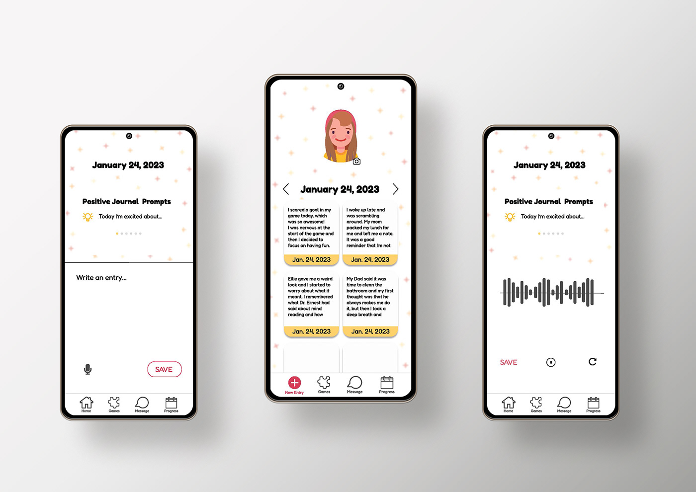
After meeting with my professor and getting feedback from him and my peers, I made several big changes to my design. I changed the homepage completely from the game menu to the journal entry page. I changed my progress page so that it now has simple comparison images and the user can click on "see more" to view the actual month and dates of entries. I changed the game design so that it is more of a storytelling game instead of having a PowerPoint feel. The journal home page now has a scrolling menu, and I added a new entry button. I kept the rounded shapes of the boxes but changed the navigation icons to be outlines instead of a mix of solid and outlined shapes. My project endured a major overhaul, but I'm now ready for my last round of user testing.


Left to right: the original home page with the game buttons, main journal page, journal writing page, and progress tracker page.


Left to right: New home page with the journal as the main feature, and 3 of the game story pages in order.
USABILITY TESTING, ROUND 3
TEST 1:
My first tester was confused by the game buttons and the names of the games. She thought the affirmation builder was the journal page and didn't notice the journal icon at the bottom of the page. The second scenario with the progress tracker was a little rocky too, she finally found the calendar at the bottom and navigated through those pages. The game scenario went the most smoothly. I realized it makes more sense to put the journal on the home page because it was not clear enough that the buttons were the names of the games. I also added text under each of the navigation buttons to clarify their purpose. I then conducted the next test with a new user.
TEST 2:
My second tester thought that he should click the plus button under the picture to add a new journal entry, he was able to find the journal button at the bottom, but he said it was confusing to have two plus signs on the page. He also wanted to scroll through the journal prompts and thought that was required before adding an entry. Once he clicked on the "add new entry" section the rest went smoothly. The progress tracker was very easy for him to navigate and understand. The game went pretty well, but he was unsure when one game scenario ended and when the second one started. I changed the journal page so that you can scroll through the prompts and see more ideas. I removed the plus under the picture and added a camera icon. I had already removed the avatar creator/camera page since it's not necessary for my scenarios, but I wanted to keep the idea of the function on the home page. I also added a transition page with a short time frame to the game; this made the transition from one game scenario to the next clear.
TEST 3:
My final tester easily navigated to the progress page and liked being able to see the calendar pages. She was excited about the number of streaks for each month. It took her a second to find the new entry button, but she navigated through that easily once she found the plus sign at the bottom. She said she thought she should be able to click on a blank entry box to add a new entry. She liked the game, and that went smoothly. Overall, her test was quick and easy! I only had to make one small change, which was adding a link from a blank journal box to the next journal entry page. Now she can click blank boxes or use the plus sign at the bottom to add a new journal entry.


FINAL DESIGN
My design went through one final round of editing where I simplified, removed unnecessary color blocks, added a muted background to the journal pages, and created an overall feeling of ease and cleanliness. Here is the finished design!

Mockup image by Vectonauta on Freepik
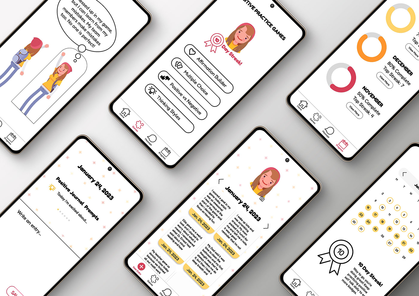
Mockup images by Vectonauta on Freepik. Left to right: record journal entry page, the home page featuring journal entries, and an option for voice-to-text entry recording.

These are the progress tracker pages for scenario 1. The center image shows the main progress tracking page. The left and right images highlight the days the child practiced positive self-talk and their top streaks each month.

The game page menu is featured in the center. The left and right images show the Positive vs Negative game being played.
PRESENTATION
You can try out my app for yourself in Figma below! The link to my video presentation is:


