


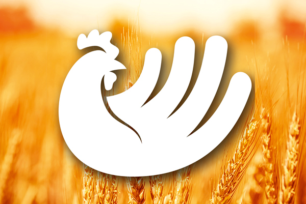
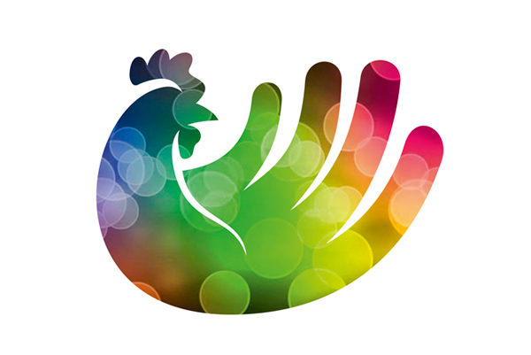


Voorstel logo ontwerp voor De Hoop, pluimvee mengvoeder bedrijf te Zelhem. Het logo is een kip waarbij de veren tevens de vingers van een hand zijn. De hand staat symbool voor de hand die voed, maar ook voor het zorgende aspect. In het woord Hoop zijn de o's licht van vorm veranderd zodat ze meer een ei vorm hebben.
Proposition for a new logo design for De Hoop, food manufacturer for poultry. The logo is a chicken, but also a hand. This is the hand that feeds, but also a symbol to take care for. In the word Hoop the O's are chanced a little so the look more likes eggs.


