


This was a year-long project done by the The La Salle Yearbook 2014.
The Yearbook Team designed a clean and classic design compared to the past yearbooks - a big leap for the creative team. We wanted to stray away from the typical yearbook vibe, thus we made the design to be minimal and classy, and give more emphasis to the content.
The Yearbook Team designed a clean and classic design compared to the past yearbooks - a big leap for the creative team. We wanted to stray away from the typical yearbook vibe, thus we made the design to be minimal and classy, and give more emphasis to the content.
The yearbook is divided into two volumes. Volume 1 (white) contains the information regarding the graduate's profile. It has a formal approach to design. Volume 2 (black) leans more to a liking of a photobook; it mostly contains photos of the school year's events, and also the casual photos of the students.

_____________________________________________________________________________________
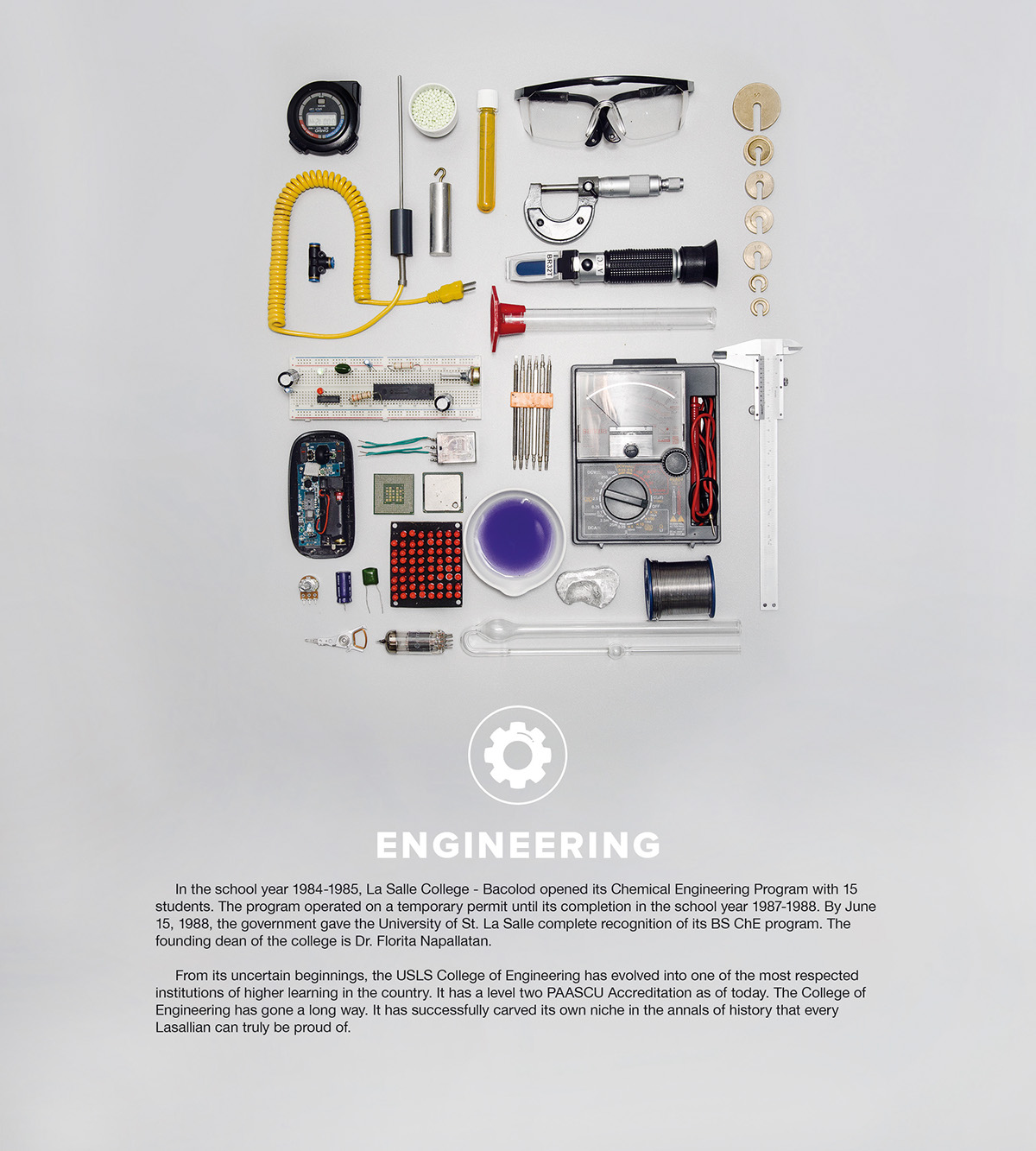
The page divider for each college is an image of a variety of essential objects to the student's life in his/her respective college.

_____________________________________________________________________________________
The team also designed infographics for each course as a page divider. The infographics contained actual facts and figures coming from the students of each course.
This year's message from the Editor-in-Chief is also an infographic, which is really fresh.
This year's message from the Editor-in-Chief is also an infographic, which is really fresh.


_____________________________________________________________________________________

An updated map of the university is also featured in the yearbook.

Deconstructed University of St. La Salle logo


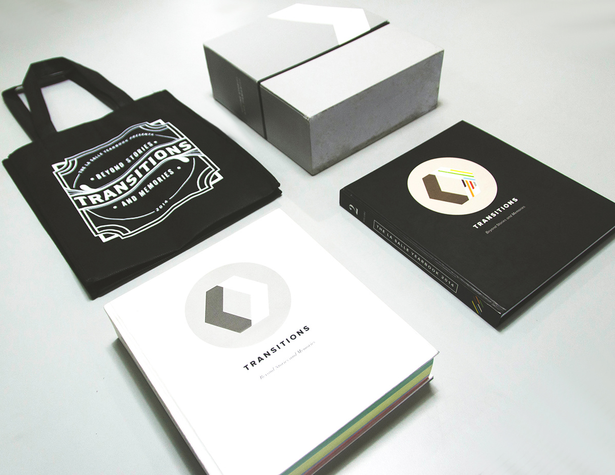
The La Salle Yearbook is among the few yearbooks in the country that is being distributed to the university's graduates before their respective graduation.

_____________________________________________________________________________________
Art Direction
Cheenky Bayona
Printer
Midtown Printing Corporation Incorporated, Davao City


