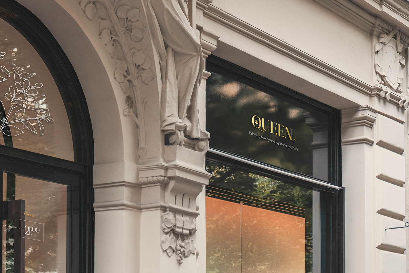
Brand Strategy
Queen’s is a flower brand business that specializes in producing and selling flowers or other floral products, such as bouquets, arrangements, or potted plants. Queen’s position itself as the go to brand for luxury, high-end floral arrangements and bouquets. This could include special occasions like weddings and anniversaries, as well as everyday celebrations like birthdays and holidays. Queen’s also convey a sense of sophistication, elegance, and exclusivity, the brand’s aesthetic are refined and luxurious, with a focus on high-quality, carefully curated flowers and arrangement. A brand that promises to deliver the most luxurious and exquisite flowers, hand-selected from the finest farms and gardens around the world. Each bouquet is a work of art, crafted by our team of expert florists with the utmost attention to detail and presented in a way that truly captures the essence of luxury.
Queen's will target affluent, stylish individuals who value luxury and are willing to pay a premium for the finest quality flowers and arrangements. This includes high-end event planners, luxury hotels, and affluent individuals who appreciate the beauty and elegance of flowers. Queen’s communicate the value and exclusivity of its products through its messaging, this include highlighting the use of rare and exotic flowers, as well as the craftsmanship and attention to details that goes into each arrangement. They strive to create a luxurious memorable experience for their customers, this include offering personalized consultations and delivery options, as well as hosting events and partnerships with high end brands.
Overall, the goal of Queen’s brand strategy is to establish the brand as the premier choice for luxury floral arrangements and bouquets, offering unparalleled quality, exclusivity, and customer experience.


Color Strategy
A color strategy for a luxurious brand using forest(dark) green, slate gray, pale turquoise, midnight blue, and light grey, involve incorporating these colors in a cohesive and visually appealing way that reflects the brand's luxury positioning.
Forest(Dark) green is a color that is often associated with nature and the natural world, as well as luxury and sophistication. It is a rich, deep shade that is often used to represent the lush greenery of forests, fields, and gardens, as well as the exclusivity and prestige of high-end products and services.
Slate gray could be used as a secondary color, providing a sophisticated and neutral contrast to the dark green. This color could be used for background elements, such as website backgrounds or the interior of packaging, to create a cohesive and sophisticated visual aesthetic.
Pale turquoise and midnight blue could be used as accent colors, adding pops of color to the overall color scheme. These colors could be used for smaller visual elements, such as buttons or icons, to draw the eye and add visual interest.
Light grey could be used as a neutral color, providing a subtle contrast and balance to the bolder hues in the color scheme. This color could be used for text elements, such as body copy or product descriptions, to make the overall design feel cohesive and polished.
Overall, this color strategy could create a cohesive and luxurious visual aesthetic that effectively conveys the brand's premium positioning.


Thank you
Email: chisomvictor118@gmail.com


