ptbr
A marca foi totalmente fiel ao briefing do cliente, trazendo um visual minimalista, leve, acolhedor, moderno, confiante e visionária, passando um ar leve a pessoa que visita o local.
eng
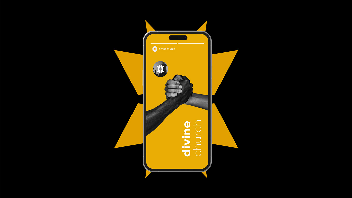
The brand was completely faithful to the client's brief, bringing a minimalist, light, welcoming, modern, confident and visionary look, giving a light air to the person who visits the place.


ptbr
Para a criação do simbolo foi utilizado 2 elementos: as coroas, simbolizando que Jesus é rei e também a santissima trindade. Também foi utilizado como elemento no logo a luz que significa brilho e notoriedade, que é oque essa marca da igreja quer passar
eng
To create the symbol, 2 elements were used: the crowns, symbolizing that Jesus is king and also the holy trinity. Light was also used as an element in the logo, which means brightness and notoriety, which is what this church brand wants to convey.

ptbr
A paleta de cores foi utilizada a pedido do cliente que era ter a cor original das coroas laranja/amarelo
a luz foi representada com sua cor padrão, branco.
As cores de suporte que foram utilizadas são mais para fundos e alguns elementos que ajudam a visualizar melhor a identidade visual como um todo.
a luz foi representada com sua cor padrão, branco.
As cores de suporte que foram utilizadas são mais para fundos e alguns elementos que ajudam a visualizar melhor a identidade visual como um todo.
eng
The color palette was used as a customer requirement which was to have the original color of the crowns orange/yellow
light was represented with its default color, white.
The supporting colors that were used are more for backgrounds and some elements that help to better visualize the visual identity as a whole.
light was represented with its default color, white.
The supporting colors that were used are more for backgrounds and some elements that help to better visualize the visual identity as a whole.