
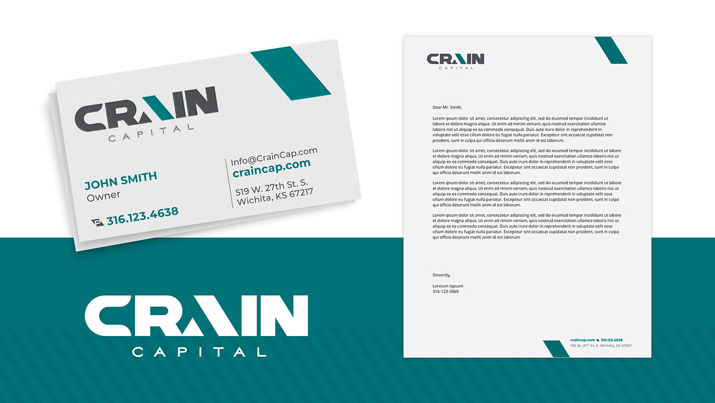
As the principal corporation of multiple divisions, Crain Company branding required a recognizable consistency that would convey the distinct color variations within each division. The affable red identity offers gentleness, warmth, and comfort—all aspects of the Crain Company. Simultaneously the gray tones support practicality and efficiency in each logo.
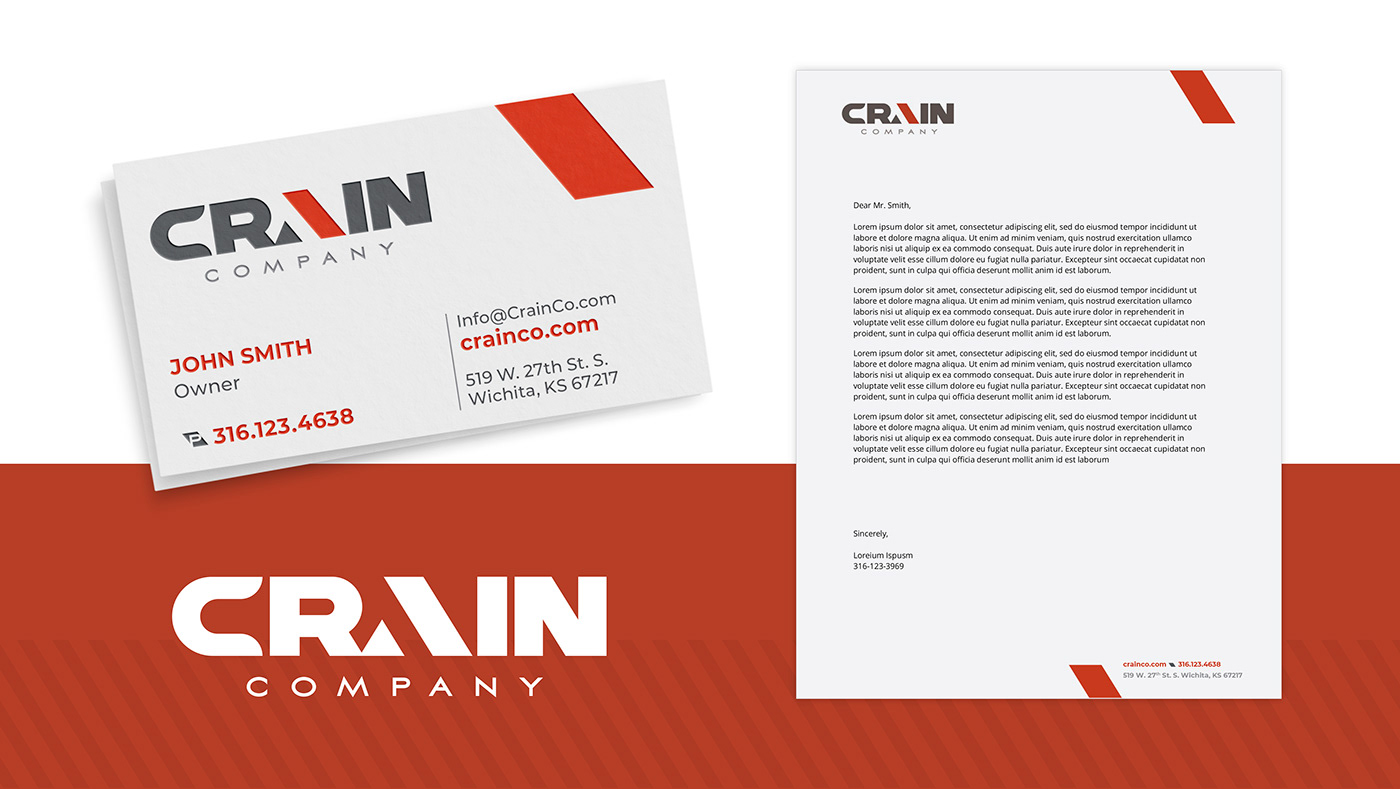
The stylized "A" (present in each division's logo) represents an angled bar and an uprising triangle. The bar symbolizes a grounded roof line element, while the smaller triangle presents an entrance to progression and purpose. The sharp Aviano Sans font beneath these logos offers a supportive footing and the division's name.

Crain Capital is a private equity real estate company that supports all Crain Company investment interests. The color teal signifies clear communication and honesty.

Crain Management deploys orange tones to represent change, energy, and prosperity.


Crain development drives commerce and communities; the brand tone is blue, associated with wisdom, loyalty, and respectability that create successful developments with a forward-looking vision.