Color
Art 102
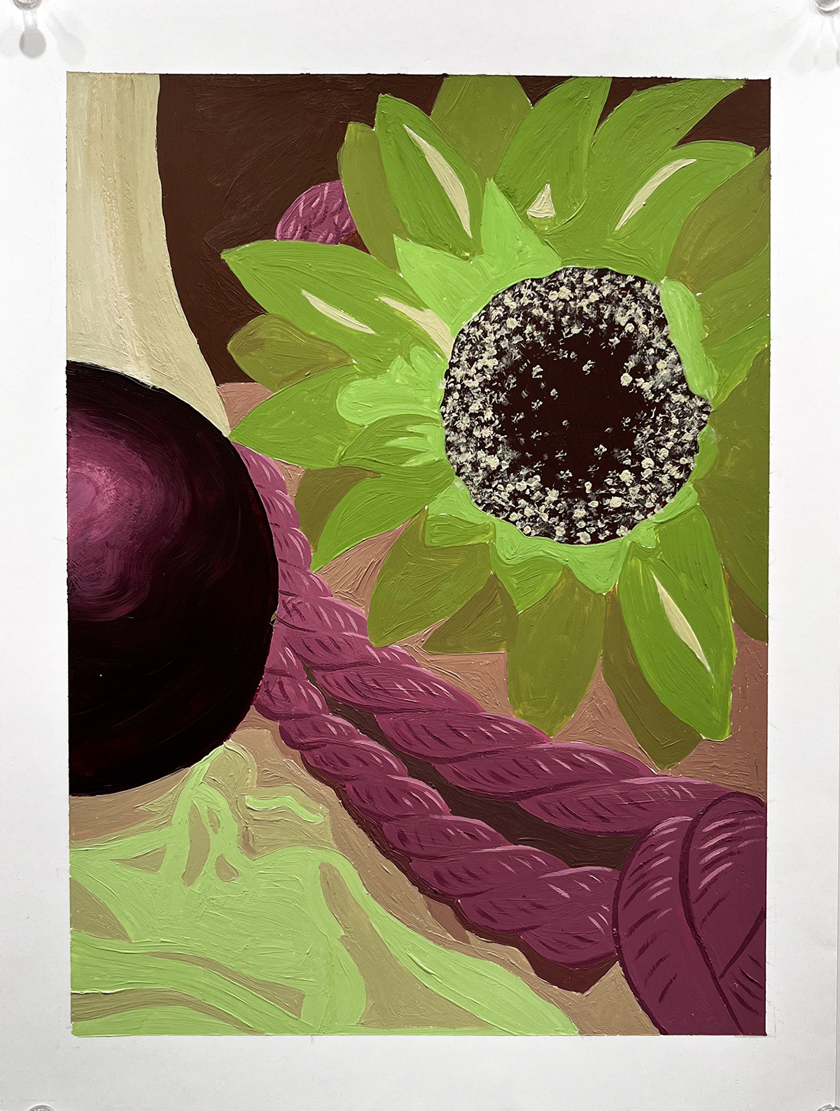
Still life painting
This project was designed to learn to utilize the saturation of a color to create depth within the piece using only a complimentary color scheme. The more saturated objects come closer to the front and desaturated pieces seem to appear farther back. This piece is a strong representation of my understanding of color schemes as well as the use of saturation of color to create a greater sense of depth.