Brand identity for the kids clothing brand OUTKID
OUTKID is a stylish, minimalistic, adult-like clothes that are pleasant to the delicate skin of children. Clothes are suitable for a walk, for a photoshoot and for lunch with mom and dad in a bistro. OUTKID has simplified the task for parents, but at the same time took into account the wonderful age when there is not a second without adventures.
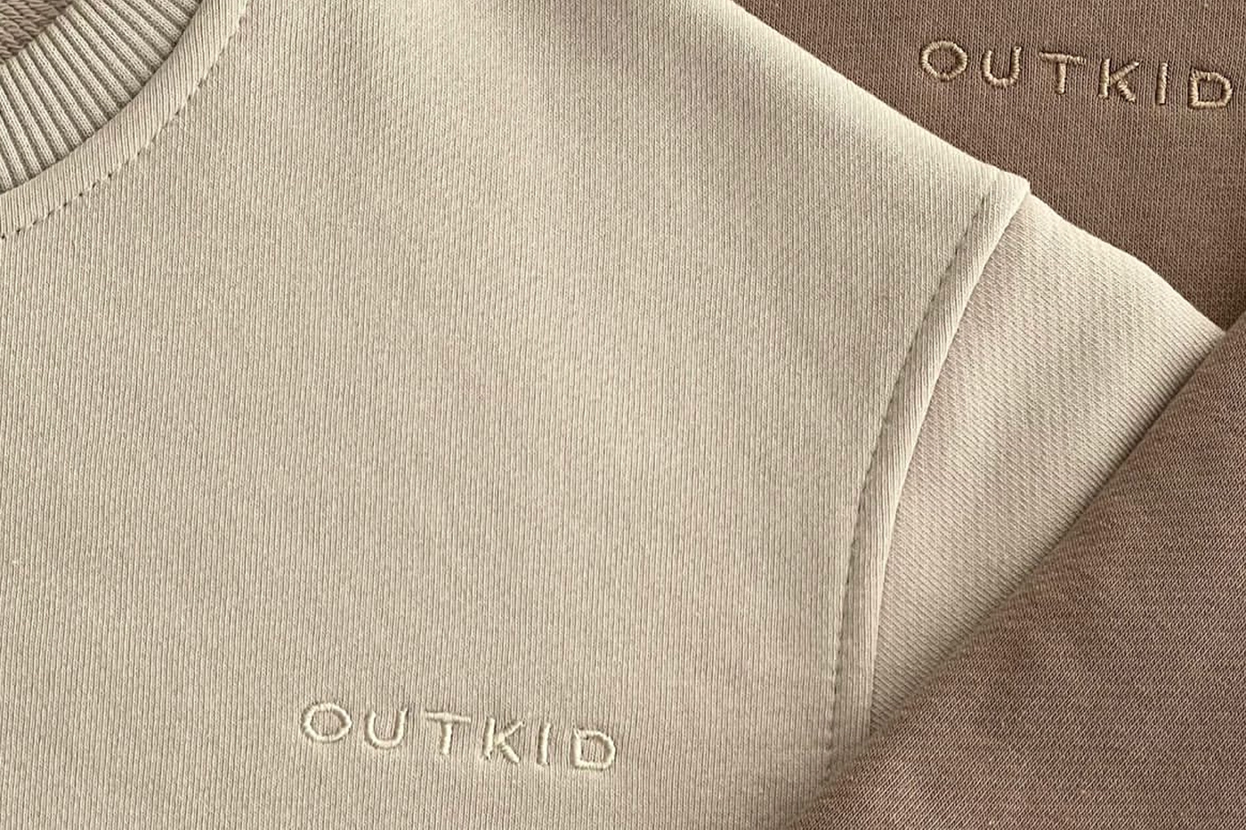
Logotype concept
Logo OUTKID was created entirely manually, the letters were drawn from scratch.The metaphor of the logo is: one stroke in the letter U was not accidentally made lower than the other. Visually, it seems that this letter goes beyond the baseline of the logo. In such a small but interesting element, the idea is conveyed that the brand goes "beyond the usual" and stands out from all the others. The monogram, like the logo, is not overloaded with additional unnecessary details, supports the laconic image of the brand. Arrows and strokes made by hand were drawn as branded graphic elements. Due to such elements, a hint of childishness and naivety was made, but not forgetting that the brand is based on the idea of "children's clothing as for adults".