

Logo Design Showcase
Examples of Logos and Identities designed by Will Phillips Jr, Sleek Design Graphics Studio. Some were full identity designs including a broader scope of branding material, such as stationary, website, etc., while others were simply a design of the just the image. I tried to explain the thought process behind each concept below.

Angela Mcquarrie Marketing
AMM was a small startup looking for a fun, quirky image to represent their small team in a fun, yet professional way. The emblem is a combination of the letters "A" and "M." As the initials of the startup it also helped to promote the use of the acronym AMM which they wanted to promote. Using thick strokes with rounded ends created more of a branding mark, as if from a hot iron. This help tie in the idea of branding and enhancing a brands image - major services of the new business. Bright lime green showed a more playful and energetic side. And coupling that with a more neutral gray helped to provide more balance and a more serious side to the concept.

Madarn's Bake House
Madarn's Bake House wanted an elegant, yet simple and fun design to represent their services. Madarn's is an independent bakery and dessert catering business using all natural ingredients. This design was created as part of a complete brand design for Madarn's Bake House, spanning from cake box labels to their website.

15th Annual Overton Square Crawfish Festival - 2010
Annual crawfish festival held in Overton Square in Midtown Memphis, TN. The festival features live music, rows of booths selling arts and crafts, food and drinks, and of course, crawfish! Thousands of people usually attend every year when the festival is held - usually late spring. The logo was used on posters, flyers, and print and web ads promoting the event, and was also sold on t-shirts at the festival.

Adult Diaper Care
An online store offering incontinence care supplies for caregivers and families. The logo design was used in the complete brand created including the stationary design and mainly, the website. It needed to have a soft mood, so soft rounded corners were used in the design. An image of the heart doubling as two individuals in a caring embrace helped create a sympathetic feeling that needed to be shown in representing a business targeted at caregivers. Bright, vibrant colors were chosen to keep a cheerful and inviting mood.

Bandoggo Kennels
Bandoggo Kennels offers special breeding and training of protection dogs. They developed a breed from the Fila Sao Miguel they named Bandoggo's. The use of rustic and royal colors and the shield with the silhouette of the breed helped to accurately convey what the business was all about - providing quality protection canines.

Richard's Hardwood Service
Richard had many years experience in installing hardwood floors and wanted something new and different. Enough of the same-old, plain-looking, contractor business cards - he wanted something that would look attractive and stand out among his competitors. I created this design to communicate the traditional style and many years experience Richard had. The strokes inside the letter-forms helped add an engraved looked to the logotype as if they were carved out of wood. The floral elements help to frame the text and add a flair of elegance and class to the piece.

Tangerine Pool & Lawn
As a new start-up, Tangerine needed a new look to help establish their identity and begin their marketing. With the season fast approaching, they needed something that was appropriate to their name, yet readily identified what they offered. The waves of a pool were created using negative space in which to show a floating Tangerine - reminiscent of a bobber floating in a pool. Blue was used to easily associate the image with water and pool care, and orange and green were appropriately chosen for the tangerine to help provide contrast to the design, making it stand out more. The concept was kept simple to allow versatility in use as it would be applied on many marketing and branding materials as the business grew.

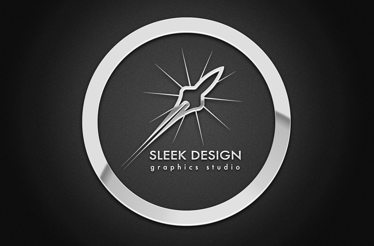
Sleek Design Graphics Studio
My own logo design for my personal business which I freelance as. Being a designer, there was wider range of conceptual freedom to create an icon that would convey what I do. It didn't have to be a pencil, a brush or some combo of cmyk colors. It could be anything creative, really, that simply communicated the idea of what I was all about. I also needed something that wouldn't pigeon-hole me into one specialized field, as I offered design services in print design, web design, and film editing - quite a versatile skill set. The simple outline of a rocket in flight helped convey a contemporary feel, something that was current and appealing. The fading tail helped simplify the design and suggest swiftness - something very important in design work. A star-burst was added to create a little more energy and excitement in the piece. Futura was chosen for the typeface as it had a classic, simple look, but complimented a futuristic design as well. (And no the name of the typeface had nothing to do with it - well... maybe) This has become my icon for a few years now and I'm thankful to say many locally are beginning to recognize it. It often get's a cocked head and and a "Huh... That's pretty cool" when people first see it. So it's been working well in action, and I hope to keep it for much time to come.
NEED A LOGO DESIGNED?
Looking to get your brand image refreshed, or need a new logo to get your new business looking good and off on the right foot? Feel free to contact me - will.phillips@sleekdesignstudio.com
View some more of my work and other design services I offer at:


