
The Concept
Through reasearching the book and the time it is set in I came to a number of conclusions. The greasers were in essence’s teddy boys. I wanted a modern take of this book cover but while keeping a 1960’s edge. The pictograms created are based on key moments within the story. They would not give much away to anyone who hasnt read it but the sym- bolism would certainly intrique as you would wonder ‘What connection does a fountain have to a gun?" The pictograms basiclly spilit the book in to 4 parts. Instead of focusing on a character within the book the focus was on the story. This timeless classic updated for the modern age. I also wanted to book cover to stand out, so from my research i made sure it was going to make a bold statement.

The Cover
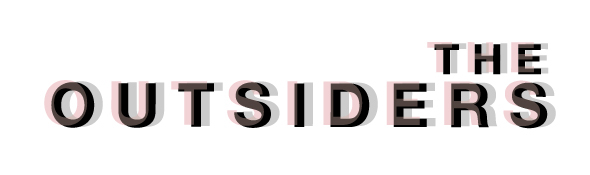
The final cover takes inspiration from international typographic style and is enhanced with the use of pictograms.The fountain, switch blade, cross and gun all play major parts in the book. The deep red was selected to highlight the running theme of violence, blood and fire. Red is also the colour of rebeling which is a part of the plot in the book. The main title ‘The outsiders’ is in bold helvetica and almost looks blured. It is actually multi-layed with red and black which acts as theme of looking outside the lines or group, Just like the gangs with in the novel.


