


Logo Design - Brand Identity - Key Visuals - // 2022
SWEAT
Welcome to Sweat, your ultimate destination for premium fitness equipment that will help you achieve your health and wellness goals. We are proud to be a leading brand in the industry, dedicated to providing you with the highest quality products and innovative solutions to elevate your fitness journey.
At Sweat, we understand that fitness is not just a hobby, but a way of life. We believe in the transformative power of exercise and its ability to enhance physical and mental well-being. With this in mind, we have meticulously curated a range of fitness equipment that caters to all fitness levels, from beginners to seasoned athletes.
Our commitment to excellence drives us to go the extra mile in delivering exceptional products that surpass your expectations. Each piece of equipment in our collection is crafted with precision, using durable materials and state-of-the-art technology to ensure optimal performance and longevity. We believe that investing in high-quality equipment is an investment in your health and future.
PROJECT SCOPE ROLE
Logo Design - Brand identity Logo Designer - Brand Identity Designer
INDUSTRY CREATIVE
Fitness equipment's supplier Aakash Ali


DESIGN GOALS
When branding a fitness equipment seller brand named "Sweat," my design goals should align with the brand's identity and target audience. Here are some design goals to consider:
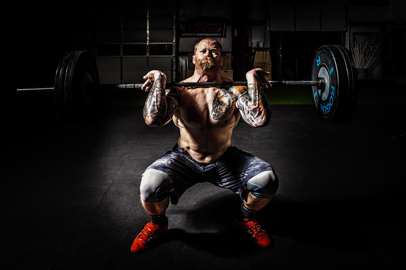
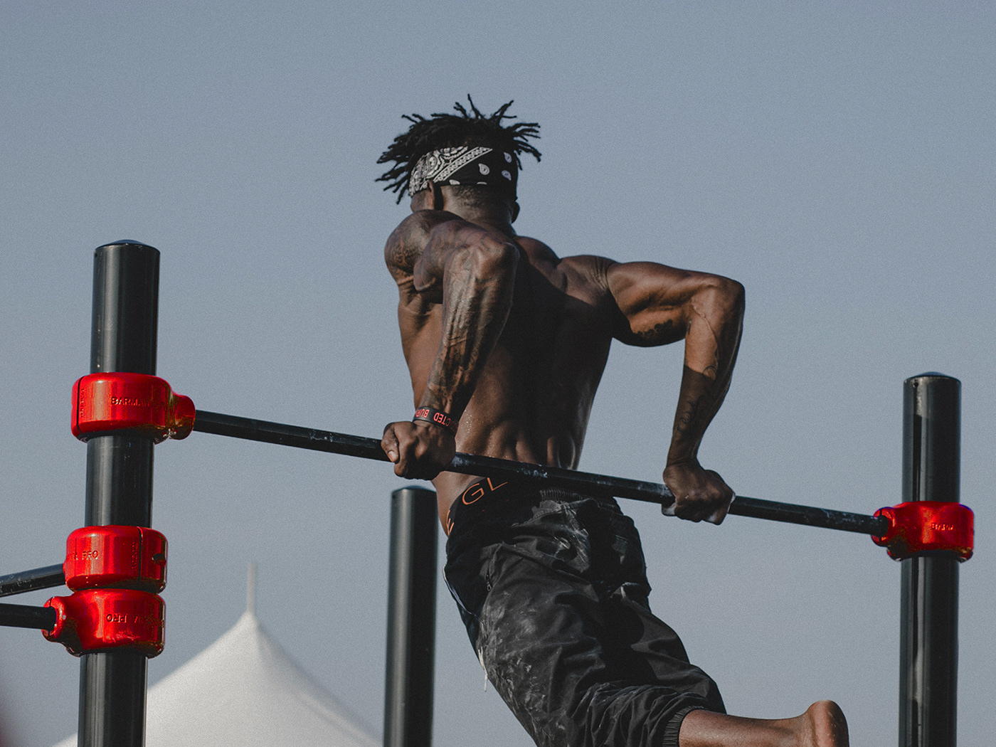
Reflect an Active Lifestyle: My design should convey energy, movement, and a sense of vitality. I have used dynamic and bold visual elements to capture the essence of an active lifestyle.
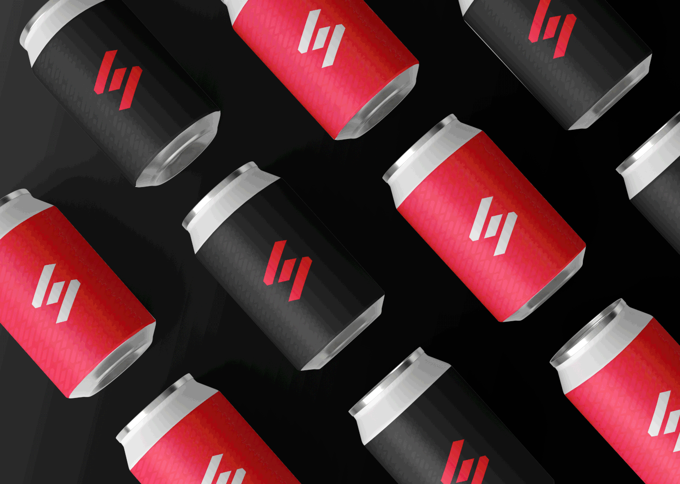
Use Vibrant Colors: Choose a color palette that is vibrant, energetic, and stimulating. Bold colors like red, orange can evoke a sense of energy and enthusiasm. Consider incorporating these colors into your logo, website, packaging, and other brand materials.
Emphasize Strength and Endurance: Fitness equipment is often associated with building strength and endurance. I have Incorporated elements in my design that symbolize power, resilience, and achievement, such as strong typography, muscular figures, or geometric shapes.
Clean and Modern Aesthetics: Create a design that is clean, modern, and visually appealing. Streamlined typography, minimalistic layouts, and sleek imagery can convey professionalism and sophistication.
Typography: Choose fonts that are bold, sleek, and easy to read. The typography should align with the brand's image and appeal to the fitness-conscious audience.
Consistency: Maintain consistency across all brand touchpoints, including logos, packaging, website, social media, and advertising materials. Consistency helps build recognition and strengthens the brand's identity.
Appeal to Target Demographic: I Understand my target demographic's preferences and design elements that resonate with them. As the brand primarily targets athletes, my design might be more focused on performance and competition.


CONCEPTS
I aim to develop a strong brand identity that reflects the values and personality of "Sweat." I Consider positioning the brand as modern, innovative, and dedicated to helping individuals lead healthier lives. Emphasize the brand's commitment to quality, reliability, and customer satisfaction. The logo for "Sweat" incorporate elements that represent energy, movement, and fitness. Using vibrant and dynamic colors like red, orange, or yellow can evoke feelings of vitality and excitement.


LOGO DESIGN
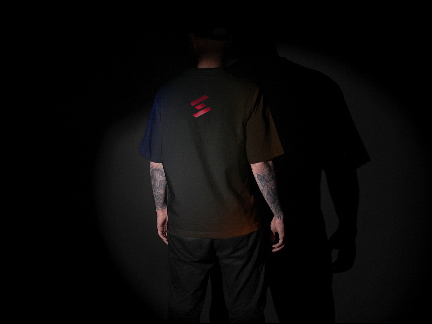
The logo is an essential visual representation of your brand, so I invest time and effort into creating a design that accurately reflects the values and mission of "Sweat" while appealing to its target customers. I keep the logo design clean, simple, and easily recognizable. I constructed a rigid logo type that represents the brand's personality. I use red color strategically to evoke emotions of strength and create visual impact.
Before diving into the design process, it's essential to conduct thorough research and user analysis. Understanding the target audience and their needs is paramount. This research will help gather insights into the preferences, habits, and pain points of fitness enthusiasts who would potentially buy equipment from "Sweat." By gaining a comprehensive understanding of the user's motivations, a designer can create a logo that can truly represent a brand personality.


SHAPE PSYCHOLOGY
The shape you employ in your logo design will play a major role in shaping the message that the consumer will receive about the nature of the business. Diagonal lines are very dynamic in nature and represent action, thrill, adventure, movement and sports. Thus, I chose diagonal lines to construct logo mark as these lines are perfect match for fitness sector and will represent the brand very well.

GRID SYSTEM
The Grid System is one of the most scientific logo design processes exist. When executed correctly in your logo design process, the system can transform it into a work of art. One of the most crucial benefits of using grid systems is keeping your designing process organized, proportional and staying focused.

TYPOGRAPHY
When designing for a modern fitness equipment seller brand, I want to select a font that reflects the brand's characteristics such as energy, vitality, and a contemporary feel. I consider factors such as legibility, scalability, and compatibility with various mediums (print, web, signage) when choosing a font. I chose Aileron for branding materials as aileron is a versatile and elegant sans-serif font that combines modern aesthetics with a touch of sophistication. It conveys a sense of professionalism while still maintaining a clean and contemporary look. Additionally, I experiment with different weights, spacing, and combinations to create a unique and memorable brand identity.


COLOR PSYCHOLOGY
Color plays a very important role in the perception of a brand. It generates many doubts and fear when choosing color. The psychology of color uses to build a strong brand, a brand that is also capable of connecting with its audience. As brand deals in selling fitness machines, orange or red color would be a good choice. Red color represents Passion, love, power and confidence. Thus, red color is a perfect choice to evoke emotions of power and bodybuilding within the consumers.
COLOR PALETTE


GRAPHICS / USE CASES
Logos are commonly used on business stationery such as letterheads, business cards, envelopes, and invoices. Including the logo on these materials adds a professional touch, reinforces the brand identity, and helps establish credibility and trust with clients and partners. Logos are widely used in marketing and advertising materials. They are featured on websites, social media platforms. By incorporating the logo into marketing campaigns, companies reinforce their brand presence and increase brand recall among the target audience.


COLOR CONTRAST
The brand have three main colors red, black and white. The logo will look perfectly fine on all three color backgrounds as I have designed the logo in all three colors as shown below.


OUR PRODUCTS
Sweat offers a wide range of innovative products to its customers. Here are some examples of the fitness equipment and accessories that Sweat sells:
Smart Treadmill: A cutting-edge treadmill equipped with a built-in touchscreen display, interactive training programs, and real-time performance tracking.
Ergonomic Exercise Bike: A comfortable and adjustable indoor cycling bike with a digital console that displays workout metrics, including distance, speed, and calories burned. It also offers various resistance levels.
Adjustable Dumbbell Set: A space-saving and versatile set of dumbbells that allows users to adjust the weight according to their fitness level, ranging from 5 to 50 pounds.

UI UX DESIGN
UI (User Interface) and UX (User Experience) design play a crucial role in the success of any brand. In the case of "Sweat," a brand dedicated to selling fitness equipment, a well-designed UI/UX can significantly enhance the customer's overall experience, drive sales, and foster customer loyalty. The use of a clean and modern design aesthetic with vibrant colors, high-quality product imagery, and relevant graphics can create an engaging visual experience. The design should reflect the energy and excitement associated with fitness, motivating customers to explore and make purchases.


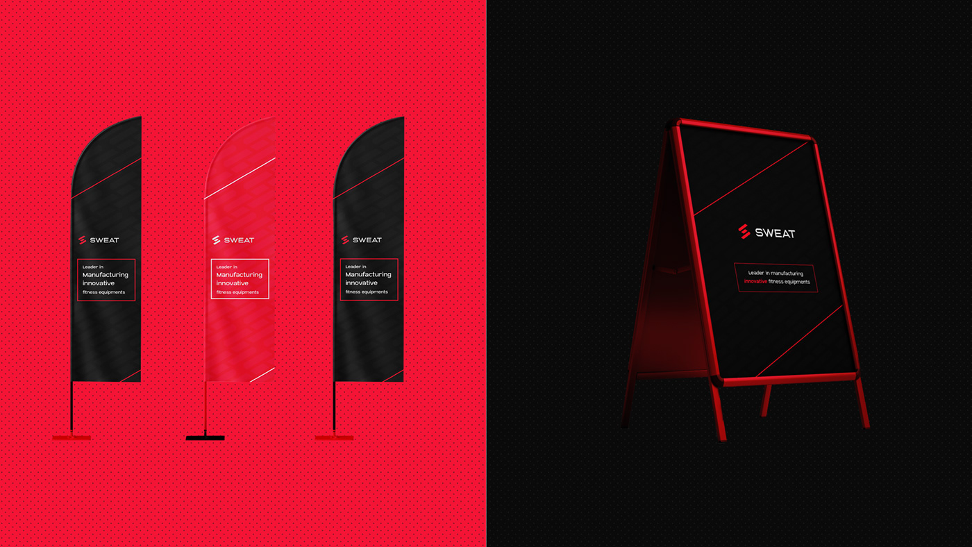
BRAND APPLICATIONS
Brand application is essential as it is the rollout of your brand across your marketing materials and customer-facing materials. Your brand must be consistent when interacting with customers, and a strong brand voice and visual identity help consumers get to know and understand you and your brand very well. Having a consistent look and feel across all your assets strengthens your brand as people are met with a consistent experience every time they engage. This creates trust and helps to create a positive impression and opinion about your product or service.


If you want a similar logo or branding for your company.
THANKS FOR WATCHING!
STAY BLESSED


