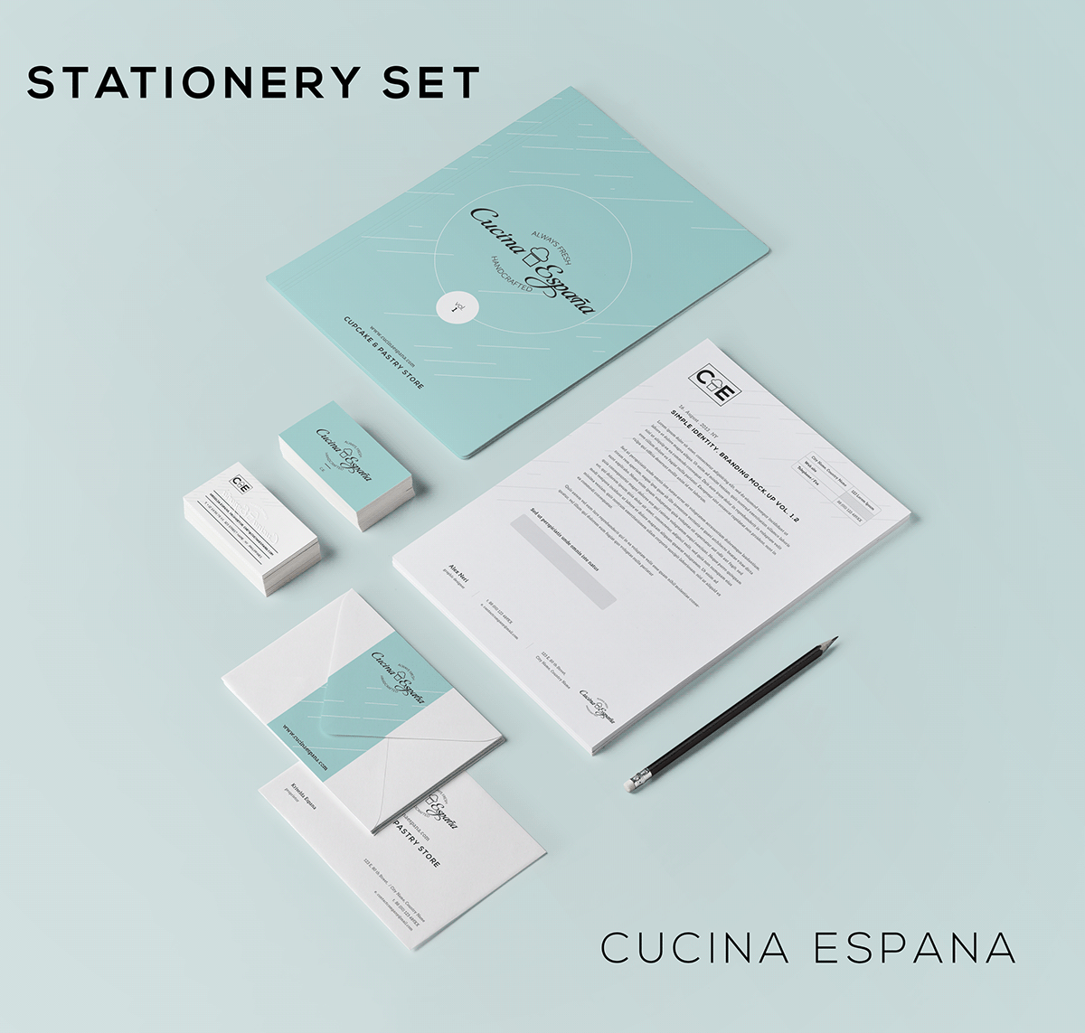
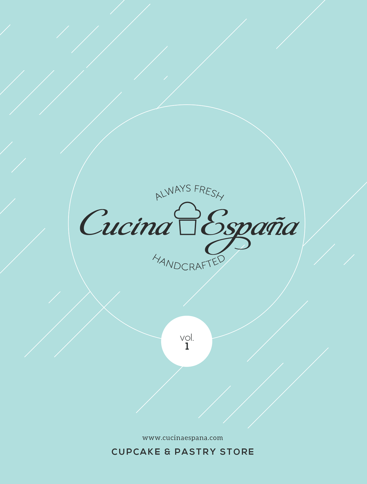
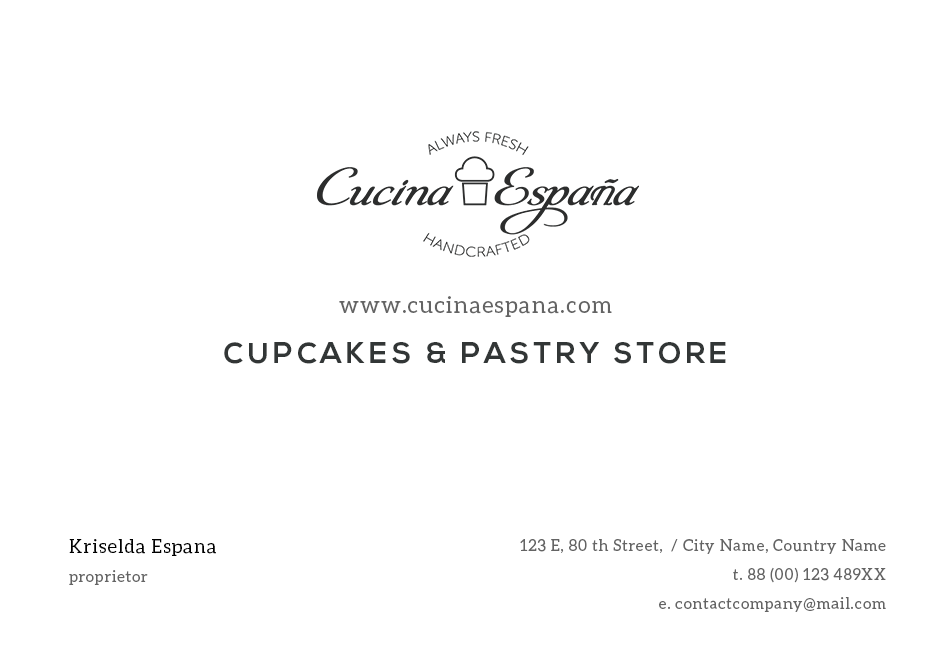
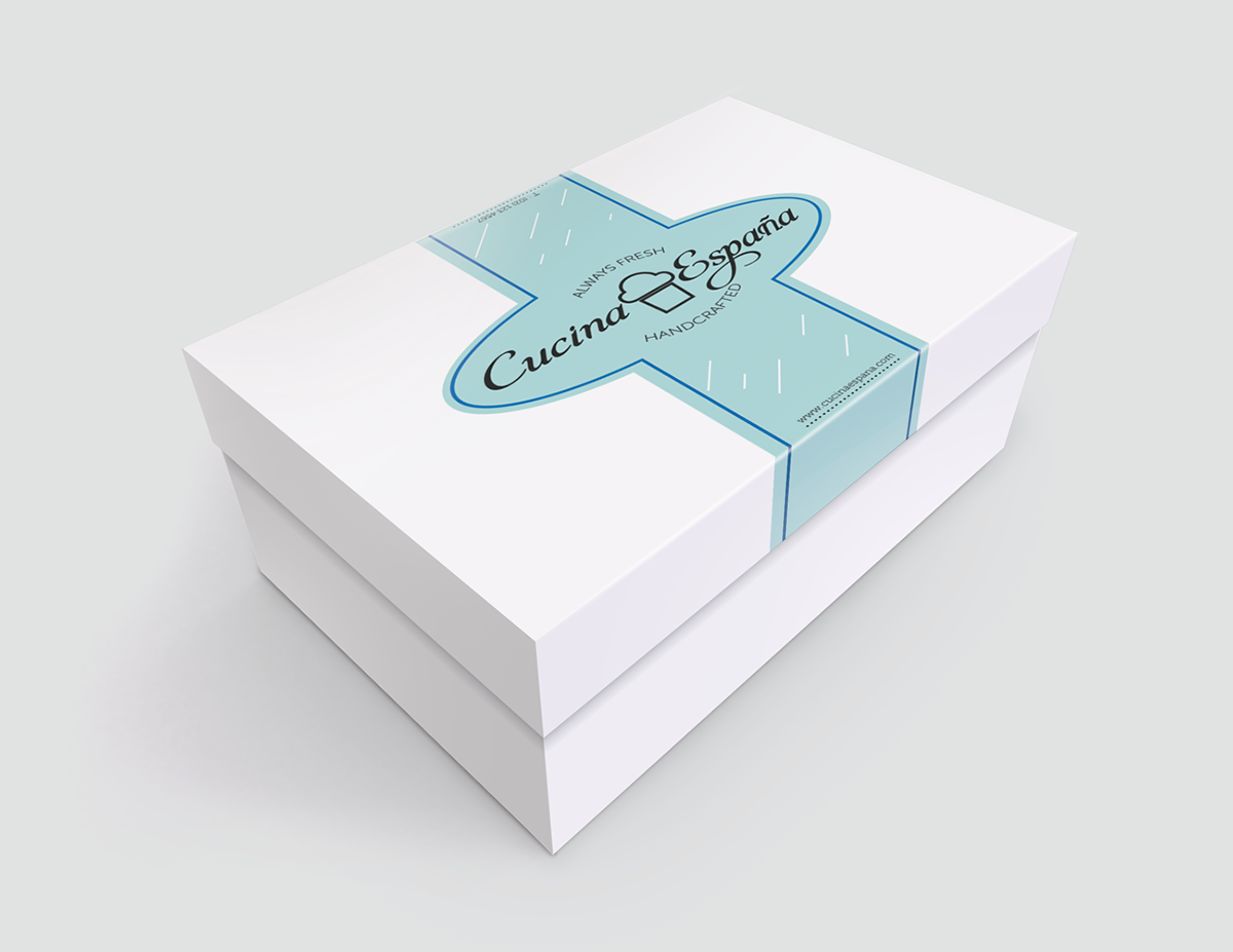
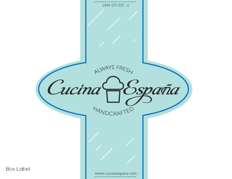
A specialized store that bakes cupcakes that are handcrafted using fresh ingredients, my aim for this design was to give the feel and idea that everything that comes out of this kitchen is well-made and well worth it.

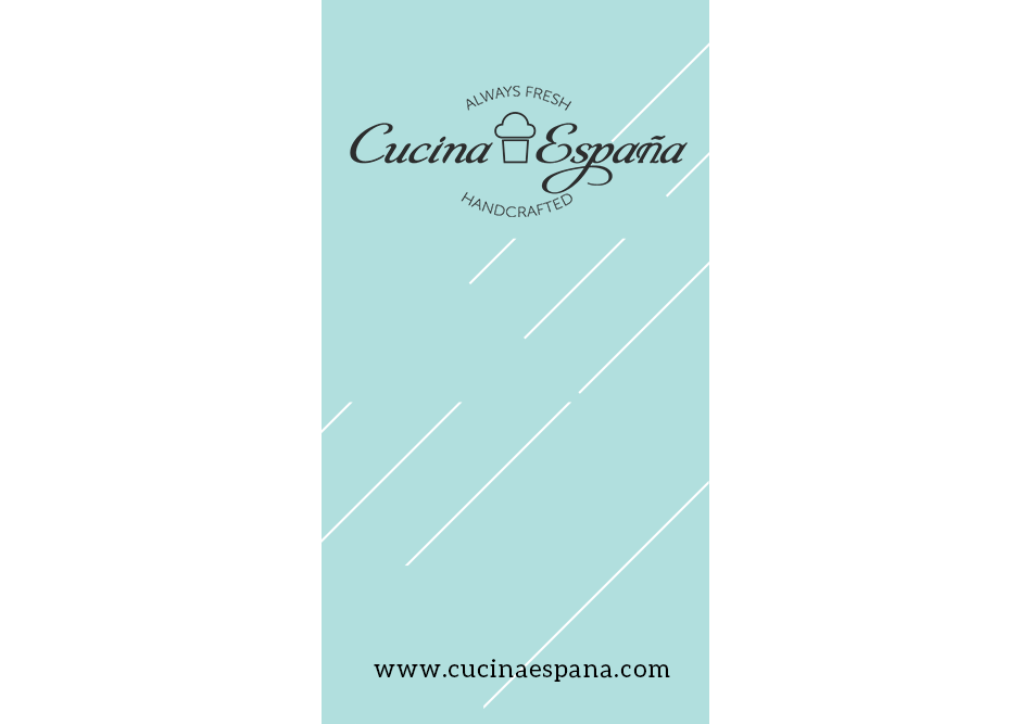
Used minimal treatment for the cupcake symbol in the middle, since cupcakes are the store's primary product. Went with a clean and cursive font to go with it. And the top and bottom texts are the store's motto or ideal, which acts like a "stamp"; which means that for every product that comes off the oven, it is always fresh and always handcrafted.
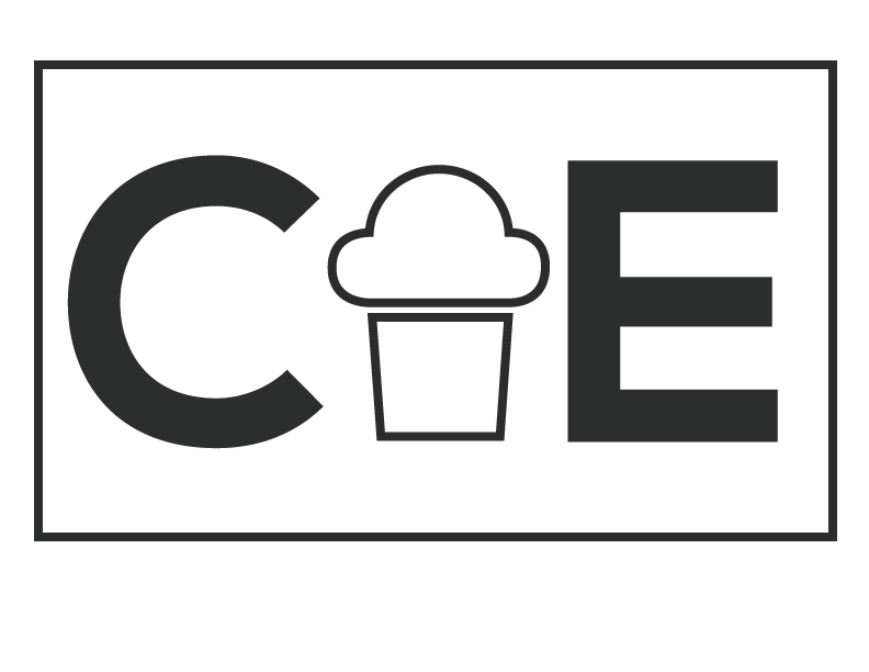
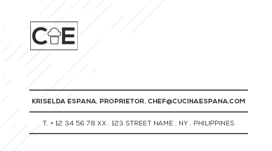
The "minimized" version of this logo keeps the idea of being a stamp, too. Which can be used both as a pattern for a favion, app icon (in case an app does get developed) or maybe as a pattern for an actual stamp.
In this project, I used it in business cards and in headers.