Kelson Lopes Advogados
EN
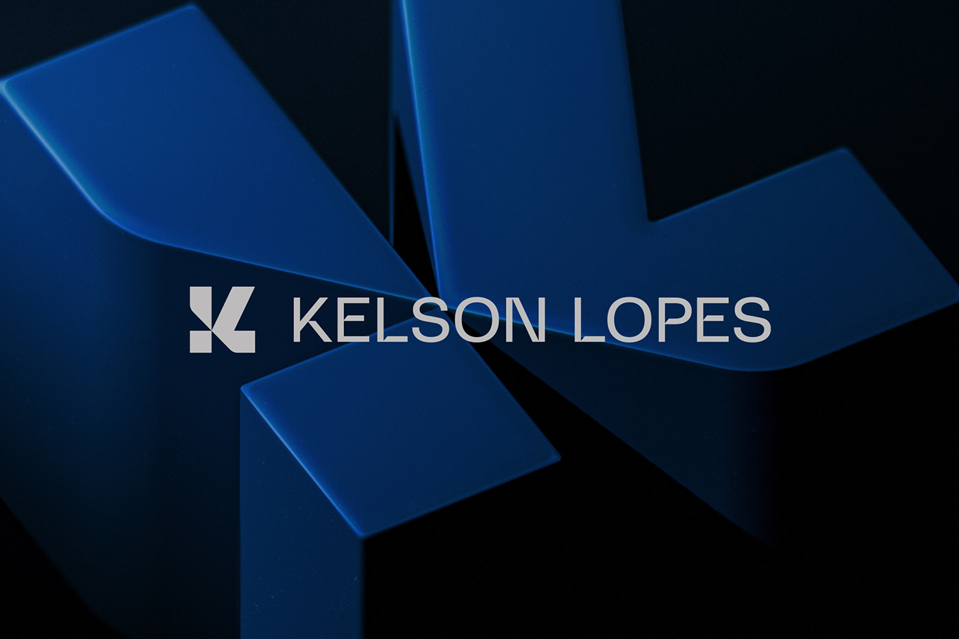
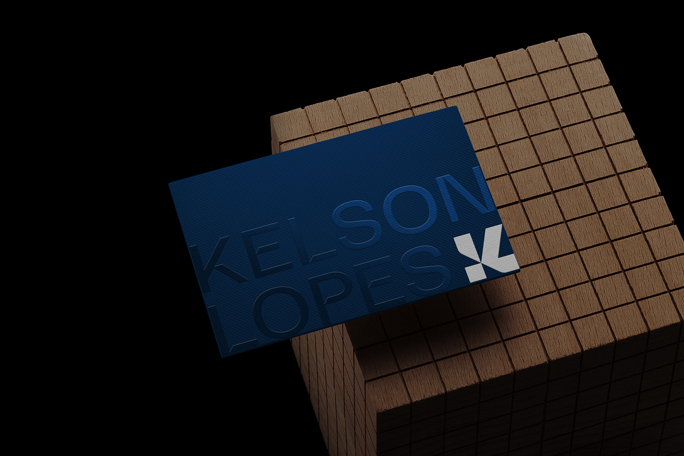
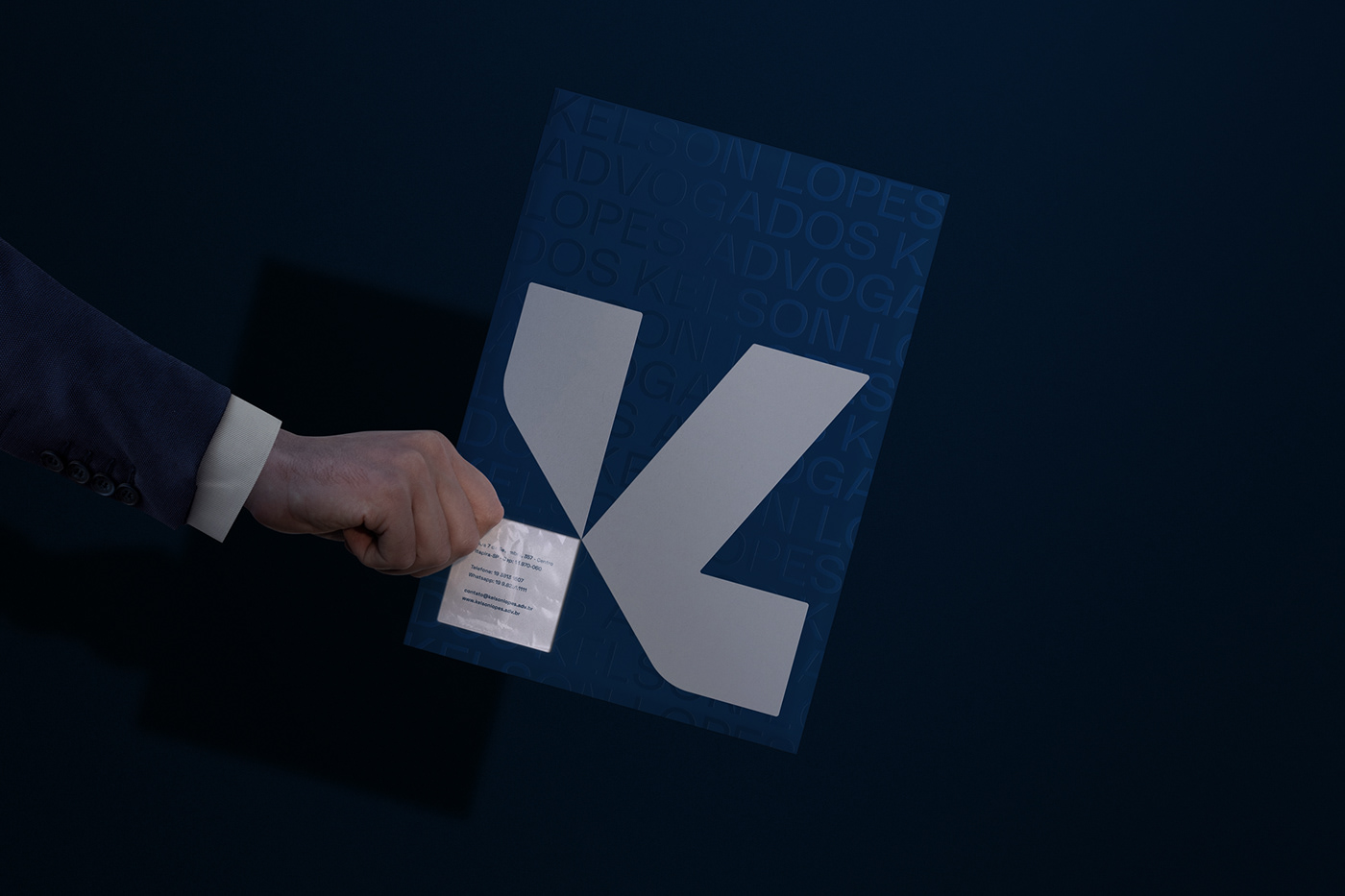
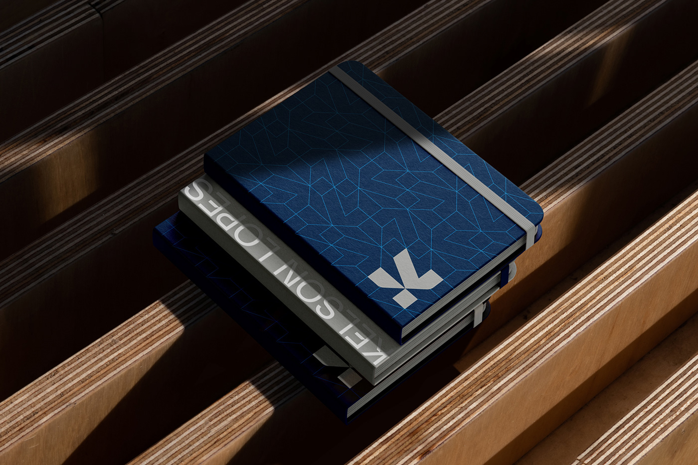
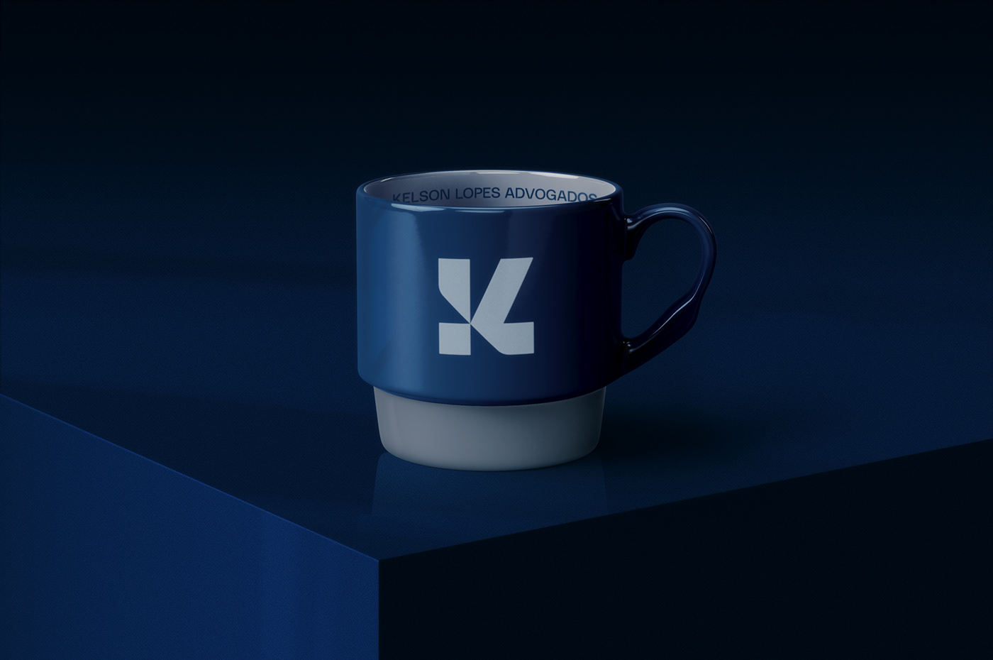
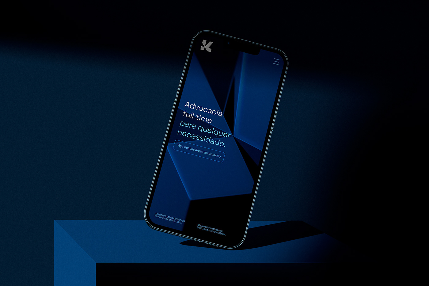
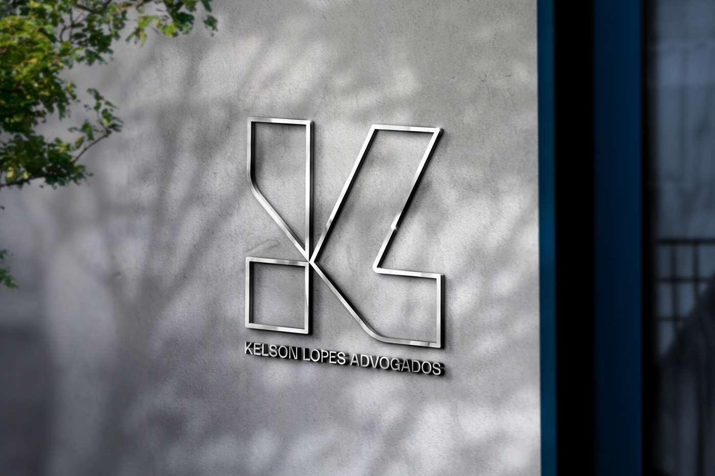
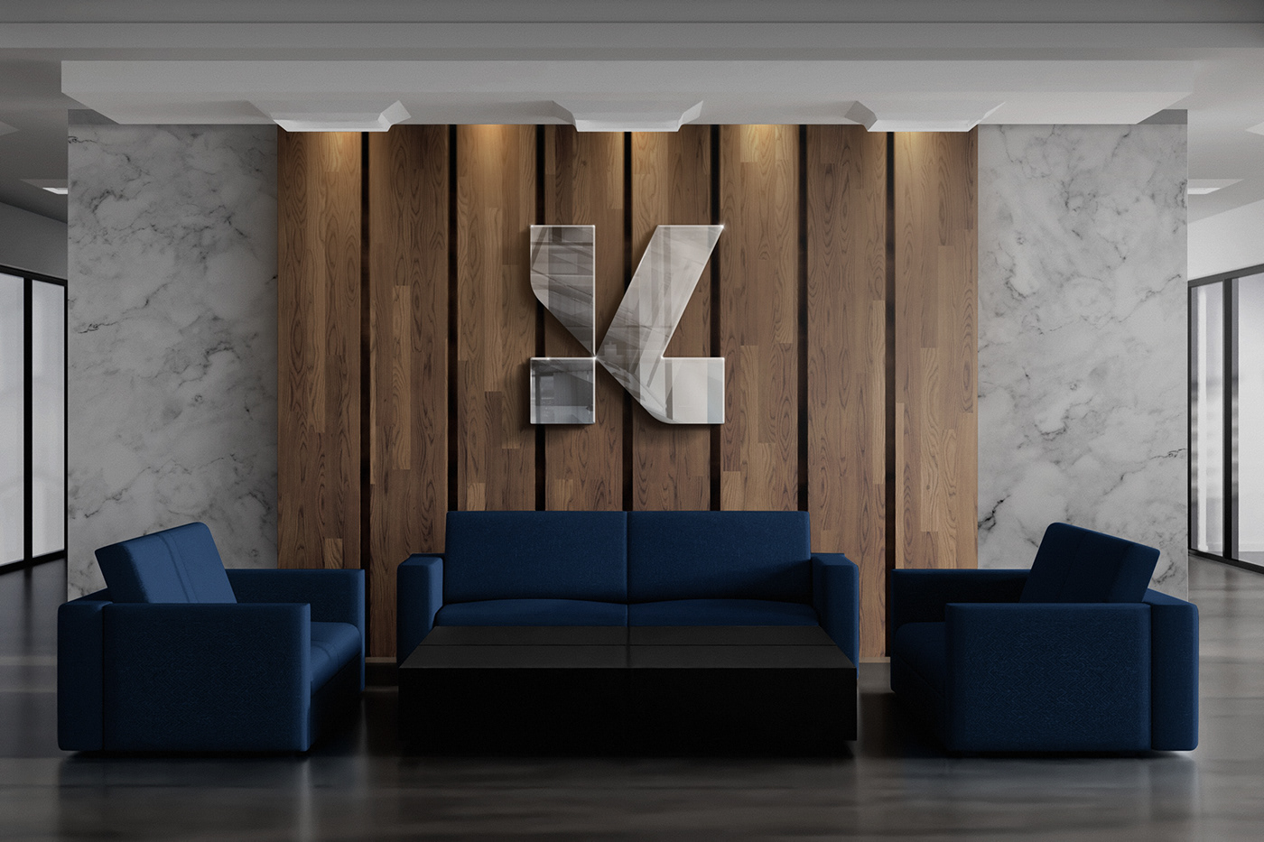
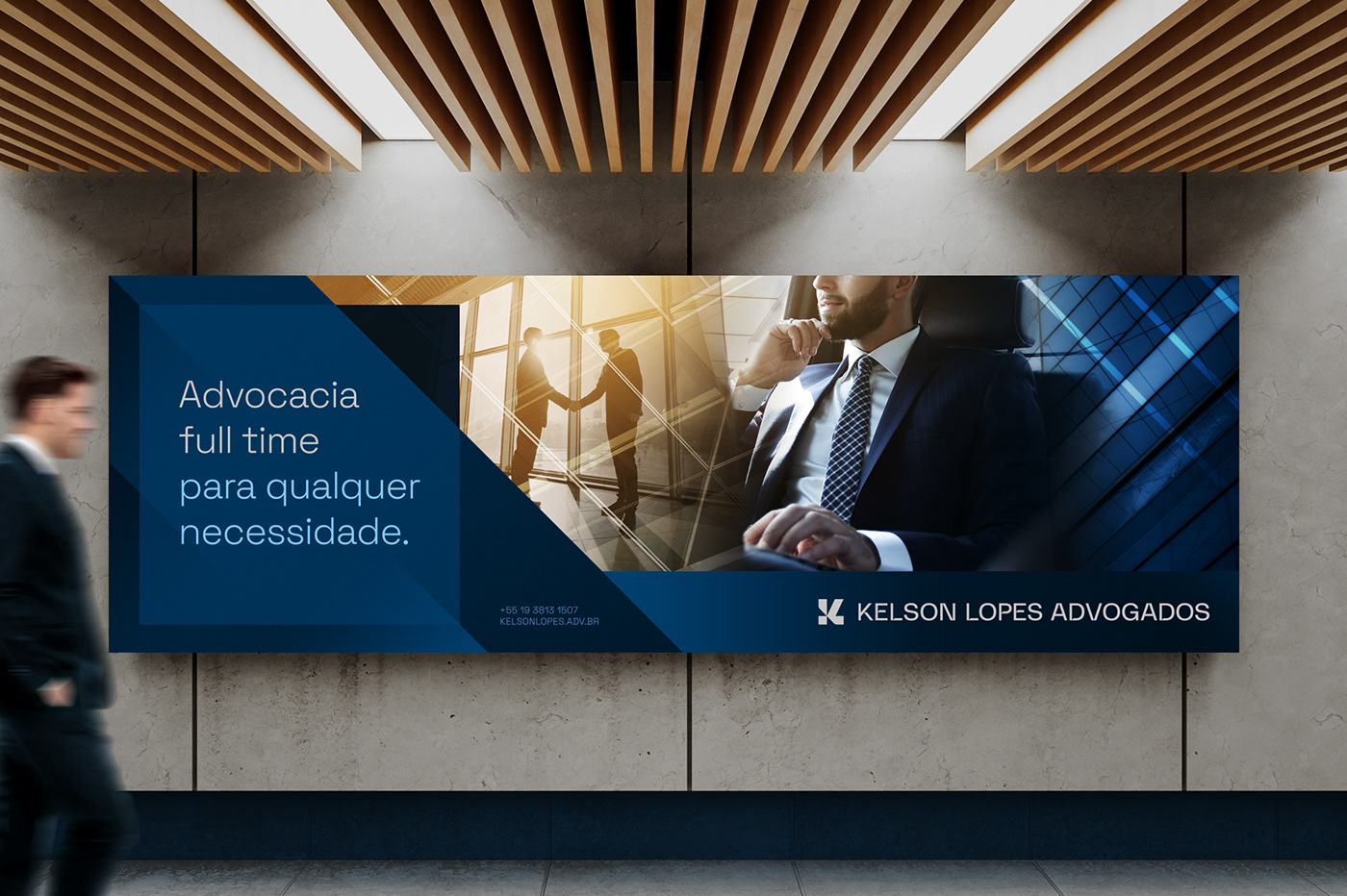
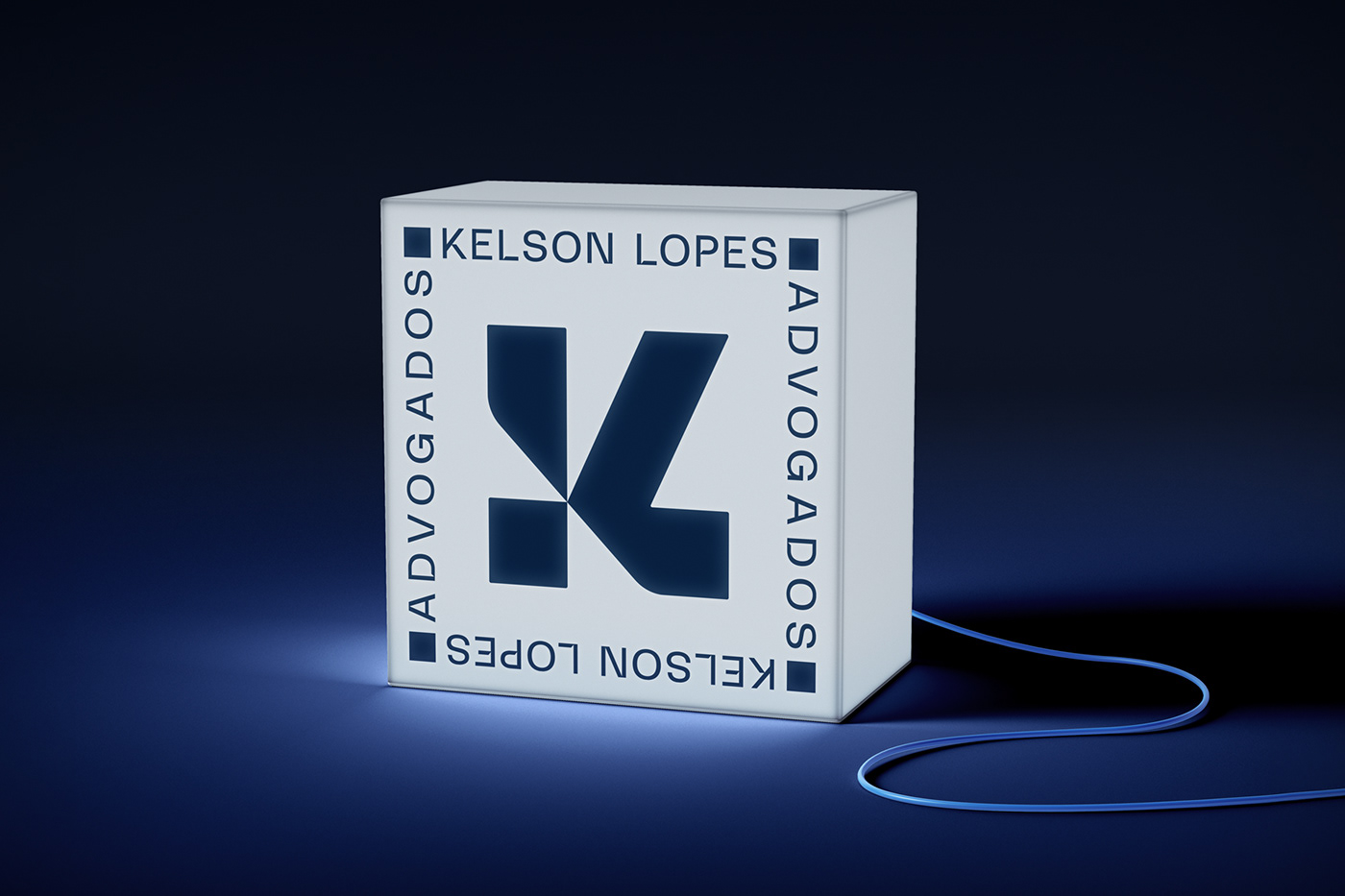
Kelson Lopes is a law office that, after consolidating itself in the market, was looking for a new minimalist and versatile brand in line with its current moment. The solution was to design a symbol made from the square shape (solidity), which presents the letter K (Kelson) in its shape and the letter L (Lopes) in its half shape, accompanied by its own typography (grotesk) with cuts that refer to the symbol, creating an identity that is reinforced by the colors, textures and graphic elements.
PT-BR
Kelson Lopes é um escritório de advocacia que, após se consolidar no mercado, buscava uma nova marca minimalista e versátil alinhada com o seu momento atual. A solução foi desenhar um símbolo feito a partir do quadrado (solidez), que apresenta em sua forma a letra K (Kelson) e em sua meia forma a letra L (Lopes), acompanhado de uma tipografia própria (grotesk) com cortes que remetem ao símbolo, criando uma identidade que é reforçada pelas cores, texturas e elementos gráficos.
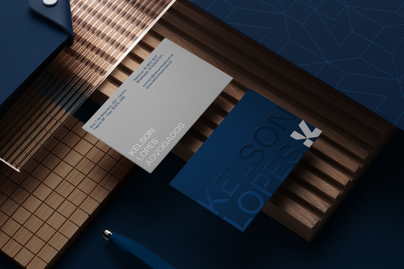


Client: Kelson Lopes Advogados | Year: 2022 | Country: Brazil
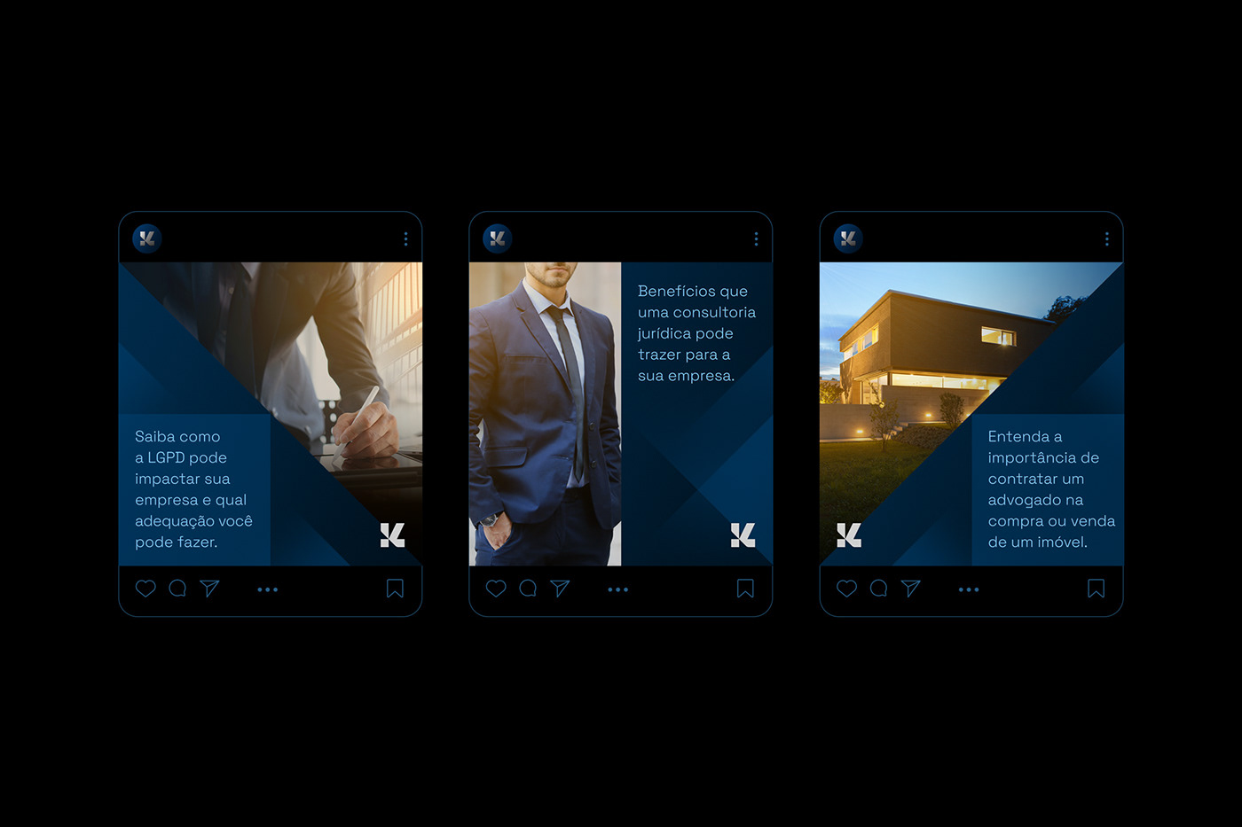
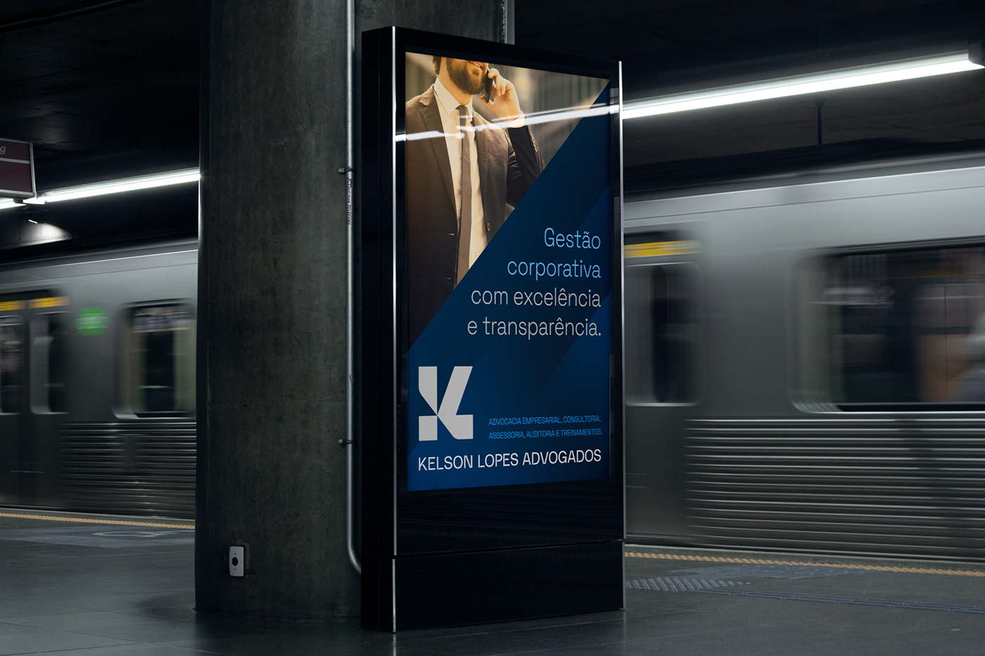
Service: visual identity with key visual for social media.
____________________________________________
L U C A S C O R A D I - B R A N D D E S I G N E R