a priori | design and little bit more
w𝗵𝗮𝘁 𝗶𝘀 𝗮 𝗽𝗿𝗶𝗼𝗿𝗶? In professional terms, it refers to knowledge acquired independently of any specific experience, contrasting with a posteriori knowledge, which is derived from experience. In other words, it's knowledge that seems known in advance. However, if you want to understand my interpretation, it could be likened to the invisible thread that connects knowledge, skill, imagination, and everything I've honed over the years as a graphic designer, as well as in all aspects of creativity and my hobbies.
𝗮𝗽𝗿𝗶𝗼𝗿𝗶 – it represents me and my design. The challenge I faced was designing my own logo based on a story that holds personal significance, while also aiming to create a fun, light, and minimalist logo.

logo idea | the story of one birdie
The concept of the logo is built on three things, one of which arguably holds the most significant value. It's the titmouse, which in my culture symbolizes spring, heralding the awakening of life. It embodies kindness, happiness, and a sense of rejuvenation. However, its importance isn't just from that; ever since childhood, my grandmother used to call me "ptichka sinichka," which translates to "little tit birdie". The second integral element of my life is art, drawing, and everything related to it, while the third element is the invisible threads, symbolizing 𝗮𝗽𝗿𝗶𝗼𝗿𝗶. It represents the unseen that surrounds and leads us. Everything is intertwined with each other, all like invisible threads that have meaning.
These three symbols, each with its own unique story, interweave among themselves, forming the core of my design.
The challenge was to unite them, and I hope I have managed to do so. In any case, I invite you to take a look.

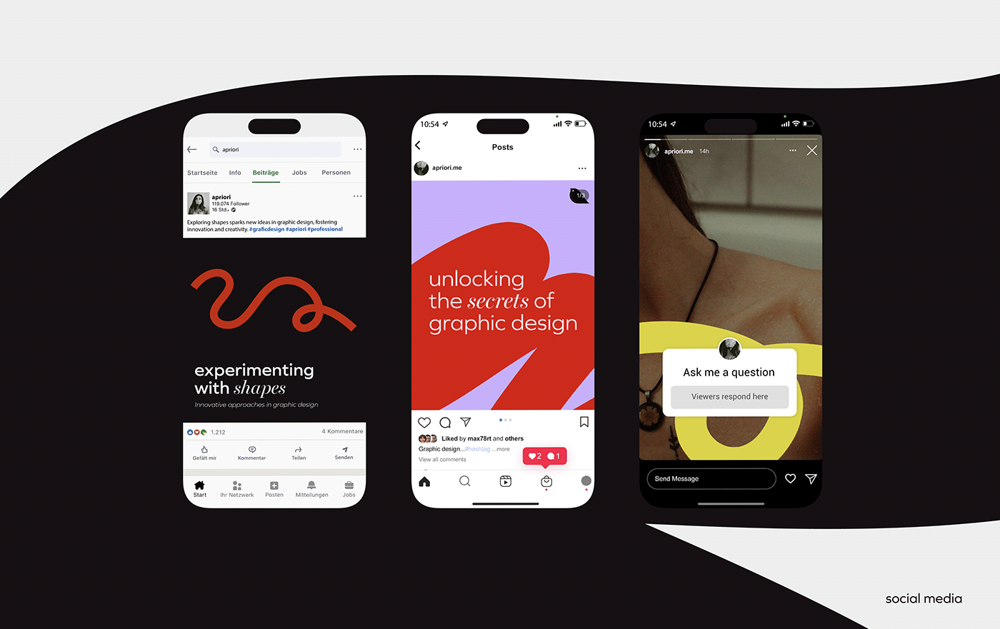
color palette and elements | hidden in the details
I wanted to create a color palette that could always accommodate another color and produce an interesting combination. It's like a bouquet of flowers. Since I was creating this logo for my personal brand, I decided not to limit myself in any way. The world is constantly changing, and so is design. And since I am free in execution, I should also be free in adaptation.
The main design element that adds dynamism is the lines. Lines can vary in thickness, with sharp, non-rounded edges. They can be used as a decorative element for posts on Instagram or LinkedIn. They can be used to create carousels and offer a unique and engaging storytelling experience. Additionally, this element encapsulates the essence and concept of 'invisible threads' entirely.


typography as a concept | see the invisible
So, what's the hidden secret in typography as an element? It lies within the fonts themselves, more precisely, in the combination of fonts: one bold and stringent, while the other acts like an "invisible" thread connecting
Primary Typeface: Graphie
The Graphie typeface, sans-serif, embodies a strict and concise demeanor with its geometric precision and straight lines, instilling a sense of stability and steadfastness. Its role is pivotal, serving as the primary component to be utilized across all variations, from bold to italic.
Secondary Typeface: Miller
is the secondary typeface and acting as a connecting element. Its elegance shines through in prominent headings, imparting a subtle warmth that harmonizes seamlessly with Graphie.