
Project Overview
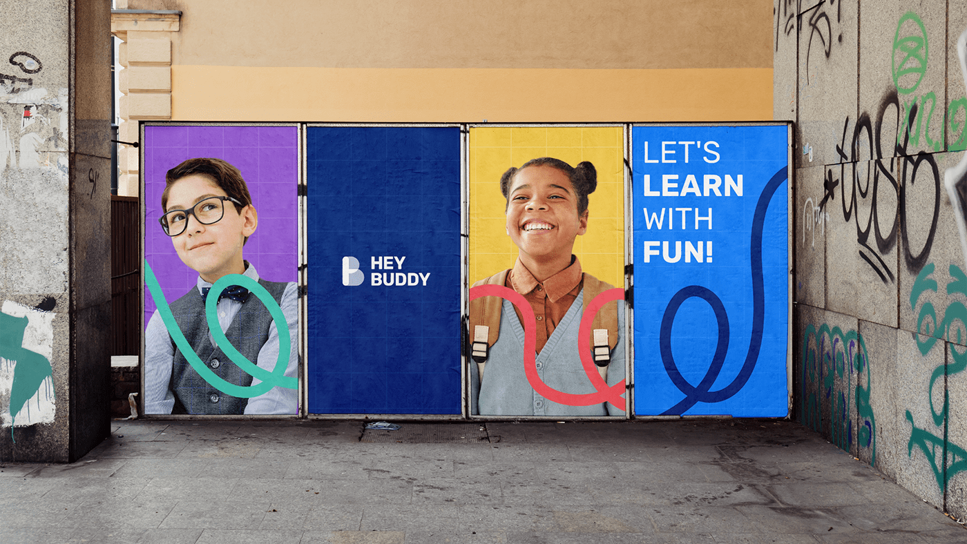
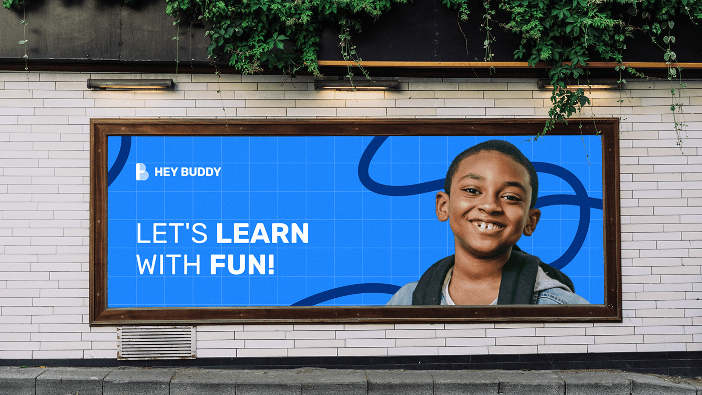
Hey, Buddy is a platform that provides online learning/ education courses and lessons for school students. This educational platform is for students who want to learn quickly, easily, and in the most fun way possible and for teachers who want to do freelancing online.


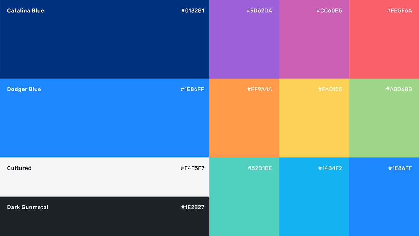
Colors
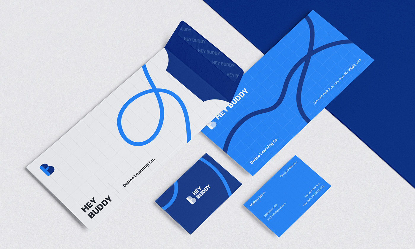
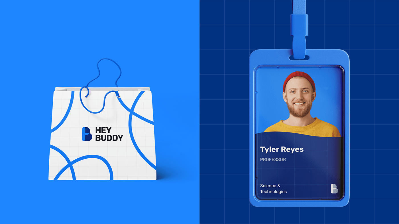
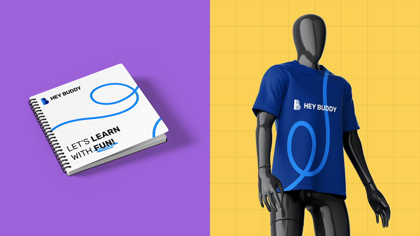
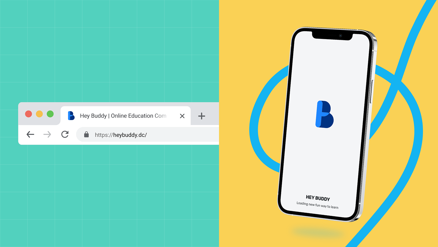
Hey Buddy's brand identity uses a complementary color palette. Two shades of blue are used as the primary colors to create a feeling of honesty and sincerity. Another set of different colors is used as complementary, supporting the primary colors and bringing a fun and exciting vibe to the brand identity.
Typography
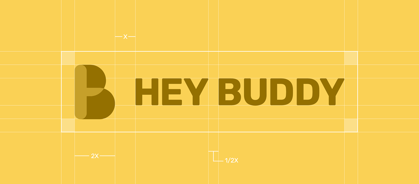
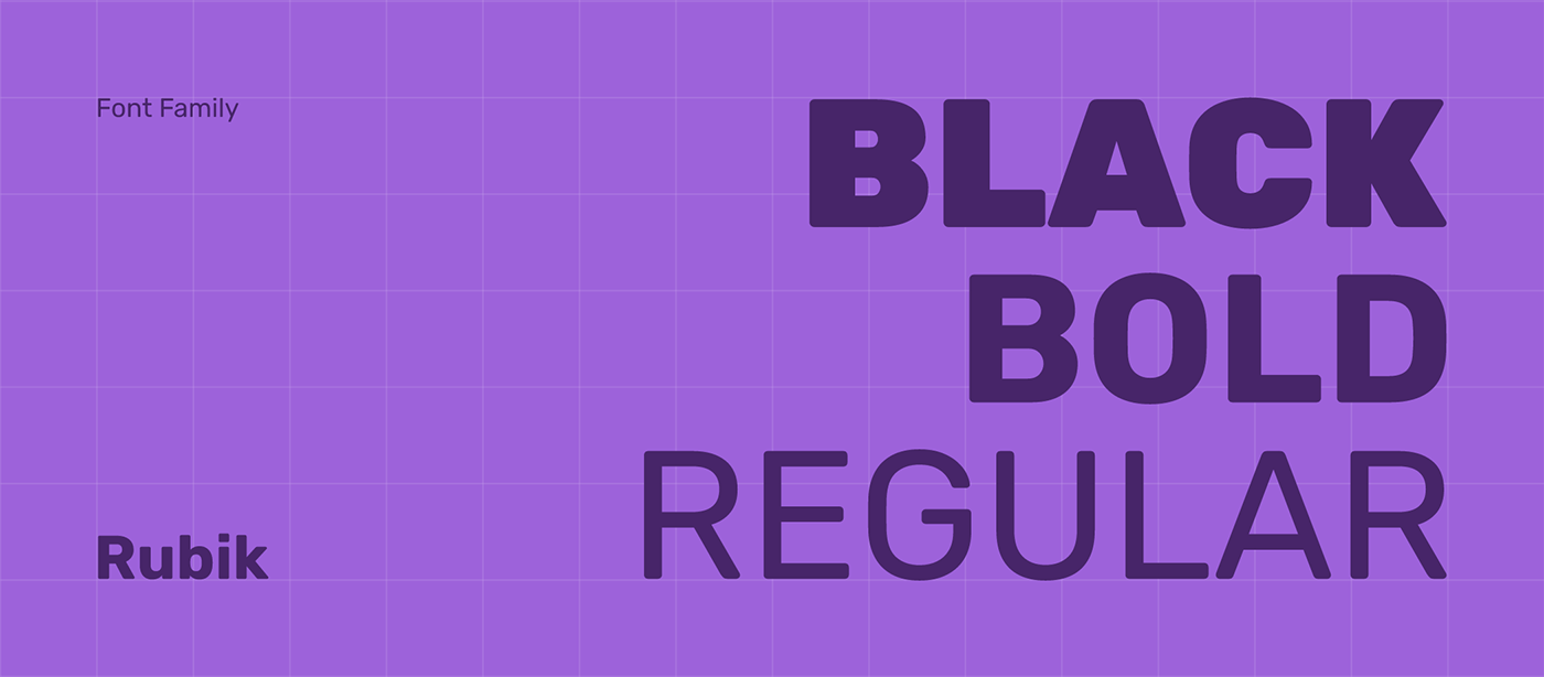
Rubik is used for brand typography. A great font that looks great in all use cases, from headlines to short text to medium size, both online and offline. This is a beautifully crafted font that can cover all your modern business needs. Another reason to choose Rubik is the rounded corners of this authentic typeface, it gives warm and fun energy to the brand.
Pattern & Frames
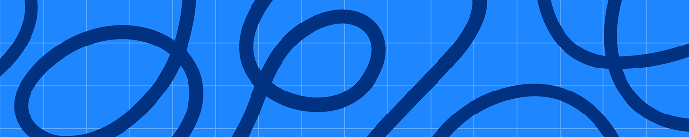
The bold, fat, colorful lines will separate Hey Buddy from the competition and will help to stand out uniquely as a brand. Another grid pattern is used to give the schoolish vibe to the identity. The fully rounded corner of the frames gives as own separate identity to the brand itself.


Communication
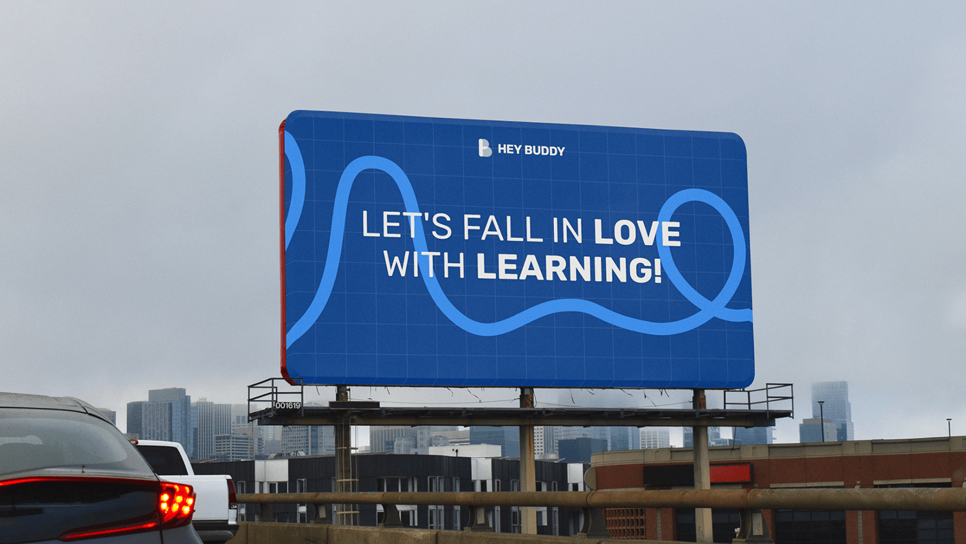
In addition to the brand identity, we created some additional assets to make Hey Buddy look great in all kinds of media. A complete style guide for online and offline materials, plus tons of social media post templates, presentations, and more that you use in your daily business.