


ALPINDUSTRIA appeared in 1988 as a small cooperative of mountain climbers. Now it is a large chain of stores, a mountain club, a travel agency and organizers of competitions on trail running and freeride.The last time the company updated the logo more than 20 years ago. The old logo consisted of graphics and fonts, it was difficult to use in digital and physical media. The new version should have kept the association with the mountains, but made it lighter and more adaptive. The updated logo became typographic, minimalistic and concise.
«Альпиндустрия» появилась в 1988 году как небольшой кооператив, объединяющий альпинистов. Сейчас это крупная сеть магазинов, горный клуб, турагентство и организаторы соревнований по трейлраннингу и фрирайду.Последний раз компания обновляла логотип больше 20 лет назад. Старый логотип состоял из графической и шрифтовой части, его сложно было использовать в диджитал и на физических носителях. В новой версии следовало сохранить ассоциацию с горами, но сделать её более легкой и адаптивной. Обновлённый логотип стал шрифтовым, минималистичным и лаконичным.

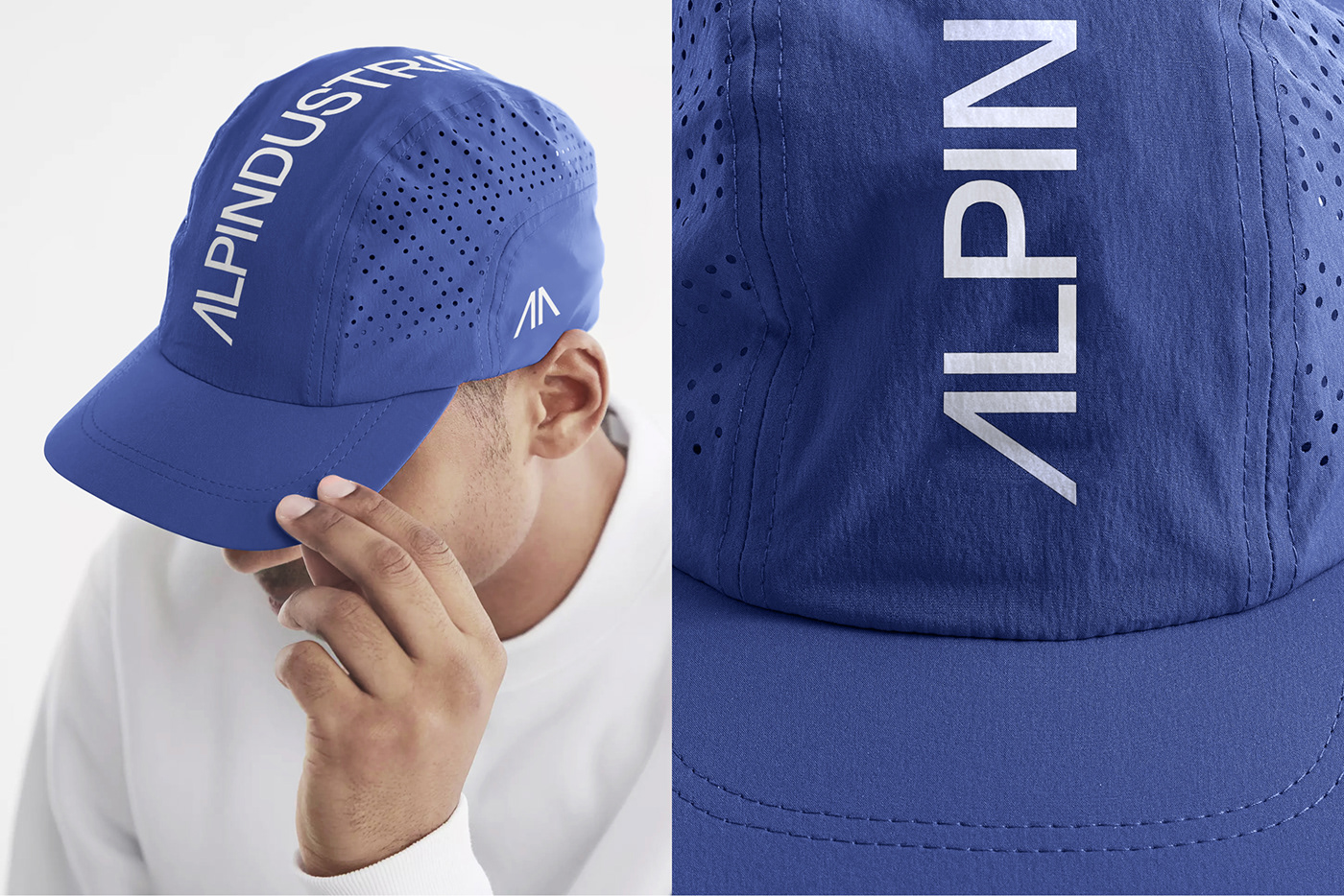
The logo can be rolled up into a sign — two letters "A" resembling mountains. It can be used for different formats: a social media avatar or a website icon. The logo is also suitable for physical media of different sizes - for flags, tents or even a tea mug. Blue was chosen as the main color when creating the identity. The cold shade is associated with professionalism, cold and gear, and is often found on top of mountains. Additional colors are green, red and purple.
Логотип может сворачиваться в знак — две буквы «А» напоминающие на горы. Его можно использовать под разные форматы: аватарка в социальных сетях или значок веб-сайта. Логотип подходит и для физических носителей разных размеров — для флагов, палаток или даже для чайной кружки. При создании айдентики главным цветом выбрали синий. Холодный оттенок ассоциируется с профессионализмом, холодом и снаряжением, а также часто встречается на вершине гор. Дополнительные цвета — зеленый, красный и фиолетовый.


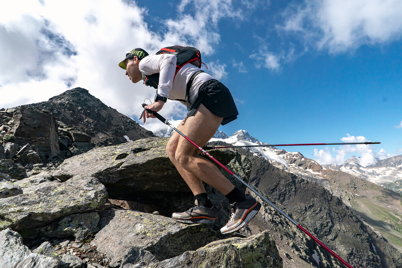


Branded color filters have been developed for the photos. The filters help make the brand's content more recognizable and convey the thrill of extreme sports.The company's new branding can already be found in the design of the offline store, on equipment and even in the mountains at competitions.
Для фотографий были разработаны фирменные цветные фильтры. Фильтры помогают сделать контент бренда более узнаваемым и передать захватывающее дух ощущение от экстремальных видов спорта. Новый брендинг компании уже можно встретить в оформлении офлайн-магазина, на экипировке и даже в горах на соревнованиях.


SETTERS AGENCY:
Head of design department: Ksenia Zhavoronok
Branding Art director: Dmitriy Litvinov
Graphic design: Dmitriy Litvinov, Liza Filippovа
Project manager: Ksenia Bulychova
Thanks for watching!


